Category Recent Work

The magic of creative constraints

portrait
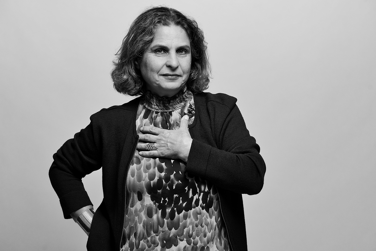
Parivash Rohani, @Brian Fitzgerald


One of the best ways to engage one’s creativity is to first strip away options.   Constraint, not necessity, is the mother of creativity.   

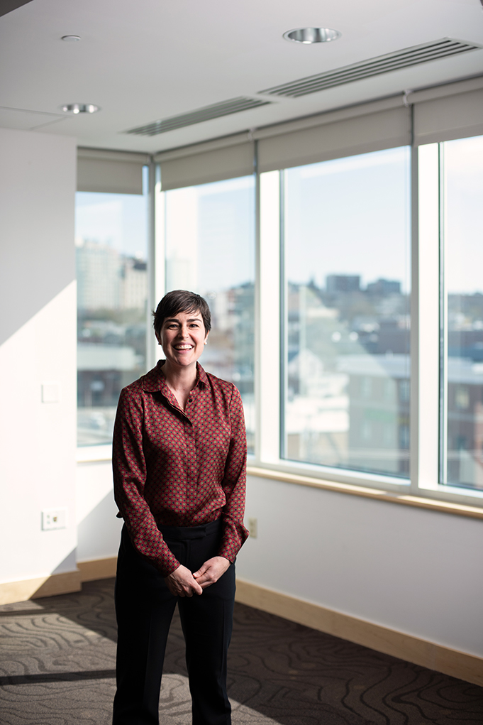
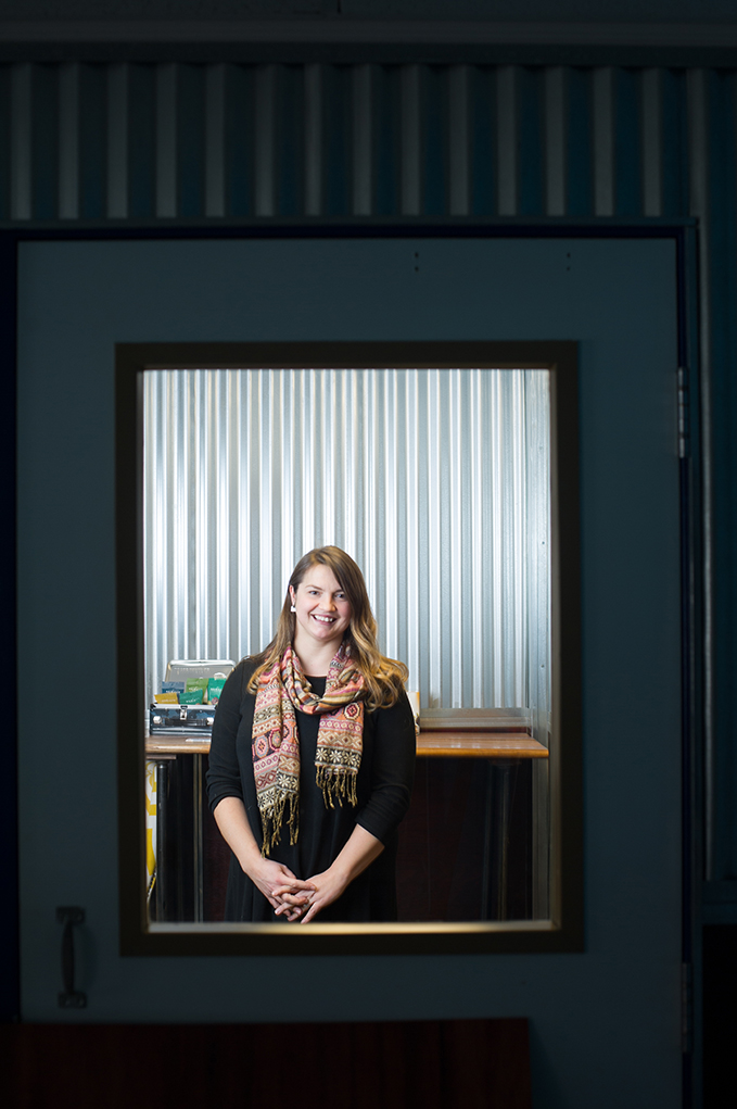
For portrait photographers, the focus of the image is the subject.  Yet background elements and interesting locations help to tell a story and can result in a more compelling portrait.   They can also be a crutch.   One piece of advice I give to aspiring portrait photographers:  learn to shoot portraits with no background. 

The artist Platon is famous for his high-key white seamless black and white portraits.  They are so simple—just the subject, often shot with a very simple lighting setup—but each one tells a story and compels the viewer to linger over every portion of the frame.   

When you strip away all of the choices, you focus on the essential.  When you strip away the excess background elements,  the focus is solely on the subject.  

The photographer is forced to focus on connecting with the person being photographed and helping them to carry the weight of the image through expression and mood, captured in fleeting moments. 

Mass Casualty Drill at Maine Med

mass casualty drill

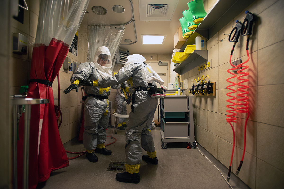
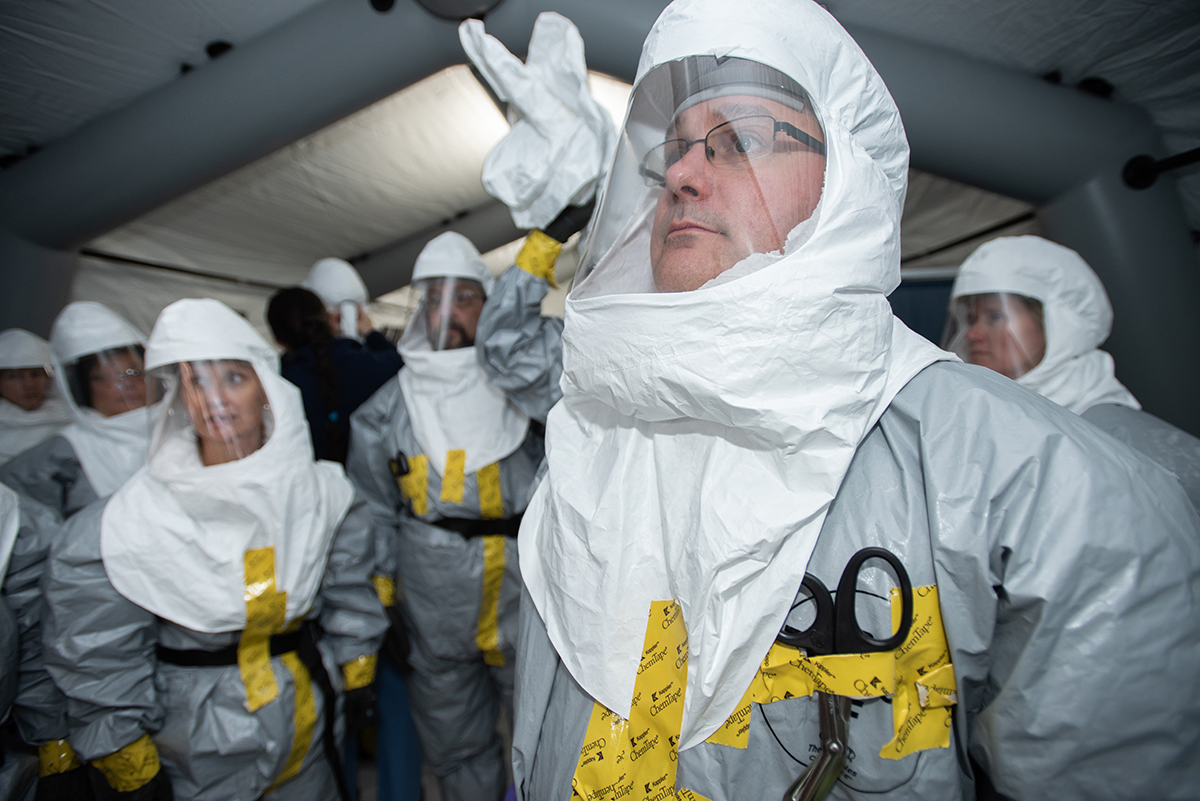
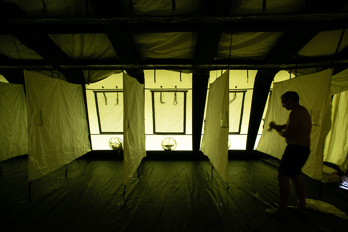
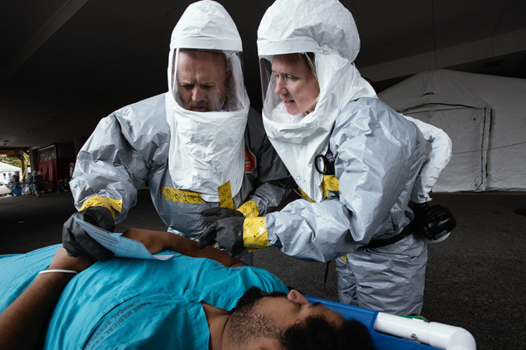
Early last fall, I completed a fun (but hectic) project for Maine Medical Center that I can now share. It was a readiness drill simulating a mass casualty incident involving biological or chemical contamination, as in a spill, industrial accident or terrorist incident.  Involving dozens of medical staff, doctors, students volunteering as mock patients, observers and hospital administration, these types of drills give the hospital staff hands-on practice coordinating assets to triage, decontaminate and treat an overwhelming number of patients.

 Much of my daily work is very purposeful and planned, so going into a large scenario like this one was like stepping back into my newspaper photojournalism days.

It was fast-paced and fun, at least for me (I’m not sure the college kids being scrubbed down in decontamination showers would say the same).

These images became part of the documentation used by the hospital to certify their ability to respond to significant mass casualty events.

Outtakes: the Portrait Moments that Weren’t

Portrait Outtakes

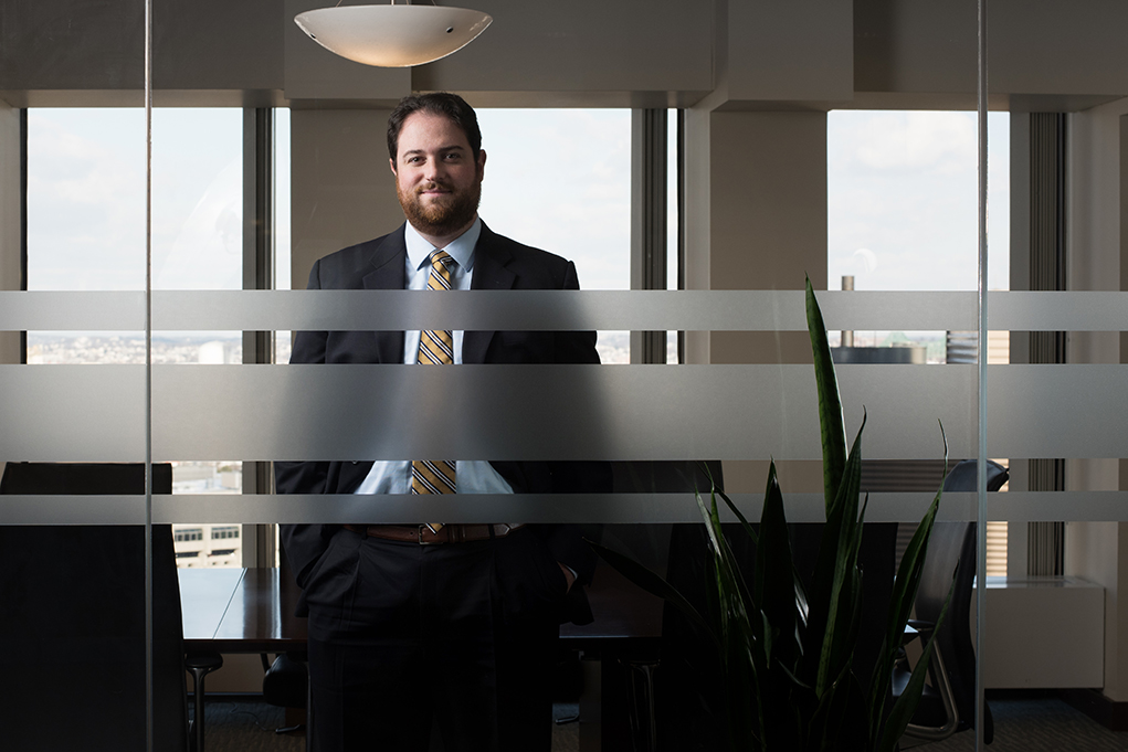
In the photo editing world, outtakes are those images that don’t survive the multiple rounds of editing that allows the cream of your shoot to rise to the top.    The first images to go are the obvious mess-ups: closed eyes, hair issues, equipment elbowing its way into a shot, poor exposure.   The next rounds of editing then refine the selections further until a handful of images remain that I feel proud to submit to my clients:  technically strong, of course, but also appropriate for their brand and their unique story.

Of these, only a small percentage make it to print or screen, meant for public consumption.  In this digital version of the Hunger Games, the rest are discarded and are usually never seen again.  It’s a ruthless, never-ending process.

That’s why I like to go through my past shoots regularly, pulling images that I like that weren’t used.  They may not fit the purpose at hand, but out of context they still are interesting and strong images.

Here are a few from the first couple of months of this year.  I like them because in each case there’s moment that strikes a chord in me.  The lighting, the environment and body language all work together to tell a story of sorts.    I hope you enjoy them as much as I like seeing them again.

Portait Outtakes


Portrait Outtakes


Portrait Outtakes

Creative Portraits for iBec Creative

Creative Portraits


When your client is a marketing agency, things tend to get interesting.   I’ve had the fortune to work with a bunch of great creative types at agencies small and large, and I find that collaborating with a talented team of creatives leads to great results.

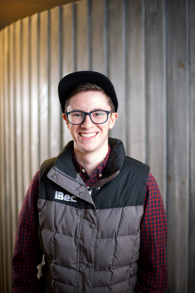
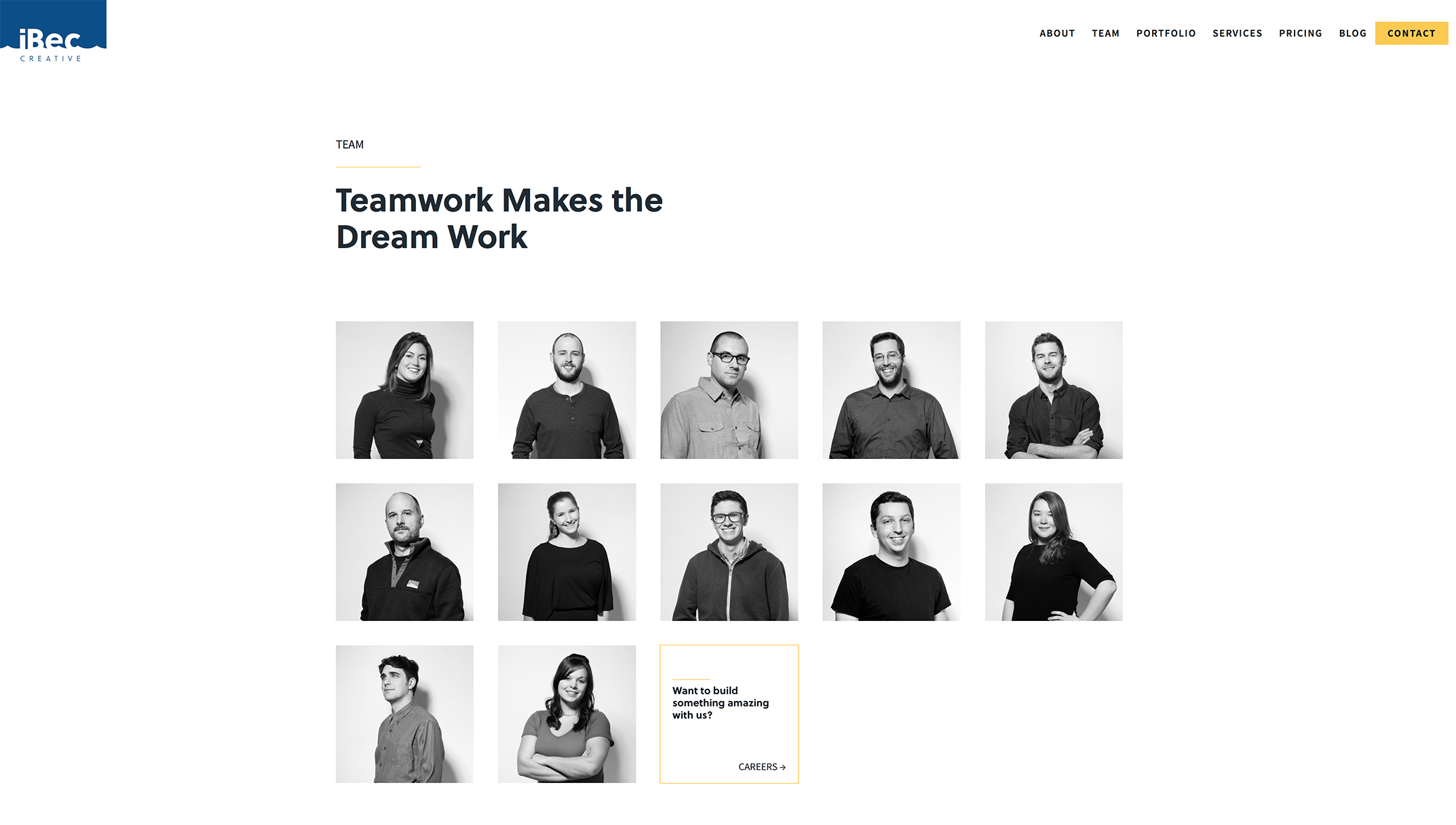
iBec Creative is a Portland-based web design and development agency that I’ve worked with several times over the years on various client projects—always a fun experience. Recently they hired me to produce creative portraits of their own team for use on their newly-redesigned website.

It’s one thing for a creative agency to choose you to photograph for their clients, and another when being hired to photograph the agency itself. Given the many talented photographers iBec has worked with, I was honored to be asked to help.

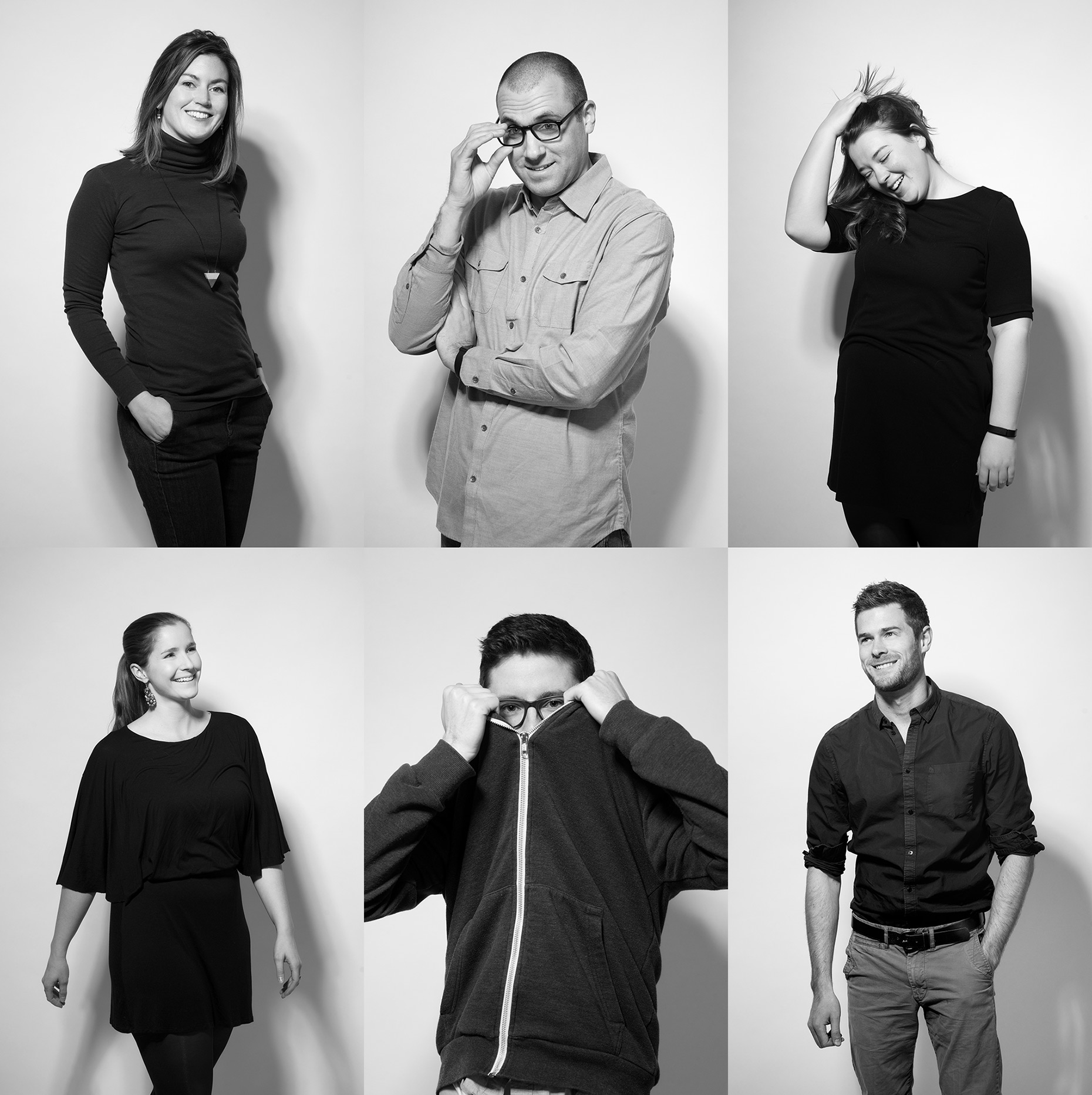
iBec already knew the look they wanted: contemporary, fun and with a fashion sensibility.  They opted to be photographed on white seamless in the studio.  The lighting was simple, but purposeful: dramatic and directional, casting shadows on the background. Basically, it was like photographing a fashion shoot, but with less fans, stylists and featuring coders and programmers instead of models.

The idea was to photograph real moments, rather than static, overly-posed formal shots. The team did great (even those who probably don’t love having their photos taken). I love the variety of shots we got, and like the way iBec used them on their site: a black and white grid, overlaid with patterns that reference the areas each member specializes in, from web design and development to application prototyping to digital marketing.  The team page reflects the cool people and personalities that make iBec tick.  See more of the images, below.


Creative Portraits


To see more of my work, including many more creative portraits–please click here to visit my portfolio site, Fitzgerald Photo.  Thank you!

Client Work: Catalyst Paper


Catalyst Paper


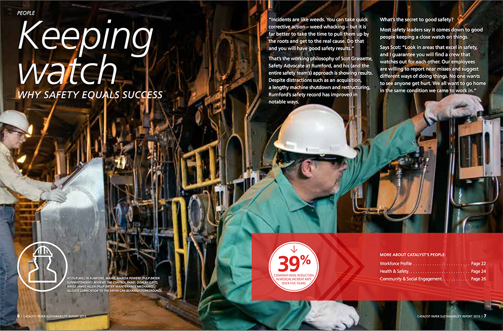
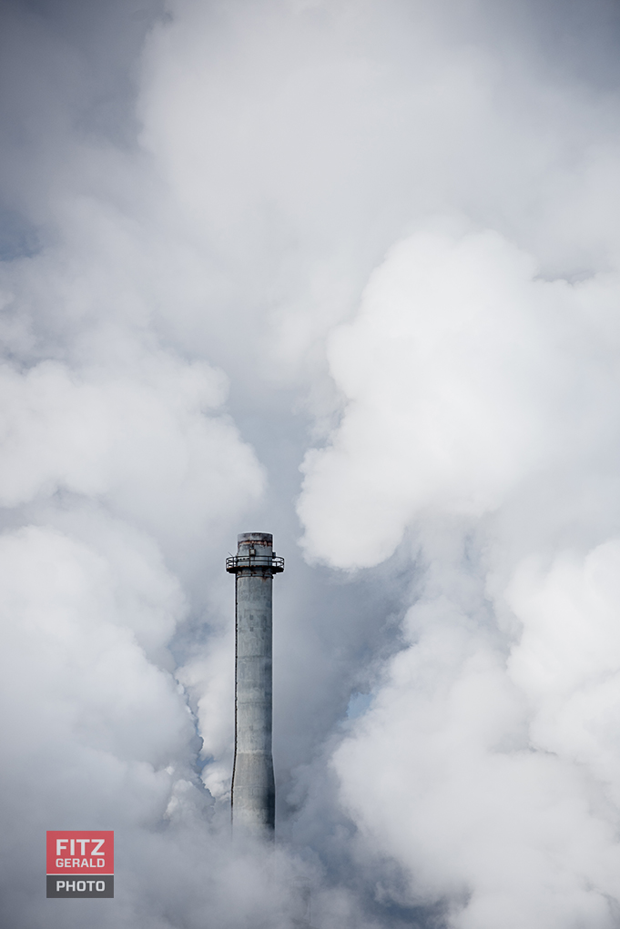
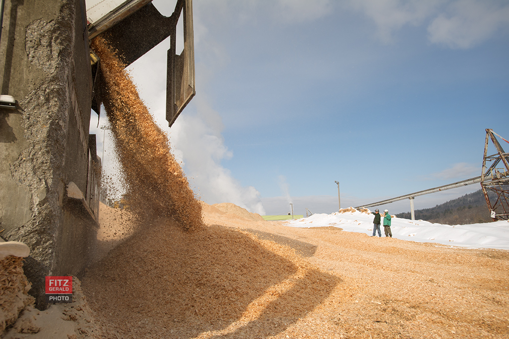
I’ve been working with North American printing paper manufacturer Catalyst Paper for a couple of years now to produce content for their annual sustainability reports. They operate paper mills across the United States and Canada, including one in Maine.

They put together beautiful materCatalyst Paperials that highlight the work the company is doing to better manage resources, be more efficient and safety-conscious. The images themselves tell a story about the connection the company fosters–with the communities they live in, the people that work at the plants, and with the environment that makes their products possible.
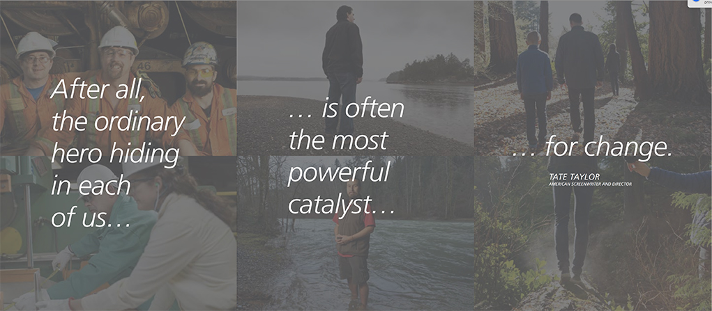
In other words, the story of Catalyst Paper has less to do with paper, and more to do with people, environment and community.

This kind of project illustrates perfectly the need to be able to solve the complex issues that come up often when doing location industrial photography: challenging lighting, last-minute changes to schedule and location, and a sometimes unpredictable and active environment in which to photograph.

In other words, I love it.

Below are some of the images taken for the project:


Catalyst Paper


Catalyst Paper


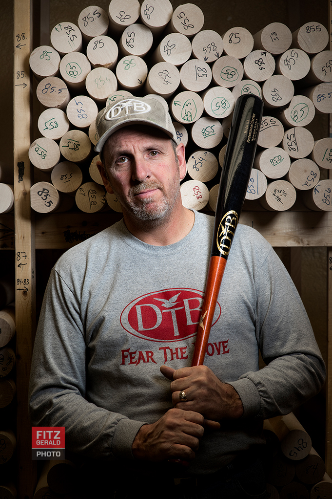
Dove Tail Bats Makes it in the Major Leagues

Across the country, spring has begun and with it, a new season of major-league baseball. In Maine, where spring is more concept than reality (often referred to as Mud Season), baseball is a sign that warmer days are ahead even if the weather hasn’t yet gotten the memo.

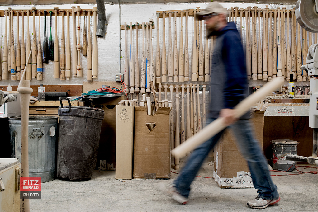
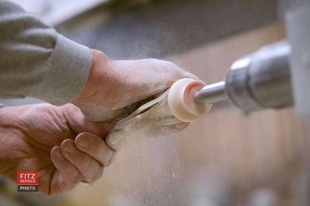
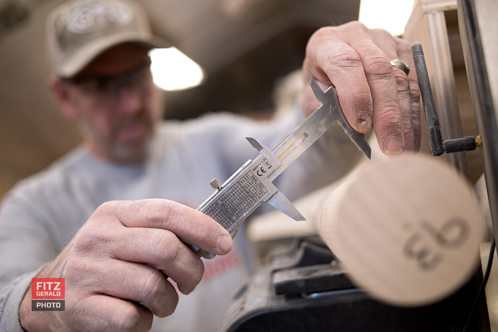
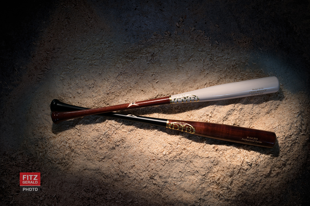
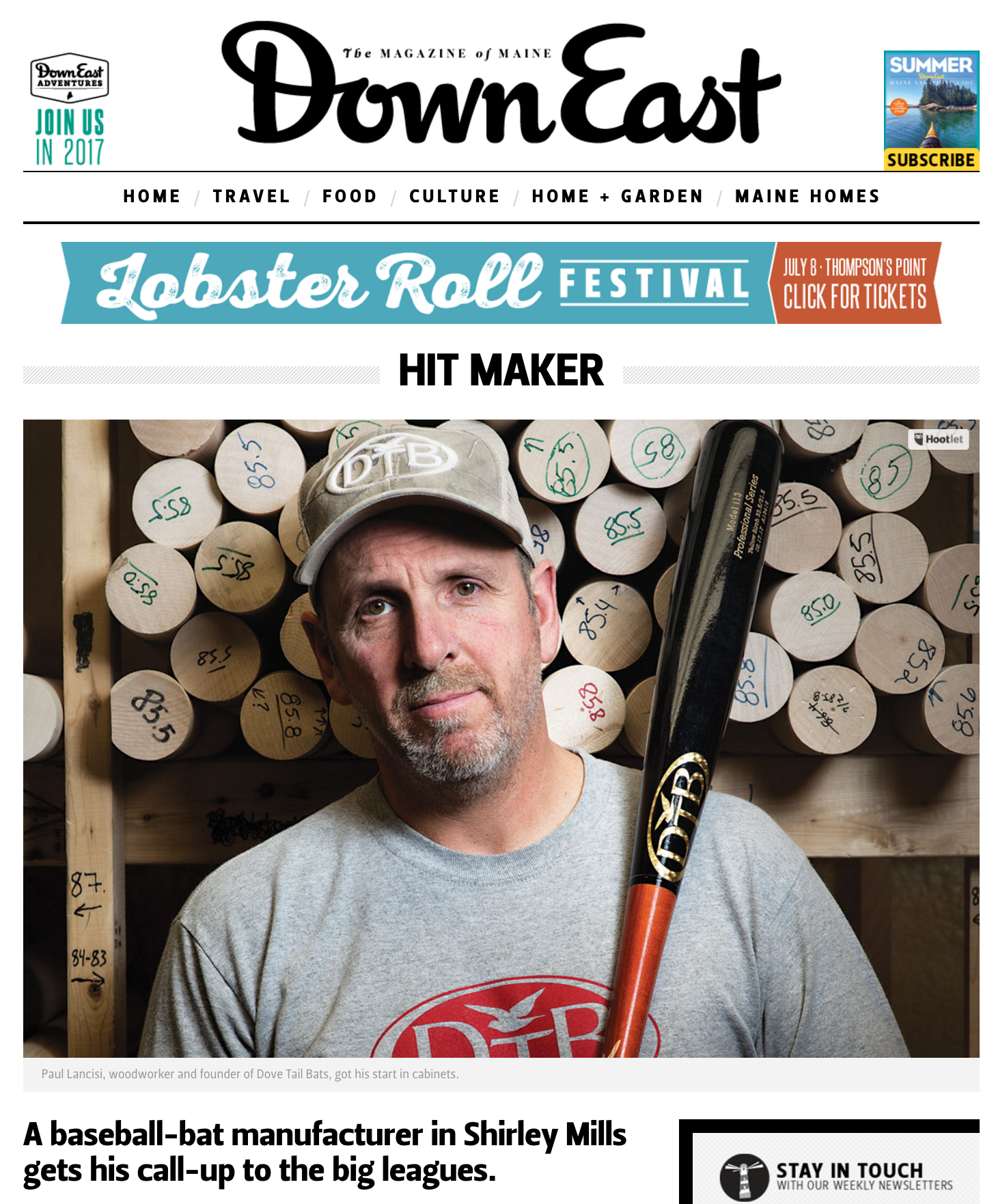
Maine, a staunch member of Red Sox Nation, now has another reason to get excited about the sport. The Dove Tail Bat Company, headquartered in tiny Shirley Mills, Maine–not far from Moosehead Lake, smack-dab in moose country–produces one-of-a-kind, custom-designed bats for the major leagues that look more like art and less like tools for knocking the stuffing out of a ball. Increasingly, across the major leagues, they’ve done just that.

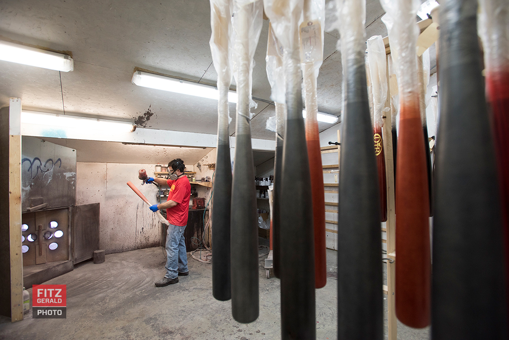
Down East Magazine sent me to photograph owner Paul Lancisi, a former baseball player himself who once tried out for the Red Sox, along with his crew as they turned Maine hardwoods–ash, maple and birch–into glossy things of beauty.

Please read more about the DTB story in the May issue of Down East Magazine.  I had a great time getting to know Paul and his talented crew.  See below for additional images.


dove tail bat


dove tail bat


dove tail bat


dove tail bat


dove tail bat


dove tail bat


Changing Mood By Photographing Opposites

mood

Before I owned a studio full of lighting gear and travelled with assistants, I spent years as a photojournalist who owned little more than a Domke F-2 bag with two camera bodies.  When you boil things down, I’m a location photographer who happens to have a studio.

When on location, I often have to travel quickly, adjust on the fly and create visual gold out of thin air.   When it comes to using light, I’ve learned to work fast and to think in opposites.  More on that in a moment.  The advantages of also having a studio means that I can test and experiment with my lighting before going on scene, which is a huge plus.

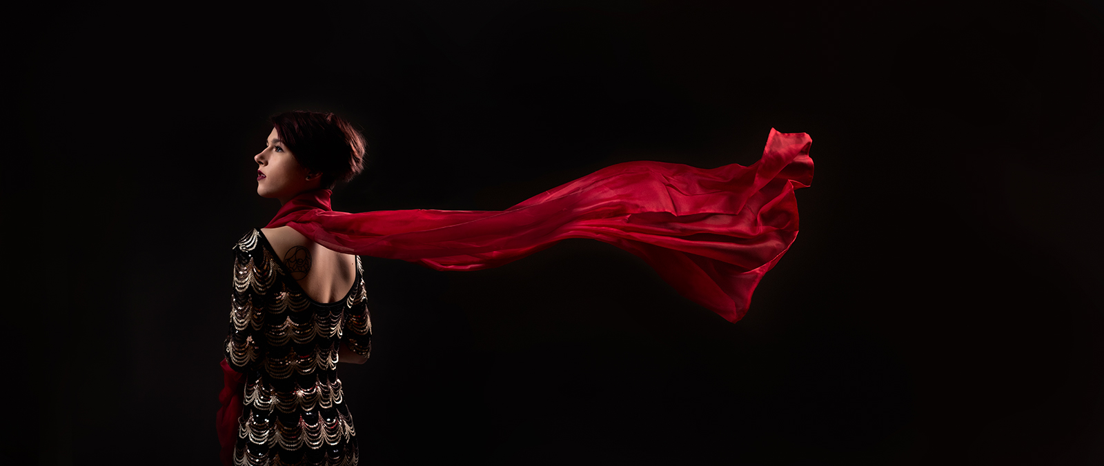
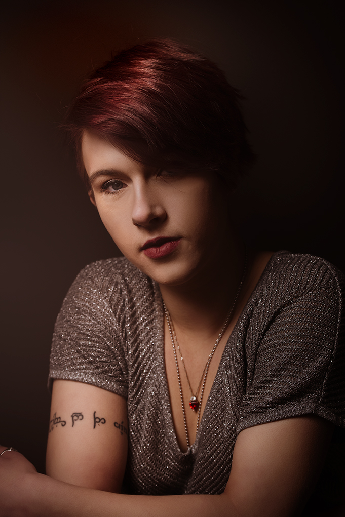
A recent collaboration with Virginia, a local actress looking for theatrical images, demonstrates the idea of “opposites” well.  The challenge was to create a series of distinct looks in the studio in a relatively short period of time, relying only on lighting and a few key elements. As a mental exercise, I try to challenge myself to create looks that are visual “opposites”–i.e., if I photograph a scene heavily lit, then I’ll try one completely using natural light. If something is very dark toned, I’ll try one scenario that is all light or white tones. It’s a way of expressing something completely different even with the same subject and location.

My favorite image of the day was of Virginia wrapped in a flowing red scarf, blowing in the breeze. In the absence of the background, the red scarf gives life and movement to the image and I love how it turned out. Then there’s the quiet moment of Virginia, looking dark with warm, low-contrast tones. Contrast these with images where she is looks unflinchingly at the frame, a study in bright tones.

One space, a few elements, and deliberate lighting to help convey a different mood. Virginia knocked it out of the park.


mood


mood


Behind the Curtain with Maine Freemasons

Maine Freemasons

Having a camera is like having a Golden Ticket into the lives of others. It’s opened doors on people, experiences and places that otherwise I’d have never met, done or seen.

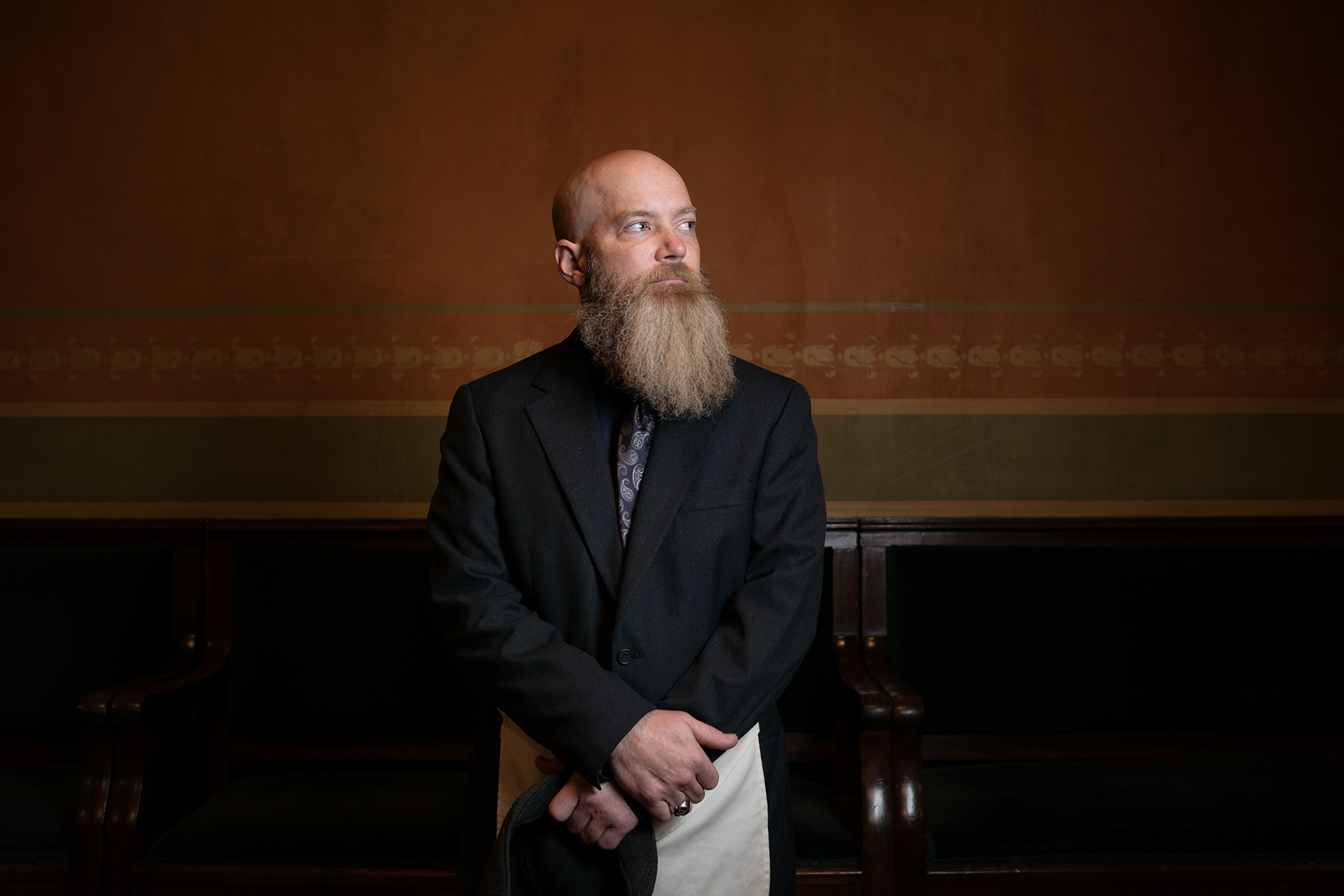
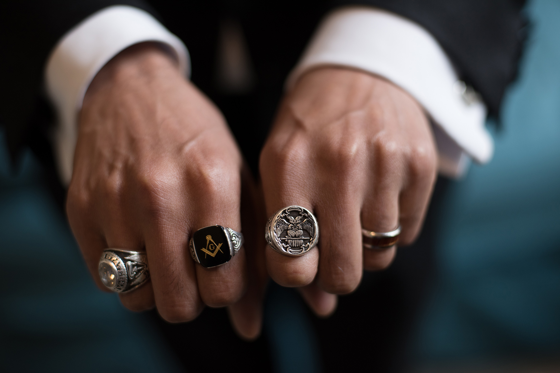
It’s an honor to be allowed into peoples’ lives, and it’s a trust that I hold very sacred. That’s why I was so excited that my camera recently opened another door: one that led to the Freemasons of Maine. I was chosen to produce an initial set of images for a website redesign the Grand Lodge of Maine has been planning for some time.

I should note that my sum of knowledge of fraternal organizations stems from brief visits to my father’s Elk Lodge as a kid and a long-ago viewing of the movie National Treasure.  I’m pretty sure neither qualify as research.   I was eager to meet real Masons and photograph some of the actual ceremonies in Portland’s gorgeous Masonic Temple.

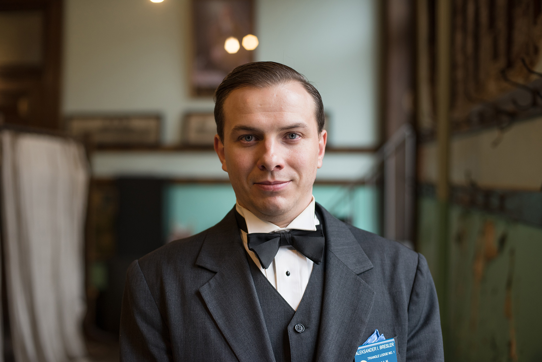
Freemasonry has a long and storied history in Maine, with roots going back to the first lodge, chartered in Falmouth in 1762. Portland’s Triangle Lodge 1 still has their original charter, signed by Paul Revere in 1796 (yes, that Paul Revere).

The Masons still attract men—young and old—drawn by the many traditions and looking for camaraderie, connection and brotherhood.

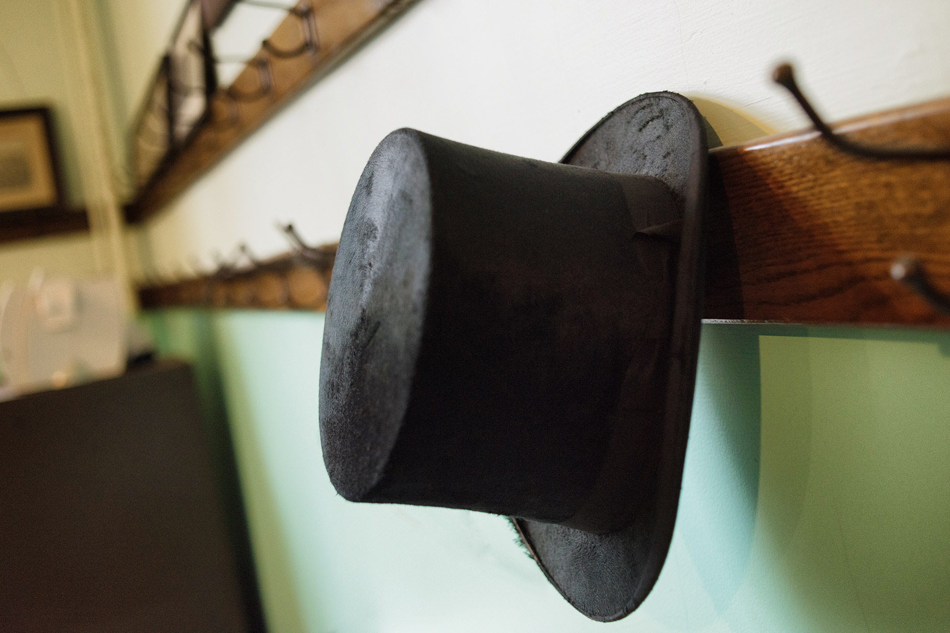
You might not have suspected as much, looking at the Maine Masons website, which was in need of a redesign and new visuals. Most images they had showed members in tuxedos, wearing Masonic aprons in a formal lodge setting.  Although I did photograph some of these same things, one important part of the project I’ve done so far with them is a portrait series of Masons in Maine, both in and outside of the lodge setting.  Work is ongoing, but I’ve had a great time so far meeting with the members and learning about the organization–a peek behind the velvet curtain, so to speak.

What I found was a thriving group of individuals of all ages who are devoted to each other and to their community.  I plan to be able to add additional images soon.

Maine Freemasons


Maine Freemasons


Maine Freemasons

A Portrait Of Martin’s Point Healthcare

healthcare

I can’t think of any other industry that touches everyone’s lives at one point or another like the healthcare industry does.

Not surprising that one of the constant themes of my work over the years has been photographing doctors, nurses and first responders. As a journalist I covered endless procedures, including open-skull brain surgery, in-home hospice and spent nights at hospitals and with paramedic crews.

Now I work for agencies and healthcare providers directly, creating imagery that increasingly focuses on patients and on desired outcomes (instead of showing doctors, show the healthy lives enabled by quality healthcare). It’s a fun challenge. That’s why I was excited to take on a more editorial-style project about Martin’s Point, a Maine based care center located right on Casco Bay.

Instead of focusing on patients, I would focus on the “story” of Martin’s Point–a series of images that speaks to the experience of being there, the environment and the mood of the main clinic. I did photograph some procedures and patient care, but my focus was on the feel of the place, on the caring interactions of providers and even behind-the-scenes images of places where patients don’t normally go. A multi-faceted portrait of healthcare in Maine.

The project was a step back to my editorial roots and a lot of fun. Please check out the complete story on my site to see all of the images.

It’s Always About the Subject

Dunham Group


The background as subject

One of the greatest tools in a location portrait photographer’s toolbox is the context provided by the shooting location. For example, a portrait of a person standing in a long hallway covered in glass windows.  The environment—the glass windows and long hallway—conveys potentially important information about the subject.  It also gives the final portrait mood—in this case it might be bright, open, cheery, confident, clean, modern and contemporary.  Obviously, the right background is extremely important to a portrait. It does a lot of work that propels the portrait or the image..or, conversely, can sink it. The “environment” part of an environmental portrait is so critical that I think of it as the second character in the room—equally important, in terms of attention and consideration, as the human subject in the frame.


Missing Context

Until it isn’t.

Backgrounds are very important, but photographers can’t always rely on having them. Often, the backgrounds convey the wrong information, give the wrong mood, or need to be mitigated and modified. Sometimes, the background is intentionally removed from the equation entirely.

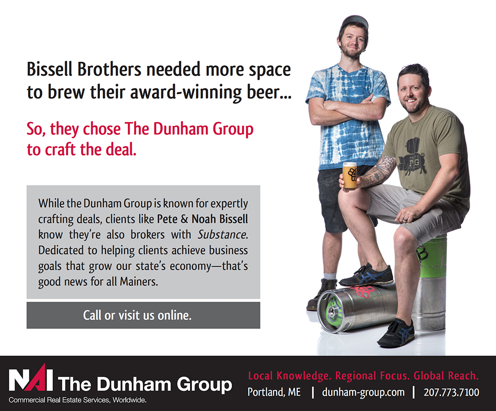
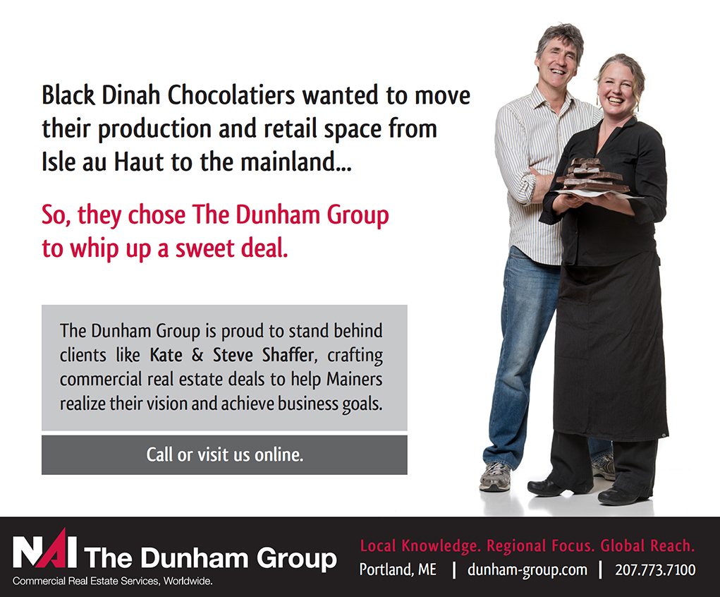
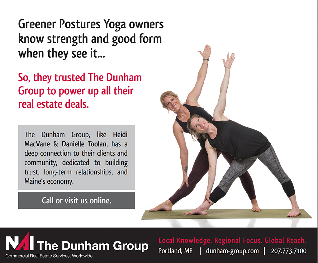
This was the case with a recent shoot.  I worked with Maggie Hoople of East Shore Studio & Print on an ad campaign for NAI The Dunham Group, a large commercial real estate broker based in Portland, ME.  The ads would feature the owners of interesting Maine-based businesses who leased their commercial spaces with the Dunham Group’s help.  We’d done the same campaign previously, featuring solo individuals.  This time, each image would feature the two partners who ran each business.

Since these images would be used in a variety of ways from print ads to large displays at the airport, on buses and elsewhere, they would need to be photographed as full-body portraits on a white seamless paper background. I’d have to rely on really engaging with the subjects since the mood and emotion of each ad would have to come purely from them. The bright white background, though featureless and without context, still would convey a bright, optimistic, clean and modern look.


Fascinating Subjects

It was a fun shoot. Business owners are fascinating people, by nature optimistic, dynamic people who have a passion for what they do.  People like Kate and Steve Shaffer from Black Dinah Chocolatiers, Peter and Noah Bissel of Bissel Brothers Brewing, Heidi MacVane and Danielle Toolan of Greener Postures Yoga and Ben Waxman and Whitney Reynolds of American Roots. The shoot was an exercise in making them feel comfortable enough that they could forget about the background, and the lights, and the setting, and to focus instead on their accomplishments, their motivations and their business plans. Having two people in the frame provided a great opportunity for interactions, too, leading to serendipitous, unscripted moments, and key props and clothing helped give clues that the background couldn’t provide.


Backgrounds are nice…but it’s always about the subject

So without the context of a background, it’s an opportunity for photographers like me to dive in and go deeper with my subjects. Freed of obvious visuals, the challenge and the reward comes from telling a story through moments that change from second to second. To me, that’s what it means to be a photographer of people. It reminds me that even when there is an interesting background in the frame, the focus should always be on the people in front of the lens. The emotional impact of the portrait comes from them, and that will make an image fly or fail no matter the background.
Dunham Group


Dunham Group


Dunham Group