Category News

The gear you need when on the road

Pocket Wizard Radio Transmitter

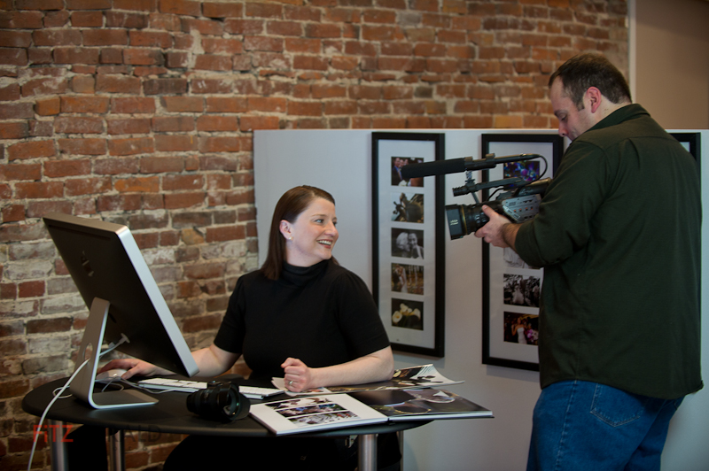
We’re just a couple of weeks from our Traveling Light Workshop, and as a lead-in I’m previewing some of the topics and shoots we’ll cover during the three-hour class.

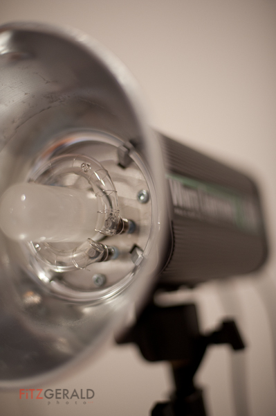
You can’t  discuss portable lighting without getting heavy into some nerdy gear discussions.   So, we’ll be talking plenty about triggering your flashes using manual and auto triggers—everything from old-school sync cords to off-camera TTL cords, from optical slaves to Pocket Wizards and Radio Poppers.

But it’s not all about gear.  It’s also about technique—how you approach a shoot and what works best for different situations ‘in the wild’.

As always, the best system for you is the one that fits your budget and allows you flexibility in lighting on location.

I’ve gotten requests from people who want to bring their flashes and other gear.  Great!   We’ll discuss those and, time permitting, will give hands-on demos with your gear.

If you have any questions about off-camera lighting that you want to make sure we cover, shoot me an email with your feedback.

Traveling Light #2: Location portraits

Ben: Two-light portrait

Here’s another sample of the types of portraits we’ll be building with small lights during the upcoming Traveling Light workshop on May 24.
Location photographers find themselves in an incredible variety of environments. In the studio it’s easy to control all the variables. When you show up at a location, you’ve got to make some decisions to make regarding ambient light and background. Namely, how much of each do you want to include in the final image?

For me, location photography is kind of a reductive exercise—start with what you find, and then remove light, clean up background elements, modify your flash— until you end up with what you want. In the studio, it’s more of an additive approach: start with nothing and build up the lighting and elements to create the image.


In the case of these portraits, shot with the help of Matt and Ben of Single Source Staffing, we had about 15 minutes to do two different looks. The vivid green walls in the office were an interesting feature I knew I wanted to use, as was their cool, colorful logo—perfect for an environmental portrait.

No lighting diagrams on these—we”ll talk more about approach during the workshop—but here’s the basics: Ben (green background) is lit from camera left with an SB800 shooting through a white diffuser screen simulating window light. There’s an SB900 in a medium soft box (camera right with a 1/2 power CTO gel), placed to hit Ben slightly angled toward the back side of his head.   The shadow?  A happy accident.  Once I saw it, I liked it.

Matt is lit by the same soft box. There’s another SB800 with a diffusion dome just to camera left, pointing at the right side of Matt’s face. On camera right, there’s a third strobe with a snoot aimed at the SingleSource logo. In this case, we underexposed the background so that there’s very little ambient light (ugly flourescent lighting) in this image.

These are two quick-hit examples of location portraits that use their environment to create interest and drama.

Matt: three-light environmental portrait

Visuals for Verrill Dana

Verrill Dana's new website

I met the folks at Portland-based law firm Verrill Dana last year.  The firm was in the middle of a complete web redesign of their site, and needed photos—lots of them.  Verrill Dana is one of the largest law firms in northern New England, with offices in Maine, Boston, Connecticut and Washington, DC.

The firm already had professional headshots of most of the their 100+ attorneys, but needed updated versions.  In addition, they wanted to showcase more of each attorney’s personality: on each bio page they would run three black-and-white candid photographs of each person in their work environment, engaged in normal interaction.

We met and came up with a plan to tackle the job. The formal portraits would be taken over the course of weeks and would be shot in Portland, Boston and in our studio—but they had to look consistent, as if they were taken all at the same time.   The candids needed to be purposful but natural, orchestrated but spontaneous-looking.

I started by photographing some test “attorneys” in a variety of ways to provide some different looks.  Once the artistic vision was decided on, we arranged shoot dates and makeup days, then got to work.   The shooting days went very smoothly, primarily because the marketing team at Verrill Dana is so well-organized.   Although small issues always come up in the course of shooting, a bit of flexibility and a solid team can easily overcome them.  My years as a photojournalist helped me move quickly and roll with the punches, too.

We love Verrill Dana’s new site, launched earlier this month.  It’s inviting, clean and filled with nice touches, like being able to view an image of each attorney just by mousing over their name.   Congratulations, Verrill Dana!

Lighting workshop at Studio B

I was asked (by my wife, Beth) recently to make a presentation to the monthly photo group she hosts.  The group, known as a PUG (Pictage User Group), is run by local wedding photographer Emilie of Emilie Inc.  Beth ran the show while Emilie was on maternity leave, hence the request.

So I put together a short program around the use of studio lights (not camera flashes).  We would start with a one-light wonder and build a three-light portrait from there.  Along the way, we’d use a variety of modifiers to sculpt the light:  softbox, umbrella, beauty dish and reflectors.

To my surprise, we had a packed studio.  The session was great–lots of good questions and energy.   When our model called in with the Flu, group members happily allowed themselves to be pulled in for impromptu example shots, which we promptly projected for the group to see.

We covered a lot of ground, but as the session ended I knew I wanted to put together a new workshop–this time demonstrating how to use studio strobes on location and synchronizing electronic light with ambient light.   It’s still in the works, but will probably happen this summer before the season gets too busy for wedding shooters.

Below I’m including a beauty dish photo I took of participant Charlie Widdis.   The concept was on layering lights so that the image shows bright-dark-bright areas from back to front.  Beauty dishes are great for this kind of effect because they produce a very defined and controllable beam of light (with no hot spots, incidentally).   This is literally a 30-second set-up-and-shoot portrait, but Charlie looks great.

Charlie Widdis


The cool thing is that, a few days later, Charlie practiced the session and expanded on it, producing a very nice softbox variant with some good model material–Miss Maine.  Then, he sent that image to me to show off his results.   Nice job, Charlie!   I love it when people immediately apply lessons learned–there’s no better way to commit the technique to memory.   Charlie blew the doors off of this one and made it his own.

©2011 Charlie Widdis

Below is a list of resources based on questions that came up during the workshop.  Hope it’s helpful to the group (and others).   And for anyone wanting to take part in the upcoming outdoor lighting session, feel free to email me at brian@fitzgeraldphoto.com.

Resource Links and Terms

Honl Photo:  For straps, grid spots and other modifiers for your on-camera flash.

Gaffers Tape:  This is the slightly expensive cloth tape the pros use.  Very sticky, but no residue afterwards.

Beauty Dish:  For beautiful, directional light with no hot-spot

Alien Bees:  Relatively inexpensive monolights good for traveling wedding and portrait photographers.  Great customer service.

Elinchrom:   Professional studio lights with a built-in radio remote that allows you to change the power from your camera.

Pocket Wizards:  The best camera/light wireless remote system, in my opinion.

Lastolite:  A bit expensive, but great products such as the light diffusion panels and the Ezybox softbox for camera speedlights

Ebay remotes:  Cheaper alternative to pocket wizards found on EBay.  OK, but you get what you pay for.

Strobist.com:  Fantastic resource for amateurs and pros who want to use their camera strobes more effectively.

Rosco “Strobist” Filter kit:  Get exactly the gels you actually can use–and get multiples of them, too.  They’re cheap, fit right over the head of your flash–and don’t have a hole in them like the free sample packs do.

Seamless:  Paper background available in a variety of roll widths.  Savage and Superior are two well-known brands.

Note:  With the exception of the Alien Bees, much of this stuff is available at  (or can be ordered through) locally-owned businesses  Photo Market and Hunt’s Photo & Video.  Check them out!


Image libraries: a great business tool


I routinely use the phrase ‘image library’ in my presentations to groups and clients, but since I’m aware that blank stares usually follow, I follow it up with an analogy.

Visual tools for your business kit.   Need to post a blog post about a new hire?   Have a feature about a partnership, case study or issue you’ve dealt with that needs a visual hook?   Do you have a marketing plan that includes print and web but are stumped about the images you’ll need?

These are all situations where an image library can make your business life easier.   Imagine if you had a stock of 15-20 images specific to your business and industry.  These are specific because they show your location, your people, your services and products.   These one-of-a-kind images are priceless to you and much more interesting to potential clients than a generic image from a stock photo site.

I regularly work with companies small and large to strategize what images should go into their image libraries.  As the name implies, once an image goes in, it can be used in a multitude of ways over time.   The library can grow as a business does.  The images may start with portraits of company personnel (used on “about us” pages, as handouts for speaking engagements and sent to news organizations for PR purposes) if the company’s people are in the public limelight. If it’s a service-based business, we may decide to do lifestyle images-basically, scenarios showing a business interacting with customers, doing its job, solving problems.  If the company has a product, it might involve product photography either in studio or in a setting in which it may be used.   Some of my customers have professional writers who complete editorial-style features for their blogs on news-worthy stories that my clients have had a hand in–the very epitome of controlling the message–and they want exclusive images done to illustrate their stories.

As a long-time newspaper photojournalist, I love conceiving images that convey –usually in one image–the story from the client’s perspective.

Studio lighting presentation at Fitzgerald Studios


My wife Beth is temporarily leading the Pictage User Group (PUG) for Emilie of Emilie Inc.  This month’s program, which is free, is on March 16th at 7 pm here at the studio (28 Maple Street, 3rd floor).   I’ll be presenting hands-on tips on studio lighting to demonstrate portrait lighting using one, two and three lights utilizing a range of different light modifiers.    If you’re interested in attending, please email Beth at Blush Imagery to RSVP.


Hope to see you there!

For police officer injured by distracted driver, a slow recovery

South Portland Police Officer Rocco Navarro

Photographer’s Note:  Mainers at Work is an ongoing portrait series featuring Maine individuals who work some of the most dangerous, dirty or low-paying jobs as compiled by CareerCast.Com for its 2011 ranking of 200 jobs nationwide.


Behind South Portland police officer Rocco Navarro, the Casco Bay Bridge looms, a symbol that connects his past with a forever altered future.  “You never think of this happening on a routine call,” he says.   A former athlete with a degree in kinesiology,  Navarro has to shift his hips to adjust for the weight of his duty belt, now painful to wear.

Click to Enlarge
Photo courtesy of South Portland Police Department

Stretching away across the Fore River and linking South Portland with Maine’s largest city is the drawbridge that more than 30,000 drivers cross daily.  It was there, on Nov. 1, 2010, that Navarro had a brush with death—in the form of a distracted driver on a cell phone.

Navarro, 28, is in many ways a typical Maine police officer.   Born and raised in Portland, he attended local schools and played football—Navarro was a punter, and good enough to play for three years at the University of Maine—before deciding on a career in law enforcement.  He chose South Portland because it was close to home but also because he wouldn’t be patrolling his old neighborhood.  “I figured it would be too awkward to work where I knew everyone,” he says.

After graduating the police academy in 2007,  Navarro started on the late shift and eventually was assigned a daytime patrol slot, first shift, that started at 7 am.

The morning of the accident,  Navarro responded to a routine call involving a broken-down Kia sedan in the northbound lanes of the Casco Bay Bridge.  It was just before 11 am, and Navarro had just returned to his vehicle, parked behind the disabled car, to await a tow truck. “Thirty seconds earlier, I would have been killed,” he says.

A full-size 2010 Chevrolet pickup truck rammed into the back of Navarro’s police cruiser at an estimated 45 miles per hour.  After the impact, the officer struggled to remain conscious.   He manged to kick open his jammed driver side door and stand up briefly—he was concerned about the car catching fire, he says—and the last thing he remembers is fellow officer Robert Libby approaching the scene.  The next thing he knew, he woke in the hospital.

Since that time it’s been a difficult and long recovery.  “The first three weeks, I felt like a 90-year-old,” Navarro remembers.   His first month was a haze and bad migraine headaches came frequently.  Even as short-term effects faded, other issues stubbornly remain.  Navarro’s short-term memory has been slow at coming back, and it’s difficult for him to sit for long periods of time.   “I didn’t drive for a month.  In traffic, I’d get flashbacks,” he says.  “It was hard going over the bridge for a while.”

Maine is one of only a handful of states without laws banning texting and cell-phone use for all drivers–something Navarro and his fellow officers would like to see changed.   The driver of the Chevy was cited for failure to maintain control of a vehicle.

In the meantime, Navarro rides a desk until cleared for patrol duty by his doctors.  That could still be a while.  He’s also found he’s in a unique position to make a difference in the lives of others.  This month, he started speaking at local high schools on the dangers of texting while driving.  He hopes to get back on the street and plans to eventually retire from the department despite the dangers.

“It’s been a huge setback, he says of the accident.    “I love my job and to have it taken away like that…you’re not prepared for it.   It’s probably the biggest setback in my life.   I’m trying to get back to where I was.”


Name: Rocco Navarro
Age: 28
Occupation: Police Officer
Employer: South Portland Police Department
Rank on CareerCast survey: 178 (out of 200)

Don’t like that skin color? Replace it.

Image showing high yellow values

Proper skin tone is a must for any professional portrait.   Sometimes, especially when shooting in natural-light conditions, a warmer or cooler color of skin is desired.   When in studio or daylight conditions, however, skin tone and color is critical for making sure faces look natural and healthy.

You can’t just judge the tones of a photo by visually assessing it on a computer monitor, unless you have a recently calibrated screen.  Everyone sees color differently.   Instead, it’s best to use objective numbers.   Select the eyedropper tool in Photoshop and hover over the skin areas in your image to see the C,M,Y,K values. You must have the “Info” window open to do so.  The Info palette is a densitometer that measures the amount of cyan, magenta, yellow and black present in your image.  These are the colors that make up the four-color printing process.   Even though your images most likely are being rendered in an RGB space and may never need to be converted to CMYK, we use the CMYK values in the densitometer to measure whether our skin tone is where it needs to be.

Primarily, we’re concerned with relative values, not absolute values.  For example, For Caucasian skin, you’d likely see the numeric values for M (Magenta) in the 30-50 range.   It really doesn’t matter where it is; what’s important is this value relative to the Y (Yellow) number.   For white, Caucasian skin the Y value should always be about 3-5 points above the M value.   K?  That’s black, by the way–and it should read quite low, in the single digits, or zero.  The C, or Cyan, value, should be roughly a third of the value of the M or Y numbers.   So for our current example, a C value of 8-15 would be dead-on.    Without going into specific sets of numbers for all the various kinds of skin, the darker the skin, the higher the Cyan value should be relative to the M and Y values.

By the way, this whole number scheme doesn’t really work if the skin you’re working with has been lit by any extreme light–you know, the gorgeous, golden glow of a sunset or the cool glow of a neon sign.  You have extreme light, you want to preserve that.   You don’t want ‘natural’.

So, once you’ve determined that you DO want natural skin tone and you’ve identified the problem–that guy’s skin looks really pink and you’ve confirmed values of, say, Y=35 and M=75–then how do you fix it?

There are a lot of great ways to do so in Photoshop, and what works for one picture won’t always work for another.  That said, my go-to first tool is always “Replace Color” (Edit–>Adjustments–>Replace Color).  To use it, simply click on a lit, shadowless area of skin and select the degree of latitude (called ‘fuzziness’) you want your selection to cover.  A high degree of fuzziness will select more areas of the image that match the tone of the skin area you clicked on.   Once that’s done, move the sliders to adjust the Hue, Saturation and Lightness.  It doesn’t take much.    In the example below, I moved the Hue slider to -3, the Saturation slider to -5 and the Lightness to +1.   I’ve rarely had to go above 10 on the Hue slider, which is my primary adjustment slider.

That’s really it–just move the eyedropper icon over the skin again to read the new values and, if they look good, go with it.  Again, it may be difficult but you should trust the numbers way, way before you trust your eyes.   A properly adjusted image will reproduce on any calibrated printer even if it doesn’t look great on your uncalibrated screen.

So pay attention to your skin values, and try out Replace Color.   Doesn’t your skin deserve it?

Image adjusted using Replace Color, showing corrected relative values

Looking for models

Are you an aspiring model, or do you want to take your portfolio to the next level? I’m looking for real people for lifestyle shoots in the Greater Portland area. The shoots are fun, creative and scenario-based. I like to tell visual stories with my photographs and am looking for men and women of all ages and types. Whether you look good on the beach or would feel more at home in a parka, chances are I have a shoot that’ll be a good fit. Contact Brian if you’re interested in being on our call list for both paid and unpaid shoots.

Blush in motion

Beth’s always looked great in front of the camera…this week at Fitzgerald Studios, Beth was filmed for a video profile on Blush Imagery by Chris Cavallari, of Filmosity Productions. I’ve known Chris for a couple of years now, and really enjoy his approach and skill. Having had the opportunity to see him work, I like his style, too. Stay tuned for the video results!