Category Education

Photographing AI leader Amanda Stent at Colby

Female Scientist
Amanda Stent, inaugural Director of the Colby College Davis Institute for Artificial Intelligence.  ©Brian Fitzgerald

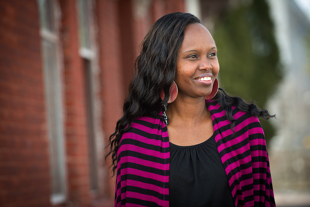
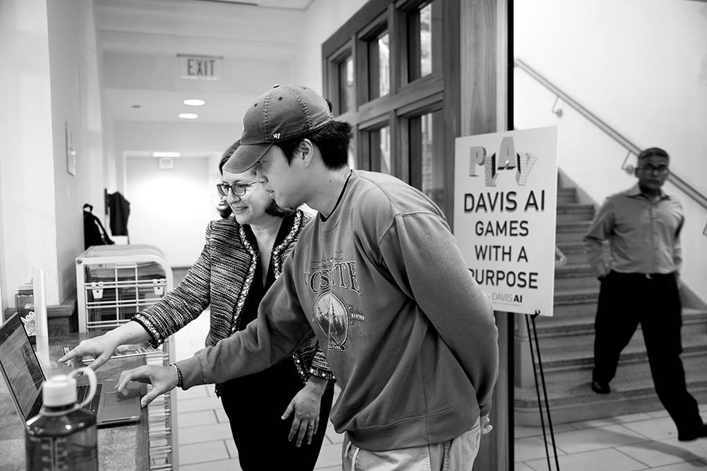
I’m excited to share one of the assignments I did for Colby College recently. This was to photograph Amanda Stent, the inaugural Director of the Davis Institute for Artificial Intelligence at Colby—the first such cross-disciplinary institute at a liberal arts college.
Professor and student discussion
©Brian Fitzgerald

Stent, a renowned expert in Natural Language Processing (NLP), transitioned from her role as NLP architect at Bloomberg L.P., where she led their AI team. She has authored or co-authored more than 100 papers and is co-inventor on more than 30 patents in NLP. In short, Stent is a big deal in the world of AI, and her leadership of the Davis Institute will allow Colby to fulfill its goal of integrating AI and machine learning into a liberal arts framework.

Luckily, the Colby Campus provided a number of interesting environments for portraits and for interactions with students. It was important to try to give a sense of the academic environment as well as the innovative work being done there at Colby.

Female Scientist
Amanda Stent, inaugural Director of the Colby College Davis Institute for Artificial Intelligence.  ©Brian Fitzgerald


Rituals That Preserve Energy and Creativity

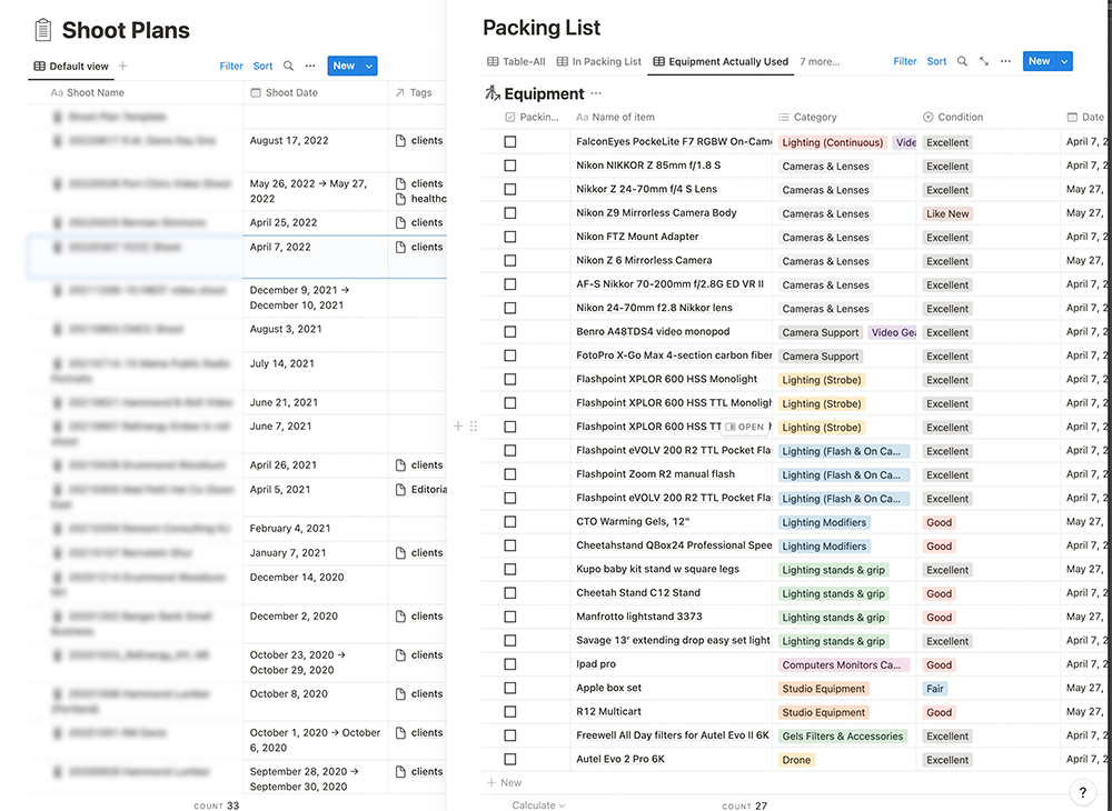
Photo Shoot Gear LIst
Gear Checklist © Brian Fitzgerald


With years of commercial and editorial photography under my belt, I’ve learned that the devil is truly in the details. Never mind the big stuff, like bustling locations or fickle weather. It’s the little things that make or break a shoot. Like the old proverb goes, “for want of a nail, the kingdom was lost”, small errors can lead to big problems.

Photographers and videographers juggle a lot. From equipment to location details, timing to names—keeping track of it all is a Herculean task. That’s why experienced pros systemize their workflows to preempt surprises and minimize errors.

My pre- and post-shoot rituals are a must. Sure, they’re mundane and time-consuming, but not skipping them is a lesson I’ve learned the hard way. I always kick-off each location shoot with a gear checklist. Once packed, I tick off each item once more lest I wind up forgetting a digital card or battery. Post-shoot, the list doubles up to check off used items and note gear needing servicing.

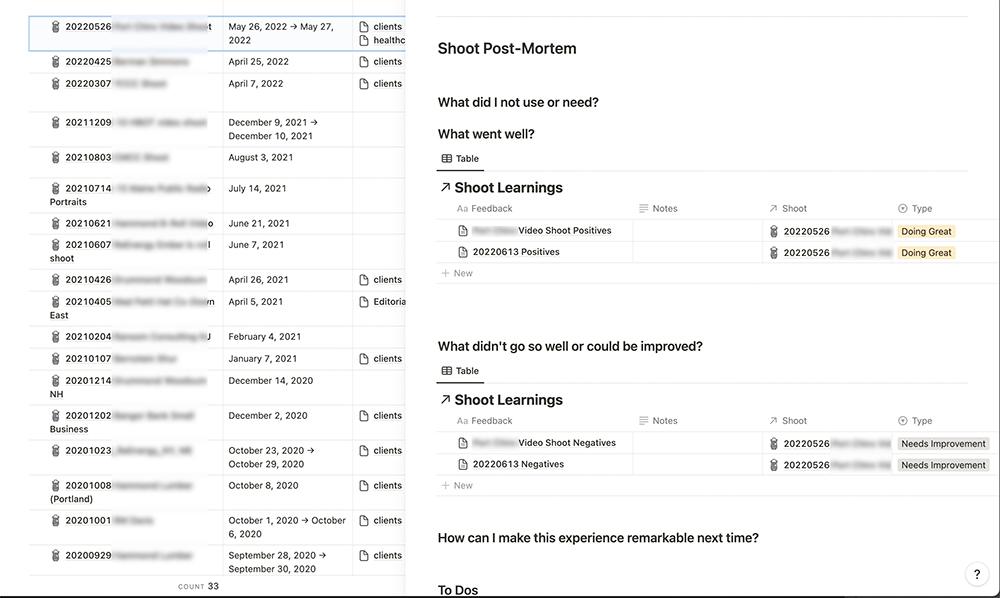
My other post-shoot ritual is a comprehensive review—think of a military-style After-Action Review. This step is vital to noting both wins and areas for improvement. Only then can I truly learn and progress. This entire process adds about an hour, but it’s saved me ample headaches and led to constant refinement of my processes.

Over the years, I’ve used everything from journals and paper checklists to Evernote templates and now, Notion. The tech isn’t important—consistency is.

Challenge yourself to identify places in your workflow where you can add checklists and simple procedures that will free you up to focus on your creative (and more valuable) work.


Shoot Post Mortem
Shoot Post-Mortem by Brian Fitzgerald


–30–

Visual trends of 2023: Reality and virtual reality

Linda Holtslander
©Brian Fitzgerald

It seems like 2023 has just started, and already visual arts world is evolving at a blistering pace. Whether through impactful imagery or storytelling video, content marketers have to work hard to stay ahead of the curve.

At a time of low institutional trust and with the rise of ai tools, authenticity is critical when it comes to visual content. According to a report from Adweek, audiences now crave genuine and relatable imagery that reflects real-life experiences rather than highly curated and polished content.  Photographer Annie Leibovitz famously said, “A thing that you see in my pictures is that I was not afraid to fall in love with these people.” This quote epitomizes the importance of capturing raw emotions and connections in today’s visual content.  

Another significant trend is the growing demand for immersive experiences. In a recent article from Forbes, virtual and augmented reality technologies are increasingly being used to create visually engaging content. Content marketers should focus on incorporating these cutting-edge technologies into their visual strategy to stay ahead of the curve and provide memorable and immersive experiences for their audiences.

Sustainability is also trending with the visual arts, with both photographers and videographers incorporating eco-friendly practices into their work. This trend reflects a growing global awareness of environmental issues and the desire to create visual content that respects the planet. Content marketers can leverage this trend by showcasing brands’ sustainable efforts through visually compelling narratives and engaging storytelling techniques.

Lastly, the trend of minimalism and simplicity, also referred to as ‘antibranding‘ is growing.   As consumers are bombarded with content daily, the power of striking, minimalistic visuals has become even more apparent. By focusing on clear, concise messaging with strong visuals, content marketers can make a lasting impression on their target audience.

Content marketers should keep a close eye on these visual trends of 2023 to ensure their photography and video content remains relevant and appealing. By embracing authenticity, leveraging immersive technologies, promoting sustainability, and capitalizing on minimalism, they will be better positioned to capture their audience’s attention and drive meaningful engagement.

–30–

Let your backgrounds tell the story

Portland, Maine Bartender
Andrew Volk, co-owner of Portland, Maine’s Hunt & Alpine Club © Brian Fitzgerald


When it comes to portraits: choosing the proper background environment is as important (and sometimes, more so) than the subject themselves.

Your backgrounds give clues, both subtle and overt, and add contextual information that gives portraits mood and depth. They help to tell a more complete story about your subject. In short, a well-executed background can do some heavy lifting when it comes to conveying information and emotion.

Think about your background environments as deeply as you do your primary subjects. Give that background your attention—with purposeful lighting, frame composition and styling—and let it do the hard work of storytelling for you.

Tips for great team portraits

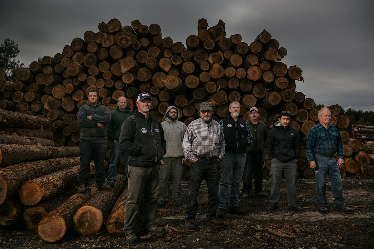
lumber mill
© Brian Fitzgerald

The dreaded group portrait. Just the prospect of wrangling potentially dozens of subjects strikes fear in the hearts of many a photographer and can result in images that recall an old-school wedding party photo.

Team portraits in particular are a challenge for companies whose amazing image is no sooner published than invariably one member decides to quit or retire. Such portraits may have a limited shelf life, then, but still can be a powerful way to convey a mood and feeling around the collective that makes your company successful.

Allowing enough time for the portrait is critical. Lighting—enough to make your team members look great and minimize any distracting details in the background—is a must. Careful posing of team members can make even large groups look manageable: I do this by arranging large groups into smaller clusters of people, typcially no larger than five, placed at varying distances from the lens to create centers of interest. Last, backgrounds are critically important to telling the story of your team and the group being photographed. Keep them simple, graphic and relevant.

You may not be able to control how long your employees will stay with the company, but with some planning you can turn your team portraits into something they’re proud to be a part of.

Want better portraits? Work on your backgrounds.

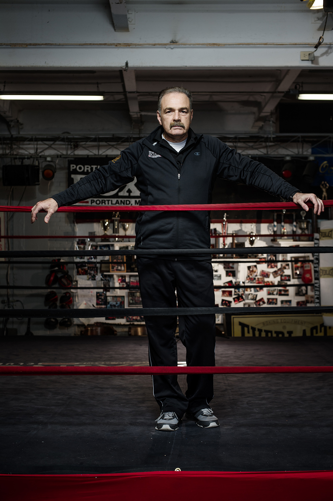
Boxing Coach
Portland Boxing Club owner and head coach Bob Russo.  © Brian Fitzgerald


To most photographers—those whose focus is on people and portraits, certainly, but also those who specialize in structures, food and products on location—the subject is the star of the show.  

Location-based photographers know that the unsung hero of any successful portrait is the environment behind and around the subjects.   Often, the environment offers clues and context that tells the story better than the subject themselves can.  

In short, your backgrounds matter more than just as a place to put behind your subject.  

Give thought to the environment around your subjects as deeply as you think about your subjects.  Make sure that anything that shows in the frame is there for a reason.  


Five photography tips for content marketers

Editor’s Note: The following is a reprint from a peice written for a Maine Public Relations Council (MPRC) newsletter. It’s practical tips, relevant for all content creators, whether photographers or marketers.


One of my favorite photography-related quotes is from National Geographic photographer Jim Richardson. “If you want to be a better photographer, stand in front of more interesting stuff.”

Richardson stood in front of plenty of interesting stuff during his long career.

With a decent digital camera (or an iPhone), standing shoulder to shoulder with Richardson—say, on one of his trips to Cuba, photographing a wedding—you and I both would come away with something we’d want to hang on our walls.

The problem is, most of the time, we’re not in Cuba. Instead, we’re working an awards ceremony in a dimly-lit ballroom. Rather than capturing a portrait of a campesino standing in a sugar cane field, we’re snagging a headshot of an unfortunate new hire in the spare conference room.

Your work may never end up on the pages of National Geographic. That doesn’t mean you can’t elevate your images to something you’re proud represents you and your brand. Here are a few tips that can help you improve your images, today, with the gear you already have.


Watch your backgrounds

Before clicking, do a visual check of your background. Is there a pole back there, looking like it’s growing out of your subject’s head? Analyze your backgrounds and then position yourself in order to clean them up.

Simple backgrounds keep the focus where it belongs: on your subject.


Lose the horizon

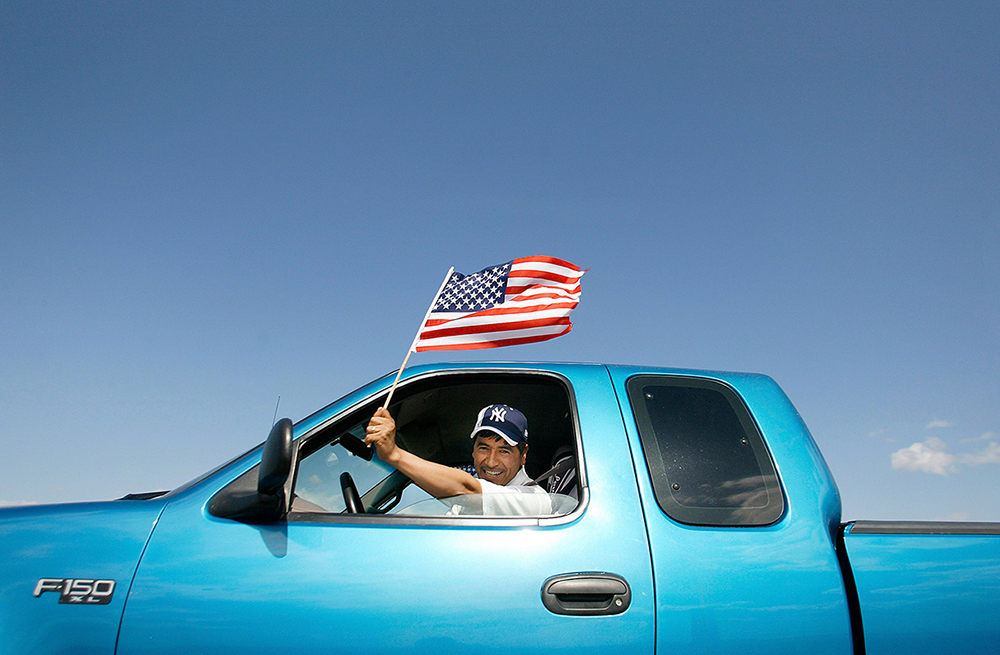
Examine your images. Does the horizon line —the line separating the ground from the sky—appear right across the middle of your frame? Get rid of it by squatting down low and photographing at an upward angle. Or, get up on a chair and angle the lens down, until only the floor fills your frame. This trick can make your background simpler and cleaner and result in more interesting images.

american Flag
Angling your camera up or down will result in a cleaner, more interesting composition.


Use the Rule of Thirds

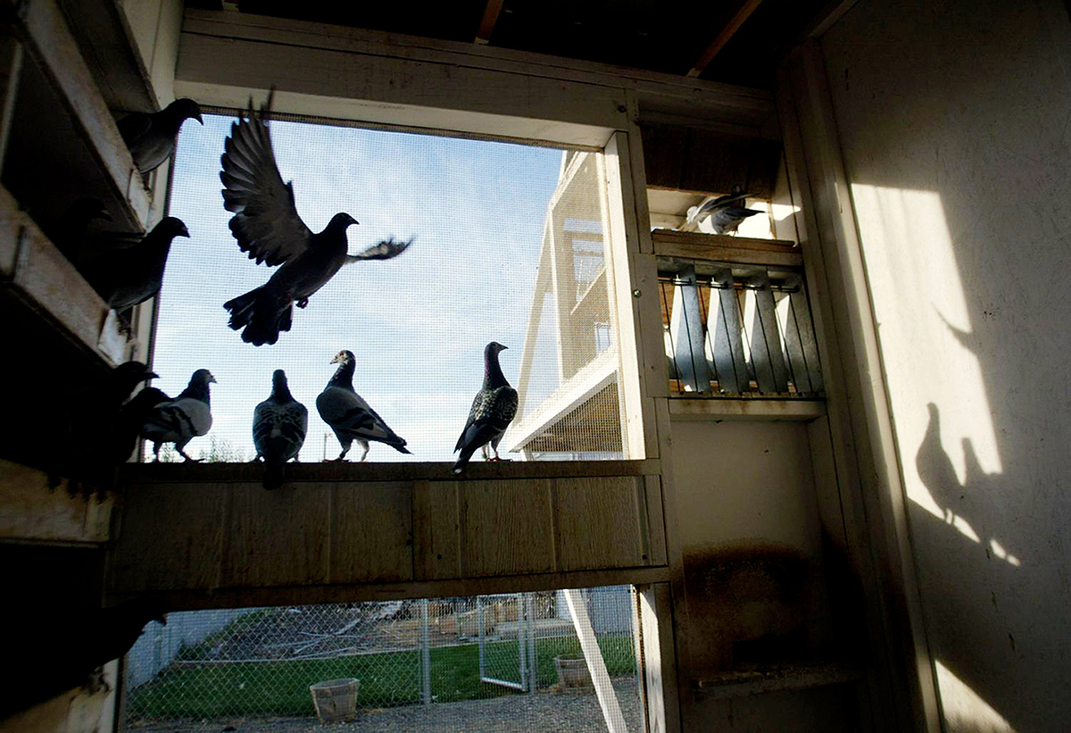
Divide your frame into a grid of nine squares. Place your dominant subject in one of the the top, bottom or sides squares, creating visual tension and interest.

Racing Pigeons
Utilize the Rule of Thirds by placing your primary subject into the left or right third of the frame.


Go Outside

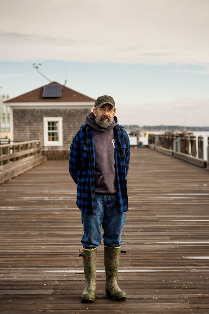
Make outdoor images during the “Golden Hour”—the magical time just after sunrise or before sunset—when the sun is low and the light horizontal. This warm-toned light will flatter any subject.

Maine Fisherman
The low angle of light early in the morning offers pleasing tones and angles.


Turn off your Flash

Turn off your built-in camera flash. Find a location with sufficient ambient light, and use that light instead. Even after color-correction, your portraits will immediately look a thousand times better, I promise.

Flash looks great when it is used to emulate or enhance available light.

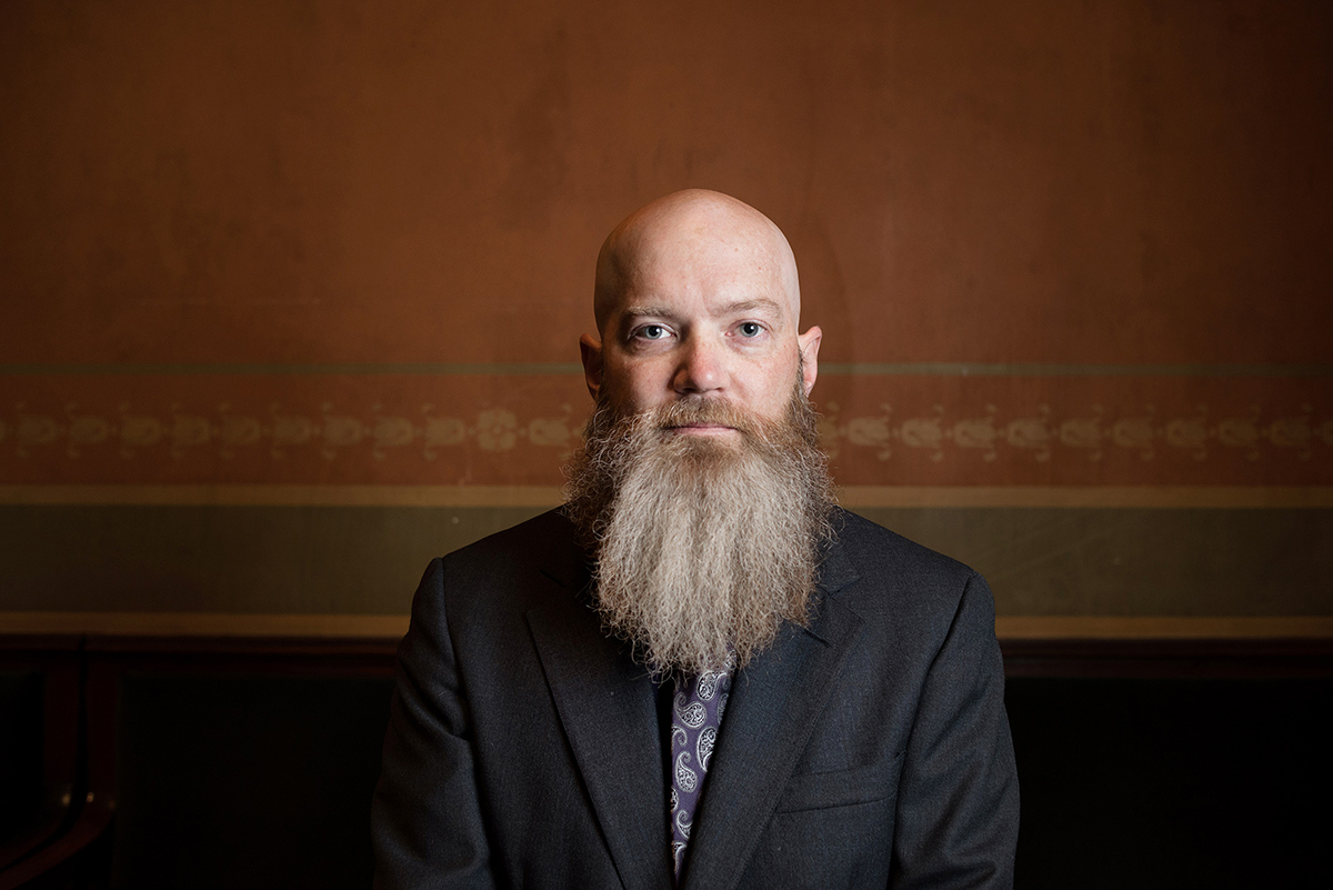
Headshot portraits with intent

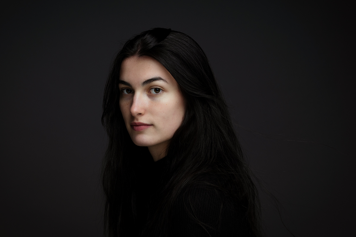
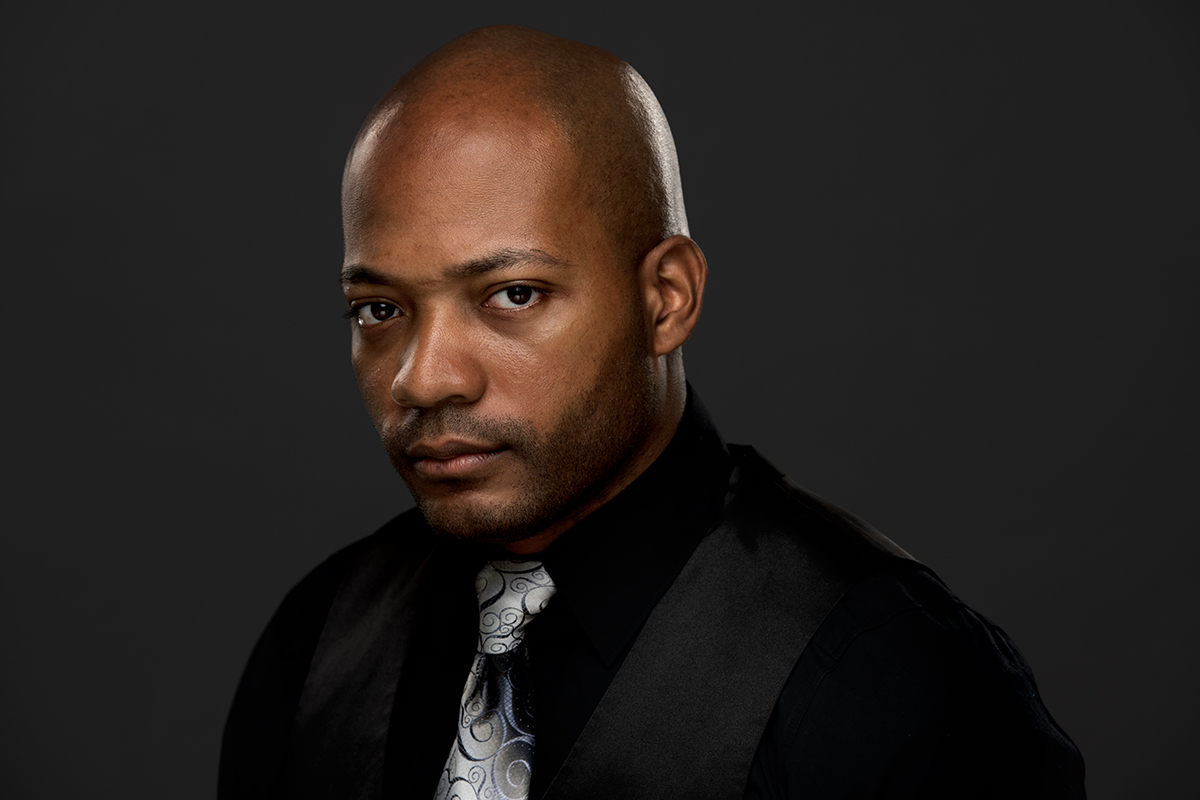
Headshot portraits are deceptively simple. A head-and-shoulder portrait done in a studio is a staple need for businesses small and large, for entrepreneurs, service professionals and actors, to name a few.

Lights, camera, background, subject.

Simple.

On the way to creating that perfect portrait—the one that represents your company, your brand or, simply, YOU—are intentional choices that ensure success, or failure.

Good is a given.

It’s not enough to have a great, high-quality headshot. Your portrait has to align with your goals, your industry and must take consideration of your client and audience expectations.

It’s about your face.

Specificaly, it’s about your mood, your energy and your vibe and how your eyes and face express that.

Great headshots convey a mood, a feeling, a sense of the person, in an instant. No distracting elements. This takes a proper mindset, some time, and a purposeful interaction with the camera as guided by a photographer.

That’s the hard, most critical part; but it’s not enough:

Background

Backgrounds should be simple as possible, so as to keep attention where it belongs: your face. Unlike an editorial or environmental portrait, the background doesn’t have to do any heavy lifting by providing contextual clues or storytelling elements. It just has to stay out of the way and allow you to be the star of the show.

Wardrobe

It’s not a clothing or product shoot, so keep your clothing simple and make sure it flatters your face instead of distracts from it. Simple lines, jewel tone colors. Stay away from patterns and trendy looks (unless, of course, that IS your brand). Keep it classic, keep it cool.

Lighting

Headshot lighting needs to be purposeful. Going for a commercial, fresh vibe? Perhaps something more dramatic? How about low-key and reflective? Lighting will get you there. Now, Lighting is a bit of a Diva and loves to call attention to itself with its flashy tricks.  Don’t let it take over the process; it’s a support player here.   Lighting is there to keep the focus on you, rather than on the super special cool lighting techniques. As with your backdround and wardrobe choices, lighitng must serve the story without becoming the story.

And the story, quite simply, is you.


Want Headshots and Portraits for your Brand? Consider This.

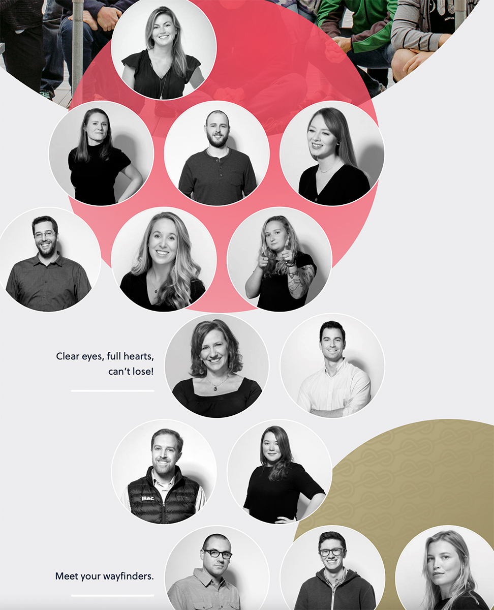
Headshot treatment for Ecommerce marketing agency iBec Creative: bringing personality to the standard head-and-shoulder portrait.


You’ve long suspected that your company’s staff portraits are in need of updating (Ted’s skinny tie has gone in and out of fashion since his portrait was taken. Twice).   Your biggest competitors on LinkedIn, have amazing portraits (is that a tiger in the backround?) and between the shame and the frustration, you’re determined to hire a photographer, now.

Hold on just a second.

If you’ve waited this long, it’s worth pausing a moment to reflect.  ‘Everyone else is doing it’ is not a good enough reason.  A well-done portrait is an investment in time and money. Chances are you’ll be using those portraits for years (or until Ted’s tie goes in and out of style one more time).  So it’s worth considering what your goals are.

When to get new headshots

The single most important question to ask when contemplating a new headshot project is, simply, ‘are my current portraits working for me?’ Your brand portraits aren’t just a nice-to-have. As a business tool you should expect them to do some heavy lifting representing your brand to potential clients, around the clock.  Your portrait, in effect, should work harder than you do.   If your existing portraits are obviously outdated, are wildly inconsistent, or just have a style that doesn’t fit your brand (cool ‘tech’ style portraits wouldn’t inspire confidence if used for the staff of a venerable investment bank, but they may be a good fit for an online banking startup that offers services exclusively through mobile apps) then your portraits are actually working against you.

Branding Portraits

What makes a ‘good’ headshot

Your company portraits must be consistent in style and professionally executed in terms of lighting, of course. They also need to be purposefully thought out so that they reflect your industry and your brand in particular.

A professional photographer can help come up with appropriate and creative looks for your brand.

It’s true, a great portrait can help your brand communicate the message you want to your audience.  But poorly-done and poorly-conceived portraits will absolutely hurt your brand.

What makes your headshots successful

Beyond hiring a professional photographer you ‘click’ with and who understands your brand,   you need to have buy-in within your company.   Everyone needs to be on board.  Don’t attempt a headshot redo unless you can count on everyone to participate.  Give yourself adequate time to do the portraits right—a two-minute assembly line approach will result in headshots, but they won’t be anything special.  Set the tone that these portraits are a critically important component of your company’s image that you are invested in doing right.  For many employees, having their portraits taken is a challenging or even downright scary proposition. Communicating why youre have them done, and giving them plenty of time to prepare, tells them that you care about their experience and want the best results.

Formal headshot vs. Environmental portraits

Formal headshots—i.e., a more typical head-and-shoulders portrait with a backdrop—is a traditional approach that still has its place.  They are especially useful on platforms like LinkedIn, where seeing the person’s face (and not getting distracted by a background) can make them stand out.

Environmental portraits are those that are typically done in a way as to show elements of an office or other location in the background as a way of conveying contextual information or a certain mood. They may appear more visually interesting and can look less ‘formal’ and thus more approachable than a more formal headshot portrait.

Your photographer should work with you to suggest the best approach for your brand. Sometimes my clients will opt for both, so they have options that may work best for different uses.

In the end, portraits are a necessary part of doing business in an internet-connected world. Approach them as an opportunity to extend your brand and send a consistent message, and you’ll find the investment is a solid one.


What’s Your Image Worth?

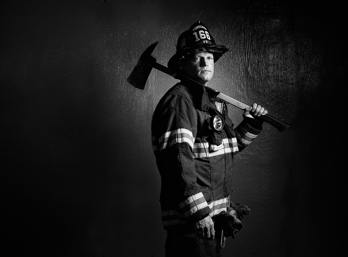
Portland Firefighter
Firefighter Chris Tillotson, @Brian Fitzgerald


As a professional commercial photographer, my job is to protect my client’s images as well as their image. This entails safely archiving their digital files so they can found months or years after a shoot, but it also means that I safeguard how those images are used and who gains access to my clients’ images in the future.

Depending on my specific contracts and releases,  I often have the legal right to reuse images for multiple purposes after they are first used. Aside from incorporating some of the images into my blog and portfolio, I almost never do so, especially if the images were taken on assignment for a client (rather than taken as part of a self-assigned project). Why? Because once I photograph someone, I take on the responsibility—sometimes legally, always ethically—to safeguard their images so they aren’t used in ways my clients wouldn’t be comfortable with.

The most obvious example might involving selling images I’d taken for a corporate client as ‘stock’ images through a stock agency like Getty. Imagine my client’s surprise when they see a billboard advertising a competitor across town using an image of their staff or clients that they paid me to take a year before. In very short order, I’d be looking for another line of work.

The number one job of a professional photographer is to serve our clients and their interests first, not our own. In effect, we’re a member of their team and need to be careful to make sure their images are not used in off-brand or unapproved ways.

A less obvious example occurred this past April.  It appeared in the form of an email sent by a photographer agency to its member photographers including me, requesting we submit gritty portraits of workers on the front lines of the pandemic: rescue personnel, healthcare providers, delivery drivers and others. A national (and unnamed) insurance agency wanted to use these images in a 6 month national ad campaign. They’d pay $3000 per image used, split evenly between photographer and the agency.

I considered the request. I have a large library of images of front line workers, mostly created not for clients but as part of personal editorial projects. Technically, I have the copyright and releases allowing me to reuse and resell these images. Back in April, with the pandemic shut-downs in full swing and uncertainty about future income, it was a tempting offer.

I could imagine the result of the campaign—a video depicting grave-faced police officers, firemen and nurses with a dramatic voiceover and swelling background music. At the end, the logo of some national insurance company would appear, and the unwritten message would be: we want to associate our brand with these popular heroes so you’ll think we’re special too.

Then I imagined the surprise of my portrait subjects in seeing their image being used to shill for a company that they’ve never heard of for a service they’ve never received. I thought of them, essentially being used to confer their heroic status to a large insurance company that doesn’t care about them personally but just want them for the uniforms they wear and the trust they confer.

I declined to participate.  Just because I can legally do something doesn’t mean that I should.   Whether a paying client or not, anyone who ends up in front of my camera are relying on me to protect their single most valuable asset—their image—and make good choices on their behalf.

I can’t judge photographers who chose to participate, either because of their financial situation or due to agreements negotiated between them and their subjects beforehand.

This anecdote highlight the importance of having discussions about future image use between photographers and their clients and subjects, with clear expectations written into a contract. In absence of such an explicit agreement, photographers should always remember that image, and reputation, is worth more than a quick hit of cash. Protect your brand and your images and make sure your photographer does, too.

–30–