Posts tagged Portraits

Client Work: Pine Tree Legal Assistance

It’s easy to get lost in the technical aspects of photography—the correct exposure, the right light modifier for the exact situation—and produce a technically perfect image that lacks heart. 

That’s why I enjoy working with clients like the Pine Tree Legal Association.  They are a statewide non-profit providing legal services to Mainers with  need but no ability to pay.   It’s a wonderful mission and they do great, important work.  

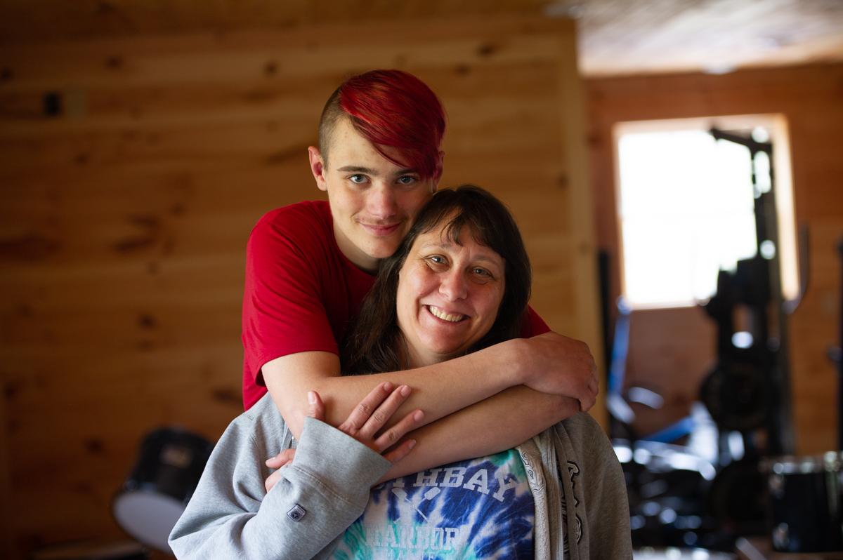
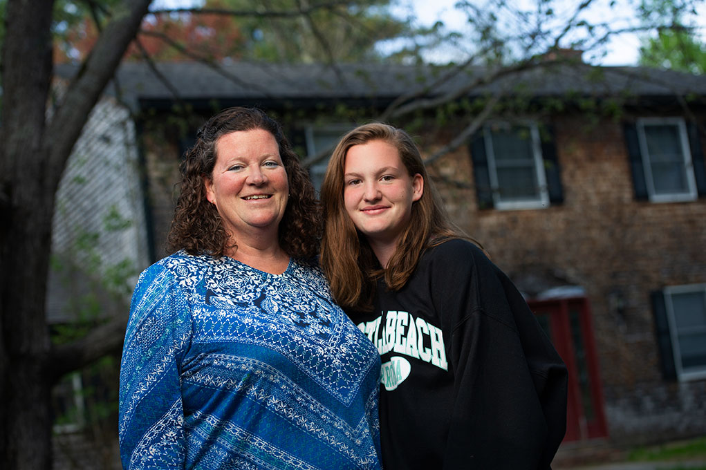
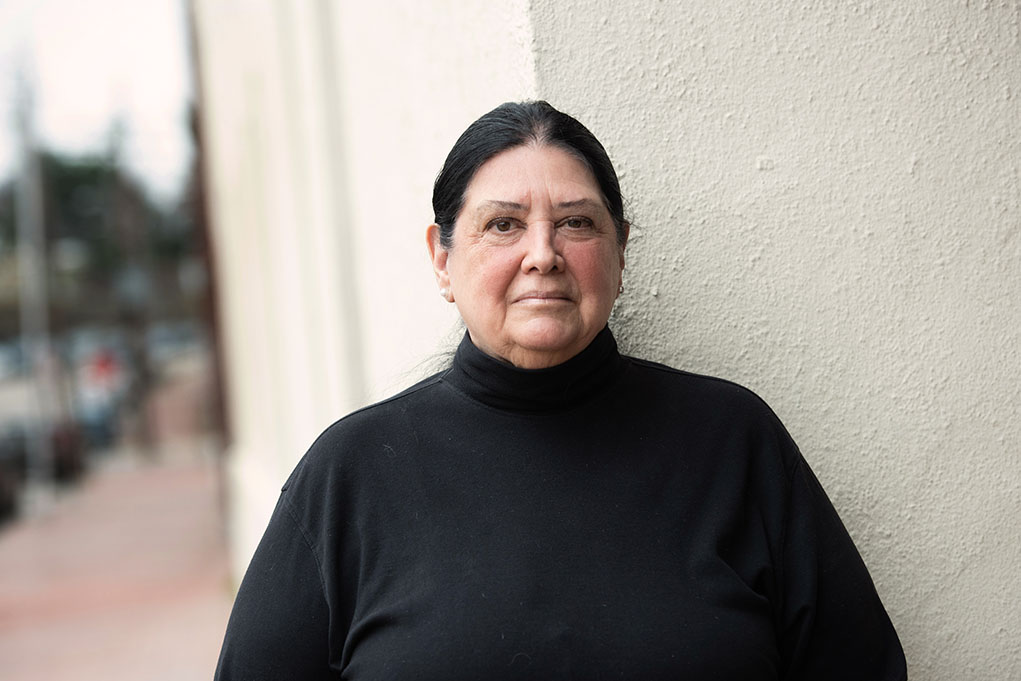
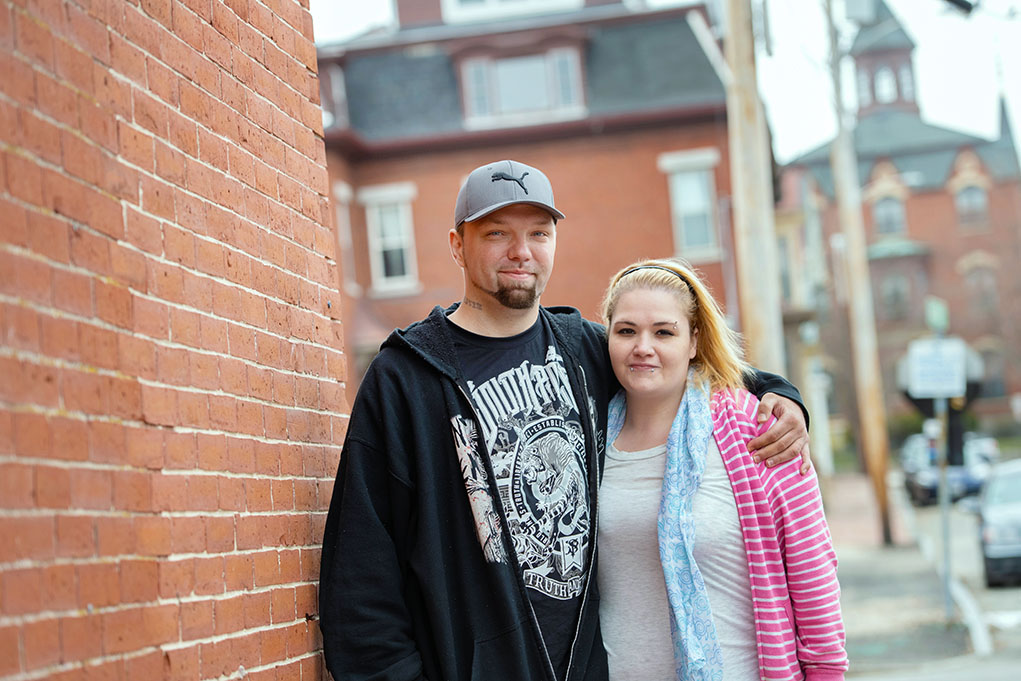
Recently, PTLA asked me to take portraits of their clients both at their Portland office and at various other locations of significance to the clients or their legal cases.  

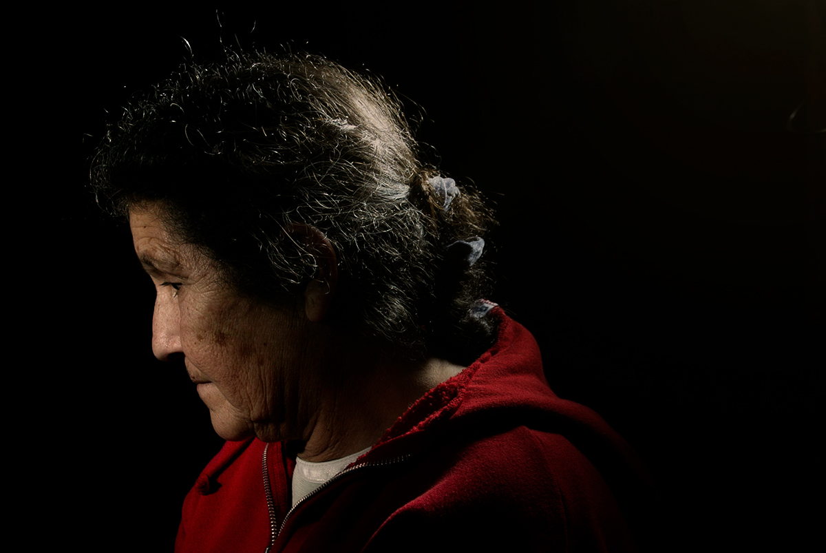
Selfishly, I love the opportunity to photograph PTLA’s clients—many of them families, all of whom have stories to tell—in a candid, simple, editorial way.   Here, the moment is the most important thing, as is revealing the stories written on the faces of their clients.   

Pine Tree Legal Association

Cinematic, environmental portraits

I love creating environmental portraits.  That’s good, because I make an awful lot of these as a commercial photographer.

One challenge when doing such location portraits is that the benefit—the environment, which can offer very cool, very visually striking contextual cues—can also be a severe liability.  Imagine showing up to a shoot to find you are limited to shooting portraits inside a tiny conference room with orange walls, or in the middle of summer using an interior of a steel shipping container (both are recent examples).

So what do you do when the environment detracts from,  instead of adds to, your portraits?

I opt to shoot portraits with very shallow depth of field, in order to throw my distracting backgrounds out of focus.  Then I carefully add in lights to create depth and color as needed. Given the time of day or the situation, this may require using ND (neutral density) filters or high-speed sync to achieve this look, but it’s worth the extra effort.

The results are tack-sharp portraits that pop from the soft background, minimizing the things I don’t want while giving a sort of cinematic feel that I love.


Turbo-charge your marketing, one mug shot at a time

mug shot

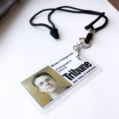
“Make sure you get the mug shot,” I heard my photo editor say as I carefully packed my camera bag, preparing for my first official assignment as an intern with the (now much-diminished)  East Valley Tribune in Mesa, AZ. I was a student at nearby Arizona State University, where I was also photo editor of the student-run State Press.

I’d heard the term ‘mug’ before–it was how we referred to the 6 x 9 pica-sized tightly-cropped headshots often run in newspapers and commonly associated with the mug shots of suspects taken and distributed by law enforcement.

There was nothing glamorous, sexy or artistic about them. They were straight-forward and not what I had in my mind as I contemplated all of the possibilities of the now-forgotten assignment I was about to shoot.

But Paul, my photo editor, knew better. A cool, wide-angle portrait that showed a person tiny in the frame, looking off-camera in an angsty way, surrounded by the light and shadows of the environment might play well across three or four columns as a lead image on a page. But if that story jumped to a new page, as it often did, or if we later decided to run additional follow up stories on the same subject, that cool artistic image would be much less valuable. More useful in those instances was a standard, straight-on headshot portrait, or mug shot. I quickly learned that if I took those headshots along with the artistic pretty portraits, I could guarantee a happy photo editor and happy page designers too. Fail to do it, and I found that as the intern I was the one sent back to shoot a 10-second mug shot of a subject because other photographers (or I) had failed to do so the first time around.


mug shot


Of the many lessons I learned as a photo intern, this was one I never forgot. It made me think about the practical uses of images, rather than just the artistic merits. Both are important considerations. It also taught me that people have a fundamental desire to see and connect with other people, and that having a mug or a headshot in a story made people much more likely to read it, connect with it and understand it.

That was true then, and it continues to be true in the world of Linkedin, Facebook and online media channels. Rather than a two-second mugshot, I create headshot portraits that take quite a bit more time and care. These headshots are unsung heros that are both simple and indispensible for many professionals. They are the yeoman workers who do the heavy lifting when it comes to a personal or corporate brand. When done well, they promote and propel a brand, build trust and connection, all without shouting, ‘look at me’.

mug shot

I used to say that a good headshot can’t help you, but a bad one can sure hurt you. In this visual, social media world, when I see a professional profile with a missing or obviously amateur portrait, my mind wonders: is it because you aren’t professional, are anti-social or simply because you can’t be bothered? None are an appealing scenario.

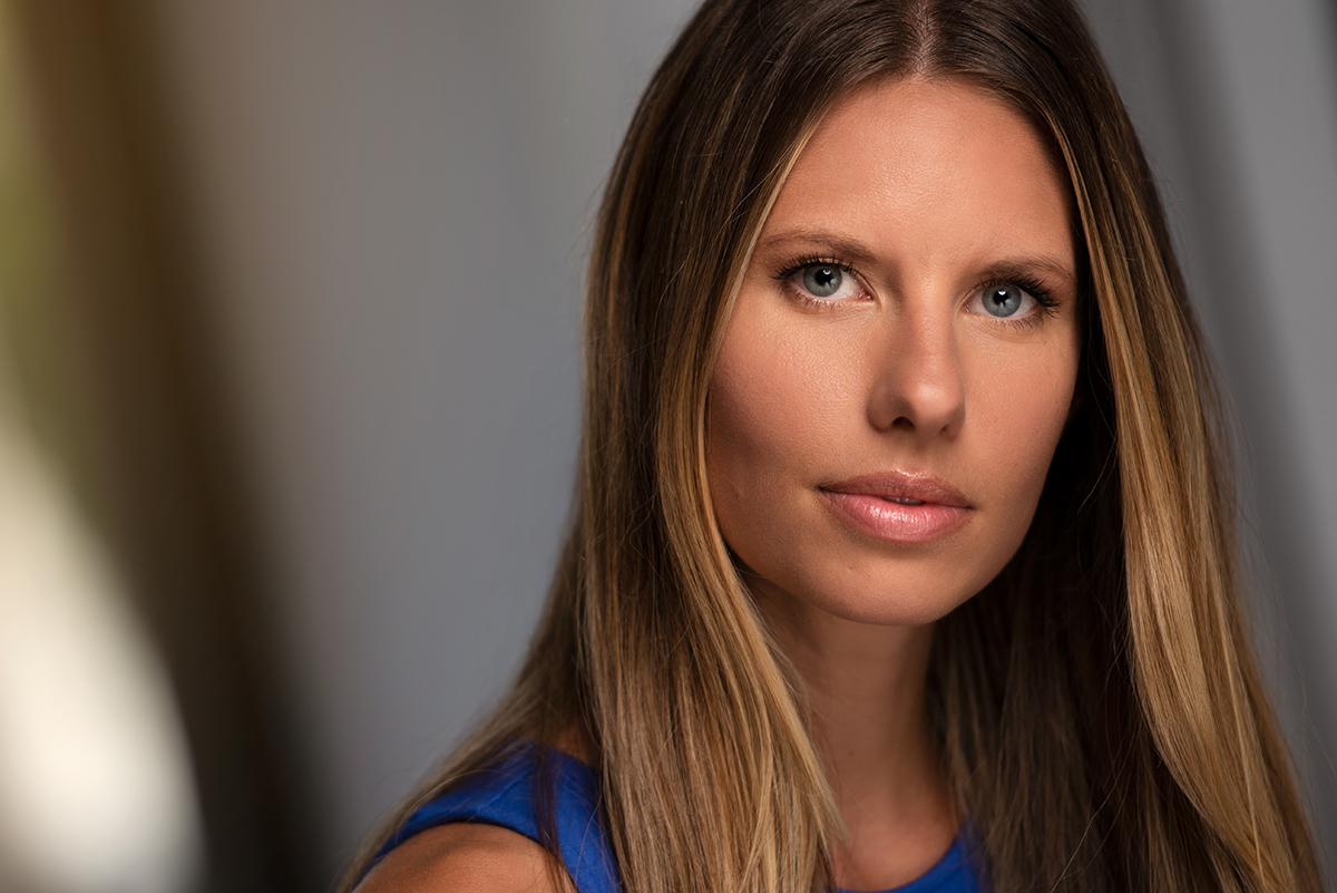
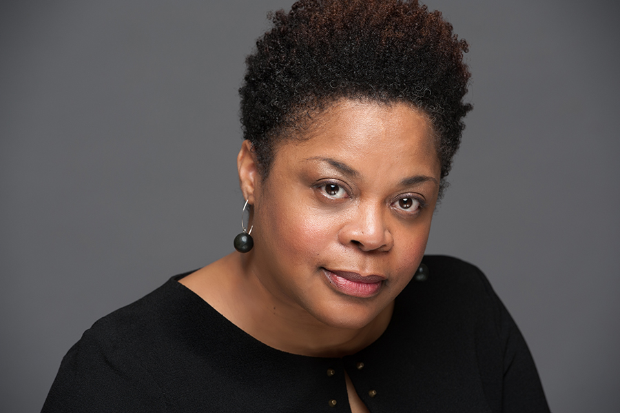
A good headshot is a long way from the ‘mugs’ we used at the newspaper. They are portraits, created with purpose, intent and function in mind. They convey real information and some intangible emotion as well. In short, they leave a few things unsaid so that the viewer can form their own opinion. They are straight-forward, and they communicate, clearly. Instead of being used in a purely utilitarian way, they must shine in their own right. No longer mugs, but finely-crafted portraits.


mug shot


I have a sister site called Maine Headshot, dedicated solely to these kinds of portraits, mostly taken in-studio. My tagline is, “Portraits that Work”, because a good headshot should do just that–work for a brand 24/7, 365.


Creative Portraits for iBec Creative

Creative Portraits


When your client is a marketing agency, things tend to get interesting.   I’ve had the fortune to work with a bunch of great creative types at agencies small and large, and I find that collaborating with a talented team of creatives leads to great results.

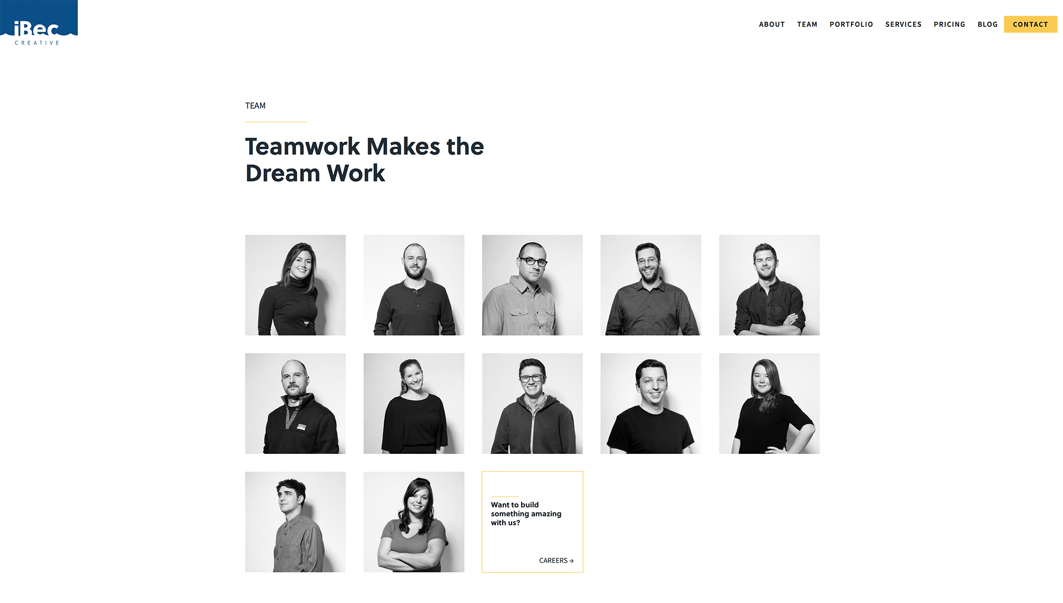
iBec Creative is a Portland-based web design and development agency that I’ve worked with several times over the years on various client projects—always a fun experience. Recently they hired me to produce creative portraits of their own team for use on their newly-redesigned website.

It’s one thing for a creative agency to choose you to photograph for their clients, and another when being hired to photograph the agency itself. Given the many talented photographers iBec has worked with, I was honored to be asked to help.

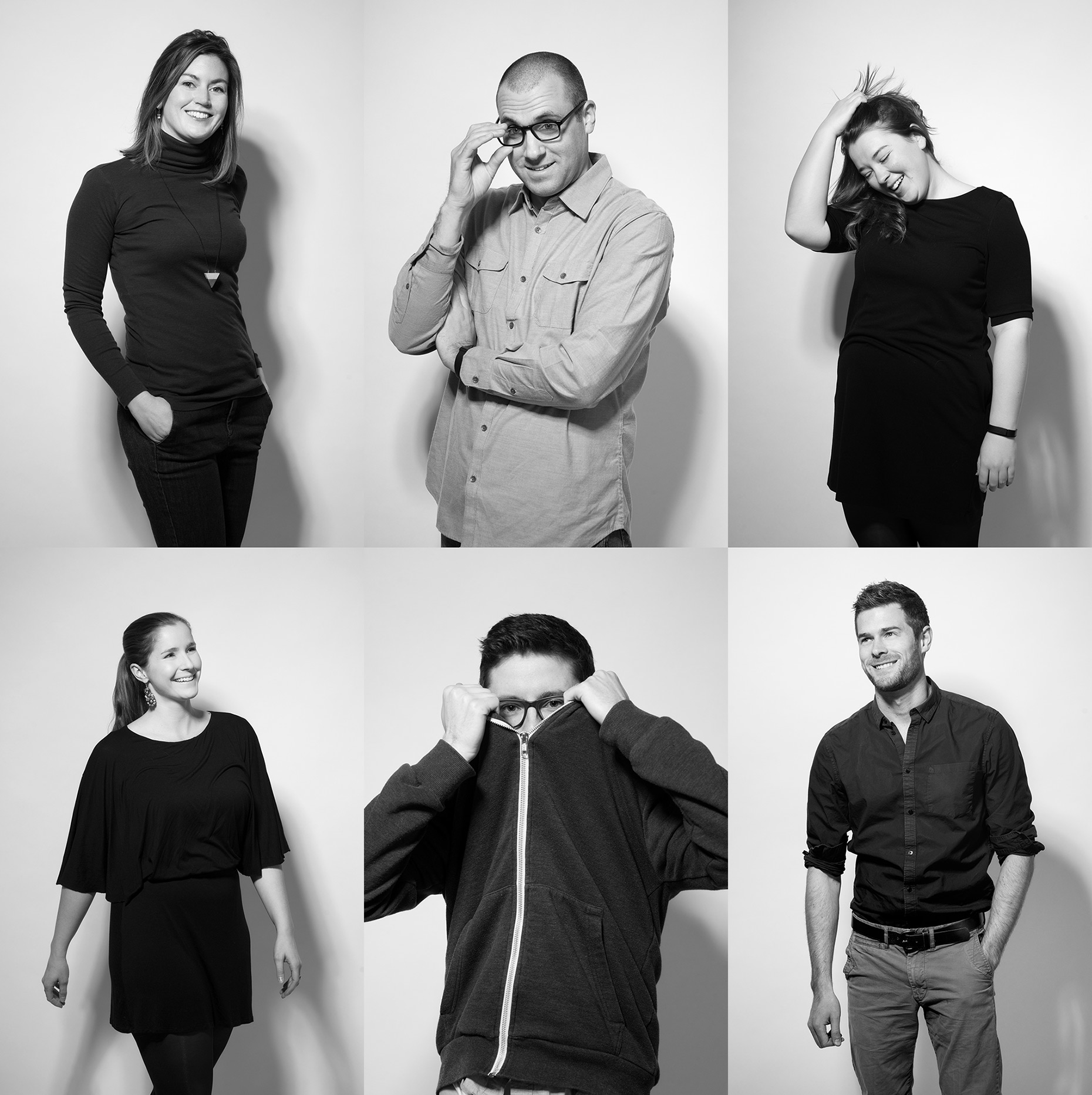
iBec already knew the look they wanted: contemporary, fun and with a fashion sensibility.  They opted to be photographed on white seamless in the studio.  The lighting was simple, but purposeful: dramatic and directional, casting shadows on the background. Basically, it was like photographing a fashion shoot, but with less fans, stylists and featuring coders and programmers instead of models.

The idea was to photograph real moments, rather than static, overly-posed formal shots. The team did great (even those who probably don’t love having their photos taken). I love the variety of shots we got, and like the way iBec used them on their site: a black and white grid, overlaid with patterns that reference the areas each member specializes in, from web design and development to application prototyping to digital marketing.  The team page reflects the cool people and personalities that make iBec tick.  See more of the images, below.


Creative Portraits


To see more of my work, including many more creative portraits–please click here to visit my portfolio site, Fitzgerald Photo.  Thank you!

Showcase: Baker, Newman & Noyes

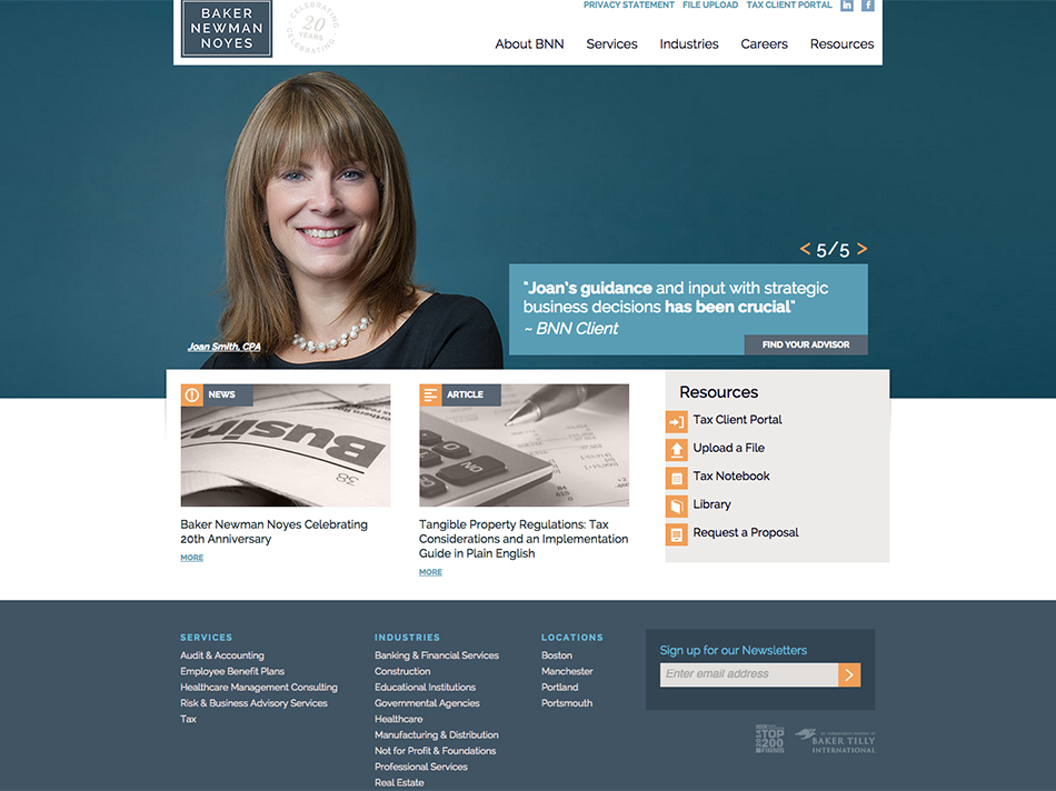
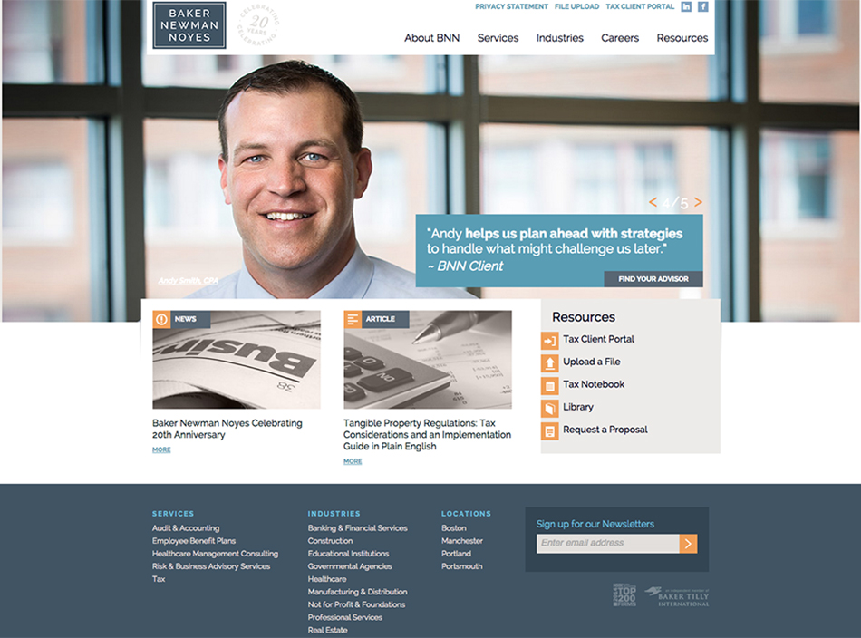
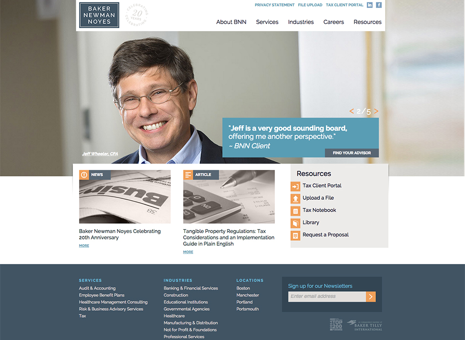
I’ve worked with the fine folks at BNN, a full-service accounting firm based in Portland, ME, for a few years now.  In honor of their 20th anniversary, they just relaunched their refreshed website look this week with a new logo and a few of the environmental portraits we’ve done featuring their principals within their beautiful downtown Portland office space.    They wanted to emphasize the personal, human component of their services, and I think the new web design and images work well to do that.


BNN_1_by_Brian_Fitzgerald

BNN_2_by_Brian_Fitzgerald

BNN_3_by_Brian_Fitzgerald

Happy Halloween from the worker bees

No one can deny that we have a fun bunch here at the Fitzgerald studios.   Since Halloween is Sunday, we decided to make Friday a dress-up day.  There’s Lady Gaga (AKA Ayla Kelley), Lucille Ball (Stepheney Collins) and drones no. 5,568 and 17,321 (we’re worker bees…it’s definitely appropriate).   So, enjoy the slideshow…and happy holidays, everyone!

[photoshelter-gallery g_id=’G0000XoQevkhjBXE’ g_name=’Halloween-2010′ f_show_caption=’t’ f_show_slidenum=’t’ img_title=’casc’ pho_credit=’iptc’ f_link=’t’ f_send_to_friend_btn=’t’ f_fullscreen=’t’ f_topbar=’t’ f_bbar=’t’ f_htmllinks=’t’ f_mtrx=’t’ fsvis=’f’ width=’560′ height=’500′ bgcolor=’#AAAAAA’ crop=’f’ twoup=’t’ trans=’xfade’ tbs=’5000′ bgtrans=’f’ linkdest=’c’ f_constrain=’f’ f_bbarbig=” f_enable_embed_btn=’f’ f_show_watermark=’f’ f_smooth=’f’ f_ap=’f’ f_up=’f’ target=’_self’ wmds=’llQ6QNgpeC.p1Ucz7U.Z9sNmliu3owDNs7Rroktg48NZO.O6MQpsrxBU9JXInuJQEstogw–‘ ]

Reach for branding success

“Branding” is one of those words that seem to be applied to everything, and with good reason. Every bit of text, every graphic, every image that conveys both positive and negative information about your company or your person is affecting your ‘brand’.

Are you still using that two-year-old portrait to represent you or your business? Worse, are you a brand fanatic when it comes to your website and printed materials but have a Facebook page featuring you holding a beer at last July’s block party?

Now more than ever, brands need to be professional and consistently applied. You need to look your best wherever on the Internet that Google directs your potential clients–and competitors.

Any business or individual wanting to have an immediate, positive impact to their branding should analyze their brand’s visual footprint around the internet and then devise a plan to prop up the places where their brand might show some wear. This process can be as simple as getting an updated portrait or other images that gets systematically applied.

Several of our clients update their portraits up to six times a year, keeping things fresh, professional and always new.  While that may not be your cup of tea,  revisiting your visuals annually or every other year is a good idea.

What a candidate can teach us about brand

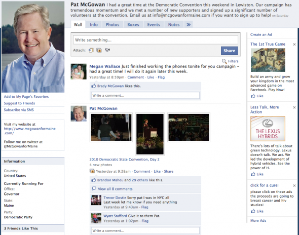
Everyone who relies on Facebook and other social media sites to market their brand and news needs to keep things fresh. That’s why I enjoy working with the McGowan for Maine campaign. I did some work with them in December and got some portraits of an active-looking Pat McGowan at his Hallowell home. Back then, the entire campaign could fit around his kitchen table. Things have changed, and he’s worked hard to get to the point he is at now. Trouble is, a portrait showing a foot of snow doesn’t fly when the thermometer is knocking on 90 degrees. So, we got a whole new round of portraits and other images for the campaign that’ll work well for them for a long time to come. It’s been great working with McGowan…but how does he get the energy?

Pat McGowan of McGowan for Maine

The campaign starts here…

December is supposed to be a slow month, but for me it turned out to be the busiest month of the year. Since much of that turned out to be business-related, that’s not such a bad thing. Of course, there were a couple of hitches thrown in….more on my saga to find a new vehicle to replace my dead 4Runner later…but it’s been a great end to a pretty amazing year in our new studio.
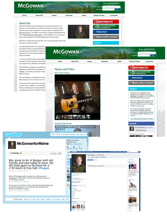
One of the coolest things I’ve been doing has been my involvement with the McGowan for Maine campaign. Pat McGowan announced his candidacy for governor earlier this week. He also launched his new website, designed by my friend and talented web designer Kevin Brooks, and staged the Social Media equivalent of the Blitz (what the blog Maine Politics called, “McGowapalooza”) with the launch of Twitter, YouTube, Flickr and Facebook Pages dedicated to his run.
These days, you have to have a consistent look and feel across not only your website and printed materials, but also on social media platforms. This obviously extends to your image, which is where I come in. I was called in to help with Pat’s photos by campaign manager Brandon Maheu. We tossed around a lot of ideas, and timing was a factor–so we decided was that we’d try for a variety of environmental portraits shot in and around his home. To me this was the best choice–it allowed Pat to be comfortable, on his home turf, which translated into a more relaxed, natural and genuine set of images. I think Pat nailed it. Good luck this year!