Posts tagged tutorial

I have my digital files…now what?

[photoshelter-img width=’500′ height=’352′ i_id=’I0000w85MS3SOAJM’ buy=’0′]


I get the feeling my corporate and entrepreneur clients are thinking this when I’ve delivered a job to them.

My deliverables may include DVDs of high-resolution images, a “READ ME” file explaining color space, file format, etc, and pdf contact sheets.  Beyond that, I often post images in a protected gallery on Photoshelter, my online image library.  Each file I deliver is typically a high-resolution, 300 dpi color file, saved either as .jpg (compressed) or a .tif (uncompressed).  Think of it as a master file.  From this high-quality original file, clients can output the image in a variety of ways for specific uses including:

  • Newsprint:   Most newspapers have a line screen of 100 lpi (lines per inch) or less.   Double this number to get the necessary resolution, or dpi (dots per inch).   In addition, newspapers are printed on an offset press that uses four colors, so ideally you’d convert your file’s color space from RGB to CYMK.  Reds, blues and other colors can dramatically be altered during this conversion process, which may require additional imaging work to recover the brilliance and colors of the original image.  Lastly, because newsprint absorbs ink, photos destined for a newspaper require quite a bit of sharpening (much more than a print on photo paper) in order to look clear, sharp and bright in your average newspaper.    Most newspapers will accept any kind of high-resolution digital file, and then do all of this work for you.  If you want to make sure it’s correct, we can do it as well.
  • Photo Prints:  Most pro labs require resolutions of 240-300 dpi, so your image will automatically work great for that.   To really make it pop, it’s good to do a little bit of sharpening to your image.  It’s also useful to soft-proof the image on a color-calibrated monitor–ideally after embedding the correct .icc color profile built for the specific printer you’re using.  These are available often from the printer themselves, or you can download them here:  Dry Creek Photo.
  • Web:  Since the web is viewed on machines and screens of all types, it’s not impossible to make your image look great on every one of them.   Make sure you have a fighting chance by converting your file to the sRGB color space, or otherwise it may look too yellow or magenta on PC screens.
  • Black and White:  If your image needs to be turned black and white, you could just do an automatic grayscale conversion in Photoshop or even in free editors like iPhoto and Picasa.   It’ll work, but it’s not optimum.   My preferred way is a multi-step process that preserves detail in shadow areas and gives a much richer tone to the finished black and white image.
  • Upsampling:  If you need to make a print that is physically larger than the size of the digital image, you have a few choices.  You can resize the image to the larger size, but if it’s more than 10% larger than the original you’ll get pixelation and softness.   Again, I use special software to upsample the images to larger sizes in a way that preserves the image’s integrity as much as possible.  Keep in mind that when you size a photo up, you’re asking the software to add more pixels.  These have to come from somewhere, so basically the software takes a look at the color of the existing pixels and makes an educated guess about what color pixels to add to generate the larger-size photo.   Depending on the sophistication of the software, this can be done well or very badly.

It can be daunting when you aren’t sure exactly how to use the image files in an optimum way for each specific application, be it web, newsprint, photo print or other.   Knowing how you’ll use your images, and communicating that to your designer, photographer or programmer , is key to your success.   As part of my service, I’m happy to help my clients optimize their images for use in magazines or the web.

 

Don’t like that skin color? Replace it.

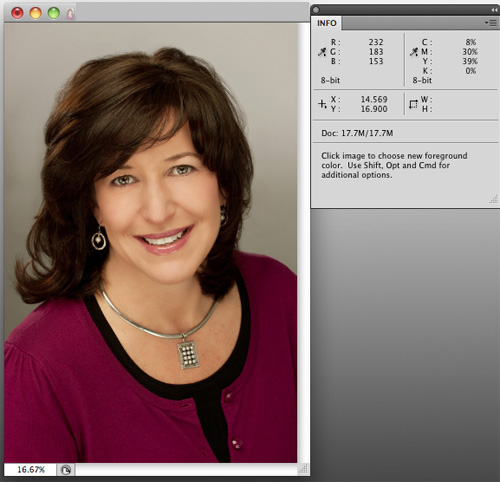
Image showing high yellow values

Proper skin tone is a must for any professional portrait.   Sometimes, especially when shooting in natural-light conditions, a warmer or cooler color of skin is desired.   When in studio or daylight conditions, however, skin tone and color is critical for making sure faces look natural and healthy.

You can’t just judge the tones of a photo by visually assessing it on a computer monitor, unless you have a recently calibrated screen.  Everyone sees color differently.   Instead, it’s best to use objective numbers.   Select the eyedropper tool in Photoshop and hover over the skin areas in your image to see the C,M,Y,K values. You must have the “Info” window open to do so.  The Info palette is a densitometer that measures the amount of cyan, magenta, yellow and black present in your image.  These are the colors that make up the four-color printing process.   Even though your images most likely are being rendered in an RGB space and may never need to be converted to CMYK, we use the CMYK values in the densitometer to measure whether our skin tone is where it needs to be.

Primarily, we’re concerned with relative values, not absolute values.  For example, For Caucasian skin, you’d likely see the numeric values for M (Magenta) in the 30-50 range.   It really doesn’t matter where it is; what’s important is this value relative to the Y (Yellow) number.   For white, Caucasian skin the Y value should always be about 3-5 points above the M value.   K?  That’s black, by the way–and it should read quite low, in the single digits, or zero.  The C, or Cyan, value, should be roughly a third of the value of the M or Y numbers.   So for our current example, a C value of 8-15 would be dead-on.    Without going into specific sets of numbers for all the various kinds of skin, the darker the skin, the higher the Cyan value should be relative to the M and Y values.

By the way, this whole number scheme doesn’t really work if the skin you’re working with has been lit by any extreme light–you know, the gorgeous, golden glow of a sunset or the cool glow of a neon sign.  You have extreme light, you want to preserve that.   You don’t want ‘natural’.

So, once you’ve determined that you DO want natural skin tone and you’ve identified the problem–that guy’s skin looks really pink and you’ve confirmed values of, say, Y=35 and M=75–then how do you fix it?

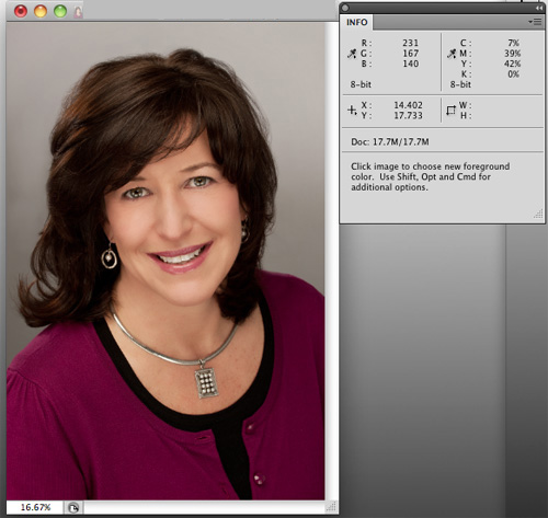
There are a lot of great ways to do so in Photoshop, and what works for one picture won’t always work for another.  That said, my go-to first tool is always “Replace Color” (Edit–>Adjustments–>Replace Color).  To use it, simply click on a lit, shadowless area of skin and select the degree of latitude (called ‘fuzziness’) you want your selection to cover.  A high degree of fuzziness will select more areas of the image that match the tone of the skin area you clicked on.   Once that’s done, move the sliders to adjust the Hue, Saturation and Lightness.  It doesn’t take much.    In the example below, I moved the Hue slider to -3, the Saturation slider to -5 and the Lightness to +1.   I’ve rarely had to go above 10 on the Hue slider, which is my primary adjustment slider.

That’s really it–just move the eyedropper icon over the skin again to read the new values and, if they look good, go with it.  Again, it may be difficult but you should trust the numbers way, way before you trust your eyes.   A properly adjusted image will reproduce on any calibrated printer even if it doesn’t look great on your uncalibrated screen.

So pay attention to your skin values, and try out Replace Color.   Doesn’t your skin deserve it?

Image adjusted using Replace Color, showing corrected relative values

Shop Talk: Think in layers

Add Adjustment Layers to the long stack of reasons why Adobe Photoshop is my go-to image editing software.   Most photographers are used to the idea of adjusting their images using tools like Curves, Levels and Brightness/Contrast.  You can directly adjust your images in a variety of ways using these tools.

Next time, use the Adjustment Layer versions of these tools (Layers–>Adjustment Layers).   In doing so, you apply these imaging changes not directly onto the surface of the base image, but on a layer sitting atop that base (or, background layer).  This provides protection to the original image, since you’re not altering the image itself.

The best part is that you can build layer on top of layer as you fine-tune your image.  When it’s all done and looks like you want it, you can then flatten it into one file and save that file.   One hint:  it’s a good idea to save a version of both your layered file–so that you can return to it and tweak individual layers later if needed–and the original file (because it’s good practice to always keep the unaltered original file).

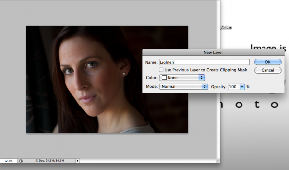
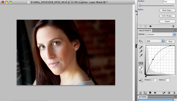
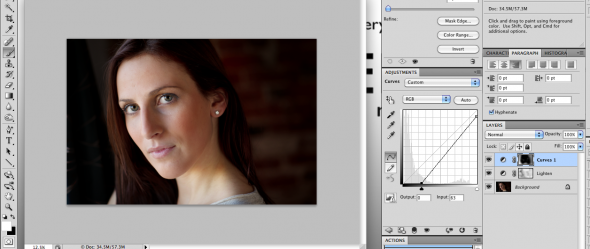
There’s one other advantage to using Adjustment Layers:  the ability to use your brushes to add and deduct your adjustments to highly-defined areas of your image.   Here’s how that works.    After you’ve made a new Adjustment Layer (say, Curves),  given the layer a name and then done the adjustment, you’ll probably find that the adjustment you just made looks great for one portion of the image but not another.  If, for example, you’ve lightened the entire image but now find areas of the subject’s face are too light, it’s simple to fix.   Just go to the Photoshop Toolbar and go down to the bottom, where there are two colored, overlapping boxes used for setting foreground and background colors.  Make sure they show one black square and one white square.  If they don’t click the small black and white box icons above them.  Then select the black box by clicking the double-arrow icon between the squares until the black box is above the white box.   Next, go to the paintbrush icon in the toolbox.   Make sure the diameter of the tool is appropriate for the area you are going to paint–in this case, the areas of the face you want to darken.   Then click the mouse while holding the brush over these areas.   You’ll see them getting brighter.   What’s happening is that the black brush is selectively removing the adjustment you made earlier.   To add it back, click the arrow in the toolbar so that the white box is now on top, or selected.   Now paint again over the same area, and it will darken.

Once you get the hang of it, adjust the size and opacity of the brush in order to add or remove adjustments you’ve made from select portions of the image.   If you’re not good at staying in the lines, you can always go back and forth (black box and white box) in order to fine-tune things.

With a little practice, you’ll quickly become a fan of the Adjustment Layers -toolbrush combo.   If you haven’t been doing it, it’ll save you time and frustration–and will result in better image adjustments.   So remember–think in layers.

Original image with Adjustment Layer dialog box open
Image with Curves Adjustment Layer-the model's face on the right is too bright.
The final photo, pre-flattening, showing both Adjustment Layers in the Layers palette

Expand your mind (and your Mac) with hard drive enclosures

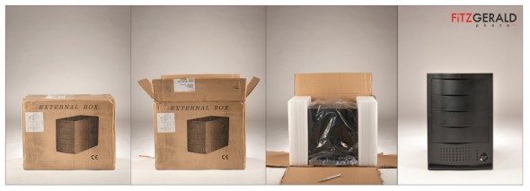
A present to ourselves: the indestructible Burly Box from MacGurus (click image to view larger photo)

I’ve written before about the need to have a 3-2-1 backup system for your important image files. Now here’s a great tool that makes automating backups, cloning and file transfers a snap: a multiple-bay hard drive enclosure. Whether you have a multiple-drive war horse or are using an iMac or laptop, if you’re a photographer you probably should look into one of these. This particular unit is sold by the knowledgeable folks at MacGurus.  When I called, the guy who helped was Rick, the owner.

I chose a four-bay unit so that my primary copies of my archive as well as backups and system clones could happen in one place. The unit is extremely tough and comes with robust power and cooling systems, so it’s meant to be run–as you might expect–all the time. This “always-on” approach solves the issue many photographers face who have a good backup system in place that may not get consistently applied because hard drives aren’t always plugged in and attached to the computer.

Ours arrived this week, and so it was fun to just light it and open it the opposite way that I opened presents as a kid: sloooowly.  More on software recommendations for handling automatic processes soon.

Shop Talk: Black and White image conversions

This is the first in a regular series I’m calling ‘Shop Talk’.  Basically, it’s a response to some of the questions I get, both from other photographers, friends…and our intern, Stepheney.     Most of the tips will be Photoshop oriented, but they will also relate to workflow, archiving of image files, and other software that I use in my daily business as a Maine commercial photographer.

Let me repeat:  I’m not an expert.  But I do make a living at this, and have a particular perspective that may be of use.

So, let’s dive right in.

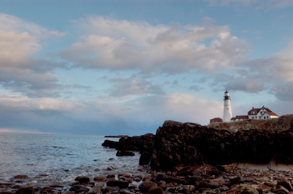
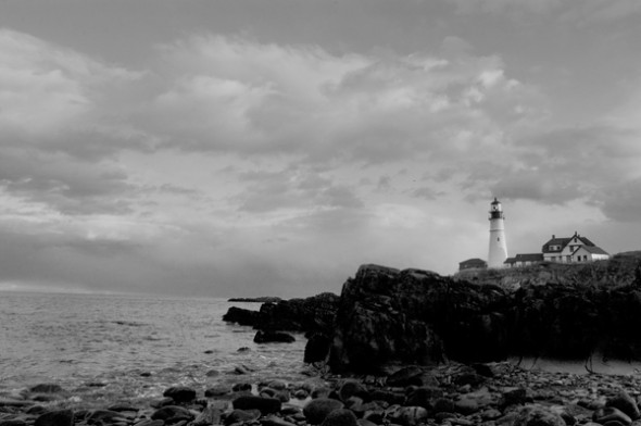
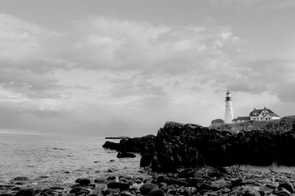
I had a shoot last week that specified delivery of Black and White images instead of color.  It seems everyone has a different method for black and white conversions.  It matters how you do it since each method tends to have a different effect on the final image.  So, below, are two common methods–straight Photoshop grayscale conversion and desaturation–and the one I use, via Lab Color conversion.  Check out the photos of a lighthouse with lots of shadow area to see the results.

Method Number One: Shoot your photo in black and white.  Yes, your DSLR will allow you to shoot a black and white photo.  If you’re a purist, with a bagful of #15 and #25 filters, you might want to shoot in black and white so that you can use various filters for great effects in-camera.  Otherwise, it makes sense to shoot in color so you have more options down the road.  Why let your camera do the auto conversion from color to black and white when you have a big, powerful computer–with a big, powerful Adobe Photoshop program to do a custom conversion?  OK….maybe you don’t have either of those two things, and so in that case, flip that switch and go black and white.  Otherwise, don’t.

Method Number Two: Automatic GrayScale conversion


In Photoshop CS4, you can go to the Image–>Adjustments–>Black and White area of your toolbar and convert any color image to grayscale.  The process is automatic, and looks pretty good right out of the chute.  Why wouldn’t you do this?  Better investigate further…..

Method Number Two: Desaturate


To Desaturate, open your image and then go to Image–>Adjustments–>Desaturate.   Wow.  It looks pretty good, too, but if you look closely you’ll notice that it looks a bit muddier than the straight grayscale conversion above.  The whites aren’t so crisp and white, and the grays are a bit muddier.  Ok in a pinch, but still not great….

Method Number Three: Lab Color conversion

This is the one that I use.  I first learned about it from a workshop put on by digital photo pioneer Rob Galbraith, and I hear references from time to time about others using it as well.   For my money, it results in detail in shadow areas and looks like it maintains more shades of gray (for you Ansel Adams enthusiasts, this one will get you zones one through five).  Note:  Make sure that if you use this or the Grayscale method that you convert to a color space.  Why?  Because your image will look pretty messed up if you try to print it without it being considered a “color” image.  You’re just applying a color profile (like sRGB) to the black and white file, which has had all the color info stripped away.  The photo will still look black and white.

That’s it.  Hope it helps some of you.  I’d love to hear other methods you use to get from color to black and white.   Next week:  Sharpening (the other way).

(BF:  Somehow the actual ‘how to’ part of this tutorial got missed, so here goes.  To convert to black and white via Lab Color:

  • Go to Edit–>Convert to Profile
  • Choose Lab Color and click OK
  • Go to the Channels Palette and click/drag either the A or B channel to the little trash can icon at the bottom of the palette (trashing one will trash the other automatically)
  • Now go to Image->Grayscale to convert to Grayscale
  • If printing, go back to Edit–>Convert to Profile and select an RGB profile (I use sRGB)

That’s it!)