Category News

Can’t wait for Halloween

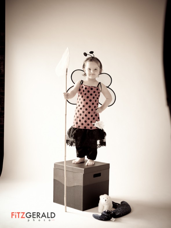
Our daughter, Maggie, is just three…so Halloween is a big deal. She has been planning what to wear for months, starting off as Rapunzel with short hair, eventually wanting to go as a green ghost (why not?), and finally to a….ladybug. I think the wings pushed her over the edge on this one. That, and the fact that black and red are (currently) her two most favorite colors. Since we got the costume she’s been trying to wear it to practice, which is how we ended up in the studio for an impromptu photo session over the weekend. I may be biased, but she looks great.
Kind words and fun spaces…

Commercial photographers operate in a world without a lot of immediate positive feedback. When a client likes what you’ve done, they’re less apt to say anything than if you’ve not met expectations. It’s hard to talk about your work as well, since you may have to wait until the images are used or published by the client. That’s why it’s been a fun week at Fitzgerald Photo HQ.

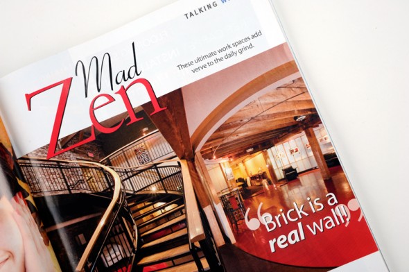
A couple of our images were published in the current, October issue of Portland Magazine (that’s the space formerly occupied by Via Marketing, above, plus an image of the LEDA (Leslie Evans Design) space in Portland. Nice reproduction! I also got a great recommendation from Pelland Advertising, a firm that is doing work for a client of mine who I really enjoy. It’s lengthy, but I’ll include the entire recommendation. I think it speaks to why an experienced professional photographer is still relevant even in this age of inexpensive digital cameras and cheap (but generic) stock photography:

“Pelland Advertising produces websites and print advertising for small business clients in the travel and tourism industries. Having retired from providing on-location photography as one of our service offerings, I have a demanding eye and extremely high standards. Unfortunately, in these days of Photoshop and forgiving Web resolution standards, when we rely on clients to provide their own photos, we are almost inevitably handed the project’s weakest link.

When a new client in Maine needed on-location photos and waited to beyond the last minute, I helped to review portfolios of local photographers, in an attempt to assist the client in making the right choice. Brian’s portfolio spoke for itself. We downloaded the results of his shoot late last week, and I immediately assured the client that she had made the right choice.

Brian’s work is simply excellent. Each shot is skillfully composed, properly exposed, crisp, and engaging. There is no middle ground when it comes to photography. I frequently hear wannabe photographers describing themselves as “semi-pros”. Brian’s work makes it clear that there is no such standard. There are pros and there are hacks, and Brian is a pro by every standard of measurement. If you need a photographer in Northern New England, I would encourage you to engage Brian’s services. If you are outside of the region, try to persuade him to take on the assignment and cheerfully pay his travel expenses. His work is that good!”

I love it when my clients get more than they expected…and I really love it when I can work with other professionals to provide a complete solution to help solve my clients’ issues.

Shop Talk: Using Adjustment Layers

With Photoshop, it’s easy to go overboard and end up with the equivalent of what we used to call the Hand of God effect.    Any change made to an image alters the bits that make up the file and cannot be reversed once done.

That’s why I love Photoshop’s nondestructive imaging capability using Adjustment Layers.  The idea is that when you make changes to an image, you do so on a separate layer.  This means you don’t make changes to the underlying image file (the background layer) at all, and thus don’t damage the original.  Once you’ve got the file where you want it, you flatten it and make all the changes all at once.

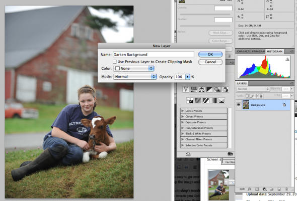
Adjustment layers are a great idea, and are easy to use.  With an image open, go to Layers–> Adjustment Layers.   You’ll have the option to choose tools such as  curves, levels, exposure etc.  When you select a tool and name the layer, you can make changes with the tool that appear to change your image (below).


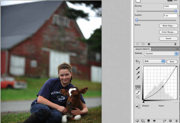
The change is really only being applied to the adjustment layer, which you can see in your Layers palette.  If one portion of the photo is too bright and I want to darken it, as in my example below, I make the entire photo darker using Curves.

Then I make sure the black square at the bottom of the tool box is set as foreground color (click the two-headed arrow to move the black box above the white one as shown below), and I select the paintbrush tool .  Now when I paint areas of the photo with the brush, I’m actually telling it to remove the darkness I’ve just added to that portion of the image.  In my example, I only want the sky and background to be darker–not the girl.  So I carefully paint around her, varying the brush size and opacity to feather in the changes so they look natural.

If you mistakenly take away too much with the paintbrush, or wander over areas of the image you don’t intend to, you can use the Undo (command + Z) tool to undo the change, or–and this is why I like Adjustment Layers so much–you can add the change back.  You do this by going to the bottom of the toolbar and making the white box set as the foreground color.  This now means that whichever area you paint, you are adding back the changes you made to the adjustment layer (in this case, adding the darkness I applied in step one).  So by alternating the additive (white) and subtractive (black) versions of the paintbrush, I can really craft my adjustments.

There’s no limit to the number of Adjustment Layers you can layer, one on top of the other.  If you don’t like what’s going on with one of your layers, you can always drag that layer (in the layers dialog box) into the trash can and deleting it.

When you’re all done, it’s a good idea to save the entire file as a “master” version of the image–either as a .psd or a .tiff–preserving all the individual layers as they are.   Then, flatten the whole thing to produce your final usable file.  Once you incorporate Adjustment Layers into your workflow, you’ll save time and have better results.

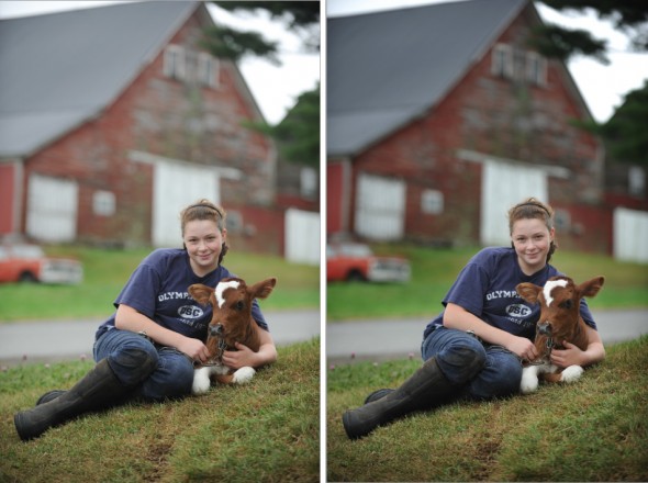
Original image, left and final image after flattening.

Portland commercial photographers present at PUG

This coming Wednesday evening, you’re invited to a presentation/panel discussion featuring myself and several other Portland-area commercial photographers.   Originally set for July, this month’s meeting of PUG (Pictage User Groups) happens September 15 from 7 to 10 pm 7-10p at emilie inc. photography, 227 Congress St., Portland.   PUGs are comprised mainly of wedding and portrait photographers. Most attendees are customers of Pictage (hence the name), a well-known photo lab and photo products company.

Local PUG organizer Emilie of Emilie Inc. invited us to show some of our work, discuss questions on things like licensing, etc. and generally have a good time talking shop.

Also on deck for tomorrow night: Darren Setlow, Zack Bowen, Jeff Stevensen and Trent Bell.  All are very talented shooters in the areas of advertising, architecture and food imagery.   Looking forward to it!

Introducing the Maine Wedding Company

No matter where we’ve lived, my wife Beth seems to wind up right in the thick of things.  She’s a very talented wedding photographer and owner of Blush Imagery–and she seems to know everyone in this town. She’s one of those Connector Types–a person who makes fast friends with people of all kinds and who is always introducing people to others they should know.

So, it wasn’t much of a surprise when, a couple of years ago, Beth brought up the idea of creating a wedding company that would serve and celebrate the many fine folks in Maine’s wedding industry.

Starting from that little seed, her idea has grown (with much tending and care).  I’m so proud to be able to broadcast her initial announcement of the Maine Wedding Company.  You can read more about what she’s up to on her blog, Applying Blush.   (Ahem….She’s looking for testers!)

As easy as 3-2-1: protect your most valuable files now

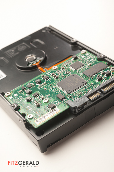
Hard Drive Failure

A few months ago, my assistant was dutifully burning DVDs from a backup external drive.  The hard drive, just a few months old, was humming along just fine until it simply disappeared from the desktop.  I’ve never had a hard drive fail so completely and without warning.   I took the disc in to Steve Bedell, a friend and systems guru with Network Knowledge.  He cracked the case and spent a day trying to recover the files, to no avail.  It was toast.

Even though all of those files existed elsewhere in my system (meaning nothing was permanently lost), it underlined the need for a more robust backup solution.   As Steve says, it’s not if your hard drive will fail…but when.   He also touts the oft-repeated rule of thumb when it comes to file backups:  have a 3-2-1 strategy.   What’s that?  It simply means that your important files should have three copies, on at least two different types of media (external drive, internal drive, write-once media like CD or DVDs, or cloud-based storage).  The “1” means that at least one copy should be stored offline (not plugged into your computer), preferably off-site in a safe location.

So, here’s my own Simple Simon method, which satisfies the 3-2-1 rule:   All of my image files live on a primary external hard drive plugged in full-time to my computer.  I also have these files in a “working”, or temporary, folder on my internal hard drive.  Everything is backed up to a second external hard drive that is unplugged and kept elsewhere.   Lastly, I burn DVDs of all these files once they are organized into the buckets I keep them in.   So:  three different permanent homes for my files, on two different types of media (external hard drive and DVD), with one copy (an external drive) stored off-site.   In the future I’ll probably explore cloud-based solutions, but right now they’re too slow for my needs.  I also use Time Machine for versioned backups, but I again don’t use this for image files for a variety of reasons.

What’s your solution?  Even if you don’t have a lot of money, a simple system like mine will give you peace of mind the next time you get a blank screen where your computer used to be.

It’s not about the cows. It’s about the people.

When people remark to me that I’m working long hours in my photography business, I usually respond, ‘hey-it beats working for a living’.   The truth is, it’s a lot of work to run a business—but the rewards are also great.   One of my joys is meeting new people and working with some really fantastic clients.

One of my favorites has been MooMilk, short for Maine’s Own Organic Milk Company.  This company is as tough and gritty as they come–formed as a response to being dropped from their conventional milk distributor last year.   The half-dozen organic milk producers comprising MooMilk are small family farms located in central, northern and Downeast Maine.   In addition to producing great-tasting, healthy milk they are running their farms and now, marketing their own product.  It’s not easy, but they are doing it.

In approaching my work with MooMilk, I realized that the idea I wanted to get across was simple:  MooMilk doesn’t come from cows.  It comes from people.  You can see a sampling of photos from my shoots above.   And there’s a great op-ed piece in the Bangor Daily News that speaks to the families that are MooMilk.

Portland’s own Mad Man

Portland-area fans of the AMC cult-favorite drama Mad Men take heart.  Due to the Mad Men Casting Call contest (a partnership between AMC and Banana Republic), you can get a shot at a guest appearance on the show.  All it takes is some creativity, a camera and a devotion to 1960s-era coolness bordering on the fanatical.

The rules are simple:  visit a Banana Republic to get a ‘Mad About Style Guide’, register, and then submit a photo showing a scene and characters that could fit right into the set of the TV show.   The photo with the highest number of votes when the contest ends on September 6 gets a walk-on appearance and a small shot at being a star.

Dan Routh is creative director of Burgess Advertising & Marketing, one of Maine’s largest ad firms.  He’s also a huge fan of the show, which depicts the life and times of Manhattan ad men in the 1960s.  Having cut his teeth as a New York City advertising art director, Routh knows the subject well.  He also happens to have a trove of period items–from desks to lamps to clunky black telephones–ready to serve as props.   Add to this the desire to take advantage of an opportunity to do a little social media marketing, and this contest was a no-brainer for Routh.

The only thing he had to buy was an $8 pack of Lucky Strikes cigarettes.

Check out Routh’s Mad Men photo and add your vote.

Below, see some of the shoot outtakes, including some wide scenes that include his entire office and the lights we used on the impromptu shoot.    Yes, that’s real cigarette smoke.

Maine Photographer chosen for Photoshelter showcase

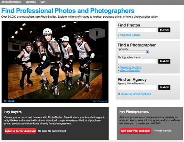
Kind of blowing my own horn here, but, well, this is pretty cool.  I’m a member of Photoshelter, which provides website and e-commerce tools and markets the work of photographers worldwide.  More than 60,000 photographers use the service, which is filled with all kinds of cool tools to help photographers help their clients.  Each month they choose 20 member photos to feature on their home page.   I’m a little surprised and humbled, but this month they chose to showcase one of my images of the Port Authorities Roller Derby team.   Really, it’s those ladies who are responsible for my selection–clearly.  So, roller dolls, thanks a million!  And thanks, Photoshelter, for the honor. Click to check out the August Photoshelter member showcase photos.

Interested photographers can click this Photoshelter link to learn more and join at a discount.

Shop Talk: Black and White image conversions

This is the first in a regular series I’m calling ‘Shop Talk’.  Basically, it’s a response to some of the questions I get, both from other photographers, friends…and our intern, Stepheney.     Most of the tips will be Photoshop oriented, but they will also relate to workflow, archiving of image files, and other software that I use in my daily business as a Maine commercial photographer.

Let me repeat:  I’m not an expert.  But I do make a living at this, and have a particular perspective that may be of use.

So, let’s dive right in.

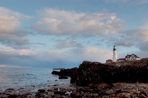
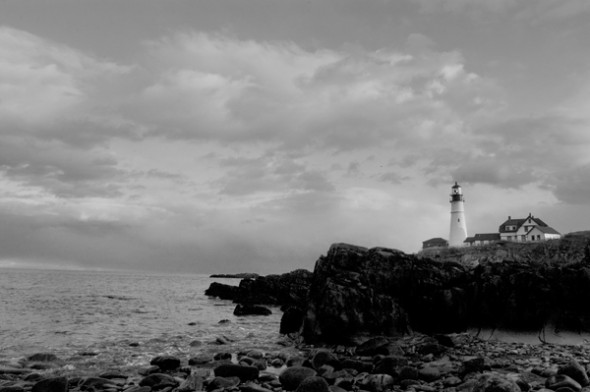
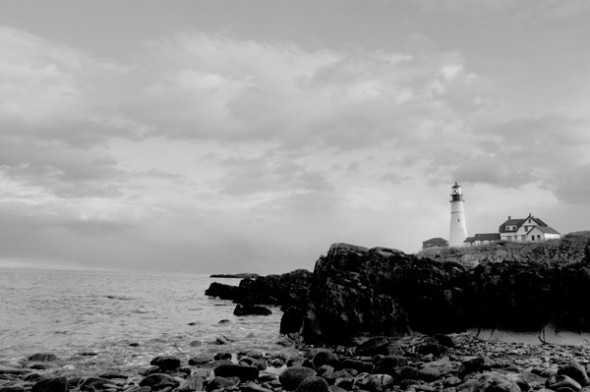
I had a shoot last week that specified delivery of Black and White images instead of color.  It seems everyone has a different method for black and white conversions.  It matters how you do it since each method tends to have a different effect on the final image.  So, below, are two common methods–straight Photoshop grayscale conversion and desaturation–and the one I use, via Lab Color conversion.  Check out the photos of a lighthouse with lots of shadow area to see the results.

Method Number One: Shoot your photo in black and white.  Yes, your DSLR will allow you to shoot a black and white photo.  If you’re a purist, with a bagful of #15 and #25 filters, you might want to shoot in black and white so that you can use various filters for great effects in-camera.  Otherwise, it makes sense to shoot in color so you have more options down the road.  Why let your camera do the auto conversion from color to black and white when you have a big, powerful computer–with a big, powerful Adobe Photoshop program to do a custom conversion?  OK….maybe you don’t have either of those two things, and so in that case, flip that switch and go black and white.  Otherwise, don’t.

Method Number Two: Automatic GrayScale conversion


In Photoshop CS4, you can go to the Image–>Adjustments–>Black and White area of your toolbar and convert any color image to grayscale.  The process is automatic, and looks pretty good right out of the chute.  Why wouldn’t you do this?  Better investigate further…..

Method Number Two: Desaturate


To Desaturate, open your image and then go to Image–>Adjustments–>Desaturate.   Wow.  It looks pretty good, too, but if you look closely you’ll notice that it looks a bit muddier than the straight grayscale conversion above.  The whites aren’t so crisp and white, and the grays are a bit muddier.  Ok in a pinch, but still not great….

Method Number Three: Lab Color conversion

This is the one that I use.  I first learned about it from a workshop put on by digital photo pioneer Rob Galbraith, and I hear references from time to time about others using it as well.   For my money, it results in detail in shadow areas and looks like it maintains more shades of gray (for you Ansel Adams enthusiasts, this one will get you zones one through five).  Note:  Make sure that if you use this or the Grayscale method that you convert to a color space.  Why?  Because your image will look pretty messed up if you try to print it without it being considered a “color” image.  You’re just applying a color profile (like sRGB) to the black and white file, which has had all the color info stripped away.  The photo will still look black and white.

That’s it.  Hope it helps some of you.  I’d love to hear other methods you use to get from color to black and white.   Next week:  Sharpening (the other way).

(BF:  Somehow the actual ‘how to’ part of this tutorial got missed, so here goes.  To convert to black and white via Lab Color:

  • Go to Edit–>Convert to Profile
  • Choose Lab Color and click OK
  • Go to the Channels Palette and click/drag either the A or B channel to the little trash can icon at the bottom of the palette (trashing one will trash the other automatically)
  • Now go to Image->Grayscale to convert to Grayscale
  • If printing, go back to Edit–>Convert to Profile and select an RGB profile (I use sRGB)

That’s it!)