Category Blog

Studio lighting presentation at Fitzgerald Studios


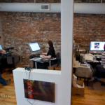
My wife Beth is temporarily leading the Pictage User Group (PUG) for Emilie of Emilie Inc.  This month’s program, which is free, is on March 16th at 7 pm here at the studio (28 Maple Street, 3rd floor).   I’ll be presenting hands-on tips on studio lighting to demonstrate portrait lighting using one, two and three lights utilizing a range of different light modifiers.    If you’re interested in attending, please email Beth at Blush Imagery to RSVP.


Hope to see you there!

For police officer injured by distracted driver, a slow recovery

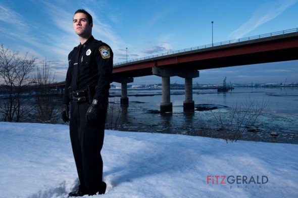
South Portland Police Officer Rocco Navarro

Photographer’s Note:  Mainers at Work is an ongoing portrait series featuring Maine individuals who work some of the most dangerous, dirty or low-paying jobs as compiled by CareerCast.Com for its 2011 ranking of 200 jobs nationwide.


Behind South Portland police officer Rocco Navarro, the Casco Bay Bridge looms, a symbol that connects his past with a forever altered future.  “You never think of this happening on a routine call,” he says.   A former athlete with a degree in kinesiology,  Navarro has to shift his hips to adjust for the weight of his duty belt, now painful to wear.

Click to Enlarge
Photo courtesy of South Portland Police Department

Stretching away across the Fore River and linking South Portland with Maine’s largest city is the drawbridge that more than 30,000 drivers cross daily.  It was there, on Nov. 1, 2010, that Navarro had a brush with death—in the form of a distracted driver on a cell phone.

Navarro, 28, is in many ways a typical Maine police officer.   Born and raised in Portland, he attended local schools and played football—Navarro was a punter, and good enough to play for three years at the University of Maine—before deciding on a career in law enforcement.  He chose South Portland because it was close to home but also because he wouldn’t be patrolling his old neighborhood.  “I figured it would be too awkward to work where I knew everyone,” he says.

After graduating the police academy in 2007,  Navarro started on the late shift and eventually was assigned a daytime patrol slot, first shift, that started at 7 am.

The morning of the accident,  Navarro responded to a routine call involving a broken-down Kia sedan in the northbound lanes of the Casco Bay Bridge.  It was just before 11 am, and Navarro had just returned to his vehicle, parked behind the disabled car, to await a tow truck. “Thirty seconds earlier, I would have been killed,” he says.

A full-size 2010 Chevrolet pickup truck rammed into the back of Navarro’s police cruiser at an estimated 45 miles per hour.  After the impact, the officer struggled to remain conscious.   He manged to kick open his jammed driver side door and stand up briefly—he was concerned about the car catching fire, he says—and the last thing he remembers is fellow officer Robert Libby approaching the scene.  The next thing he knew, he woke in the hospital.

Since that time it’s been a difficult and long recovery.  “The first three weeks, I felt like a 90-year-old,” Navarro remembers.   His first month was a haze and bad migraine headaches came frequently.  Even as short-term effects faded, other issues stubbornly remain.  Navarro’s short-term memory has been slow at coming back, and it’s difficult for him to sit for long periods of time.   “I didn’t drive for a month.  In traffic, I’d get flashbacks,” he says.  “It was hard going over the bridge for a while.”

Maine is one of only a handful of states without laws banning texting and cell-phone use for all drivers–something Navarro and his fellow officers would like to see changed.   The driver of the Chevy was cited for failure to maintain control of a vehicle.

In the meantime, Navarro rides a desk until cleared for patrol duty by his doctors.  That could still be a while.  He’s also found he’s in a unique position to make a difference in the lives of others.  This month, he started speaking at local high schools on the dangers of texting while driving.  He hopes to get back on the street and plans to eventually retire from the department despite the dangers.

“It’s been a huge setback, he says of the accident.    “I love my job and to have it taken away like that…you’re not prepared for it.   It’s probably the biggest setback in my life.   I’m trying to get back to where I was.”


Name: Rocco Navarro
Age: 28
Occupation: Police Officer
Employer: South Portland Police Department
Rank on CareerCast survey: 178 (out of 200)

Don’t like that skin color? Replace it.

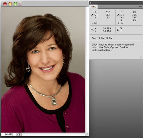
Image showing high yellow values

Proper skin tone is a must for any professional portrait.   Sometimes, especially when shooting in natural-light conditions, a warmer or cooler color of skin is desired.   When in studio or daylight conditions, however, skin tone and color is critical for making sure faces look natural and healthy.

You can’t just judge the tones of a photo by visually assessing it on a computer monitor, unless you have a recently calibrated screen.  Everyone sees color differently.   Instead, it’s best to use objective numbers.   Select the eyedropper tool in Photoshop and hover over the skin areas in your image to see the C,M,Y,K values. You must have the “Info” window open to do so.  The Info palette is a densitometer that measures the amount of cyan, magenta, yellow and black present in your image.  These are the colors that make up the four-color printing process.   Even though your images most likely are being rendered in an RGB space and may never need to be converted to CMYK, we use the CMYK values in the densitometer to measure whether our skin tone is where it needs to be.

Primarily, we’re concerned with relative values, not absolute values.  For example, For Caucasian skin, you’d likely see the numeric values for M (Magenta) in the 30-50 range.   It really doesn’t matter where it is; what’s important is this value relative to the Y (Yellow) number.   For white, Caucasian skin the Y value should always be about 3-5 points above the M value.   K?  That’s black, by the way–and it should read quite low, in the single digits, or zero.  The C, or Cyan, value, should be roughly a third of the value of the M or Y numbers.   So for our current example, a C value of 8-15 would be dead-on.    Without going into specific sets of numbers for all the various kinds of skin, the darker the skin, the higher the Cyan value should be relative to the M and Y values.

By the way, this whole number scheme doesn’t really work if the skin you’re working with has been lit by any extreme light–you know, the gorgeous, golden glow of a sunset or the cool glow of a neon sign.  You have extreme light, you want to preserve that.   You don’t want ‘natural’.

So, once you’ve determined that you DO want natural skin tone and you’ve identified the problem–that guy’s skin looks really pink and you’ve confirmed values of, say, Y=35 and M=75–then how do you fix it?

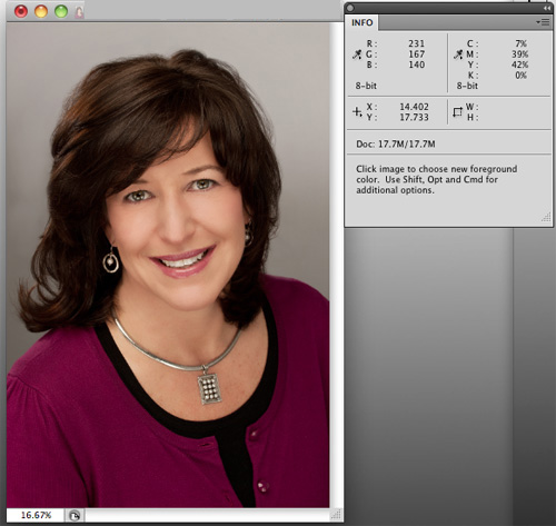
There are a lot of great ways to do so in Photoshop, and what works for one picture won’t always work for another.  That said, my go-to first tool is always “Replace Color” (Edit–>Adjustments–>Replace Color).  To use it, simply click on a lit, shadowless area of skin and select the degree of latitude (called ‘fuzziness’) you want your selection to cover.  A high degree of fuzziness will select more areas of the image that match the tone of the skin area you clicked on.   Once that’s done, move the sliders to adjust the Hue, Saturation and Lightness.  It doesn’t take much.    In the example below, I moved the Hue slider to -3, the Saturation slider to -5 and the Lightness to +1.   I’ve rarely had to go above 10 on the Hue slider, which is my primary adjustment slider.

That’s really it–just move the eyedropper icon over the skin again to read the new values and, if they look good, go with it.  Again, it may be difficult but you should trust the numbers way, way before you trust your eyes.   A properly adjusted image will reproduce on any calibrated printer even if it doesn’t look great on your uncalibrated screen.

So pay attention to your skin values, and try out Replace Color.   Doesn’t your skin deserve it?

Image adjusted using Replace Color, showing corrected relative values

Looking for models

Are you an aspiring model, or do you want to take your portfolio to the next level? I’m looking for real people for lifestyle shoots in the Greater Portland area. The shoots are fun, creative and scenario-based. I like to tell visual stories with my photographs and am looking for men and women of all ages and types. Whether you look good on the beach or would feel more at home in a parka, chances are I have a shoot that’ll be a good fit. Contact Brian if you’re interested in being on our call list for both paid and unpaid shoots.

Blush in motion

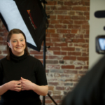
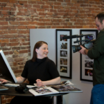
Beth’s always looked great in front of the camera…this week at Fitzgerald Studios, Beth was filmed for a video profile on Blush Imagery by Chris Cavallari, of Filmosity Productions. I’ve known Chris for a couple of years now, and really enjoy his approach and skill. Having had the opportunity to see him work, I like his style, too. Stay tuned for the video results!

We love Portland

As new ventures go, this one has pretty humble beginnings. I kind of like that. Last month I started a project will publish starting in a few months. I’m very excited about it, but will say only that it’s meant to be a celebration of the good things going on in Portland. That, and on a directly related note, our studio exploded in money during one of the shoots (above). That’s a great way to start. Stay tuned!

Portfolios for Preble Street

Join us to help people in need right now during this cold Maine winter.

On Friday, Feb. 11th from 8 am – 5 pm Beth (of Blush Imagery) and I will be critiquing photographer’s portfolios to benefit Preble Street — an important Maine resource for the homeless and hungry. Show some love. Sessions are limited, so sign up for an hour-long appointment ASAP by emailing Beth. Then bring a $50 check made out to Preble Street to your session. Each 1 hour session includes:

  • 30-minute review with Beth of Blush Imagery, an award-winning photojournalist and wedding photographer for over 10 years.  Beth will be looking at portfolios for branding, marketing success, and consumer connection.
  • 30-minute review with Brian of Fitzgerald Photo, an award-winning photojournalist, commercial photographer and a former photo editor for the Seattle Times Co.  Brian will be focusing on redundancy, technical skills and order of presentation.

Online portfolios are fine, as are books and prints.  It’s a great idea to include optional portfolio images so we can suggest adding, deleting images as needed.

With 100% of all money raised going straight to Preble Street, it’s a great way to help your community and your career, too.

–30–

Why hire a pro photographer?

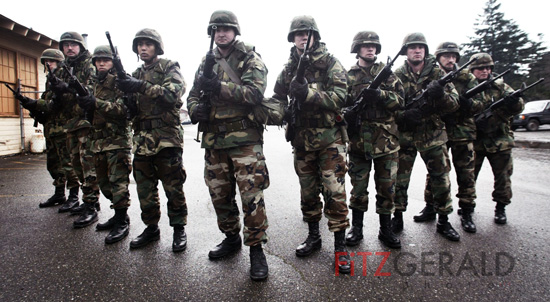
A team of pros, ready for battle

With so many quality digital cameras plus the enthusiasts willing to work for little or free, the question comes up a lot:  why should anyone hire a professional photographer?  In my mind, there are four major reasons I hire a professional to do anything, whether it’s building a web page to installing a window.  Can I do all of these things?  Yes, I can.  And, I have.   But, since we all can only do so much in the course of a day–and only become an expert in so many disciplines in our lifetimes, we are all forced to choose where to spend our efforts.    With 17 years’ experience as a professional photographer, I’ve clearly chosen mine.  Here, then, are the major reasons I counter such questions with:

You get what you pay for
What’s your expectation of the quality, timeliness and satisfaction of a job you give to a non-professional?  Probably it’s just good enough.   If that’s what you want, you should hire an amateur photographer.

Peace of Mind
When you hire a bonded, licensed electrician, you put your trust in their skills and mentally check out of the process so you can attend to other things.  You know it’ll be done right and that when you flip that light switch, the lights will come on.  You know if they don’t, you know who to talk to.   You don’t worry, fret or stress because the problem is being handled.   With a professional photographer, you may be excited and interested in the outcome, but you don’t have to worry that the images witll be of high quality, of consistent tone and feel…..you’ll have the confidence that you are getting the best effort and the best results.

Quality Consistency
Anyone can take a great photo–especially with the digital tools available today.    A photographer I know, a pro, once had two flashes go down on him during a night time wedding–shot during a hurricane, no less.   He sweated a bit, made adjustments, and the bride never knew the difference.  The photos?  If placed side-by-side with images from other weddings,  other pros would be hard-pressed to guess which one had technical difficulties.    A non-pro would have folded when faced with a daunting technical issue like this, and the wedding would have been in jeopardy.   With a pro, you are guaranteed quality good photos every time–not just once in a while.

The extra 10%
An established photographer once told a much younger version of myself that I should never just give the client what they asked for.  There had to be a way to come back with something more, something in addition….some value-add.   That way if an assignment didn’t develop in the way the client was expecting, I’d have provided them with something else they could still use.   Great advice.  I call this the extra 10%.   A professional photographer is always thinking about what they can do that the client could use, or needs.  They listen to the client to truly understand the problem and use their experience and skills to provide a solution the client can’t be expected to think of.  Because they hired you, a professional, to do so.  The 10% is what you demand of yourself, not what the clients expects of you.

It’s a relationship
Why develop a relationship with a professional?  Because who are you going to call when you need your drain unclogged on a Sunday morning over a holiday weekend–the plumber you’ve worked with for many years or someone you choose at random in the phone book?   I’m always getting calls from clients wanting images processed for an ad, cropped, or to have a DVD burned from a long-ago assignment.  They know that no matter what I’m doing or wherever I am in the world, I have the systems and help to get the answers and what they need done quickly.   That gets back to peace of mind.

We live in a world in which we are bombarded with choices and information.  The professional in any field stands as an anchor in a sea of chaos, ready to make sense of your needs and to provide you with the solutions you actually need.   Whether you’re looking for a photographer or plumber, a tax accountant or a Realtor, do your research, ask for personal references, and do yourself a favor.  Hire a pro, and get back to your life and work.

–30–

Shop Talk: Think in layers

Add Adjustment Layers to the long stack of reasons why Adobe Photoshop is my go-to image editing software.   Most photographers are used to the idea of adjusting their images using tools like Curves, Levels and Brightness/Contrast.  You can directly adjust your images in a variety of ways using these tools.

Next time, use the Adjustment Layer versions of these tools (Layers–>Adjustment Layers).   In doing so, you apply these imaging changes not directly onto the surface of the base image, but on a layer sitting atop that base (or, background layer).  This provides protection to the original image, since you’re not altering the image itself.

The best part is that you can build layer on top of layer as you fine-tune your image.  When it’s all done and looks like you want it, you can then flatten it into one file and save that file.   One hint:  it’s a good idea to save a version of both your layered file–so that you can return to it and tweak individual layers later if needed–and the original file (because it’s good practice to always keep the unaltered original file).

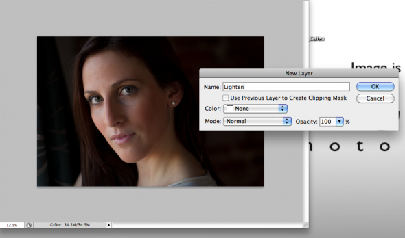
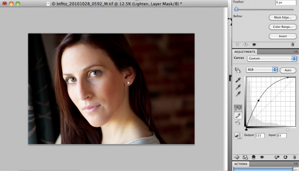
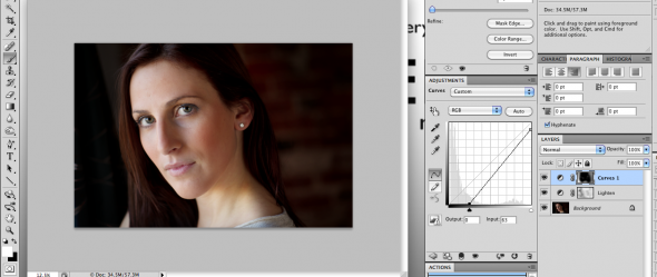
There’s one other advantage to using Adjustment Layers:  the ability to use your brushes to add and deduct your adjustments to highly-defined areas of your image.   Here’s how that works.    After you’ve made a new Adjustment Layer (say, Curves),  given the layer a name and then done the adjustment, you’ll probably find that the adjustment you just made looks great for one portion of the image but not another.  If, for example, you’ve lightened the entire image but now find areas of the subject’s face are too light, it’s simple to fix.   Just go to the Photoshop Toolbar and go down to the bottom, where there are two colored, overlapping boxes used for setting foreground and background colors.  Make sure they show one black square and one white square.  If they don’t click the small black and white box icons above them.  Then select the black box by clicking the double-arrow icon between the squares until the black box is above the white box.   Next, go to the paintbrush icon in the toolbox.   Make sure the diameter of the tool is appropriate for the area you are going to paint–in this case, the areas of the face you want to darken.   Then click the mouse while holding the brush over these areas.   You’ll see them getting brighter.   What’s happening is that the black brush is selectively removing the adjustment you made earlier.   To add it back, click the arrow in the toolbar so that the white box is now on top, or selected.   Now paint again over the same area, and it will darken.

Once you get the hang of it, adjust the size and opacity of the brush in order to add or remove adjustments you’ve made from select portions of the image.   If you’re not good at staying in the lines, you can always go back and forth (black box and white box) in order to fine-tune things.

With a little practice, you’ll quickly become a fan of the Adjustment Layers -toolbrush combo.   If you haven’t been doing it, it’ll save you time and frustration–and will result in better image adjustments.   So remember–think in layers.

Original image with Adjustment Layer dialog box open
Image with Curves Adjustment Layer-the model's face on the right is too bright.
The final photo, pre-flattening, showing both Adjustment Layers in the Layers palette

TriPom: Pug-approved and locally made

Frodo, expecting jerky

At times I’m reminded just how small Portland can be. Just last week I read in MaineBiz‘s  “New Ventures” section a profile of  TriPom Chews. Located in Brunswick, ME, owners Autumn Gullifer and Ken Bryant make chicken and turkey jerky treats for dogs.   As with all great ideas, once I heard about the healthy product they make, it seemed a natural fit for Maine–where healthy living and ‘buy local’ are deeply embedded values.

At an event this Tuesday night, a friend and fellow photographer Kathleen Kelly won a package of  TriPom treats.   Since Kathy has a cat but no dogs, she passed them on to me, thinking our two pugs, Frodo and Fred, might like them.   I then met Autumn and Ken in person, and got the back story about their business.

Ken is from Chicago and Autumn hails from Maine. They started doing their business to solve a problem–namely to provide a healthy treat for their three Pomeranian dogs that was a much safer alternative to similar treats made in China (and often containing harmful substances and ingredients).  They are bootstrapping their growing company and are already in an impressive 18 small pet boutiques and venues venues throughout the state. Their goal is not to get into the box stores that compete against the smaller pet retail operators.  The smaller service and retail shops are where they want to be, although they are pursuing direct online sales.

I love to hear about other small business owners living the dream. Great to meet you, Autumn and Ken! I can tell you that Frodo and Fred LOVED the treats. That’s not exactly a stretch for a Pug, but they seem to like them so much that I think I may be able to train them to vacuum their own hair from the carpet in exchange for regular TriPom treats. If that works, I’m a customer for life.

–30–