Category Showcase

Recent Work: Maine Standards Company

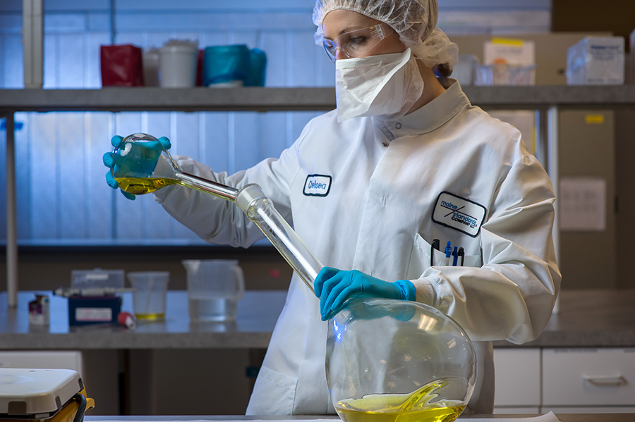
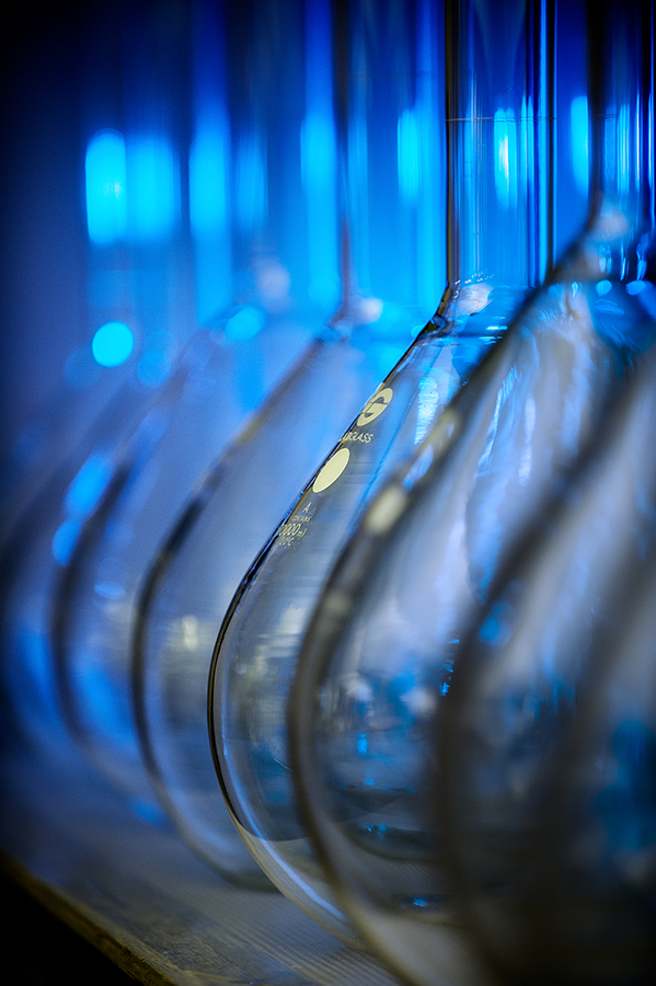
It’s surprising to realize just how many amazing, world-class companies we have in Maine that fly under the radar. Maine Standards Company is one of those. Based in Southern Maine, Maine Standards develops and provides kits for the precise testing and calibration of medical diagnostic equipment. They’re doing cutting-edge stuff using some pretty cool tools. My job was to spend the day photographing their lab, testing kits and analyzers for use in trade show materials. It was a jam-packed day of setting up and breaking down gear, gelling lights and blocking light from reflecting everywhere in those shiny lab surfaces. I love, love this stuff! Check out some of our results.

 

MaineStandards_01_by_Brian_Fitzgerald


MaineStandards_02_by_Brian_Fitzgerald


MaineStandards_03_by_Brian_Fitzgerald


MaineStandards_05_by_Brian_Fitzgerald


–30–

Recent Work: ecomaine

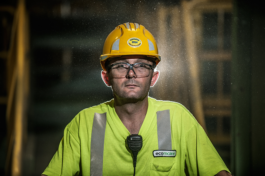
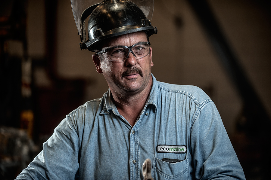
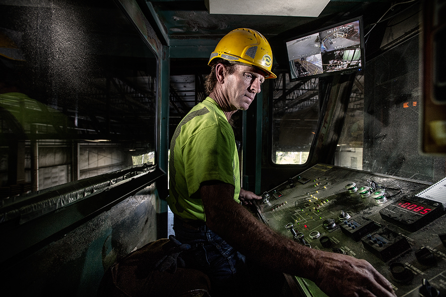
This is the second time I’ve showcased some of my work for ecomaine, a non-profit waste management company.   That’s due in part to the fact that the work they do is so interesting and their industrial environment lends itself to amazing images.   This time around, I spent a day following around the people who work at ecomaine’s landfill, waste-to-energy plant and recycling facility.   The job can be difficult and the environment is ever-changing, which makes it a photographic challenge.   I opted for a very portable lighting kit that I could set up and take down at a moment’s notice.  Even though the lighting looks complex, I kept it fairly simple, choosing to incorporate ambient light into the scene whenever possible.   Here are some of my favorites that I think really capture both the environment and the diverse people that work there.


ecomaine_by_Brian_Fitzgerald_05
Inside the machine shop.


ecomaine_by_Brian_Fitzgerald_03
Operating the Recycling Facility compactor.


ecomaine_by_Brian_Fitzgerald_02
Inside the “tipping hall”, where garbage is unloaded into a seven-story bunker.


ecomaine_by_Brian_Fitzgerald_04
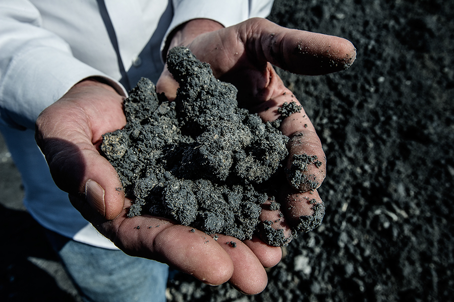
The ultimate result of all that garbage is tons of ash.


ecomaine_by_Brian_Fitzgerald_06
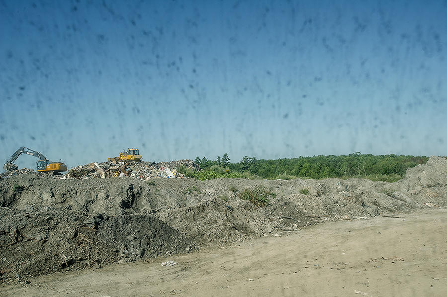
A view of the landfill through the window of a vehicle.


ecomaine_by_Brian_Fitzgerald_01
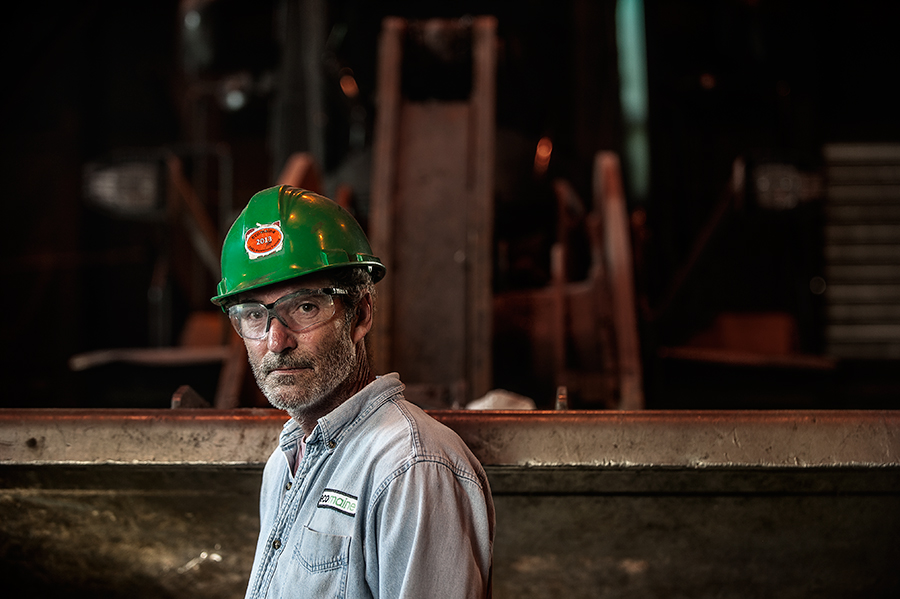
Recycling Facility supervisor.


I can’t say enough positive words about the ecomaine crew.   It’s not fun to have a camera in your face, and likely it’s even more uncomfortable when you’re operating heavy and fast-moving equipment.   They were fantastic to deal with and I think the images make them look like the rock stars they are.


–30–

Announcing: new portfolio edit, new site

FitzgeraldPhoto_2014Website


Today I’m relaunching www.fitzgeraldphoto.com with a new look and a complete re-edit of my work.   For a lot of reasons I love the results.

Easy to navigate? Check. Responsive goodness? Check. Easy to customize (read: I can change the font to Zapf Wingbats at the click of a button)? Check.

Most photographers have a love-hate relationship with their websites.  Love ’em one day, can’t stand to look at ’em the next.  Even when I created great images I’d have liked to show to the world, I hesitated posting it on my old site.  For me it was kind of  like putting a new rear spoiler and sweet ground effects on a broken-down AMC Gremlin:  A lot of effort but the end results pretty much look the same.   Redoing my site involved not only a new design, but a full re-edit of my work—and that is a huge and hairy task I couldn’t wrap my head around.

Luckily, I got help with that piece from Peter Dennen of Pedro+Jackie Photo Consultants. Peter is a great editor, and he helped whip my work into shape. I’ve also relaunched my blog, too (ooh….ahhh). Now it looks more like a tricked-out 1974 AMC Javelin, which is kind of a bad-assed looking set of wheels (truly, thanks, Peter).

The process took longer than I initially planned but the upshot is it made me reevaluate my work and gain a new sense of perspective.  So please take it for a ride and stay tuned for new work to pop up here on the blog and on fitzgeraldphoto.com. Thanks!


Showcase: Camden National Bank

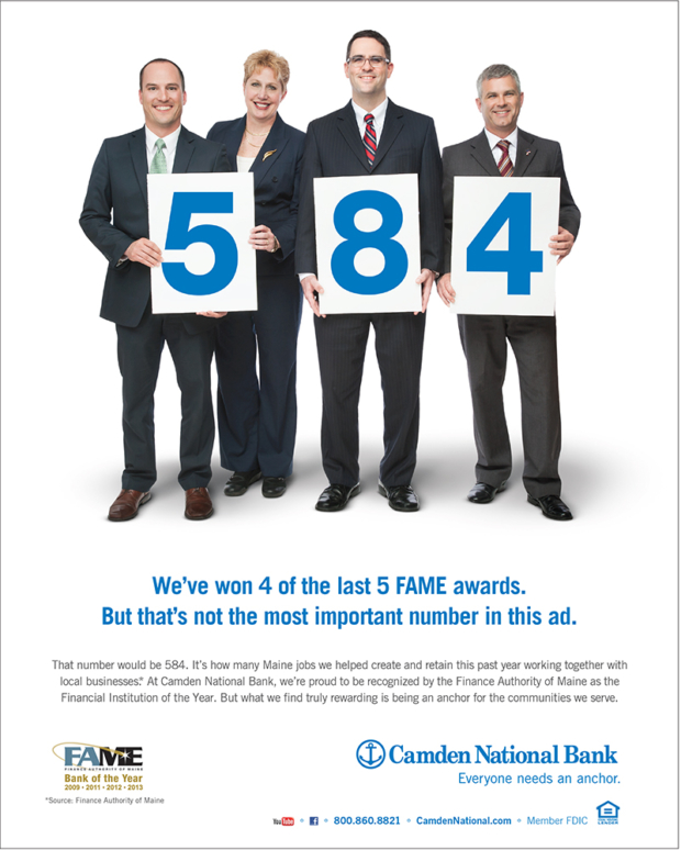
It’s been my pleasure to be involved with Camden National Bank’s advertising campaign this year.  The first image was taken in the middle of the Bangor Mall (as a journalist they’d have never let me inside that place with a camera, but for this assignment I was packing lots of lights and it was smooth sailing).
CNB_MainelyEyes
The second was taken right in my Portland photo studio.  I’m sure the bankers weren’t accustomed to so much camera time, but they were good sports.   The Josh and Charlie at Kemp Goldberg did a fantastic job managing the whole process, too. 
CNB_FAME


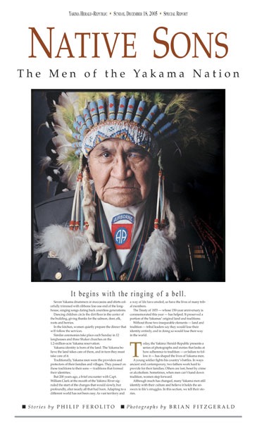
Native Sons

nativesons-1


Back in the early part of the 2000s, I was chief photographer of the Yakima (Wash.) Herald-Republic, a Seattle Times Company newspaper centrally located in the part of Washington State Seattlites refer to as “the Dry Side”, among other things.

Yakima derived its name from its nearest neighbor—the sprawling reservation of the Confederated Tribes and Bands of the Yakama Nation.    Comprised of 14 separate Columbia River tribes, the Yakamas now occupy a 2,185-square-mile sized territory that includes a portion of nearby Pahto (12,281-foot-tall Mt. Adams).

Growing up in Northern Arizona, I’ve always lived around and interacted with Native Americans.  My first reporting job out of college was to cover the Yavapai-Apache in Arizona’s Verde Valley.   When I moved to Yakima, years later, I was eager to explore the Yakamas.   A proud people, the Yakamas still live on a portion of the ancestral lands and practice their hunting, gathering and fishing traditions as best they can.   They fought the US Army in the 1800s until a federal treaty recognizing their rights was signed.  They fought many battles in federal court since, with precent-setting law the result.

For much of five years I met with interviewed and photographed many Yakama tribal members, and met many new friends along the way.  One of the results was a project with writer Phil Ferolito, published as a special newspaper section, called “Native Sons:  The Men of the Yakama Nation”.    As best we could, we attempted to show the unique struggles, challenges and triumphs of different generations of Yakama men and their families.    I’m proud of what we were able to do, but so much more could have been done to promote understanding and appreciation of Yakama, and native, culture and life realities.  See the pages of the published project below.

[photoshelter-gallery g_id=”G0000ZjGbOe9GddU” g_name=”Native-Sons-Project” width=”1000″ f_fullscreen=”t” bgtrans=”t” pho_credit=”iptc” twoup=”f” f_bbar=”t” f_bbarbig=”f” fsvis=”f” f_show_caption=”t” crop=”f” f_enable_embed_btn=”t” f_htmllinks=”t” f_l=”t” f_send_to_friend_btn=”f” f_show_slidenum=”t” f_topbar=”f” f_show_watermark=”t” img_title=”casc” linkdest=”c” trans=”xfade” target=”_self” tbs=”5000″ f_link=”t” f_smooth=”f” f_mtrx=”t” f_ap=”t” f_up=”f” height=”800″ btype=”old” bcolor=”#CCCCCC” ]


Just Published: Pop Photo + Roller Derby Dolls

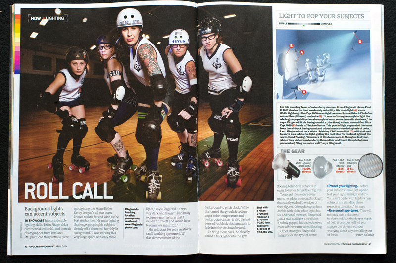
This is pretty fun—this month’s issue of Popular Photography Magazine features a two-page spread of my image of a Portland, Maine roller derby team in their regular “How * Lighting” feature. It’s a simple lighting setup that is extremely effective in creating a sense of drama. In a word, perfect for a subject like the roller derby dolls.

PopPhoto_RollerDerby_WEB

Everyday Heroes


[photoshelter-gallery g_id=”G0000xBUwjF4Y64U” g_name=”Firefighters-Calendar” f_show_caption=”t” f_show_slidenum=”t” img_title=”casc” pho_credit=”iptc” f_link=”t” f_enable_embed_btn=”t” f_send_to_friend_btn=”t” f_fullscreen=”t” f_show_watermark=”t” f_htmllinks=”t” f_mtrx=”t” fsvis=”f” width=”800″ height=”500″ bgcolor=”#AAAAAA” btype=”old” bcolor=”#CCCCCC” crop=”f” twoup=”t” trans=”xfade” tbs=”8000″ f_ap=”t” bgtrans=”f” linkdest=”c” f_constrain=”f” f_topbar=”f” f_bbar=”f” f_bbarbig=”” f_smooth=”f” f_up=”f” target=”_self” ]


I’m very excited to finally be able to share one of the coolest projects I am grateful to have worked on this year. It’s a project that combined both my interests and my skills and best of all….it benefits a great and worthy cause.

The Cause
The Fight for Air Climb is a fundraising effort that benefits the American Lung Association.    Firefighters and others from around the country participate in these ‘climbs’, in which entrants are timed on their ascent of a skyscraper or other high structure.   The Firefighter Challenge pits teams of firefighters against one another, each vying for the best time, the most money raised (and bragging rights).   Unlike other competitors, firefighters are required to wear their full gear—turnouts, helmets, gloves, boots and oxygen tanks.   In the process, these teams raise big money for ALA research and advocacy.


The Project
In 2013, a 12-member team from Auburn, Maine climbed 41 floors (82 flights) during the Boston Fight For Air Climb (each wearing more than 50 pounds of additional weight)  and crushed the other 40 firefighter teams from around New England.   On the heels of their success, this year the team set the goal of raising $10,000 for the charity.  They decided to do a charity calendar, and earlier this year approached me and asked for my help (Hint: I said yes).


The Concept
I first met with Team Captain Dan Masselli to discuss several concepts for the project.   I think he was a bit nervous, thinking that I might propose doing a “beefcake” style shoot with half-naked and oiled firefighters.   I’d done some research and found plenty of examples of such calendars done by other departments, that varied from high-production fashion shoots to glorified ‘selfies’ printed on what looked like a mimeograph machine.   What I didn’t see was much in the way of a unified conceptual approach that told a story of the team and showed the kind of personality that I knew would resonate better with the community.
Dan and the team loved my initial ideas, which led to the “Everyday Heroes” concept.    While firefighters are often portrayed as heroes, 90 (maybe even 95) per cent of the time they aren’t actually doing impossibly heroic things like pulling people from mangled cars, manning hoses at  high-rise apartment blazes or giving oxygen to a kitten.   Most of the time, their heroics are of a decidedly mundane nature: changing a baby’s diaper, putting out a smoking BBQ grill or mowing a senior’s lawn.  We’d show that stuff….just in full turn-out gear, of course.


The Challenge
As a photographer there were some obvious–and not so obvious–challenges to overcome. One was how to create 12 different conceptual images on location—each requiring lighting and planning, props and ‘models’—and to make it all happen within their tight deadlines.  The other was how to make the scenarios both realistic and over-the-top at the same time, all the while contending with logistical challenges like the weather.
We eventually photographed everything over the course of three jam-packed days in October.   Each shoot was planned down to the detail,  but with plenty of flexibility in the case of last-minute changes to plan.   It was a good thing we did.
The final image we made—of the entire team, standing in front of their firetrucks—is dramatic and one of my favorites from the whole shoot.  It also almost didn’t happen.   We originally planned to photograph the team just after sunset in front of the city’s ”burn building’—a concrete structure behind the Central Fire Station that the firefighters fill with smoke and use for training. When the time came, the burn building wasn’t available. So we ended up at at a different station entirely.   One of the trucks we needed was missing, and when the firefighters went to retrieve it, they were diverted to take an emergency call.    With daylight burning, we were out a second truck and half our firefighters.  Nervously we waited, prepping our gear and going over various other scenarios for how to salvage the shoot.  Three minutes after the sun disappeared, the truck rolled back in, we positioned it, set up our smoke and lights, arranged the group and shot 69 images, including the tests. The one that we used was taken at 6:18 pm.


The Result
As fun (and sometimes nerve-wracking) as the shooting days were, I am very happy with the final results.  I’m most gratified that they capture the personality of the Auburn team, and that they show them as what they are—a bunch of hard-working, good-natured guys who do a lot besides save lives and property.    The calendars are printed and are available for sale—primarily at locations around Auburn, but I’m told that if you email Dan Masselli he can help you to trade $15 for your very own copy, delivered to your home.     It’s a great cause, and certainly worth the price of three coffees.


The Video
Charlie Widdis, assistant extraordinairre, put together a short behind-the-scenes video of the project as well—it’s especially impressive knowing that he did that in between helping me set up and shoot my stills.  I hope you like it!

Why photographers ask so many darned questions

A lot of what I do these days is destined for web-only use.   It seems as though print use is getting less and less, but I like to think of it another way…that print is used when it really matters, and thus the quality of what’s printed—and the images needed for those pieces—is comensurately better.   Less, but more.

I like to get involved in these projects early on, or as early as possible.  It can be challenging to come in as a photographer once the design has been set by a web team, and then to have to create images that will safely fit into an ultra-cool horizontal web page slider that is 900 pixels wide and (it seems) 2 pixels deep.   Of course, that’s when you find out the client wants to shoot full-body portraits, too.

That said, I firmly believe my job as a photographer is to provide solutions—practical, useful and hopefully creatively fulfilling—no matter what stage of the process I’m called in on.   It’s never too late to bring some value to my clients even if the train has not only left the station, but is set to arrive in five minutes.

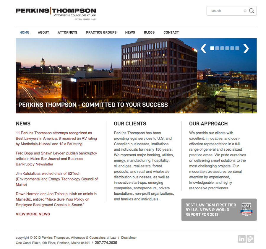
So when local law firm Perkins Thompson wanted to create a variety of team photos for their already-templated site, it was necessary not only to work with their chosen design (fortunately, not 2 pixels tall), but to understand what uses they might have beyond the site.   That’s why photographers should and do ask clients a lot of questions about potential future uses of images.  I found that they wanted the images for a variety of print ads and other collateral, even though the initial use was for a (very) horizontal web page display.  So, the images needed to be flexible enough, in terms of composition, to work for both.

Add to the mix that they have far-flung attorneys who had to be merged into photos together, and it became a logistic challenge.

Here are a few screenshots from their new site–I’m happy with the interaction and group photos we got.   All were shoot loose enough to work in print pieces and ads, but with heads and head sizes in a relative horizontal line so they could be used for web ads.  Doing so cut down on the chance that my client will have to call me in a year asking for a Photoshop miracle, like turning a head-and-shoulders image into a full-body portrait.

To their credit, Perkins T were great to work with and very patient (candidly, I also love that they were founded by a guy named Widgery “Whisker Bill” Thomas).   I’m happy with the results, which feature their teams in a dynamic way that works for them.
Perkins_Thompson_Web_01 Perkins_Thompson_Web_02 Perkins_Thompson_Web_03


It’s the story, stupid

Telling Stories: Jim Twombly

You’ve heard of the acronym, ‘KISS’, right?  It stands for ‘Keep it Simple, Stupid.’   It’s mantra that software engineers, among others, use to keep them on track during development to guard against product bloat.  I keep a similar line in my head when I’m approaching an assignment:  It’s the Story, Stupid.

Now, maybe you’re one of those rare photographers who can always stay focused and zeroed in on your work, but me—I get distracted.  I’ve been known to set up a bunch of lights in a daisy-chain, lighting up God Knows What just because I could. This is a photographer version of tunnel vision, and it makes you a slave to a concept rather than what you should be:  flexible, in the driver’s seat,  and  asking yourself the kinds of questions that lead to images that truly tell the story you’re trying to show.

On an assignment, lots of things are going on:  you’re interacting with clients or subjects, fiddling with your gear (why won’t that PocketWizard remote fire??), keeping an eye on the clock and the shot list, managing your assistant or team.  It doesn’t matter.  You always have to be aware of why you’re there and what story you’re there to tell.

It’s that awareness that leads you from the image you (by necessity) planned for to the one that Serendipity bestowed upon you that works much better.

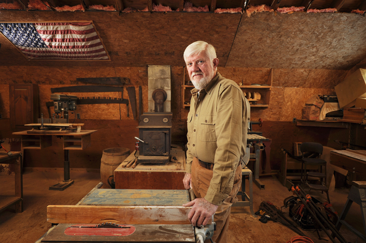
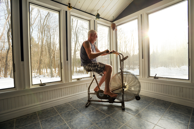
Recently I photographed Jim Twombly, a retired Portland police officer, at his home for a story featuring patients of a large medical practice group.   Jim was diagnosed a couple of years ago with diabetes and was facing a slew of health issues.  He worked with his doctor to completely change his lifestyle.   As a result of eating healthy and exercising regularly, Jim dropped more than 50 pounds and is stronger and healthier than he’s been in years.     I was there to photograph Jim as he did his morning routine—exercise followed by an oatmeal breakfast.   During my earlier scouting visit, we had decided to move his starionary bike to the more visual solarium he had built onto his home.   Early in the morning, as the sun was coming up, it would make a great visual.

Telling Stories:  Jim Twombly

And it was.  The only problem is that, devoid of the usual clutter, it made the solarium look a little bit sterile.   After photographing Jim in his home, I asked to go photograph him in the workshop above his barn.   Once we stepped into the sawdust-infused atmosphere, stacked with woodworking tools, Jim seemed to relax.   This was his element, clearly.   I set up a couple of lights but wanted to keep the portrait low-key, focused on Jim in his world.    We chatted a little, Jim settled into a comfortable position, and the image at the top of this post was made.   Once I took it, I knew it was my favorite image because it told more of a story about who Jim really is–a hard-working guy, a Mainer, a craftsman.  A guy who is tough enough to stick to a complete revamp of his lifelong eating habits because it just needed to be done.

Good on you, Jim. For more about Jim’s story, check out his feature on InterMed’s website.

Showcase: Jacquelyn, Actress Headshot


Maine Actor Actress Headshot

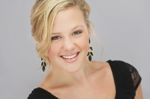
This is a photo of Jacquelyn, an aspiring actress from Maine.  Amazingly, she’s only 16…but had the poise and polish of someone much older.  After working with her for just a few minutes, Jacquelyn got it.  She pulled off a variety of different looks with ease.  If  I were a betting man, I’d say she has a great acting future ahead of her.