Category Showcase

Might & Main: how a brand feels

Might-Main_02


Might & Main is a branding firm based here in Portland–they do fantastic work and cast big shadows on the local creative scene.  They’re the team that you call in to do a rebranding, or to handle the look and feel of a product or campaign.  They’ve also got a great sense of style that infuses their work–take a look at this award-winning work for the Portland Museum of Art’s Homer Winslow exhibition (I want that bobblehead, Sean).

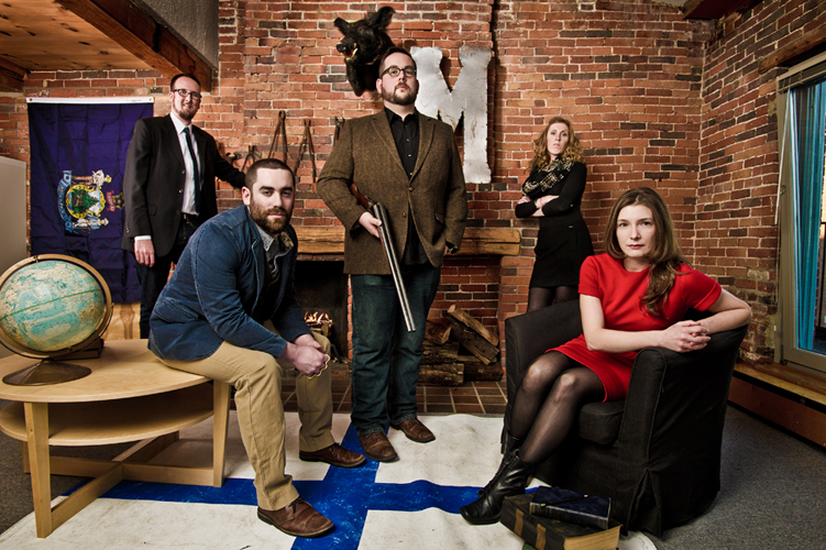
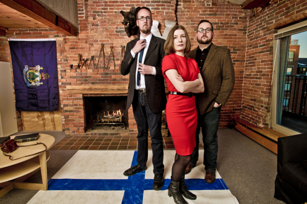
More than that, Kevin, Sean and Arielle (the principals behind M&M) are great people who always seem to be up to something interesting.   The trio,  along with team members Graeme and Morgan, moved to a new downtown Portland location in January and wanted a photo that showed them off in their new environment.  They didn’t dictate the look of the photo, but we discussed what the image should do for them:  it should give a sense of each individual person (all three principals had successful solo businesses before partnering, and all three bring different skills to the table), but show them as a team as well.  It should be interesting and striking, incorporating key elements of their new space and their quirky retro decor (Boris the Boar has made one other appearance, in an Inspire Portland feature on Sean from last year).  These guys are young, very hip and are extremely creative, so I knew I wanted to show these attributes as well.

Might-Main_03
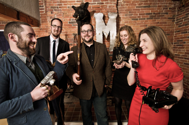
When you strip away all the fluff–the globe, the -um- shotgun, even the lights–it’s all about the people.   Might & Main is comprised of interesting people, and I wanted to give a sense that they bring a strong point of view, a certain touch of humor and, yes, a little attitude.   To that end, I think the shoot was successful.   The final frame we all liked shows plenty of attitude.  If you look at each person’s face there’s something interesting going on.  Someone once told me that successful photos don’t give you all the answers, but make you wonder a bit, too.  Add on the lighting, the props and the “look” of the final image and you get an image that tells a story…and captures the “feel” of a brand.

There’s always room for serendipity, too.  Although I gave a few pointers on dress, I could have hugged Arielle when she showed up in that bright red dress.   How could I not get a great final image?

Might & Main: Behind the brand

Case Study – Financial Services firm portraits

When a company decides to embark upon a rebranding initiative they often hire an agency, a designer or a photographer to help them.   There are a lot of ‘triggers’ for when a company decides to do take this critical step forward.  It often happens when the company is in transition, whether physical or something more existential—a move to a new location, a major renovation, a period of great growth.

Spinnaker Trust is a Portland-based company providing wealth and finance management services.  Recently they grew with the merger with another firm, and moved into a really knock-out new space downtown.  To showcase their dynamic new space and their growth, they needed environmental portraits of their team members within their amazing offices—lots of frosted glass, hardwood flooring and deep blue walls.

I spoke with the team about their needs, and decided to go with a more dramatic approach to lighting.  With lighting you can go one of two ways.  Light ‘big’, and just create a wall of light so that everything’s bright, well-lit and very commercial-looking (see any national-level  advertisement) or light ‘small’, or selectively, throwing light just where you need it to create dimensionality, mood, and highlight aspects of the environment. Spinnaker was perfect for the latter.

I used three to four lights for most of the portraits—with all of the glass around, the lighting was tightly controlled to avoid reflections.  We did multiple scenarios with each person in a relatively limited period of time—in my shoots, I tend to move fast:  15 minutes being a long time to spend on any one portrait.

I was happy with the results:  professional but dramatic, with the environment a key feature of each image.   A big shout-out to the team at iBec Creative, who designed this clean and beautiful website.

Fitzgerald_Photo_Spinnaker_01


Spinnaker_Trust_iBec


Care without compromise

This past week marked the launch of one of the coolest sites I’ve seen in a long time.   The new InterMed website also happens to be locally designed, by Kemp Goldberg Partners, with original photography taken over the course of the past six months or so.    Beginning back in the fall of 2011, I was fortunate to work with KG’s talented crew to make it all happen.

The approach the KG team took was to photograph the doctors and other medical staff in a very casual, environmental style that both made them feel comfortable and allowed for personalities to come through.   These portraits are accompanied by a bio written by each person.  The result is warm, personal and compelling.   It was great working with each of these people, who had to endure my pleas for ‘just one more shot.’    The visual centerpiece of the site are the images of doctors and staff interacting with each other and with patients, along with views highlighting the beautiful Marginal Way InterMed building.   The first thing a visitor to the site sees are documentary shots of patients and their families whose lives have been impacted in positive ways by their InterMed doctors.  Shot in the moment, these vignettes illustrate well the InterMed creed, “Care without compromise”.


Moment + Light

Warren Smarlowit, 47, holds onto photos and other mementos that remind him of his family, including a nephew's athletic letter from the Yakama Nation Tribal School.

For me, photography boils down to two key elements: moment and light. You may have one in greater proportion to the other, but for most types of photography—certainly any imagery with people—you need both.

I used this criteria as a newspaper photo editor when judging daily work and the many portfolios that came across my desk.

You kinda know a “real” moment when you see one. It’s a look, an expression, or an interaction. Usually from the viewer’s perspective, it looks like you’re viewing a private scene, voyeur-style, and the subject appears totally unaware of the camera.

As a photojournalist, real moments are mostly found situations. In feature situations, the goal is to shoot photos (usually with a long lens) before the subject really becomes aware of your presence. You get something ‘real’ of the subject doing something interesting and later you deal with getting their permission and name to actually use the photos. In news situations, such as fires, accidents or events, the subjects are usually so focused on the happenings that getting moments is pretty easy, giving you time to work on composition and light too.

At the newspaper, moment trumped light any day of the week and twice on sundays. Robert Capa’s grainy, ghostly images of the landing at D-Day fails from a purely technical standpoint but no one would argue that the moment it captures place this work among history’s finest.

As a commercial and advertising photographer, my subjects are (mostly) aware of what I do. They are paying me to be there, or my clients are paying them to be there. It’s me, them and bunch of obtrusive lighting equipment, so the goal is to get the subjects to relax and give me something real despite the unreal surroundings. When successful I get a true serendipitous moment—a peice of chaos that I thankfully can not, and don’t want to, control—in the midst of a controlled setting.

The only difference between editorial and commercial photography in this regard is that non-editorial shooters have the luxury of not having to wait for the perfect light. Regardless, being attuned to capturing the authentic moment will help turn otherwise ordinary photos into memorable images.

That’s still theway I approach the debate between moment and light. Make sure you have a strong moment, and then work on the light.