Category On Assignment

Native Sons

nativesons-1


Back in the early part of the 2000s, I was chief photographer of the Yakima (Wash.) Herald-Republic, a Seattle Times Company newspaper centrally located in the part of Washington State Seattlites refer to as “the Dry Side”, among other things.

Yakima derived its name from its nearest neighbor—the sprawling reservation of the Confederated Tribes and Bands of the Yakama Nation.    Comprised of 14 separate Columbia River tribes, the Yakamas now occupy a 2,185-square-mile sized territory that includes a portion of nearby Pahto (12,281-foot-tall Mt. Adams).

Growing up in Northern Arizona, I’ve always lived around and interacted with Native Americans.  My first reporting job out of college was to cover the Yavapai-Apache in Arizona’s Verde Valley.   When I moved to Yakima, years later, I was eager to explore the Yakamas.   A proud people, the Yakamas still live on a portion of the ancestral lands and practice their hunting, gathering and fishing traditions as best they can.   They fought the US Army in the 1800s until a federal treaty recognizing their rights was signed.  They fought many battles in federal court since, with precent-setting law the result.

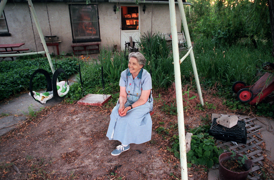
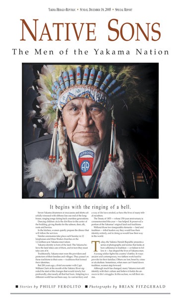
For much of five years I met with interviewed and photographed many Yakama tribal members, and met many new friends along the way.  One of the results was a project with writer Phil Ferolito, published as a special newspaper section, called “Native Sons:  The Men of the Yakama Nation”.    As best we could, we attempted to show the unique struggles, challenges and triumphs of different generations of Yakama men and their families.    I’m proud of what we were able to do, but so much more could have been done to promote understanding and appreciation of Yakama, and native, culture and life realities.  See the pages of the published project below.

[photoshelter-gallery g_id=”G0000ZjGbOe9GddU” g_name=”Native-Sons-Project” width=”1000″ f_fullscreen=”t” bgtrans=”t” pho_credit=”iptc” twoup=”f” f_bbar=”t” f_bbarbig=”f” fsvis=”f” f_show_caption=”t” crop=”f” f_enable_embed_btn=”t” f_htmllinks=”t” f_l=”t” f_send_to_friend_btn=”f” f_show_slidenum=”t” f_topbar=”f” f_show_watermark=”t” img_title=”casc” linkdest=”c” trans=”xfade” target=”_self” tbs=”5000″ f_link=”t” f_smooth=”f” f_mtrx=”t” f_ap=”t” f_up=”f” height=”800″ btype=”old” bcolor=”#CCCCCC” ]



Storytelling for John T. Gorman Foundation

One of my favorite projects this past year was working with the John T. Gorman Foundation here in Portland.  This unassuming group directs their resources to many significant non-profits statewide, from early childhood education to homeless teens and more.  Especially at a time when the state has cut its funding back of such groups, private foundations like JTG have become even more important. 

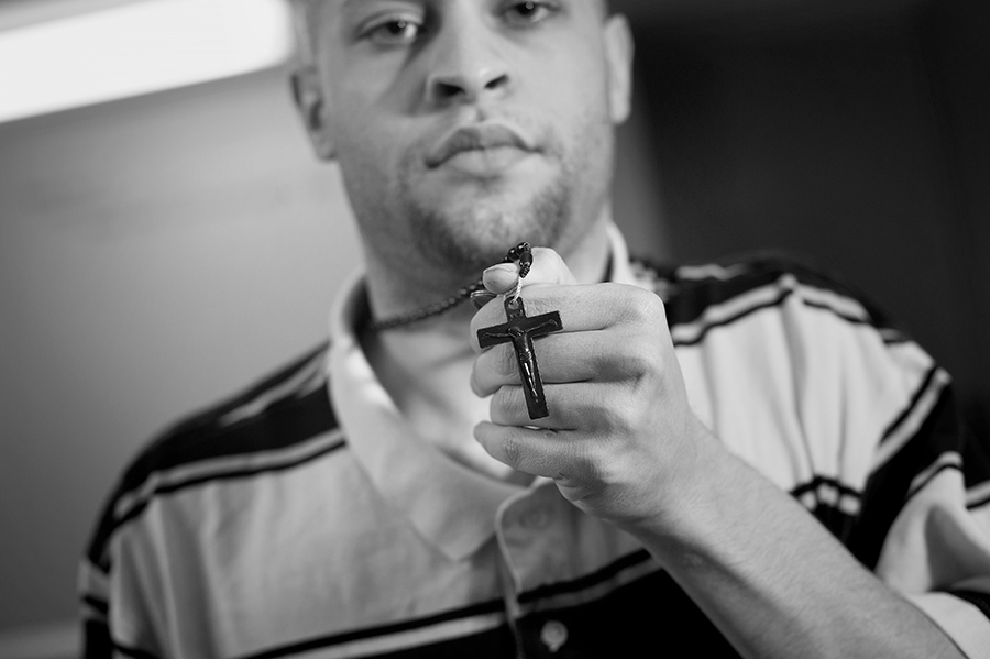
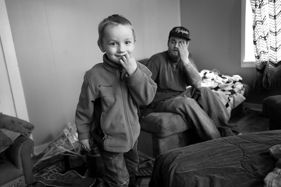
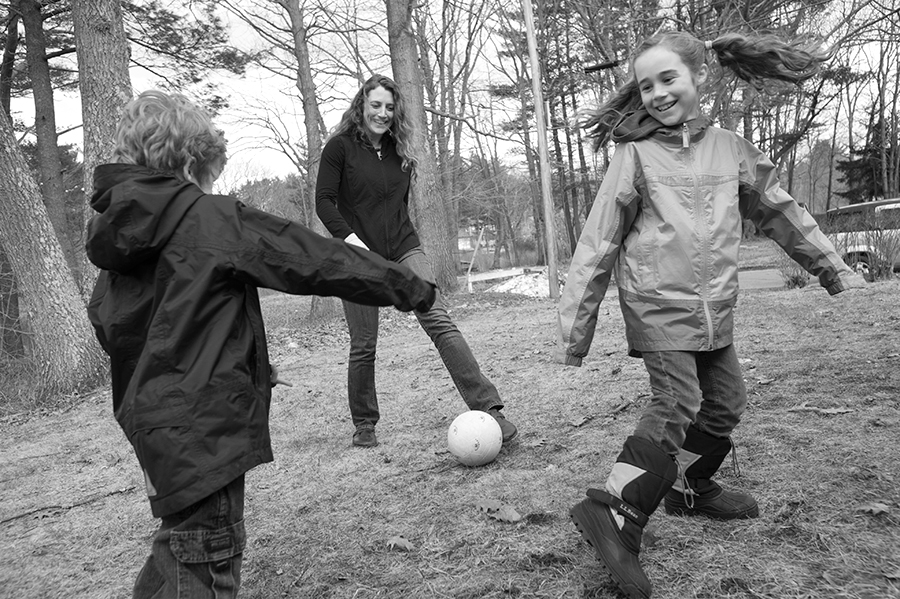
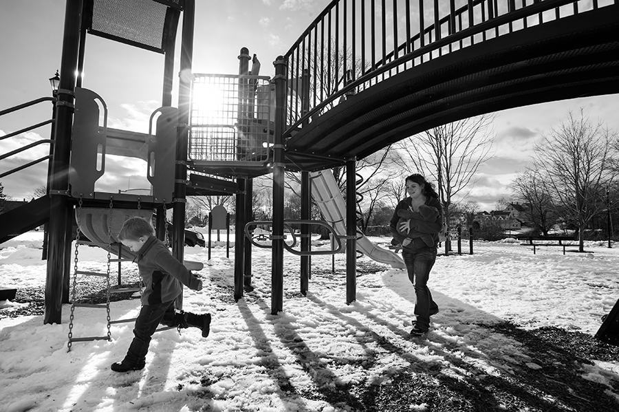
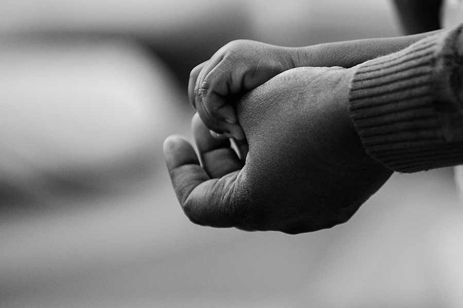
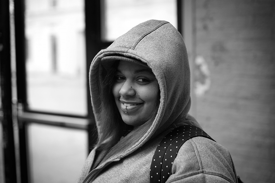
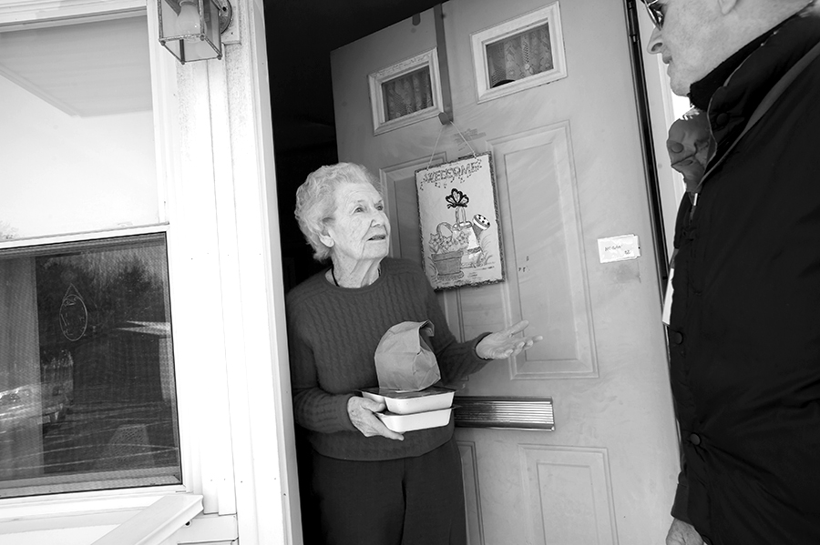
My assignment was to document the people and faces of some of their supported programs, and to show the human impact of what they do.    Over the course of a month and a half, I created a series of images that tell the story of what JTG does by showing the lives of those impacted by their efforts. I was given wide discretion over what I photographed, and focused on populations served by the foundation, among them single mothers, early childhood education and teens.  Here’s a sampling of my favorites.

Enjoy!

JTG_01_BW

JTG_02_BW

JTG_03_BW

JTG_04_BW

JTG_06_BW

JTG_07_BW

JTG_08_BW

JTG_09_BW

Limit yourself—and become a better photographer

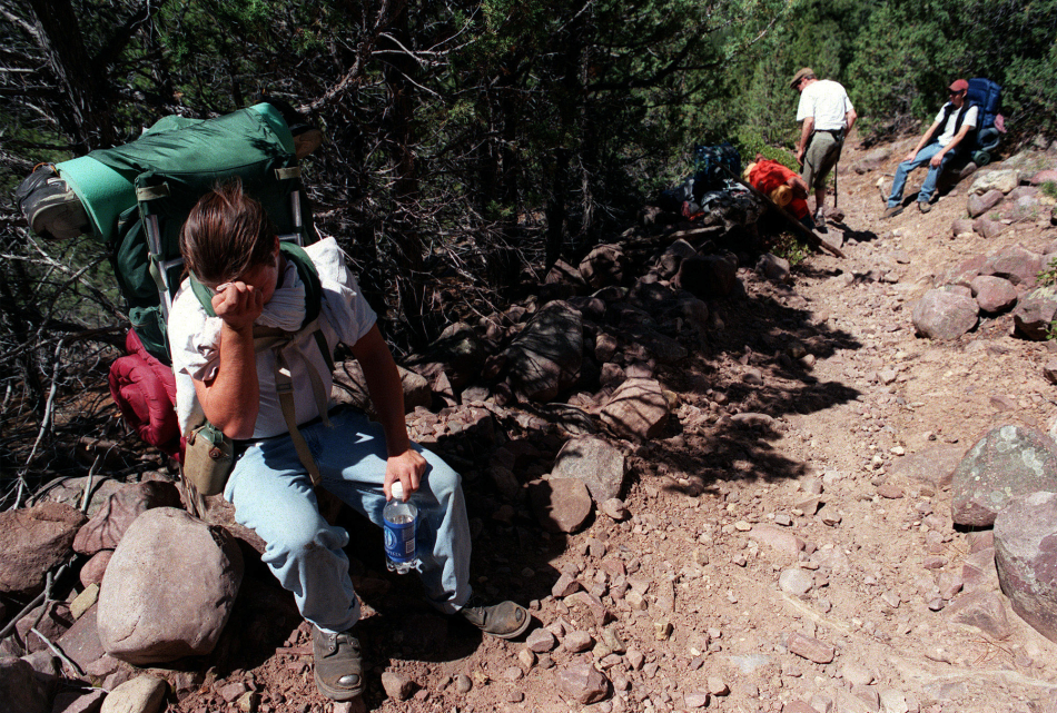
I suspected things might end badly when Garin’s pickup ran over a Gila Monster.   Then again, I always figured that my week-long trip photographing a ‘tough-love’ camp for teens was going to contain some ups and downs.   We were reporting on one of those organizations that parents bundle their troubled teens off to, figuring that six weeks spent sleeping and hiking in the middle of a southwest desert can reach them in ways they haven’t been able to.  They aren’t usually wrong.

I pitched the story and a writer,  Garin, was assigned.   We would be backpacking and living with the kids for almost a week, at least 50 miles from the nearest town in the middle of Arizona’s Tonto National Forest.    We had to pack in water, and weight was an issue.  Due to the lack of ability to recharge my digital cameras, I shot with a reduced kit:   two Nikon film bodies, three lenses and a flash.   A couple of hours into our hike towards the first night’s camp, I forded a river, slipped on a rock and went down hard.  I emerged from the waters with my primary camera body soaked, the electronics fried.  My 80-200 mm lens dripped water, the front element smashed on the same slippery rock.

There I was, miles from anything, down to one film body (a Nikon FM2) and two lenses—a 24 mm f2 and a 35-70 f2.8.     I had approximately 5.5 days of our six-day trek left.    And I was sweating.

That trip was when I learned a fundamental truth:  that limitations can be a great thing.    Freed of the need to switch camera bodies, and forced to use a wide-angle and a medium telephoto lens, I adapted.  I spent time with each lens and worked them.  I got in close when before I might have stayed at a distance.  I didn’t worry about the shots I couldn’t get and focused on the types of shots I could.    In the end, I left at the end of the week with a set of images I was very happy with, and the sense that I had learned something important.

Why is this pertinent?   Because today it’s all about choice.    As a photographer, I’m always tempted to buy the newest gear or learn the latest technique, but I know that sometimes imposing limitations on myself makes me a stronger shooter.   Instead of taking all of my lenses to an assignment, I might force myself to shoot with just my 50mm lens.   I might forego the larger studio lights I typically use and instead shoot with speedlights or just a large window and a silver reflector.   It’s very, very easy to get distracted from the actual story that you’re trying to tell.   Too many gear choices, and too many possible locations tend to muddy the waters, sapping your energy and leaving you with weak images.   Better to commit to a couple of visual situations, and to a limited selection of gear, and then spend your time actually thinking while you photograph.


[photoshelter-gallery g_id=”G0000zDe80j3C3xc” g_name=”Anasazi-Teen-Camp” f_show_caption=”t” f_show_slidenum=”t” img_title=”casc” pho_credit=”iptc” f_link=”t” f_enable_embed_btn=”t” f_send_to_friend_btn=”t” f_fullscreen=”t” f_topbar=”t” f_bbar=”t” f_htmllinks=”t” f_mtrx=”t” fsvis=”f” width=”800″ height=”600″ bgcolor=”#AAAAAA” btype=”old” bcolor=”#CCCCCC” crop=”f” twoup=”t” trans=”xfade” tbs=”5000″ f_ap=”t” bgtrans=”f” linkdest=”c” f_constrain=”f” f_bbarbig=”” f_show_watermark=”f” f_smooth=”f” f_up=”f” target=”_self” wmds=”llQ6QNgpeC.p1Ucz7U.Y67rsXMpK3GqAqM9VGWvEGejM7KK78fXDZGLxaEev6fLBWle7OA–” ]


Stories from the past: John and Zelda Robertson

Over my career as a photojournalist I’ve met some amazing people and been fortunate enough to photograph incredible events. When I reflect on the stories I’ve done, however, one really stands out: the story of John Robertson. I’m revisiting his story because I think John and his wife, Zelda, have a story that’s worth telling even today, more than a decade later.

At that time I was photo editor at the Provo (Utah) Daily Herald newspaper, a scrappy 30,000 circulation daily newspaper situated in what truly must be one of the most beautiful places in the world. In between the Pet of the Week and the required weekly commercial construction feature photo (titled, of course, ‘What’s up!”), the four of us staff photographers were constantly on the lookout for meatier fare: long-term photo documentary projects. While our daily diet of spot news and features and sports kept us busy and shooting, the photo projects we started (and did largely on our own time) stoked our souls and fed our passion. I’ve worked for larger newspapers in my career, but a 30,000-circ. paper has about the right combination of resources and autonomy to allow motivated photographers to do great project work.

Often these projects would grow out of daily stories that we connected to and felt there were more visual potential in. That’s how I met John Robertson. Our health reporter, Ann Potempa, was doing a story on hospice care in Provo. The story centered on an in-patient hospice facility, with patients having six months or less to live. I met a hospice nurse named Kit who visited patients not just at the center but at their homes. As I learned more, I knew that I wanted to explore the idea of terminally-ill patients who decide to live life on their own terms, often in their own homes. Kit introduced me to the work of Dr. Ira Byock, a leading figure in hospice and palliative care. Ultimately, she introduced me to John Robertson, 72, and his wife Zelda.

On the surface of things, John’s story is about hospice care and the comfort it can provide during the final months, days and hours. For me, John’s story is about living—and then dying—well.

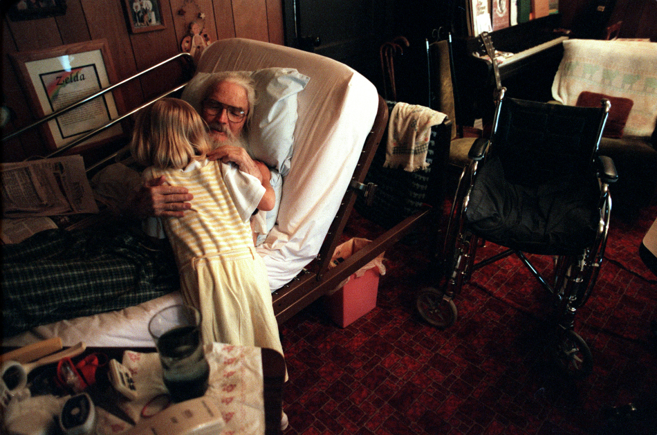
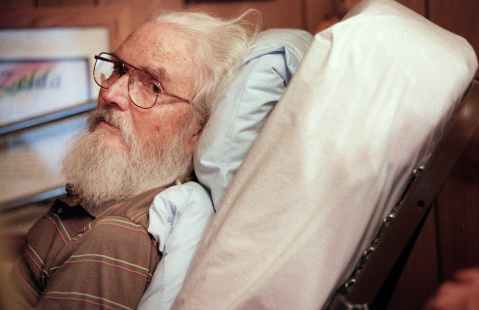
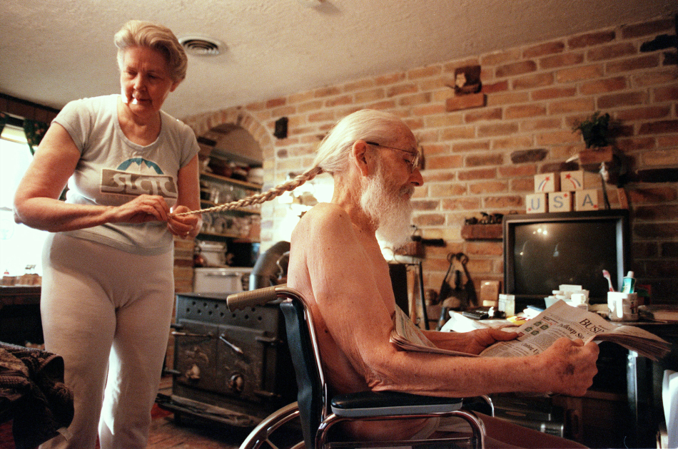
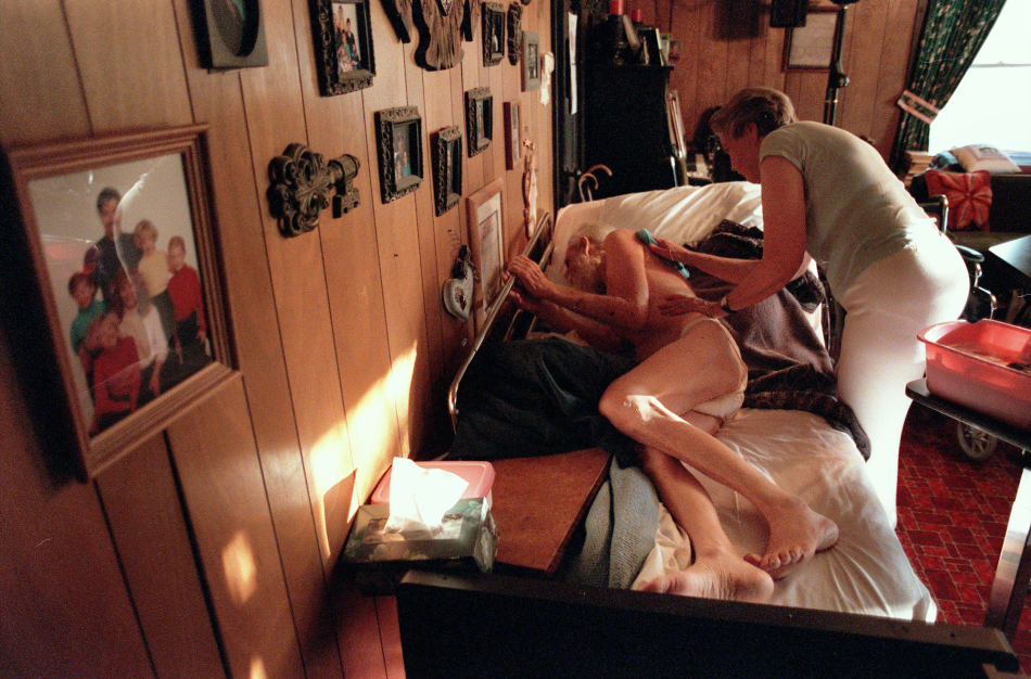
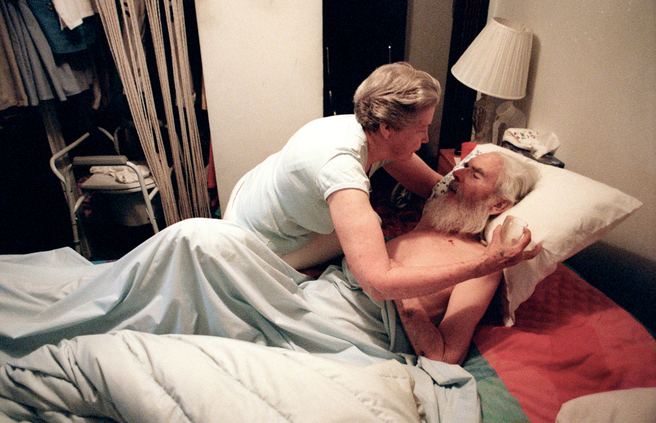
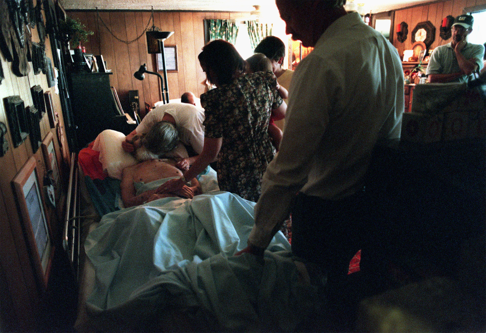
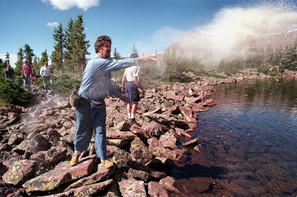
I met with John and Zelda and the first thing I noticed about this former school teacher was the long braid of hair running down his back. The elderly couple both ran marathons until John was diagnosed with cancer. After a long battle, he was placed on hospice, and true to his independent spirit had no intention of dying anywhere but at his home. I explained to them that I wanted to document their hospice journey. Amazingly, they agreed, but with one caveat—John wanted to hide nothing, and wanted me to be there for everything—the towel baths, the emotional visits with their many children and grandchildren, and ultimately, his final breaths as he lay on a hospital bed in his living room surrounded by family. The graciousness of the entire family to me, and their grace throughout what was obviously a painful journey was awe-inspiring. A month after John passed, his adult children invited me to hike to his favorite fishing lake deep in the Uinta primitive wilderness area in Northern Utah. We hiked in, camped, and the next morning committed his ashes to the winds and water. Much like they had been able to do during the period of hospice care, each of his children were able to spend a moment alone with John and say their goodbyes. Humbled by it all, I photographed as little as I needed to.

In all, the series ran in six weekly parts. The newspaper got some criticism for showing images such sensitive images of John, but mostly the reaction was positive. Frankly, hospice is an easy sell—the idea that one can die well, even in comfort, and on their own terms—is an attractive one. The Robertson family was thankful for the coverage, though I always knew they’d given far more to me than I to them. I think from the pictures below, it’s possible to see John and Zelda as the people they really were—not victims, but strong and courageous people.

Note: all photos courtesy of the Provo Daily Herald.


7-Robertson_Grandchild


1-John_Robertson


3-Robertson_Braid


2-Robertson_Bath


6-Zelda


8-Zelda-Healing


8-Robertson_withFamily


9-Robertson_Memorial


10-Robertson_Hike


11-Robertson_Ashes

Everyday Heroes


[photoshelter-gallery g_id=”G0000xBUwjF4Y64U” g_name=”Firefighters-Calendar” f_show_caption=”t” f_show_slidenum=”t” img_title=”casc” pho_credit=”iptc” f_link=”t” f_enable_embed_btn=”t” f_send_to_friend_btn=”t” f_fullscreen=”t” f_show_watermark=”t” f_htmllinks=”t” f_mtrx=”t” fsvis=”f” width=”800″ height=”500″ bgcolor=”#AAAAAA” btype=”old” bcolor=”#CCCCCC” crop=”f” twoup=”t” trans=”xfade” tbs=”8000″ f_ap=”t” bgtrans=”f” linkdest=”c” f_constrain=”f” f_topbar=”f” f_bbar=”f” f_bbarbig=”” f_smooth=”f” f_up=”f” target=”_self” ]


I’m very excited to finally be able to share one of the coolest projects I am grateful to have worked on this year. It’s a project that combined both my interests and my skills and best of all….it benefits a great and worthy cause.

The Cause
The Fight for Air Climb is a fundraising effort that benefits the American Lung Association.    Firefighters and others from around the country participate in these ‘climbs’, in which entrants are timed on their ascent of a skyscraper or other high structure.   The Firefighter Challenge pits teams of firefighters against one another, each vying for the best time, the most money raised (and bragging rights).   Unlike other competitors, firefighters are required to wear their full gear—turnouts, helmets, gloves, boots and oxygen tanks.   In the process, these teams raise big money for ALA research and advocacy.


The Project
In 2013, a 12-member team from Auburn, Maine climbed 41 floors (82 flights) during the Boston Fight For Air Climb (each wearing more than 50 pounds of additional weight)  and crushed the other 40 firefighter teams from around New England.   On the heels of their success, this year the team set the goal of raising $10,000 for the charity.  They decided to do a charity calendar, and earlier this year approached me and asked for my help (Hint: I said yes).


The Concept
I first met with Team Captain Dan Masselli to discuss several concepts for the project.   I think he was a bit nervous, thinking that I might propose doing a “beefcake” style shoot with half-naked and oiled firefighters.   I’d done some research and found plenty of examples of such calendars done by other departments, that varied from high-production fashion shoots to glorified ‘selfies’ printed on what looked like a mimeograph machine.   What I didn’t see was much in the way of a unified conceptual approach that told a story of the team and showed the kind of personality that I knew would resonate better with the community.
Dan and the team loved my initial ideas, which led to the “Everyday Heroes” concept.    While firefighters are often portrayed as heroes, 90 (maybe even 95) per cent of the time they aren’t actually doing impossibly heroic things like pulling people from mangled cars, manning hoses at  high-rise apartment blazes or giving oxygen to a kitten.   Most of the time, their heroics are of a decidedly mundane nature: changing a baby’s diaper, putting out a smoking BBQ grill or mowing a senior’s lawn.  We’d show that stuff….just in full turn-out gear, of course.


The Challenge
As a photographer there were some obvious–and not so obvious–challenges to overcome. One was how to create 12 different conceptual images on location—each requiring lighting and planning, props and ‘models’—and to make it all happen within their tight deadlines.  The other was how to make the scenarios both realistic and over-the-top at the same time, all the while contending with logistical challenges like the weather.
We eventually photographed everything over the course of three jam-packed days in October.   Each shoot was planned down to the detail,  but with plenty of flexibility in the case of last-minute changes to plan.   It was a good thing we did.
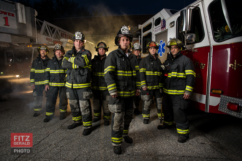
The final image we made—of the entire team, standing in front of their firetrucks—is dramatic and one of my favorites from the whole shoot.  It also almost didn’t happen.   We originally planned to photograph the team just after sunset in front of the city’s ”burn building’—a concrete structure behind the Central Fire Station that the firefighters fill with smoke and use for training. When the time came, the burn building wasn’t available. So we ended up at at a different station entirely.   One of the trucks we needed was missing, and when the firefighters went to retrieve it, they were diverted to take an emergency call.    With daylight burning, we were out a second truck and half our firefighters.  Nervously we waited, prepping our gear and going over various other scenarios for how to salvage the shoot.  Three minutes after the sun disappeared, the truck rolled back in, we positioned it, set up our smoke and lights, arranged the group and shot 69 images, including the tests. The one that we used was taken at 6:18 pm.


The Result
As fun (and sometimes nerve-wracking) as the shooting days were, I am very happy with the final results.  I’m most gratified that they capture the personality of the Auburn team, and that they show them as what they are—a bunch of hard-working, good-natured guys who do a lot besides save lives and property.    The calendars are printed and are available for sale—primarily at locations around Auburn, but I’m told that if you email Dan Masselli he can help you to trade $15 for your very own copy, delivered to your home.     It’s a great cause, and certainly worth the price of three coffees.


The Video
Charlie Widdis, assistant extraordinairre, put together a short behind-the-scenes video of the project as well—it’s especially impressive knowing that he did that in between helping me set up and shoot my stills.  I hope you like it!

Smoke and fire in Auburn

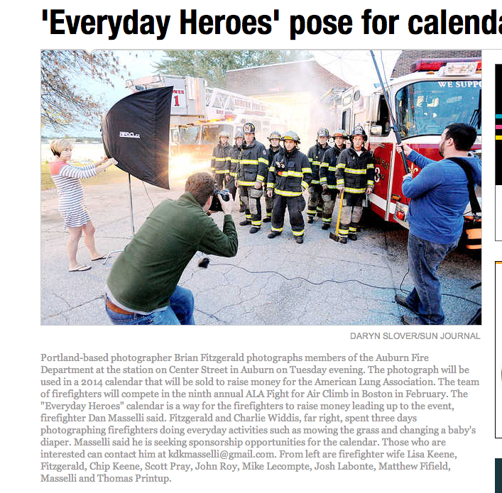
I’ve been busy lately, working on a somewhat hush-hush project in the Lewiston-Auburn area.   Last night as we finished the 12th and final shoot, the Lewiston Sun-Journal showed up and so the cat’s partially out of the bag.  Here’s Charlie and me at work in Daryn Slover’s photo from today’s Sun-Journal, ….followed by an outtake from that same shoot, just to show what it looks like in-camera with all of the smoke and lights. Once the everything is complete, I’ll post more images and explain how I approached this complicated (and extremely fun) project.:


Photo by Daryn Slover/Sun-Journal


FitzgeraldPhoto-Auburn_Fire_outtake_01

It’s the story, stupid

Telling Stories: Jim Twombly

You’ve heard of the acronym, ‘KISS’, right?  It stands for ‘Keep it Simple, Stupid.’   It’s mantra that software engineers, among others, use to keep them on track during development to guard against product bloat.  I keep a similar line in my head when I’m approaching an assignment:  It’s the Story, Stupid.

Now, maybe you’re one of those rare photographers who can always stay focused and zeroed in on your work, but me—I get distracted.  I’ve been known to set up a bunch of lights in a daisy-chain, lighting up God Knows What just because I could. This is a photographer version of tunnel vision, and it makes you a slave to a concept rather than what you should be:  flexible, in the driver’s seat,  and  asking yourself the kinds of questions that lead to images that truly tell the story you’re trying to show.

On an assignment, lots of things are going on:  you’re interacting with clients or subjects, fiddling with your gear (why won’t that PocketWizard remote fire??), keeping an eye on the clock and the shot list, managing your assistant or team.  It doesn’t matter.  You always have to be aware of why you’re there and what story you’re there to tell.

It’s that awareness that leads you from the image you (by necessity) planned for to the one that Serendipity bestowed upon you that works much better.

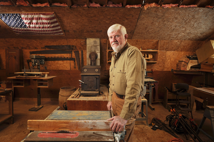
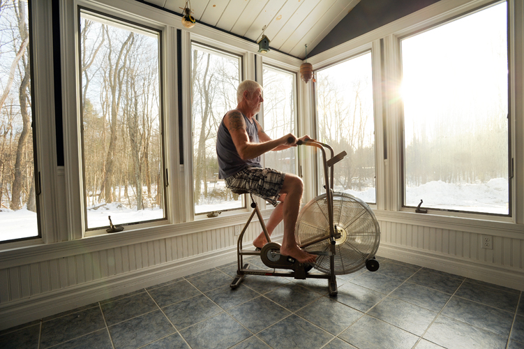
Recently I photographed Jim Twombly, a retired Portland police officer, at his home for a story featuring patients of a large medical practice group.   Jim was diagnosed a couple of years ago with diabetes and was facing a slew of health issues.  He worked with his doctor to completely change his lifestyle.   As a result of eating healthy and exercising regularly, Jim dropped more than 50 pounds and is stronger and healthier than he’s been in years.     I was there to photograph Jim as he did his morning routine—exercise followed by an oatmeal breakfast.   During my earlier scouting visit, we had decided to move his starionary bike to the more visual solarium he had built onto his home.   Early in the morning, as the sun was coming up, it would make a great visual.

Telling Stories:  Jim Twombly

And it was.  The only problem is that, devoid of the usual clutter, it made the solarium look a little bit sterile.   After photographing Jim in his home, I asked to go photograph him in the workshop above his barn.   Once we stepped into the sawdust-infused atmosphere, stacked with woodworking tools, Jim seemed to relax.   This was his element, clearly.   I set up a couple of lights but wanted to keep the portrait low-key, focused on Jim in his world.    We chatted a little, Jim settled into a comfortable position, and the image at the top of this post was made.   Once I took it, I knew it was my favorite image because it told more of a story about who Jim really is–a hard-working guy, a Mainer, a craftsman.  A guy who is tough enough to stick to a complete revamp of his lifelong eating habits because it just needed to be done.

Good on you, Jim. For more about Jim’s story, check out his feature on InterMed’s website.

Might & Main: how a brand feels

Might-Main_02


Might & Main is a branding firm based here in Portland–they do fantastic work and cast big shadows on the local creative scene.  They’re the team that you call in to do a rebranding, or to handle the look and feel of a product or campaign.  They’ve also got a great sense of style that infuses their work–take a look at this award-winning work for the Portland Museum of Art’s Homer Winslow exhibition (I want that bobblehead, Sean).

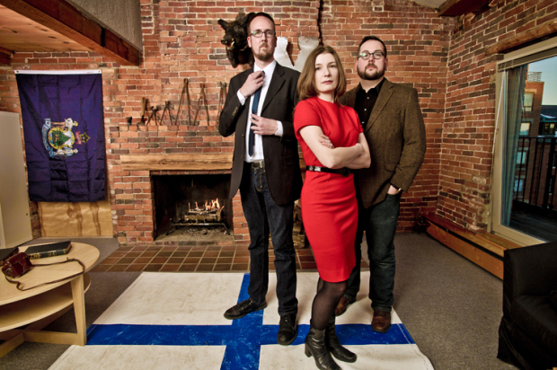
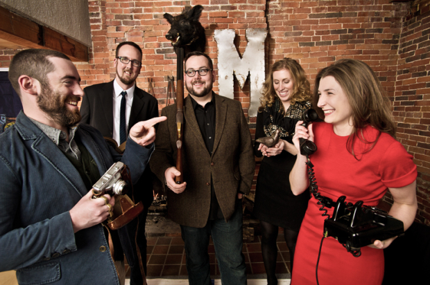
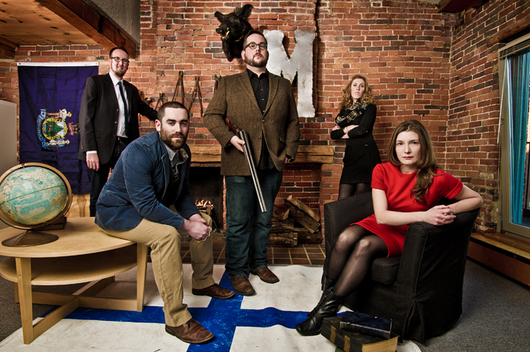
More than that, Kevin, Sean and Arielle (the principals behind M&M) are great people who always seem to be up to something interesting.   The trio,  along with team members Graeme and Morgan, moved to a new downtown Portland location in January and wanted a photo that showed them off in their new environment.  They didn’t dictate the look of the photo, but we discussed what the image should do for them:  it should give a sense of each individual person (all three principals had successful solo businesses before partnering, and all three bring different skills to the table), but show them as a team as well.  It should be interesting and striking, incorporating key elements of their new space and their quirky retro decor (Boris the Boar has made one other appearance, in an Inspire Portland feature on Sean from last year).  These guys are young, very hip and are extremely creative, so I knew I wanted to show these attributes as well.

Might-Main_03
When you strip away all the fluff–the globe, the -um- shotgun, even the lights–it’s all about the people.   Might & Main is comprised of interesting people, and I wanted to give a sense that they bring a strong point of view, a certain touch of humor and, yes, a little attitude.   To that end, I think the shoot was successful.   The final frame we all liked shows plenty of attitude.  If you look at each person’s face there’s something interesting going on.  Someone once told me that successful photos don’t give you all the answers, but make you wonder a bit, too.  Add on the lighting, the props and the “look” of the final image and you get an image that tells a story…and captures the “feel” of a brand.

There’s always room for serendipity, too.  Although I gave a few pointers on dress, I could have hugged Arielle when she showed up in that bright red dress.   How could I not get a great final image?

Might & Main: Behind the brand

Case Study – Financial Services firm portraits

When a company decides to embark upon a rebranding initiative they often hire an agency, a designer or a photographer to help them.   There are a lot of ‘triggers’ for when a company decides to do take this critical step forward.  It often happens when the company is in transition, whether physical or something more existential—a move to a new location, a major renovation, a period of great growth.

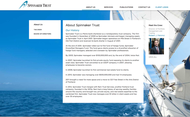
Spinnaker Trust is a Portland-based company providing wealth and finance management services.  Recently they grew with the merger with another firm, and moved into a really knock-out new space downtown.  To showcase their dynamic new space and their growth, they needed environmental portraits of their team members within their amazing offices—lots of frosted glass, hardwood flooring and deep blue walls.

I spoke with the team about their needs, and decided to go with a more dramatic approach to lighting.  With lighting you can go one of two ways.  Light ‘big’, and just create a wall of light so that everything’s bright, well-lit and very commercial-looking (see any national-level  advertisement) or light ‘small’, or selectively, throwing light just where you need it to create dimensionality, mood, and highlight aspects of the environment. Spinnaker was perfect for the latter.

I used three to four lights for most of the portraits—with all of the glass around, the lighting was tightly controlled to avoid reflections.  We did multiple scenarios with each person in a relatively limited period of time—in my shoots, I tend to move fast:  15 minutes being a long time to spend on any one portrait.

I was happy with the results:  professional but dramatic, with the environment a key feature of each image.   A big shout-out to the team at iBec Creative, who designed this clean and beautiful website.

Fitzgerald_Photo_Spinnaker_01


Spinnaker_Trust_iBec


New campaign for Poland Spring hits the road, literally.

One of the hardest things to do as a commercial and editorial photographer is to have to wait—sometimes months, sometimes longer—for your work to be used by a client before you can show some of the results of your work.

Ever since working with Maine-based Poland Spring this past summer, I’ve been patiently waiting until I could show the work, um….published, in a way.  Now that time has come, and you can see some of my images on a state route near you.

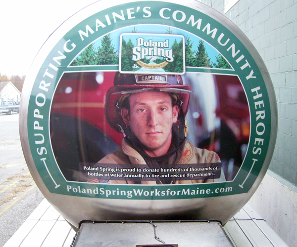
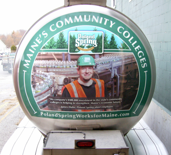
This is part of an advertising campaign called, “Poland Spring Works for Maine”.  It features portraits and scenarios that illustrate the various ways in which the Maine bottler supports its community and state.   It took a lot of planning, but the shoot was on a single busy day in late summer, in Poland Spring.   The idea was to photograph five scenarios, but we trimmed that to four by the day of the shoot.   Thanks to a great team effort, we were able to get some fabulous images in a variety of locations.  Definitely a case where being a photojournalist, with the ability to move and adjust quickly, paid off.

The images were destined for huge wraps that would be adhered to the back of Poland Spring water trucks.   Some bright person realized that there is a huge amount of real estate on the back of these tanker trucks that could be better used to promote what they do.   And speaking as someone who’s been stuck on Route 1 behind one of these guys in the midst of the summer tourist season,  having something visual and interesting to look at while you’re crawling in traffic is probably a good thing.     Brilliant.

These are a few shots the company sent me showing the fruit of our mutual labor.   The trucks are on the road now, so if you see Poland Spring in your rear-view mirror, maybe give the driver a break, let him pass you, and take a look for yourself.