Category Blog

Ambient light and dirty hands: meet Peter Brown

A week or so ago I found myself photographing Peter Brown, owner of Cumberland Ave. Garage (my friend Matt swears by these guys).  There always seems to be an antique car or two there, Peter’s passion.  On the day of our shoot, a 1921 Model T Ford was sitting, wheels off, in a corner of his garage, waiting for a little TLC.

I was there to get a portrait of Brown, but he was busy working in between my setups–it was a busy Monday with a line of cars needing work.  So I started by lighting the space and photographing him within it—all small lights.  In fact, I prefer working in such spaces with my small lights because of their portability and flexibility.   If you’re trying to light dramatically, you want the right amount of light in the right places.  Big studio lights tends to light everything you want and some things you don’t want, too.

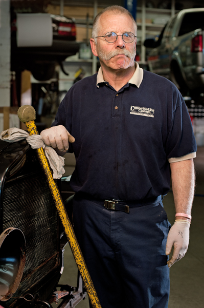
I started by lighting the Model T—one flash in the interior, several working the inky black exterior  and the flourescent -bathed shop walls cluttered with tools.   My favorite is actually a tight shot (see just the headlamp of the Model T jutting into the frame.  I like the look on Peter’s face and his body language.


Portland Maine Mechanic Peter Brown
Peter Brown, owner of the Cumberland Ave. Garage on Portland's Munjoy Hill.

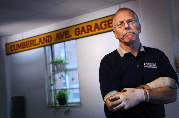
At the end of the shoot, I did a simple three-light setup in the bay with the colorful garage sign behind him.  I gelled the lights, but let his face go a little yellow just because I like the warm tones.

Portland, Maine Mechanic Peter Brown
Peter Brown gets his hands dirty.

Sometimes the light you find is better than anything out of a can.  While Peter did a weld repair,  I was able to show him in action in his environment.  This is the kind of stuff we’d encounter routinely on assignment for the newspaper.  Quick couple of portraits, enhanced by ambient light, and an interesting angle on a man going about his business in his environment.

Portland Maine Mechanic Peter Brown
Ok...that looks cool. Strobes off, ambient light on...

The gear you need when on the road

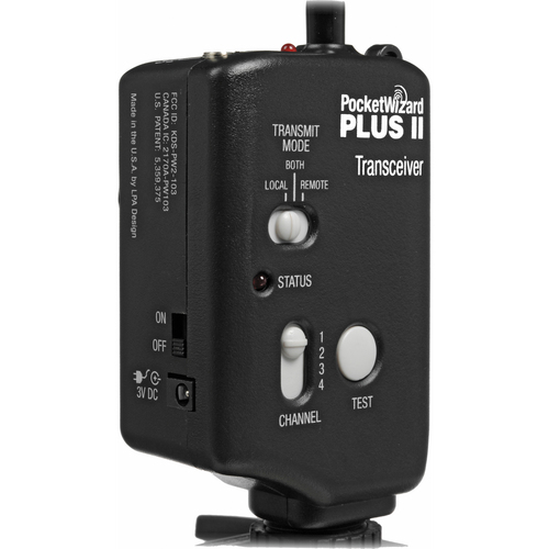
Pocket Wizard Radio Transmitter

We’re just a couple of weeks from our Traveling Light Workshop, and as a lead-in I’m previewing some of the topics and shoots we’ll cover during the three-hour class.

You can’t  discuss portable lighting without getting heavy into some nerdy gear discussions.   So, we’ll be talking plenty about triggering your flashes using manual and auto triggers—everything from old-school sync cords to off-camera TTL cords, from optical slaves to Pocket Wizards and Radio Poppers.

But it’s not all about gear.  It’s also about technique—how you approach a shoot and what works best for different situations ‘in the wild’.

As always, the best system for you is the one that fits your budget and allows you flexibility in lighting on location.

I’ve gotten requests from people who want to bring their flashes and other gear.  Great!   We’ll discuss those and, time permitting, will give hands-on demos with your gear.

If you have any questions about off-camera lighting that you want to make sure we cover, shoot me an email with your feedback.

Traveling Light #2: Location portraits

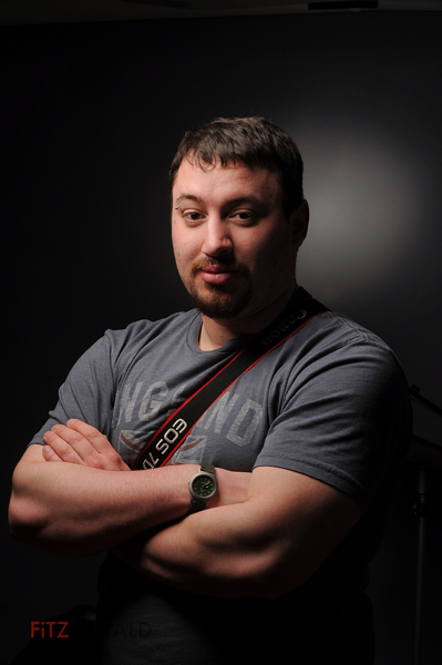
Ben: Two-light portrait

Here’s another sample of the types of portraits we’ll be building with small lights during the upcoming Traveling Light workshop on May 24.
Location photographers find themselves in an incredible variety of environments. In the studio it’s easy to control all the variables. When you show up at a location, you’ve got to make some decisions to make regarding ambient light and background. Namely, how much of each do you want to include in the final image?

For me, location photography is kind of a reductive exercise—start with what you find, and then remove light, clean up background elements, modify your flash— until you end up with what you want. In the studio, it’s more of an additive approach: start with nothing and build up the lighting and elements to create the image.


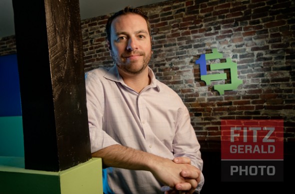
In the case of these portraits, shot with the help of Matt and Ben of Single Source Staffing, we had about 15 minutes to do two different looks. The vivid green walls in the office were an interesting feature I knew I wanted to use, as was their cool, colorful logo—perfect for an environmental portrait.

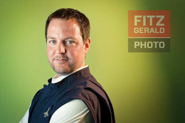
No lighting diagrams on these—we”ll talk more about approach during the workshop—but here’s the basics: Ben (green background) is lit from camera left with an SB800 shooting through a white diffuser screen simulating window light. There’s an SB900 in a medium soft box (camera right with a 1/2 power CTO gel), placed to hit Ben slightly angled toward the back side of his head.   The shadow?  A happy accident.  Once I saw it, I liked it.

Matt is lit by the same soft box. There’s another SB800 with a diffusion dome just to camera left, pointing at the right side of Matt’s face. On camera right, there’s a third strobe with a snoot aimed at the SingleSource logo. In this case, we underexposed the background so that there’s very little ambient light (ugly flourescent lighting) in this image.

These are two quick-hit examples of location portraits that use their environment to create interest and drama.

Matt: three-light environmental portrait

Traveling Light shoot #1: Beauty Light

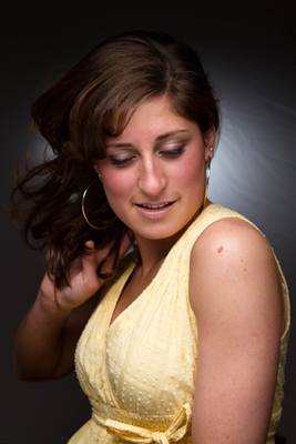
Beauty Light: soft, almost shadowless light

In preparation for our upcoming. May 24th lighting workshop, Traveling Light: lighting for photographers on the go,  I’m publishing a series of portraits that use some of the specific techniques we’ll discuss—and play with—during the all-too-brief workshop.  Again, all of these shoots are done with “small” strobes—the expensive pieces of gear too many photographers leave attached to the hot shoes of their DSLR cameras.

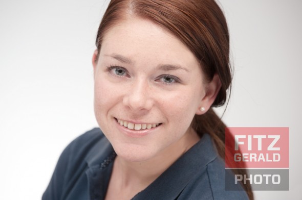
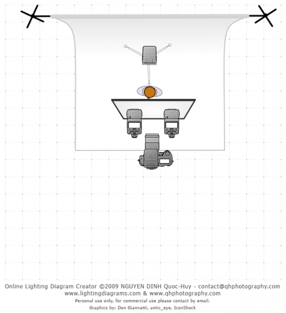
First up is Beauty Light.  Why beauty light?  Because it looks good, is flattering especially to women, and is the height of simplicity.   Three strobes, a diffusion scrim and one well-placed reflector.

Here’s a lighting diagram:

Note: Diffusion panel is actually directly overhead subject; reflector under subject's chin not shown.

Now I hear the question:  why should we come to the workshop if you’re showing off the shoots (and the lighting diagrams) here?   Well, from my point of view, describing a shoot isn’t the same as being on a shoot.  Not even close.  Hopefully you’ll glean some helpful info from these short descriptions, but this is more inspirational than strictly informational.  You can play around with settings and locations in order to recreate these shots, and you can eventually recreate them.  Thus you’ll learn, which is the point.   But if you have limited time and learn best by interaction, then you might want to attend a workshop or a class.  This will save you some time—usually, a lot of it.   At the Traveling Light workshop, for example,  we’ll discuss not just technique, but approach, philosophy and how to react when you’re in the pressure cooker situation of a real, live shoot, with real, live, impatient people.

So I hope you get a lot out of these posts.   Stay tuned to the blog for more sample shoots.  Special thanks to www.lightingdiagrams.com!

What’s your (working) space?

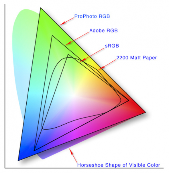
Color gamut map courtesy of adobe.com

As a photographer who doesn’t make a lot of prints—most of my ‘deliverables’ consist of digital files—I have to pay close attention to color that may render differently on my screen than on my clients’.   Specifically, the Working Space color on my computer and the color space I embed in the digital file before sending it out a client or the photo lab.

Sound mystifying? Here’s a short break-down.

Color Space is simply the gamut, or range, of possible colors. Some spaces, such as ProPhoto RGB, encompass millions of colors, which makes the images look great on a computer screen.   Output that file to a device that can’t read the ProPhoto RGB color space, and the results for your image will be less than stellar.

The basic thing I keep in mind is this. Work in the largest-gamut color space you can…say, ProPhoto or Adobe RGB.   When outputting photos for a client or for a specific use (i.e., for the web), convert the photo’s color space to one with a  more limited gamut if that makes it render better for that particular use.

As Rob Galbraith noted in a long-ago digital workflow seminar, “Assign on input. Convert on output.”

First step is setting the color space in your camera. My recommendation? ProPhoto RGB, if it is available. If not, AdobeRGB, both of which have a much bigger gamut than sRGB (see the color map above).

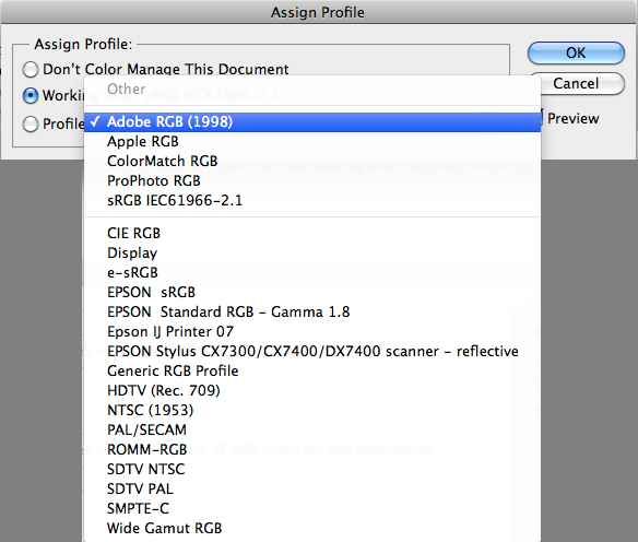
After you import your image into Photoshop in this format, you can choose to assign a new color space. This doesn’t actually change the digital zeros and ones that comprise your image, but it does make the photo appear different on the screen–sometimes very different. I only assign a new color space if my image is way too magenta, etc. I might assign ColorMatch RGB,  which takes out redness pretty effectively.  The key here is you’re visually making the photo look good on the screen.  To Assign a color profile, go to Edit–>Assign Profile in Photoshop.   There, you can choose from a variety of color spaces.  If you have the “Preview” box checked, you’ll see the effect each profile will have on the image.   If you find one you like, great.  If you don’t, then don’t worry about assigning a different profile.

Options under "Assign Profile"

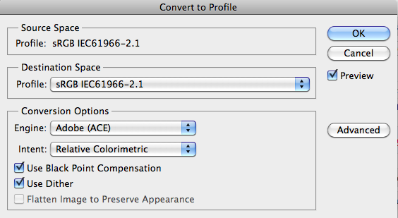
Once you’ve imaged the photo and it’s ready for it’s final destination—be it client or your own website—consider the end use.  Then you Convert by going to Edit–>Convert to Profile in Photoshop, and choosing a space there.    This time, the little zeros and ones inside the image file are changed by your selection, so always save the original before this “conversion” step.  Note the “Source Space”—the current color space of your image file—and the “Destination Space”.  In this example, both are sRGB.

Convert to Profile dialog box

My default is to convert it to sRGB. This is more limited in terms of gamut. However, sRGB is the best choice for PC (and non-Apple) screens. If you sent an image in the ProPhoto space that looks great on your gleaming Mac, your client’s PC might render it in unpredictable ways.  Convert it to sRGB, you can know that it’ll look pretty close to what you see on most average screens.  For this reason, if I’m publishing for the web I’ll convert to sRGB too. If you’re printing yourself, you may choose to keep in a higher gamut space. If you’re printing with a lab, you should check with them. Most ask for sRGB or allow you to embed an .icc profile (more on that another time; basically it’s a color profile designed for a specific printer).  Color offset printers will require conversion to CMYK at this point, and then more imaging will likely be required to tweak the images before printing.

So, whether you ever decide to play with Photoshop’s “Assign Profile” function, you should always be aware of the color space your images are using.   If they aren’t optimized for their eventual destination, make sure to convert those files to the proper color space.

Announcing: 2011 Maine Studio B Photo Workshops


Studio B 2011 Workshop series

We’ve finalized dates for our photography programs this year at Maine Studio B.     These workshops are are intended for anyone with a DSLR wanting to get to the “next level” in terms of lighting, storytelling and creativity.

Who is this workshop for?  Working professionals, amateurs, students–anyone who knows how to use their flashes and/or strobes but wants to light in a more interesting way.   It’s also for those who have a flash but can’t seem to find time to read the manual…or who have a set of studio strobes and now are thinking, “Ok, now what?”

Space is limited.  Payment instructions and other details are shown below with the description for each event.


Traveling Light: Flash techniques and tips for photographers on the go

Time: Tuesday, May 24, 5-8:30 pm
Location:  Maine Studio B, 28 Maple Street, Third Floor, Portland, ME (207) 699.9321
Cost: $99

Join veteran photojournalist and commercial photographer Brian Fitzgerald for this information-loaded seminar.   Brian will show how to more effectively use your portable flash in a variety of real-world situations. Topics include:

Manual flash vs. TTL
on-camera strobe techniques
off-camera strobes using wireless, optical and corded systems
Modifying and shaping light
Practical tips, from gels to mounts
From one flash to many: building a portrait
Q-and-A session
Plus: The 10-minute portrait challenge

Space is limited to 15. Pay for your sessions below using the Paypal button.  NOTE: Maine Wedding Company members: “Traveling Light” attendance is free with your membership.  Please just RSVP by emailing Brian.


Lights on location: Amp up your location images with studio and portable strobes  * PLEASE NOTE THAT THE TIME AND LOCATION HAVE CHANGED

Time: Tuesday, October 18, 4-7:30 pm
Location:  Ferry Beach, Scarborough (207) 699.9321
Cost: $99

Sometimes natural light isn’t enough.  Often it just needs to be “helped” by the addition of some well-placed strobes.  Join veteran photojournalist and commercial photographer Brian Fitzgerald for this comprehensive, hands-on workshop on the use of studio and portable flashes on location.   Whether you’re a studio photographer or you work out of the back of your Honda Civic,  you should know how to build a shot with all available tools–ambient and artificial.

In this workshop,  topics include:

Location gear – what you need to have
Small flashes (i.e., camera strobes) vs. studio strobes
Balancing ambient light and artificial light
Reflectors and modifiers
Tips for when things go wrong: surviving the location shoot
Plus: The 10-minute portrait challenge
Q-and-A session

Space is limited to 10. Reserve a spot now by contacting Brian Fitzgerald by email at brian@fitzgeraldphoto.com. Cost is $99 for this intensive instructional workshop.


Frequently asked questions

Why should I attend either workshop?

Professionals never stop learning.  The best way to learn—for us photographers and for most people—is to see it with our own eyes, to discuss it with others, and to get the chance to put it into practice immediately.   Why me?  My approach is what you’d expect from a photojournalist–practical, down-n-dirty, heavy on results and not theory.  In short, if you like to get your hands dirty, both figuratively and literally, then this might be for you.

What do you bring to the table?

My approach is practical,  geared toward giving useful, real-world information gleaned over 17 years as a working photojournalist and commercial photographer.

Should I bring my camera?    Will I have a chance to shoot?

Given the time available to us, and the amount of ground we’ll be covering, these are not hands-on shooting workshops.   That said, you can shoot the setups and anything else you’d care to during the talks.   It may be useful to have your flash and camera as a reference for some of the things we’ll be doing.

Is this a hands-on workshop?

This isn’t a shooting workshop, but it relies heavily on participation.  You may be called in to be a model, or to assist with lighting, or to give your two cents’ worth.    How else you gonna learn?

Will you have food?

Nope.   We only have three hours, so food will have to wait.   We will have water and sodas (we’re not heathens).

Will everything be at Maine Studio B?

The location light session starts at the studio but, weather permitting, we”ll transition to an outdoor setting for the majority of the time.

Should I bring anything else?

As my high school geometry teacher used to say, “Bring a sharp pencil and a mind to match.”   Oh, and no shirt, no shoes….no service.  Seriously.   Just come, be prepared to participate, and we’ll have a great time.

Visuals for Verrill Dana

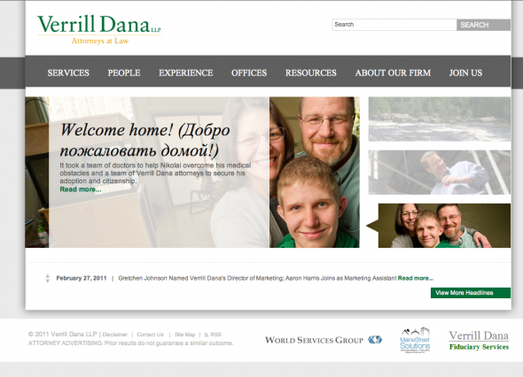
Verrill Dana's new website

I met the folks at Portland-based law firm Verrill Dana last year.  The firm was in the middle of a complete web redesign of their site, and needed photos—lots of them.  Verrill Dana is one of the largest law firms in northern New England, with offices in Maine, Boston, Connecticut and Washington, DC.

The firm already had professional headshots of most of the their 100+ attorneys, but needed updated versions.  In addition, they wanted to showcase more of each attorney’s personality: on each bio page they would run three black-and-white candid photographs of each person in their work environment, engaged in normal interaction.

We met and came up with a plan to tackle the job. The formal portraits would be taken over the course of weeks and would be shot in Portland, Boston and in our studio—but they had to look consistent, as if they were taken all at the same time.   The candids needed to be purposful but natural, orchestrated but spontaneous-looking.

I started by photographing some test “attorneys” in a variety of ways to provide some different looks.  Once the artistic vision was decided on, we arranged shoot dates and makeup days, then got to work.   The shooting days went very smoothly, primarily because the marketing team at Verrill Dana is so well-organized.   Although small issues always come up in the course of shooting, a bit of flexibility and a solid team can easily overcome them.  My years as a photojournalist helped me move quickly and roll with the punches, too.

We love Verrill Dana’s new site, launched earlier this month.  It’s inviting, clean and filled with nice touches, like being able to view an image of each attorney just by mousing over their name.   Congratulations, Verrill Dana!

Telling a story, not taking a photo

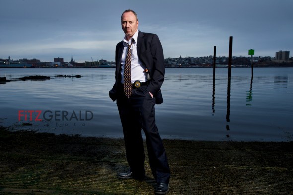
South Portland Maine Detective Steve Webster

With so many quality digital cameras out there, and so many (arguably talented) pro-amateur photographers, what value does an experienced photojournalist bring to a commercial job? It’s a question worth asking.

The best images—whether of people or of objects—don’t just record the scene.  They tell a story, expressed through body language, facial expression, light, mood and environment.

Take a look at Sergeant Detective Steve Webster. He’s a veteran of the South Portland police force and also the author of One Promise Kept: The case that made a cop, and others that almost broke him.   It’s a memoir of his decades of experience in law enforcement, centered around a high-profile case involving a home invasion. It’s a funny, gritty and sometimes shocking look into the world Steve inhabits every day.

One Promise Kept–co-written by Portland Press Herald journalist Trevor Maxwell, a former colleague of mine–is doing quite well.  Steve’s in growing demand as a public speaker.  If you heard him, you’d understand why.  He’s got a lot of great source material, and he’s natural storyteller.   The problem is that the only photo he had for handout materials shows him wearing jeans, leaning up against a wall, looking kind of like a surly version of the neighbor next door—with a gun.   Not gritty.  Not even close to the Law & Order type of shot I knew we’d have to get.   Very far removed from the feel and style of his book.

So, we met on a very cold spring day–the day before a Maine spring snowstorm was to roll in, when the clouds were building.  We arranged to shoot near the water right after before sunset, with a view of the city behind us.    Steve was great despite the sub-30 degree temperatures that literally turned his hands blue. The resulting image captures what I think One Promise Kept delves into—the sometimes heartbreaking but ultimately necessary work of a solitary detective.

Lighting workshop at Studio B

I was asked (by my wife, Beth) recently to make a presentation to the monthly photo group she hosts.  The group, known as a PUG (Pictage User Group), is run by local wedding photographer Emilie of Emilie Inc.  Beth ran the show while Emilie was on maternity leave, hence the request.

So I put together a short program around the use of studio lights (not camera flashes).  We would start with a one-light wonder and build a three-light portrait from there.  Along the way, we’d use a variety of modifiers to sculpt the light:  softbox, umbrella, beauty dish and reflectors.

To my surprise, we had a packed studio.  The session was great–lots of good questions and energy.   When our model called in with the Flu, group members happily allowed themselves to be pulled in for impromptu example shots, which we promptly projected for the group to see.

We covered a lot of ground, but as the session ended I knew I wanted to put together a new workshop–this time demonstrating how to use studio strobes on location and synchronizing electronic light with ambient light.   It’s still in the works, but will probably happen this summer before the season gets too busy for wedding shooters.

Below I’m including a beauty dish photo I took of participant Charlie Widdis.   The concept was on layering lights so that the image shows bright-dark-bright areas from back to front.  Beauty dishes are great for this kind of effect because they produce a very defined and controllable beam of light (with no hot spots, incidentally).   This is literally a 30-second set-up-and-shoot portrait, but Charlie looks great.

Charlie Widdis


The cool thing is that, a few days later, Charlie practiced the session and expanded on it, producing a very nice softbox variant with some good model material–Miss Maine.  Then, he sent that image to me to show off his results.   Nice job, Charlie!   I love it when people immediately apply lessons learned–there’s no better way to commit the technique to memory.   Charlie blew the doors off of this one and made it his own.

©2011 Charlie Widdis

Below is a list of resources based on questions that came up during the workshop.  Hope it’s helpful to the group (and others).   And for anyone wanting to take part in the upcoming outdoor lighting session, feel free to email me at brian@fitzgeraldphoto.com.

Resource Links and Terms

Honl Photo:  For straps, grid spots and other modifiers for your on-camera flash.

Gaffers Tape:  This is the slightly expensive cloth tape the pros use.  Very sticky, but no residue afterwards.

Beauty Dish:  For beautiful, directional light with no hot-spot

Alien Bees:  Relatively inexpensive monolights good for traveling wedding and portrait photographers.  Great customer service.

Elinchrom:   Professional studio lights with a built-in radio remote that allows you to change the power from your camera.

Pocket Wizards:  The best camera/light wireless remote system, in my opinion.

Lastolite:  A bit expensive, but great products such as the light diffusion panels and the Ezybox softbox for camera speedlights

Ebay remotes:  Cheaper alternative to pocket wizards found on EBay.  OK, but you get what you pay for.

Strobist.com:  Fantastic resource for amateurs and pros who want to use their camera strobes more effectively.

Rosco “Strobist” Filter kit:  Get exactly the gels you actually can use–and get multiples of them, too.  They’re cheap, fit right over the head of your flash–and don’t have a hole in them like the free sample packs do.

Seamless:  Paper background available in a variety of roll widths.  Savage and Superior are two well-known brands.

Note:  With the exception of the Alien Bees, much of this stuff is available at  (or can be ordered through) locally-owned businesses  Photo Market and Hunt’s Photo & Video.  Check them out!


Image libraries: a great business tool


I routinely use the phrase ‘image library’ in my presentations to groups and clients, but since I’m aware that blank stares usually follow, I follow it up with an analogy.

Visual tools for your business kit.   Need to post a blog post about a new hire?   Have a feature about a partnership, case study or issue you’ve dealt with that needs a visual hook?   Do you have a marketing plan that includes print and web but are stumped about the images you’ll need?

These are all situations where an image library can make your business life easier.   Imagine if you had a stock of 15-20 images specific to your business and industry.  These are specific because they show your location, your people, your services and products.   These one-of-a-kind images are priceless to you and much more interesting to potential clients than a generic image from a stock photo site.

I regularly work with companies small and large to strategize what images should go into their image libraries.  As the name implies, once an image goes in, it can be used in a multitude of ways over time.   The library can grow as a business does.  The images may start with portraits of company personnel (used on “about us” pages, as handouts for speaking engagements and sent to news organizations for PR purposes) if the company’s people are in the public limelight. If it’s a service-based business, we may decide to do lifestyle images-basically, scenarios showing a business interacting with customers, doing its job, solving problems.  If the company has a product, it might involve product photography either in studio or in a setting in which it may be used.   Some of my customers have professional writers who complete editorial-style features for their blogs on news-worthy stories that my clients have had a hand in–the very epitome of controlling the message–and they want exclusive images done to illustrate their stories.

As a long-time newspaper photojournalist, I love conceiving images that convey –usually in one image–the story from the client’s perspective.