Category Blog
New campaign for Poland Spring hits the road, literally.
One of the hardest things to do as a commercial and editorial photographer is to have to wait—sometimes months, sometimes longer—for your work to be used by a client before you can show some of the results of your work.
Ever since working with Maine-based Poland Spring this past summer, I’ve been patiently waiting until I could show the work, um….published, in a way. Now that time has come, and you can see some of my images on a state route near you.
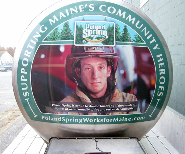
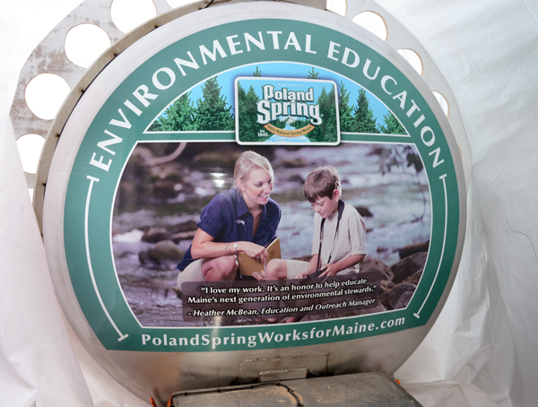
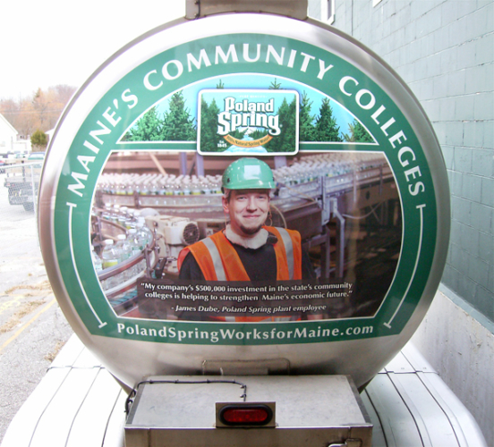
This is part of an advertising campaign called, “Poland Spring Works for Maine”. It features portraits and scenarios that illustrate the various ways in which the Maine bottler supports its community and state. It took a lot of planning, but the shoot was on a single busy day in late summer, in Poland Spring. The idea was to photograph five scenarios, but we trimmed that to four by the day of the shoot. Thanks to a great team effort, we were able to get some fabulous images in a variety of locations. Definitely a case where being a photojournalist, with the ability to move and adjust quickly, paid off.
The images were destined for huge wraps that would be adhered to the back of Poland Spring water trucks. Some bright person realized that there is a huge amount of real estate on the back of these tanker trucks that could be better used to promote what they do. And speaking as someone who’s been stuck on Route 1 behind one of these guys in the midst of the summer tourist season, having something visual and interesting to look at while you’re crawling in traffic is probably a good thing. Brilliant.
These are a few shots the company sent me showing the fruit of our mutual labor. The trucks are on the road now, so if you see Poland Spring in your rear-view mirror, maybe give the driver a break, let him pass you, and take a look for yourself.
A move, and an upgrade for Fitzgerald Photo
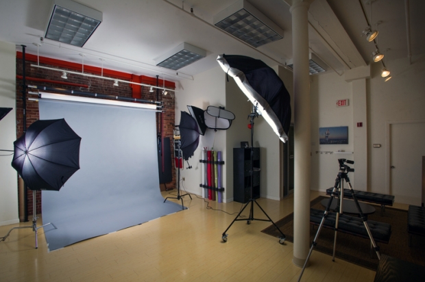
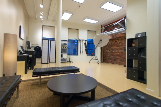
Fall is generally my busiest time of year—lots of clients needing to close out projects before year’s end—and so this year, I thought: “Why not make it even busier?” So, I moved out of the super-awesome downtown Portland studio I’ve shared with my lovely wife and talented photographer Beth Fitzgerald (of the Maine Wedding Company and Blush Imagery) for the past four years and….moved into a new, super-awesome downtown Portland studio.
Why?
Beth and I are known for doing crazy things when we probably shouldn’t—like ripping out our kitchen in the middle of winter just because we were bored that weekend. This time around, though, we planned a bit better. This fall marked the start of kindergarten for our daughter Maggie, and in anticipation, Beth transitioned to working out of our home office while I hit the bricks in a search for a new studio space just for me.
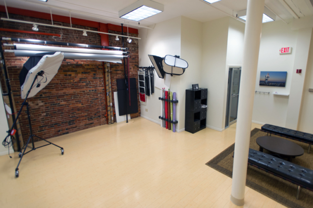
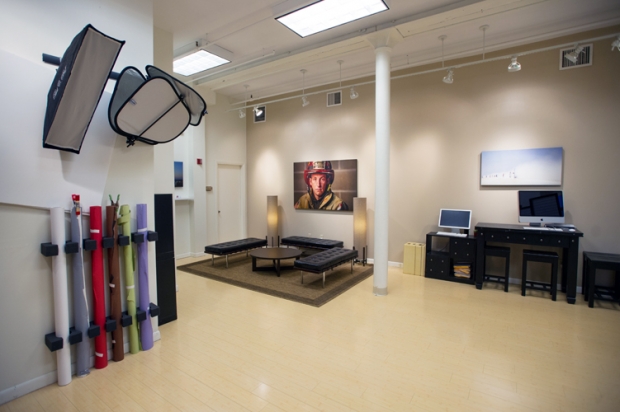
It wasn’t easy, and my broker definitely did not get paid enough. The pressure was on to get something on par with our last studio, which Beth found and decorated for us. Nailed it. As cool as our old studio was, my new Pearl Street studio has many advantages. It’s not just the high, 14-foot-high ceilings, the 8-foot-high windows or the exposed brick wall. Nah. What really sold me was something not even in my studio, but down the hall: the elevator. As a photographer who does a lot of work on location, that’s a feature that just makes my life…better. To top it off, I have parking right outside my door and the location (although I’ll miss the Portland Pie Company, I ate WAY too much of their pizza) is closer to many of my clients. Not to mention, coffee. And the police station, just in case.
I’m all moved in now, and have had a number of shoots here already. I’m still figuring out the angles, but it’s fun doing so. I’ll host an open house after the first of the new year. Until then, enjoy the photos and if you’re in the neighborhood, stop by the Fitzgerald Photo Studio! If I’m not here, at least you can enjoy the elevator.
- High ceilings mean….happiness.
Portland’s MadGirl
Portraits of strength
Recently I photographed several Mainers whose orthotic and prosthetic devices help them function and live more independent lives. The people I met are incredible, inspiring and have had tougher times than most of us would like to imagine.
The day involved a lot of documentary coverage of patients getting fitted for devices and using them to walk. Although most of the shoot would be editorial style, very much grab-and-go, I decided to make a couple of simple one- and two-light portraits as well, thinking that the right look in the eyes could dramatically tell another aspect of the story.
The patients were amazing—ranging from young children up to adults—all with very compelling stories to tell. I was happy to get strong portraits of Ken and Kimberly. Ken uses a prosthetic lower leg after losing one to an accident at work. Kimberley uses a wheelchair to get around but is pushing herself to walk on two custom-made leg braces that enable her to walk with assistance.
The portraits themselves are incredibly simple from a technical point of view—in fact, I had just a few minutes to set up lights and shoot—but I think they reveal some of each individual’s inner strength. Looking at the images, the eye sees a wheelchair and a presthetic limb, but it’s the faces, expressions and body language that grab and hold the attention.
Interestingly, both have tattoos that relate to their recovery. Kimberly’s is, ‘Fear is lack of faith,’ while Ken’s is accompanied by a handicapped wheelchair symbol and reads, ‘I’m just in it for the parking’.
Thus illustrating the power of both humor and grit to see you through very tough times.
[photoshelter-gallery g_id=’G0000ZcMrF8gSVvw’ g_name=’Portraits’ f_show_slidenum=’t’ img_title=’casc’ pho_credit=’iptc’ f_link=’t’ f_send_to_friend_btn=’t’ f_fullscreen=’t’ f_topbar=’t’ f_bbar=’t’ f_show_watermark=’t’ f_htmllinks=’t’ f_mtrx=’t’ fsvis=’f’ width=’600′ height=’550′ bgcolor=’#AAAAAA’ btype=’new’ bcolor=’FF0000′ crop=’f’ twoup=’t’ trans=’xfade’ tbs=’5000′ bgtrans=’f’ linkdest=’c’ f_constrain=’f’ f_bbarbig=” f_enable_embed_btn=’f’ f_show_caption=’f’ f_smooth=’f’ f_ap=’f’ f_up=’f’ target=’_self’ ]
Into the wild
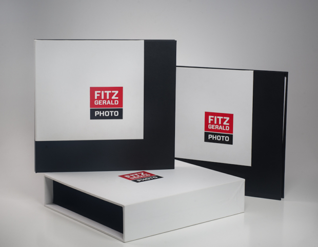
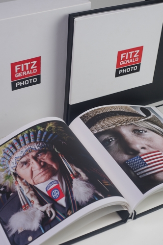
The other day I got a big box delivered to the studio. It was taped up and packaged with so many layers that it took some dedication to get through. It was worth it. I’ve been in the process of revamping my portfolio book for some time now, enlisting help from Selina Maitreya and from book maker Scott Mulllenberg, and printing expertise from Lincoln and crew at Pushdot Studio, located in the other Portland. All told, it’s taken about a year, and the results were sitting in this box—over a hundred exquisitely printed portfolio pages destined for my two-book portfolio.
A quick note here for those that eschew printed, custom portfolio books as being dead or pointless in the digital age—I respectfully disagree. It’s true that the cost is far greater than, say, an iPad portfolio (which I also use) or a Blurb book (which I’d like to experiment with). To me, each has their uses and nothing beats the impact of finely-printed, large images displayed in a custom-bound book. (Boards are great, too, but I’d destroy those, I’m afraid). Expensive, yes. But impactful? Absolutely. I’ve been showing my new book around already and have gotten a great response.
As a photo editor, the packaging of a portfolio showed me as much as the work itself. In the newspaper world, this meant mostly digital presentations on CDs with the occasional board of slides thrown in. It may seem old school, but I always loved seeing portfolios on slides, partly because I knew just how much work it takes to do this right—and also because everything, from the labels on the slides to the tonal consistency from start to finish told me volumes about the applicant’s dedication to craft, consistency and detail. Someone who spent a weekend building a single portfolio probably would care about doing a good job even on the dreaded “Man on the Street” assignment. That’s the person I wanted on my team.
The printed book is much the same way. It’s tactile, it’s classic, and if done right it isn’t easily forgotten. And that’s why I’m busier booking dates for my portfolio than my high school senior class around prom time.
The butcher of Portland, Maine
One of my favorite Inspire Portland subjects this year has been Jarrod Spangler, the butcher at Rosemont Market & Bakery. It’s a no-brainer, really, given a my love for grilled meats and a mutual affinity for certain kinds of drink.
I’d never spent much time in the market—I think I’d made it in once since it opened in its Brighton Avenue location—but since our interview in May I’ve been there on almost a weekly basis. I’d recommend Friday as a great time to visit, by the way.
Jarrod is doing all sorts of interesting things that contribute mightily to the vaunted food scene here. For me, it’s not about the finished, plated food. There are so many talented photographers, here and elsewhere, who do amazing work of plated food from the kitchen. Give me a raw cut of meat, allow me to follow a farmer or a cutter, and let me show the process. I find my best portraits are of people who, for a lack of a better description, Do Stuff.
Spangler is an artist in his own right, albeit one with a hacksaw. Read more about what makes him tick, about his plans for Portland’s future and more in this week’s issue of Inspire Portland.
Note: The observant will notice our hiatus from Inspire Portland since mid-May. Suffice to say that time with family and some fantastic work opportunities in Portland and elsewhere took precedence over this project temporarily, which is not a bad thing. Stay tuned for our final installment of Inspire Portland on August 15th…and thanks for hanging with us for the journey.
[photoshelter-gallery g_id=’G0000awObWQvObOs’ g_name=’Spangler’ f_show_slidenum=’t’ img_title=’casc’ pho_credit=’iptc’ f_link=’t’ f_send_to_friend_btn=’t’ f_fullscreen=’t’ f_topbar=’t’ f_bbar=’t’ f_show_watermark=’t’ f_htmllinks=’t’ f_mtrx=’t’ fsvis=’f’ width=’600′ height=’550′ bgcolor=’#AAAAAA’ btype=’new’ bcolor=’FF0000′ crop=’f’ twoup=’t’ trans=’xfade’ tbs=’5000′ bgtrans=’f’ linkdest=’c’ f_constrain=’f’ f_bbarbig=” f_enable_embed_btn=’f’ f_show_caption=’f’ f_smooth=’f’ f_ap=’f’ f_up=’f’ target=’_self’ ]
Transition time for Maine Studio B
Note: The following is a post originally published by my wife, Beth (and co-tenant at our great downtown Portland studio), on her blog, Applying Blush. We are looking forward to the next phase and hope that some lucky entrepreneurs (we’ve already had some photographers check it out) end up here. —Brian
My daughter Maggie, 5, starts kindergarten at St. Brigid’s in Portland this Fall. Our family is headed into yet another chapter. I’ve been a working mom doing about 50+ hours a week for the past 5 years. And I have been working out of the house for most of this time. First, I worked at my smaller Falmouth office (OMG, remember us over there… so long ago!) and, for the last 3+ years, from our gorgeous office and studio in downtown Portland.
But now, Maggie will be coming home every day at 2 pm so my hours will be dramatically different— starting earlier and ending earlier for her. It is time to adjust the setup.
Brian’s business, Fitzgerald Photo, has grown a ton and is he is so, so ready to be out in his own space. We’re very proud of that! (He has been over flowing into my areas of the studio for some time now with gear and lights.) So he is moving on up into a space of his own…. TBD… we’ll keep you posted where he lands but we DO know, it will be in the downtown Portland area for his corporate clients.
I have adjusted my business down to 1. my wedding work and 2. my work with Maine Wedding Company. I am just on-location or virtually needed now. So I am headed to our home office to be the anchor for Maggie there! I will keep just a small part of Brian’s new space just to meet clients.
We hate leaving this space. It has been amazing…. the parties, classes, photographers in and out, staffers, gin and tonic Fridays, Portland Pie, great landlords, working downtown…. and being so close to our great friends and MWC partners at Might & Main.The studio has been the apple of our eye and made such a great lifestyle for us!
But a family does what a family needs to do.
If anyone is looking for fabulous creative suite with private bathroom in the downtown area… it’s open now. If you are interested talk to our fabulous commercial relator! He handles the space for Portland Pie Company – our landlords!
Loren Ayer
Associate Broker
Harborview Properties
P: 207.321.3617
E: layer@harborviewproperties.com
We’ll keep you posted as we land. It may be awhile or it may be later when Maggie starts school this Fall. If you are a photographer who wants a great downtown space, I can tell you it gets no better than this!
Mbr>
Putting the back shop out front
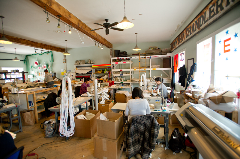
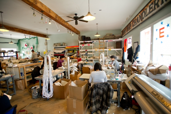
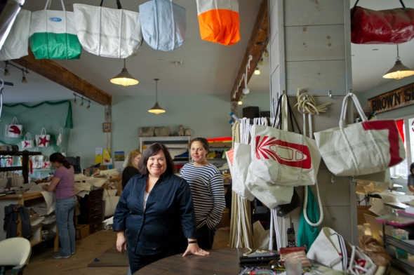
The thing that strikes most people when they first walk into the Sea Bags retail/production facility on Portland’s Custom House Wharf is the palpable energy and constant activity. Sea Bags isn’t some cute, trendy shop with bags hanging on sparsely-decorated walls, soothing music and posters of nautical scenes. It’s gritty, cluttered and although there are some bags on display, the largest area is reserved for work. As you watch, you can see seamstresses sewing bags and pre-production folks doing cutting work. The items on the walls are nautical in nature, yes; but they’re likely to have come from the dark recesses of an old fishing shack along the pier, perhaps lightly dusted, and stuck wherever whimsy dictated they might fit.
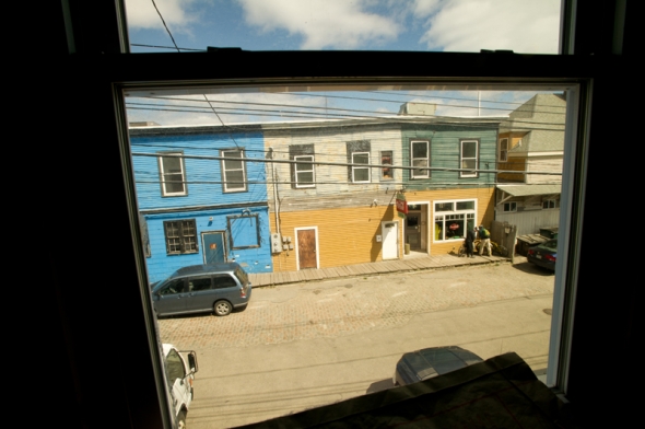
Walking upstairs, through the shipping department (hallway) you see the conference area with windows that once belonged to the landmark Porthole Restaurant, located just across the street. You can tell this because no one bothered to strip the vinyl letters spelling out the restaurant’s name from the windows.
It’s clear that, under the charred beams of this building, scarred by long-ago fires, is a very different sort of business, indeed. Once that perhaps only could be run by Mainers, in a town like Portland, on a real, working waterfront.
Hannah and Beth were fantastic during our shoot, allowing me to photograph them in the upstairs sail storage area. I took a few extra photos to show the environment—one I could easily spend a day in, shooting in a more documentary mode. Read more about what makes Sea Bags different in this week’s Inspire Portland.
Care without compromise
This past week marked the launch of one of the coolest sites I’ve seen in a long time. The new InterMed website also happens to be locally designed, by Kemp Goldberg Partners, with original photography taken over the course of the past six months or so. Beginning back in the fall of 2011, I was fortunate to work with KG’s talented crew to make it all happen.
The approach the KG team took was to photograph the doctors and other medical staff in a very casual, environmental style that both made them feel comfortable and allowed for personalities to come through. These portraits are accompanied by a bio written by each person. The result is warm, personal and compelling. It was great working with each of these people, who had to endure my pleas for ‘just one more shot.’ The visual centerpiece of the site are the images of doctors and staff interacting with each other and with patients, along with views highlighting the beautiful Marginal Way InterMed building. The first thing a visitor to the site sees are documentary shots of patients and their families whose lives have been impacted in positive ways by their InterMed doctors. Shot in the moment, these vignettes illustrate well the InterMed creed, “Care without compromise”.