Category Blog

Why photographers ask so many darned questions

A lot of what I do these days is destined for web-only use.   It seems as though print use is getting less and less, but I like to think of it another way…that print is used when it really matters, and thus the quality of what’s printed—and the images needed for those pieces—is comensurately better.   Less, but more.

I like to get involved in these projects early on, or as early as possible.  It can be challenging to come in as a photographer once the design has been set by a web team, and then to have to create images that will safely fit into an ultra-cool horizontal web page slider that is 900 pixels wide and (it seems) 2 pixels deep.   Of course, that’s when you find out the client wants to shoot full-body portraits, too.

That said, I firmly believe my job as a photographer is to provide solutions—practical, useful and hopefully creatively fulfilling—no matter what stage of the process I’m called in on.   It’s never too late to bring some value to my clients even if the train has not only left the station, but is set to arrive in five minutes.

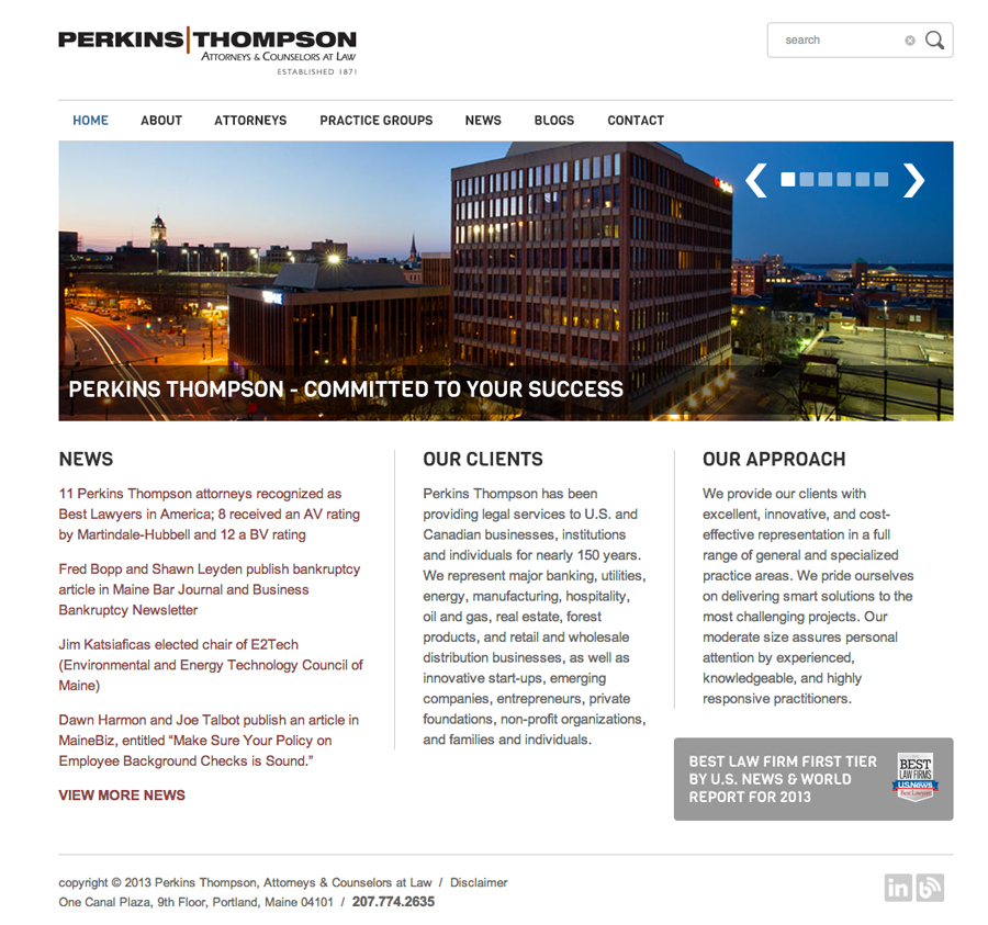
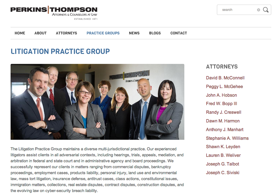
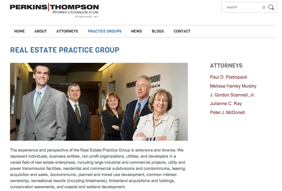
So when local law firm Perkins Thompson wanted to create a variety of team photos for their already-templated site, it was necessary not only to work with their chosen design (fortunately, not 2 pixels tall), but to understand what uses they might have beyond the site.   That’s why photographers should and do ask clients a lot of questions about potential future uses of images.  I found that they wanted the images for a variety of print ads and other collateral, even though the initial use was for a (very) horizontal web page display.  So, the images needed to be flexible enough, in terms of composition, to work for both.

Add to the mix that they have far-flung attorneys who had to be merged into photos together, and it became a logistic challenge.

Here are a few screenshots from their new site–I’m happy with the interaction and group photos we got.   All were shoot loose enough to work in print pieces and ads, but with heads and head sizes in a relative horizontal line so they could be used for web ads.  Doing so cut down on the chance that my client will have to call me in a year asking for a Photoshop miracle, like turning a head-and-shoulders image into a full-body portrait.

To their credit, Perkins T were great to work with and very patient (candidly, I also love that they were founded by a guy named Widgery “Whisker Bill” Thomas).   I’m happy with the results, which feature their teams in a dynamic way that works for them.
Perkins_Thompson_Web_01 Perkins_Thompson_Web_02 Perkins_Thompson_Web_03


Fitzbits: Friday Favorite Clicks

It’s Friday, and it’s time to unwind a little. Here are some of the more interesting things I’ve encountered this week. Some are photo-related, others are business-oriented and a few are just plain random.  I think you’ll find them useful too, so I’m sharing them in a little feature called Fitzbits. Go ahead. Lose an hour surfing. I won’t tell the boss….

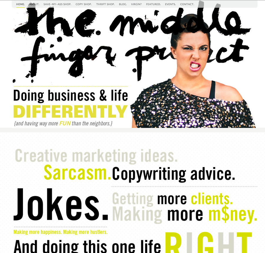
Middle Finger Project
Irreverent, full of voice, very well written. It’s geared towards small business owners who are unique and want their brands to have personality.  Highly entertaining, informative and a kick in the pants. As a ‘smart and solo’ operator, you aren’t doing something right. Trust me. And they’ll tell you about it.

FB_MiddleFinger


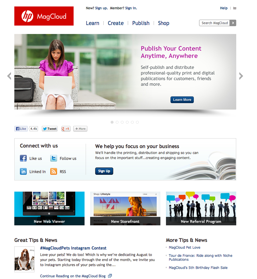
MagCloud
This HP-run print-on-demand service is similar to services like Blurb. I’ve used both (just got a promo piece prpinted by MagCloud in fact) and the quality (especially at athe price point) is astonishing. Full-bleed, saddle stiching….if you aren’t using this service, you’re truly missing out

FB_MagCloud


WP Better Security
The great thing about WordPress? It’s all in my little hands (I, like most photographers, am a control freak). The bad thing? It’s all in my hands. All too often, I don’t remember to reset a default setting, or don’t update a version or a plugin when I should, and the inevitable happens–I get hacked, like I did this week.  In fact, I’m still dealing with it…a bigger post is in order later). Suffice to say that if you use WordPress, you should have a plugin like WP Better Security.  Nothing’s failsafe, but it’ll help to prevent hacks and to harden your site so you can focus on photography.

FB_Security

-30-

Stanley times three, and client love

Stanley_Triptych_WEB

Meet Stanley.  Stanley is a Pit Bull mix belonging to a client of mine.   He’s a little camera shy, so in this photo his eyes are locked onto his human, Tawny.  Tawny’s a lawyer at a law firm that’s also one of my oldest local clients.  I really like them and think they do an amazing job with their marketing.    So, when they asked me to donate a pet session in the studio to the winner of an internal contest, as part of their bigger marketing efforts, I couldn’t say “yes” fast enough.

No one would confuse me  with a pet photographer, but despite novice pet-shooting skills I was pretty happy with the results of our session.  After everything was done and prints were ordered, I put together this triptych of Stanley yawning and made a print for Tawny.

I love doing extra things like this for clients.  I don’t do it enough.  Making prints, sharing expertise, doing pro bono work (a set amount per year).  Most of my clients are very cool, interesting people and I like to interact with them more often than during the occasional shoot.  When I give gifts one of my go-tos is a box of chocolates from Black Dinah Chocolatiers, based on Isle au Haut, ME.  ‘Box of chocolates’?! you say.  But you’ve never had chocolates like these, I guarantee it.  My amazing business coach, Mandy, gave me these chocolates once.  Now, I’m just paying it forward.

The art of corporate headshots


As a busy location-based commercial photographer, headshots are a staple of the services I provide to law firms, hospitals, accounting firms and other corporate clients. Although a head-and-shoulders portrait seems simple, it’s also one of the most practical, useful and important types of image I create for clients.

There are a few keys to success with corporate headshots. One is the ability to match the existing look of a headshot done by another photographer. Large, far-flung companies with multiple locations often choose to hire local photographers, but all of them must look like they’re taken by the same photographer. The ability to ‘reverse-engineer’ a photo is a very necessary component of that process. The examples below demonstrate two such situations.


Maine_Headshot_Example_01 Maine_Headshot_Example_02

 
Maine_Headshot_Example_04It’s critical to be able to provide suggestions that are appropriate for the brand and type of company. The same headshot done for Big Bank XYZ isn’t the same approach or look that is needed for a hip, small tech company or a creative firm. The ability to provide creative options and know what’s needed is key.

 

Another important component of corporate headshot photography is the process itself. I can scale my operation to fit into even tiny conference rooms. It’s rare that I work with professional models, so my subjects need a photographer who can work quickly and efficiently, and who can give them little, easy to follow direction that translate into a great image. Often I travel with a large screen so they can see exactly what they’re getting before the session is done.

Once the domain of realtors, bankers and salesmen, now everyone who uses LinkedIn, Biznik or other social networking sites for business reasons needs a headshot that is professional and is appropriate to their brand.

Maine_Headshot_Example_03

It’s the story, stupid

Telling Stories: Jim Twombly

You’ve heard of the acronym, ‘KISS’, right?  It stands for ‘Keep it Simple, Stupid.’   It’s mantra that software engineers, among others, use to keep them on track during development to guard against product bloat.  I keep a similar line in my head when I’m approaching an assignment:  It’s the Story, Stupid.

Now, maybe you’re one of those rare photographers who can always stay focused and zeroed in on your work, but me—I get distracted.  I’ve been known to set up a bunch of lights in a daisy-chain, lighting up God Knows What just because I could. This is a photographer version of tunnel vision, and it makes you a slave to a concept rather than what you should be:  flexible, in the driver’s seat,  and  asking yourself the kinds of questions that lead to images that truly tell the story you’re trying to show.

On an assignment, lots of things are going on:  you’re interacting with clients or subjects, fiddling with your gear (why won’t that PocketWizard remote fire??), keeping an eye on the clock and the shot list, managing your assistant or team.  It doesn’t matter.  You always have to be aware of why you’re there and what story you’re there to tell.

It’s that awareness that leads you from the image you (by necessity) planned for to the one that Serendipity bestowed upon you that works much better.

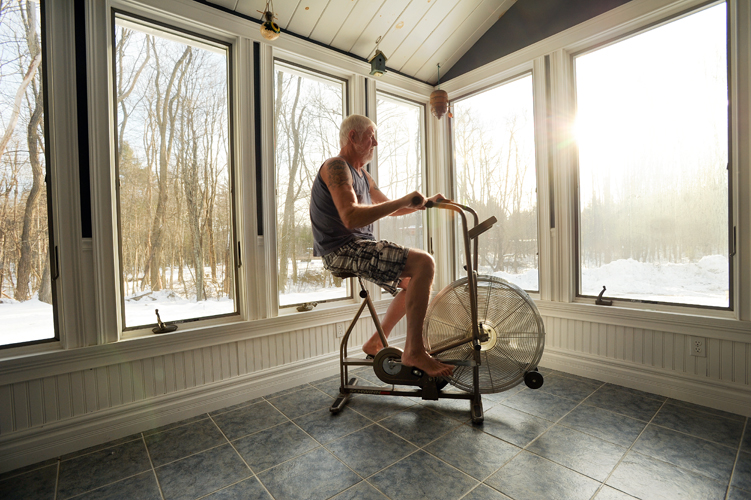
Recently I photographed Jim Twombly, a retired Portland police officer, at his home for a story featuring patients of a large medical practice group.   Jim was diagnosed a couple of years ago with diabetes and was facing a slew of health issues.  He worked with his doctor to completely change his lifestyle.   As a result of eating healthy and exercising regularly, Jim dropped more than 50 pounds and is stronger and healthier than he’s been in years.     I was there to photograph Jim as he did his morning routine—exercise followed by an oatmeal breakfast.   During my earlier scouting visit, we had decided to move his starionary bike to the more visual solarium he had built onto his home.   Early in the morning, as the sun was coming up, it would make a great visual.

Telling Stories:  Jim Twombly

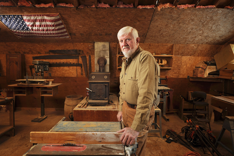
And it was.  The only problem is that, devoid of the usual clutter, it made the solarium look a little bit sterile.   After photographing Jim in his home, I asked to go photograph him in the workshop above his barn.   Once we stepped into the sawdust-infused atmosphere, stacked with woodworking tools, Jim seemed to relax.   This was his element, clearly.   I set up a couple of lights but wanted to keep the portrait low-key, focused on Jim in his world.    We chatted a little, Jim settled into a comfortable position, and the image at the top of this post was made.   Once I took it, I knew it was my favorite image because it told more of a story about who Jim really is–a hard-working guy, a Mainer, a craftsman.  A guy who is tough enough to stick to a complete revamp of his lifelong eating habits because it just needed to be done.

Good on you, Jim. For more about Jim’s story, check out his feature on InterMed’s website.

Showcase: Jacquelyn, Actress Headshot


Maine Actor Actress Headshot

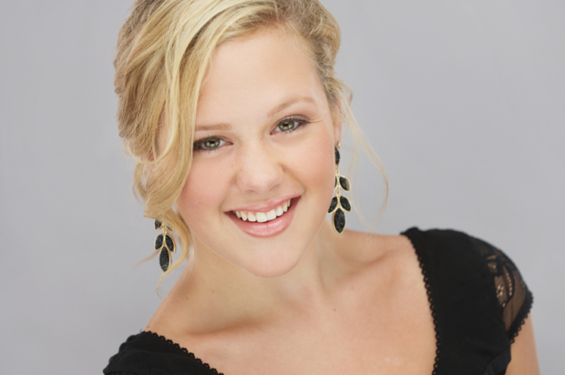
This is a photo of Jacquelyn, an aspiring actress from Maine.  Amazingly, she’s only 16…but had the poise and polish of someone much older.  After working with her for just a few minutes, Jacquelyn got it.  She pulled off a variety of different looks with ease.  If  I were a betting man, I’d say she has a great acting future ahead of her.


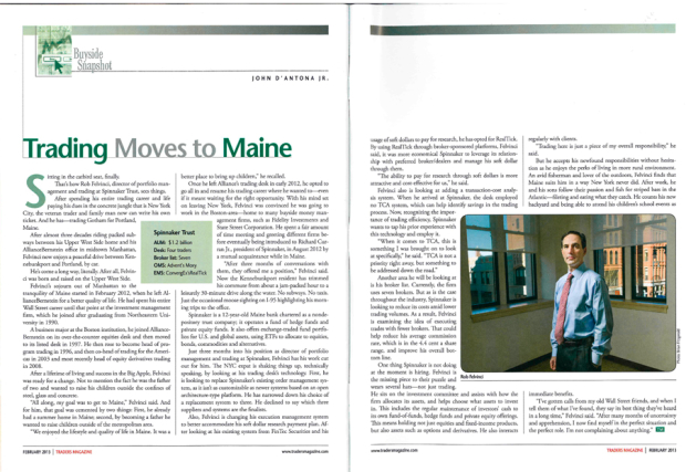
Published this week: Traders Magazine

Spinnaker_Trader_Magazine

It’s always cool to get my work published in a new place (new for me, that is). Traders Magazine just went to press with a feature about Rob Felvinci, a NYC financial trader who decided to trade the big-city lifestyle for the slower (and more family-friendly) pace of Maine. We ideally would have been somewhere out on the docks with him and his kids, fishing, but due to time constraints had to stay in and around his Congress Street offices. I liked the setting of this portrait…empty office, waiting to be filled, with Congress Street pictured through the windows.

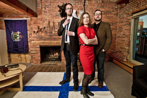
Might & Main: how a brand feels

Might-Main_02


Might & Main is a branding firm based here in Portland–they do fantastic work and cast big shadows on the local creative scene.  They’re the team that you call in to do a rebranding, or to handle the look and feel of a product or campaign.  They’ve also got a great sense of style that infuses their work–take a look at this award-winning work for the Portland Museum of Art’s Homer Winslow exhibition (I want that bobblehead, Sean).

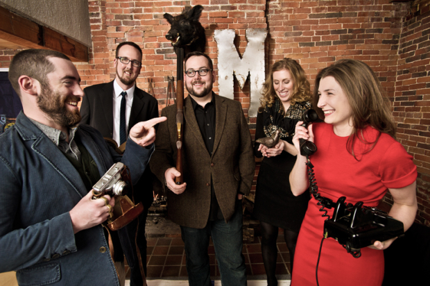
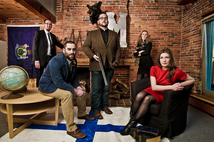
More than that, Kevin, Sean and Arielle (the principals behind M&M) are great people who always seem to be up to something interesting.   The trio,  along with team members Graeme and Morgan, moved to a new downtown Portland location in January and wanted a photo that showed them off in their new environment.  They didn’t dictate the look of the photo, but we discussed what the image should do for them:  it should give a sense of each individual person (all three principals had successful solo businesses before partnering, and all three bring different skills to the table), but show them as a team as well.  It should be interesting and striking, incorporating key elements of their new space and their quirky retro decor (Boris the Boar has made one other appearance, in an Inspire Portland feature on Sean from last year).  These guys are young, very hip and are extremely creative, so I knew I wanted to show these attributes as well.

Might-Main_03
When you strip away all the fluff–the globe, the -um- shotgun, even the lights–it’s all about the people.   Might & Main is comprised of interesting people, and I wanted to give a sense that they bring a strong point of view, a certain touch of humor and, yes, a little attitude.   To that end, I think the shoot was successful.   The final frame we all liked shows plenty of attitude.  If you look at each person’s face there’s something interesting going on.  Someone once told me that successful photos don’t give you all the answers, but make you wonder a bit, too.  Add on the lighting, the props and the “look” of the final image and you get an image that tells a story…and captures the “feel” of a brand.

There’s always room for serendipity, too.  Although I gave a few pointers on dress, I could have hugged Arielle when she showed up in that bright red dress.   How could I not get a great final image?

Might & Main: Behind the brand

Case Study – Financial Services firm portraits

When a company decides to embark upon a rebranding initiative they often hire an agency, a designer or a photographer to help them.   There are a lot of ‘triggers’ for when a company decides to do take this critical step forward.  It often happens when the company is in transition, whether physical or something more existential—a move to a new location, a major renovation, a period of great growth.

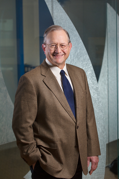
Spinnaker Trust is a Portland-based company providing wealth and finance management services.  Recently they grew with the merger with another firm, and moved into a really knock-out new space downtown.  To showcase their dynamic new space and their growth, they needed environmental portraits of their team members within their amazing offices—lots of frosted glass, hardwood flooring and deep blue walls.

I spoke with the team about their needs, and decided to go with a more dramatic approach to lighting.  With lighting you can go one of two ways.  Light ‘big’, and just create a wall of light so that everything’s bright, well-lit and very commercial-looking (see any national-level  advertisement) or light ‘small’, or selectively, throwing light just where you need it to create dimensionality, mood, and highlight aspects of the environment. Spinnaker was perfect for the latter.

I used three to four lights for most of the portraits—with all of the glass around, the lighting was tightly controlled to avoid reflections.  We did multiple scenarios with each person in a relatively limited period of time—in my shoots, I tend to move fast:  15 minutes being a long time to spend on any one portrait.

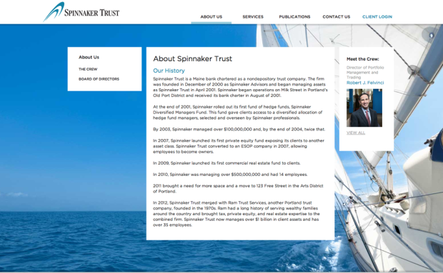
I was happy with the results:  professional but dramatic, with the environment a key feature of each image.   A big shout-out to the team at iBec Creative, who designed this clean and beautiful website.

Fitzgerald_Photo_Spinnaker_01


Spinnaker_Trust_iBec


Fitzgerald Photo Studio open house (and gallery show)


[box_grey]

Fitzgerald_Photo_Studio_LOGO_WEB

Fitzgerald Photo Studios Open House
Thursday, February 21st, 4:00 – 6:30 pm
66 Pearl Street, Suite 210 (Map)
Portland, ME

Serving light refreshments & wine

Please RSVP on our Facebook event page.

[/box_grey]


2012 was a great year, and already 2013 is shaping up to be amazing as well.  One of the biggest changes I made to my business last year was moving from the first Portland studio that my wife Beth (Blush Imagery and the Maine Wedding Company) shared for three and a half years to my current studio, right in the heart of downtown Portland.

Of course, I moved during my busiest time of year…and the studio itself has seen a steady stream of visitors since then.  Still, I’ve managed to paint, and organize, and get it ship-shape enough that I can hold my open house for all my friends, clients and fellow creatives.

We’ll also be displaying some of my Inspire Portland project work. Inspire Portland is a year-long showcase of some of the best, brightest and most interesting people that make Portland such a great place in which to live, work and play.

Whether you’re local or are planning to fly here from Arizona just to experience the Maine winter,  can’t wait to see you here!


Entrance is facing Pearl and Newbury streets: red building, wooden awning.
Studio entrance faces Pearl and Newbury streets (red building, wooden awning)