Posts tagged tips

Five Clicks: Tools for Keeping on Track


Being an independent photography professional or content creator is a great, amazing, beautiful thing.

Except when it isn’t.

When you first start as a photographer or designer, it’s like falling in love with a beautiful/handsome other person. Everything is great, and when you’re with that person, time seems to stand still.  Then you get married, and the relationship matures, and as wonderful as it is to spend time together, you also can’t help but notice that the dishes are piled up, the bills need to be paid and the in-laws are coming to visit, again.

If every day could be spent behind the lens while getting a ride with the Blue Angels or documenting a religious festival in the mountains of Catalonia, it would be like that spouse that never gets old, gets angry or challenges you in any way.  But the reality of marriage and of creative careers is that 80 percent of it is the ‘unsexy’ stuff—in the case of content creation it’s the production work, marketing and other tasks that keep the lights on—that makes the other 20 percent possible.

The problem is, it’s hard to stay focused and on track when the tasks are not so fun.  That’s why I love tools that make my job easier, are useful and help keep my animal brain on track. When my willpower or my resolve falters, I just let these pieces of software guide the way:

Activity Timer (iOS and Mac)
This is a very simple custom timer app that allows you to specify and save time blocks of custom length for various activities, and a custom “success” message. I know by experience that 90 minutes is about the longest I can focus on any given task, so most of my time sprints are anywhere from 15 minutes to an hour and a half. I have a stand-up desk and I use this tool to remind me to sit down and stand about every 20 minutes throughout my workday in front of the computer.

Trello (Web, Android, IOS, Mac, PC)
I’ve used Trello for at least 4 years. In that time, I’ve found other project management tools but the ‘kanban’ style visual drag-and-drop interface always brings me back. I use it to set up various ‘workflows’ relating to client work, my sales pipeline, and even for my editorial calendar. It’s great for collaborating between teams, too. Using this tool for my work ensures that I keep track of a lot of moving pieces in a consistent way.

Todoist (Web, Android, IOS, Mac, PC)
This is about the 1,000th ‘to do’ app I’ve tried, but at this point it’s won the award for longevity. It’s very simple to use and can interpret deadlines from text (i.e., ‘in two weeks’, or ‘next January 1’) easily. I use it all the time….and I like the way it gamifies item completion—the more you complete, the more ‘karma’ you earn and the more enlightened you become. One of these days, I’ll be a Grandmaster. But not today.

Routinist (iOS, Android soon)
I’m fascinated by the idea of creating good habits (and getting rid of negative ones) by ritualizing them into a routine that you perform daily until they become deeply ingrained. This little app helps create and define routines based on a sequence of actions and habits that, once triggered, run in sequence until they are complete. I’ve used this app to change the way I approach my morning routine.

Streak CRM (Web, IOS, Android)
This software is a CRM (which stands for “customer relationship management” tool) which is a fancy way of saying that it is used for sales, projects, leads, and anything else related to your clients.  It’s capable of far more.  I use it to do project management, sales and client pipelines in situations where most communications are email conversation-based. First I define the stages of a pipeline and also set up email templates for some of the stages. I then create a box for each new client/story/item/lead and move it through each stage of the pipeline until done. It saves me a lot of time but more importantly, Streak is a powerful way to stay consistent on predefined processes built around email. In fact, it’s designed to be used exclusively with gmail, and it operates inside your email browser.   If you’re a gmail or Google apps user, Streak is worth checking out.  It’s particularly powerful for teams, including editors, journalists and bloggers. It allows you to schedule and track emails as well.

I hope you enjoy these tools—and more importantly, find them useful for keeping your own messy business life on track. Hopefully, that unsexy stuff just got a little more sexy.

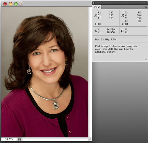
Don’t like that skin color? Replace it.

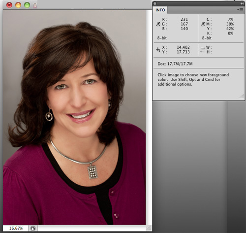
Image showing high yellow values

Proper skin tone is a must for any professional portrait.   Sometimes, especially when shooting in natural-light conditions, a warmer or cooler color of skin is desired.   When in studio or daylight conditions, however, skin tone and color is critical for making sure faces look natural and healthy.

You can’t just judge the tones of a photo by visually assessing it on a computer monitor, unless you have a recently calibrated screen.  Everyone sees color differently.   Instead, it’s best to use objective numbers.   Select the eyedropper tool in Photoshop and hover over the skin areas in your image to see the C,M,Y,K values. You must have the “Info” window open to do so.  The Info palette is a densitometer that measures the amount of cyan, magenta, yellow and black present in your image.  These are the colors that make up the four-color printing process.   Even though your images most likely are being rendered in an RGB space and may never need to be converted to CMYK, we use the CMYK values in the densitometer to measure whether our skin tone is where it needs to be.

Primarily, we’re concerned with relative values, not absolute values.  For example, For Caucasian skin, you’d likely see the numeric values for M (Magenta) in the 30-50 range.   It really doesn’t matter where it is; what’s important is this value relative to the Y (Yellow) number.   For white, Caucasian skin the Y value should always be about 3-5 points above the M value.   K?  That’s black, by the way–and it should read quite low, in the single digits, or zero.  The C, or Cyan, value, should be roughly a third of the value of the M or Y numbers.   So for our current example, a C value of 8-15 would be dead-on.    Without going into specific sets of numbers for all the various kinds of skin, the darker the skin, the higher the Cyan value should be relative to the M and Y values.

By the way, this whole number scheme doesn’t really work if the skin you’re working with has been lit by any extreme light–you know, the gorgeous, golden glow of a sunset or the cool glow of a neon sign.  You have extreme light, you want to preserve that.   You don’t want ‘natural’.

So, once you’ve determined that you DO want natural skin tone and you’ve identified the problem–that guy’s skin looks really pink and you’ve confirmed values of, say, Y=35 and M=75–then how do you fix it?

There are a lot of great ways to do so in Photoshop, and what works for one picture won’t always work for another.  That said, my go-to first tool is always “Replace Color” (Edit–>Adjustments–>Replace Color).  To use it, simply click on a lit, shadowless area of skin and select the degree of latitude (called ‘fuzziness’) you want your selection to cover.  A high degree of fuzziness will select more areas of the image that match the tone of the skin area you clicked on.   Once that’s done, move the sliders to adjust the Hue, Saturation and Lightness.  It doesn’t take much.    In the example below, I moved the Hue slider to -3, the Saturation slider to -5 and the Lightness to +1.   I’ve rarely had to go above 10 on the Hue slider, which is my primary adjustment slider.

That’s really it–just move the eyedropper icon over the skin again to read the new values and, if they look good, go with it.  Again, it may be difficult but you should trust the numbers way, way before you trust your eyes.   A properly adjusted image will reproduce on any calibrated printer even if it doesn’t look great on your uncalibrated screen.

So pay attention to your skin values, and try out Replace Color.   Doesn’t your skin deserve it?

Image adjusted using Replace Color, showing corrected relative values

Expand your mind (and your Mac) with hard drive enclosures

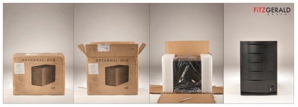
A present to ourselves: the indestructible Burly Box from MacGurus (click image to view larger photo)

I’ve written before about the need to have a 3-2-1 backup system for your important image files. Now here’s a great tool that makes automating backups, cloning and file transfers a snap: a multiple-bay hard drive enclosure. Whether you have a multiple-drive war horse or are using an iMac or laptop, if you’re a photographer you probably should look into one of these. This particular unit is sold by the knowledgeable folks at MacGurus.  When I called, the guy who helped was Rick, the owner.

I chose a four-bay unit so that my primary copies of my archive as well as backups and system clones could happen in one place. The unit is extremely tough and comes with robust power and cooling systems, so it’s meant to be run–as you might expect–all the time. This “always-on” approach solves the issue many photographers face who have a good backup system in place that may not get consistently applied because hard drives aren’t always plugged in and attached to the computer.

Ours arrived this week, and so it was fun to just light it and open it the opposite way that I opened presents as a kid: sloooowly.  More on software recommendations for handling automatic processes soon.

Shop Talk: Looking Sharp

In Photoshop there are several different ways to sharpen your images.  The two which I use routinely are quite different from each other, and are applied at opposite ends of my workflow.

Again, I’d love to hear from other photographers who use methods other than those I’m describing.

First, it’s important to understand that there are two (at least) different reasons for sharpening your images in the first place.  There’s the sharpening you do to an untouched or out-of-camera file that restores the  native sharpness of those fantastic, thousands-of-dollars lenses that you attach to your camera.  The second reason is to sharpen your images specifically for the intended medium of display (newsprint, photo print, computer screen or Wheaties box).

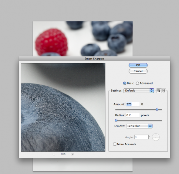
It’s surprising that with such great lenses, images from digital cameras look a bit soft at magnification.  That’s due in part to the low-pass filter built into the camera.  So, a good way to address this is by using the Smart Sharpen option in Photoshop (Filter–>Sharpen–>Smart Sharpen).   When you first open the Smart Sharpen dialog box, you’ll have to select “Lens Blur” from the small drop-down menu.  I use the basic rather than advanced, and typically set the sliders to a maximum amount of 275 and with a radius of 0.2.  Click the preview box and see the difference.   It’s an awesome tool and is best applied to images right out of the camera, before any other work is done.  See screenshot below:

What about Unsharpen Mask?  This is the favorite tool of photojournalists used to outputting images to be printed on tissue paper—aka, newsprint.  Newsprint is a poor printing medium as ink spreads and blots when it hits the fibers, rendering the sharpest images as indistinct blobs.  Hence, you must know what the final destination of your images will be.  If Newsprint, you’ll want to use higher levels of sharpness.  For prints, it’s less.  For screen/web, it’s still less.  An image that looks great for newsprint will look terrible on the screen, with halos around bright areas.   Once you apply Unsharpen Mask, your image is ‘damaged’ forever.  It should be the final step before output, after all other imaging is done.  It should never be done to a “master” version of a file that will be archived and used in potentially different ways later on.   Check out this handy table for approximate starting points for various output destinations (with due thanks to Rob Galbraith):

Finally, to recap:  Use Smart Sharpen to make your images pop the way your lenses intended for them to.  Save a master version of your final files and output variations of that file with different amounts of Unsharpen Mask depending on what that image will be used for:  newsprint, print, web, etc.  Rinse and repeat.