Posts tagged clients

Client Work: Bangor Savings Bank

Bangor Savings Bank


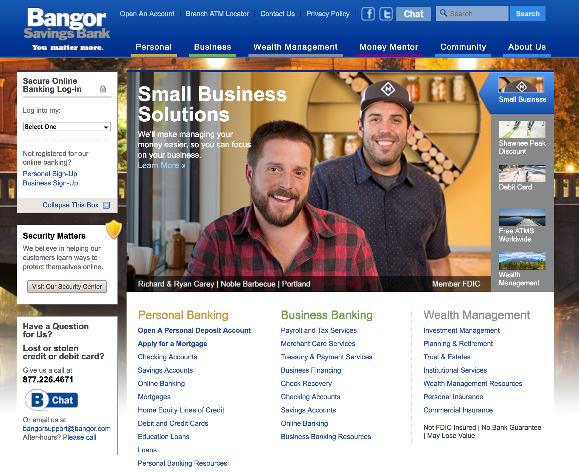
Over the past year I’ve been lucky to work with Bangor Savings Bank on a variety of shoots showcasing their small business customers from around Maine.

If you’ve ever been into a Bangor branch in Maine, you’ll have seen images of their business clients prominently displayed. When I first moved to Maine I remember loving their campaign because it showed real Maine people in authentic, real ways. In truth, that campaign is the reason I choose to step through their doors and opened my first business checking account, way back when.

I’d guess the campaign still inspires people to sign up for accounts, just it did for me.

I’m excited to be able to show off the first of the images—taken of Ryan and Richard Carey, owners of Portland’s Noble BBQ last summer—featured on the Bangor website this week.   The brothers were fun to work with and their barbecue sandwiches, incredible.

Creative Portraits for iBec Creative

Creative Portraits


When your client is a marketing agency, things tend to get interesting.   I’ve had the fortune to work with a bunch of great creative types at agencies small and large, and I find that collaborating with a talented team of creatives leads to great results.

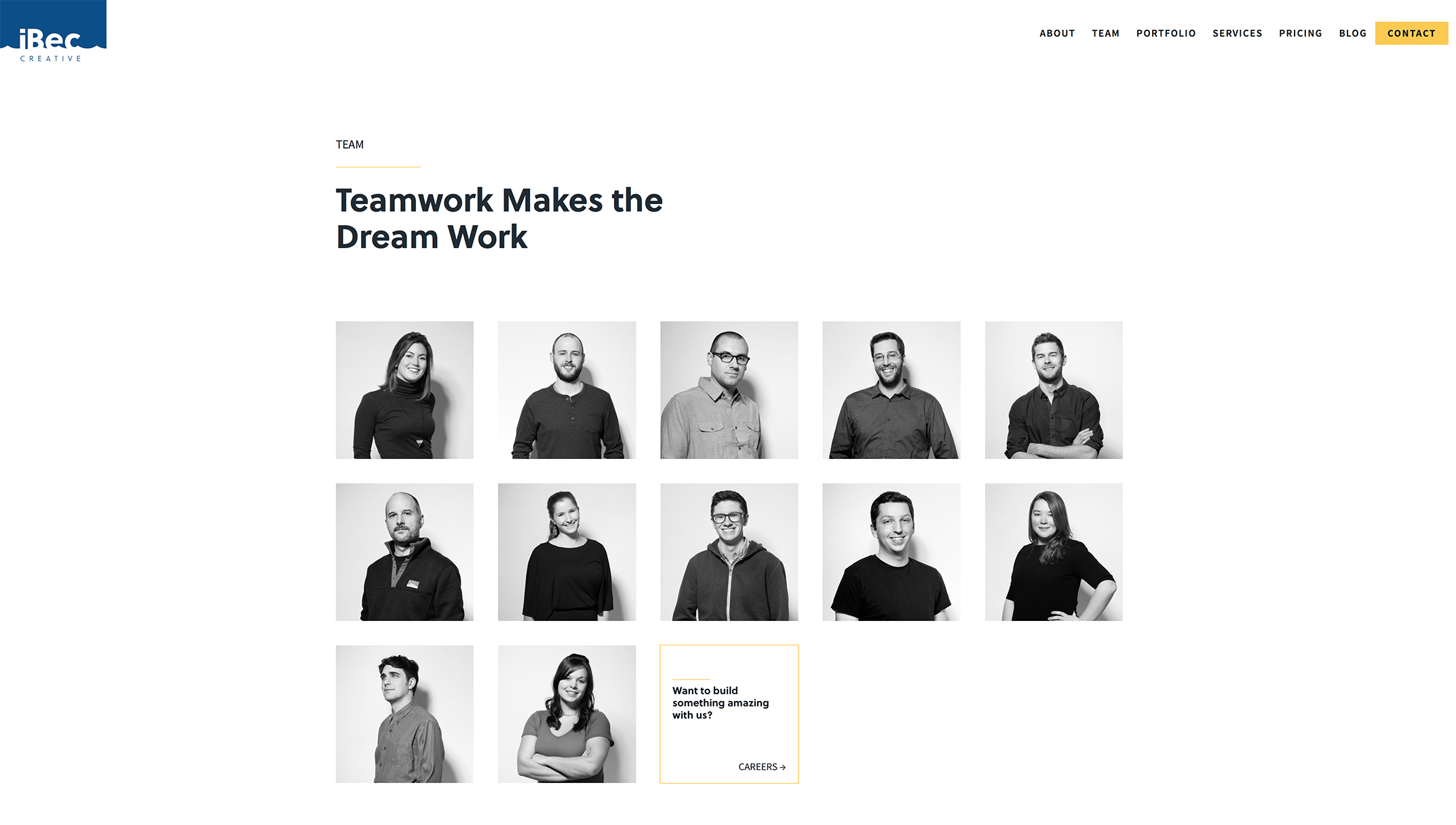
iBec Creative is a Portland-based web design and development agency that I’ve worked with several times over the years on various client projects—always a fun experience. Recently they hired me to produce creative portraits of their own team for use on their newly-redesigned website.

It’s one thing for a creative agency to choose you to photograph for their clients, and another when being hired to photograph the agency itself. Given the many talented photographers iBec has worked with, I was honored to be asked to help.

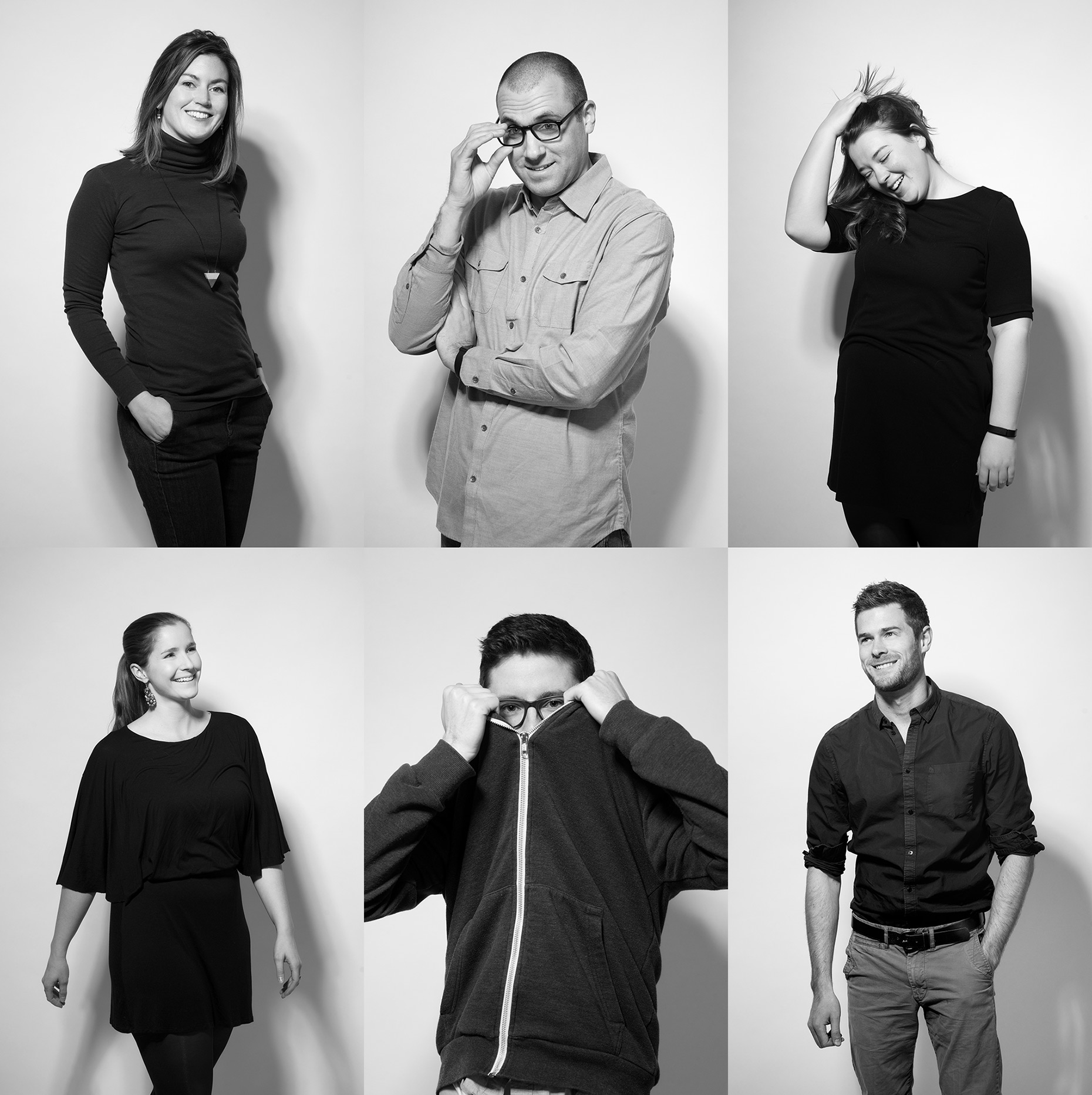
iBec already knew the look they wanted: contemporary, fun and with a fashion sensibility.  They opted to be photographed on white seamless in the studio.  The lighting was simple, but purposeful: dramatic and directional, casting shadows on the background. Basically, it was like photographing a fashion shoot, but with less fans, stylists and featuring coders and programmers instead of models.

The idea was to photograph real moments, rather than static, overly-posed formal shots. The team did great (even those who probably don’t love having their photos taken). I love the variety of shots we got, and like the way iBec used them on their site: a black and white grid, overlaid with patterns that reference the areas each member specializes in, from web design and development to application prototyping to digital marketing.  The team page reflects the cool people and personalities that make iBec tick.  See more of the images, below.


Creative Portraits


To see more of my work, including many more creative portraits–please click here to visit my portfolio site, Fitzgerald Photo.  Thank you!

Bernstein Shur: letting clients help tell the story

Bernstein Shur: letting clients help tell the story


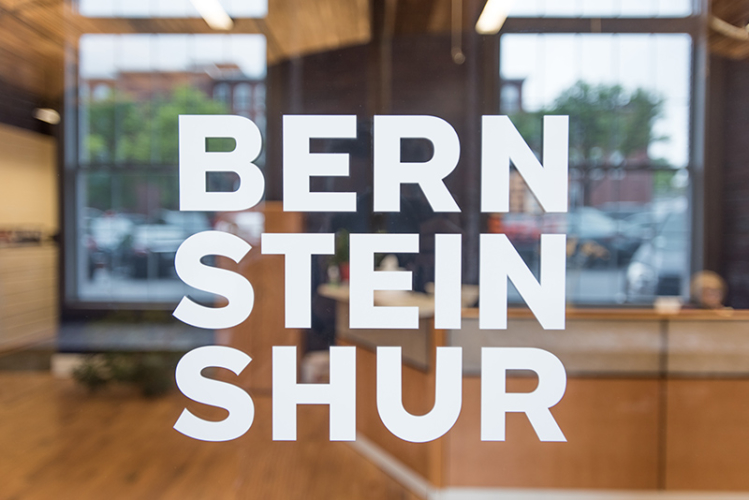
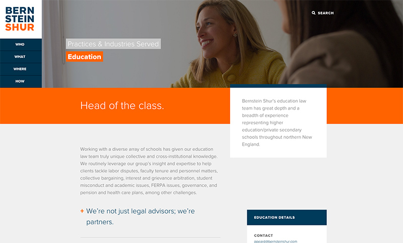
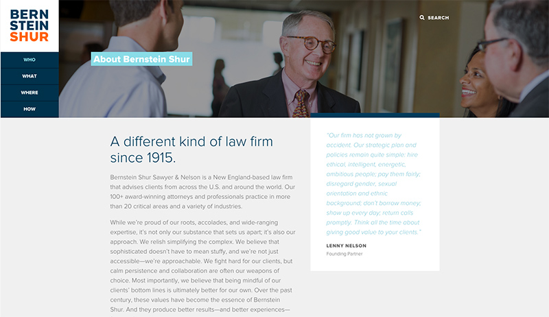
One of the largest single projects I’ve had the pleasure of being involved with over the past year was a branding redesign for Maine-based law firm Bernstein, Shur, Sawyer & Nelson, P.A.

I was contacted by Thinkso!, a New York creative agency, to produce all of the imagery for a comprehensive rebranding effort. Working with their creative team and with the amazing people at Bernstein Shur, we photographed all of the firm’s attorneys in Portland,  Augusta and New Hampshire. We also spent time with several of the firm’s clients, photographing their operations over the course of several months.  This project was unique not just because of its scope and size, but also because of the opportunity to work with Bernstein Shur’s clients in the course of showing the deep relationships involved.

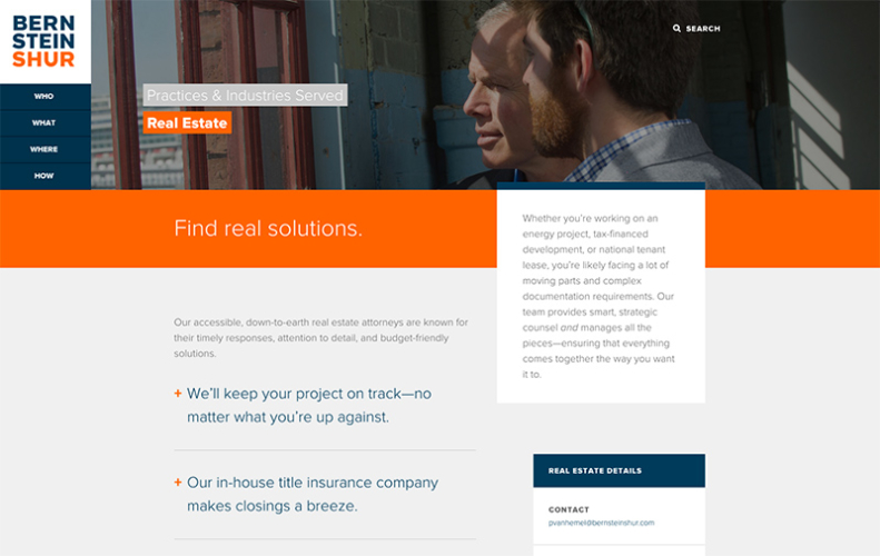
The rebrand was rolled out at the end of 2015 and looks amazing. I’m grateful to have been a part of such a monumental effort and for the chance to visually tell the story of this proud Maine firm.  See below for examples of the work in action.


Bernstein Shur: letting clients help tell the story


Bernstein Shur: letting clients help tell the story


Bernstein Shur: letting clients help tell the story

Stanley times three, and client love

Stanley_Triptych_WEB

Meet Stanley.  Stanley is a Pit Bull mix belonging to a client of mine.   He’s a little camera shy, so in this photo his eyes are locked onto his human, Tawny.  Tawny’s a lawyer at a law firm that’s also one of my oldest local clients.  I really like them and think they do an amazing job with their marketing.    So, when they asked me to donate a pet session in the studio to the winner of an internal contest, as part of their bigger marketing efforts, I couldn’t say “yes” fast enough.

No one would confuse me  with a pet photographer, but despite novice pet-shooting skills I was pretty happy with the results of our session.  After everything was done and prints were ordered, I put together this triptych of Stanley yawning and made a print for Tawny.

I love doing extra things like this for clients.  I don’t do it enough.  Making prints, sharing expertise, doing pro bono work (a set amount per year).  Most of my clients are very cool, interesting people and I like to interact with them more often than during the occasional shoot.  When I give gifts one of my go-tos is a box of chocolates from Black Dinah Chocolatiers, based on Isle au Haut, ME.  ‘Box of chocolates’?! you say.  But you’ve never had chocolates like these, I guarantee it.  My amazing business coach, Mandy, gave me these chocolates once.  Now, I’m just paying it forward.

Care without compromise

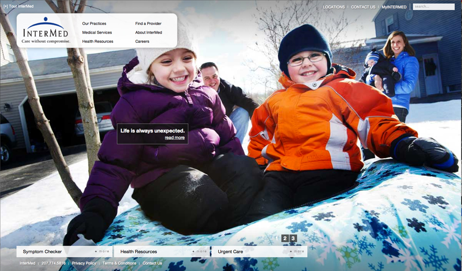
This past week marked the launch of one of the coolest sites I’ve seen in a long time.   The new InterMed website also happens to be locally designed, by Kemp Goldberg Partners, with original photography taken over the course of the past six months or so.    Beginning back in the fall of 2011, I was fortunate to work with KG’s talented crew to make it all happen.

The approach the KG team took was to photograph the doctors and other medical staff in a very casual, environmental style that both made them feel comfortable and allowed for personalities to come through.   These portraits are accompanied by a bio written by each person.  The result is warm, personal and compelling.   It was great working with each of these people, who had to endure my pleas for ‘just one more shot.’    The visual centerpiece of the site are the images of doctors and staff interacting with each other and with patients, along with views highlighting the beautiful Marginal Way InterMed building.   The first thing a visitor to the site sees are documentary shots of patients and their families whose lives have been impacted in positive ways by their InterMed doctors.  Shot in the moment, these vignettes illustrate well the InterMed creed, “Care without compromise”.


I have my digital files…now what?

[photoshelter-img width=’500′ height=’352′ i_id=’I0000w85MS3SOAJM’ buy=’0′]


I get the feeling my corporate and entrepreneur clients are thinking this when I’ve delivered a job to them.

My deliverables may include DVDs of high-resolution images, a “READ ME” file explaining color space, file format, etc, and pdf contact sheets.  Beyond that, I often post images in a protected gallery on Photoshelter, my online image library.  Each file I deliver is typically a high-resolution, 300 dpi color file, saved either as .jpg (compressed) or a .tif (uncompressed).  Think of it as a master file.  From this high-quality original file, clients can output the image in a variety of ways for specific uses including:

  • Newsprint:   Most newspapers have a line screen of 100 lpi (lines per inch) or less.   Double this number to get the necessary resolution, or dpi (dots per inch).   In addition, newspapers are printed on an offset press that uses four colors, so ideally you’d convert your file’s color space from RGB to CYMK.  Reds, blues and other colors can dramatically be altered during this conversion process, which may require additional imaging work to recover the brilliance and colors of the original image.  Lastly, because newsprint absorbs ink, photos destined for a newspaper require quite a bit of sharpening (much more than a print on photo paper) in order to look clear, sharp and bright in your average newspaper.    Most newspapers will accept any kind of high-resolution digital file, and then do all of this work for you.  If you want to make sure it’s correct, we can do it as well.
  • Photo Prints:  Most pro labs require resolutions of 240-300 dpi, so your image will automatically work great for that.   To really make it pop, it’s good to do a little bit of sharpening to your image.  It’s also useful to soft-proof the image on a color-calibrated monitor–ideally after embedding the correct .icc color profile built for the specific printer you’re using.  These are available often from the printer themselves, or you can download them here:  Dry Creek Photo.
  • Web:  Since the web is viewed on machines and screens of all types, it’s not impossible to make your image look great on every one of them.   Make sure you have a fighting chance by converting your file to the sRGB color space, or otherwise it may look too yellow or magenta on PC screens.
  • Black and White:  If your image needs to be turned black and white, you could just do an automatic grayscale conversion in Photoshop or even in free editors like iPhoto and Picasa.   It’ll work, but it’s not optimum.   My preferred way is a multi-step process that preserves detail in shadow areas and gives a much richer tone to the finished black and white image.
  • Upsampling:  If you need to make a print that is physically larger than the size of the digital image, you have a few choices.  You can resize the image to the larger size, but if it’s more than 10% larger than the original you’ll get pixelation and softness.   Again, I use special software to upsample the images to larger sizes in a way that preserves the image’s integrity as much as possible.  Keep in mind that when you size a photo up, you’re asking the software to add more pixels.  These have to come from somewhere, so basically the software takes a look at the color of the existing pixels and makes an educated guess about what color pixels to add to generate the larger-size photo.   Depending on the sophistication of the software, this can be done well or very badly.

It can be daunting when you aren’t sure exactly how to use the image files in an optimum way for each specific application, be it web, newsprint, photo print or other.   Knowing how you’ll use your images, and communicating that to your designer, photographer or programmer , is key to your success.   As part of my service, I’m happy to help my clients optimize their images for use in magazines or the web.


Now that’s a cool Christmas gift!

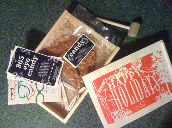
It’s the end of the year, which means that it’s time for gifts!  I think I’ve mentioned I have the best clients…ever.  I got a good reminder of this when Jondi from the Maine Eye Center knocked on our studio door last Wednesday.   She was bearing a cool hand-made wooden box with a sliding top that, when opened, revealed a bunch of holiday goodies…all Maine-made, of course (see above for my hasty iPhone capture of the loot).   First was a monthly calendar featuring the work of local artist Erin Flett of studio e flett design.   My wife Beth loves her design work and recognized it immediately.   I immediately went to the peanut brittle, made by Sugar Hill Baking Company.  I was about to go monkey on the large plate of brittle, but noticed at the last minute the small wooden mallet and accompanying safety goggles.   Turns out there was a method to this madness.  I put on the safety gear, readied the mallet, and let ‘er fly.   After enjoying way too much of the treat I noticed that the box and mallet were made by Mainer Richard Holman.    Kind of a nice icing on the cake to see that everything was made locally.

Thanks, Jondi and Maine Eye Center!   Not only were these guys a treat to work with throughout 2010, but they are a class act, too.    Of course, now that ups the ante for me for next year…how do you top homemade peanut brittle and a hammer?

–30–