I have my digital files…now what?

[photoshelter-img width=’500′ height=’352′ i_id=’I0000w85MS3SOAJM’ buy=’0′]


I get the feeling my corporate and entrepreneur clients are thinking this when I’ve delivered a job to them.

My deliverables may include DVDs of high-resolution images, a “READ ME” file explaining color space, file format, etc, and pdf contact sheets.  Beyond that, I often post images in a protected gallery on Photoshelter, my online image library.  Each file I deliver is typically a high-resolution, 300 dpi color file, saved either as .jpg (compressed) or a .tif (uncompressed).  Think of it as a master file.  From this high-quality original file, clients can output the image in a variety of ways for specific uses including:

  • Newsprint:   Most newspapers have a line screen of 100 lpi (lines per inch) or less.   Double this number to get the necessary resolution, or dpi (dots per inch).   In addition, newspapers are printed on an offset press that uses four colors, so ideally you’d convert your file’s color space from RGB to CYMK.  Reds, blues and other colors can dramatically be altered during this conversion process, which may require additional imaging work to recover the brilliance and colors of the original image.  Lastly, because newsprint absorbs ink, photos destined for a newspaper require quite a bit of sharpening (much more than a print on photo paper) in order to look clear, sharp and bright in your average newspaper.    Most newspapers will accept any kind of high-resolution digital file, and then do all of this work for you.  If you want to make sure it’s correct, we can do it as well.
  • Photo Prints:  Most pro labs require resolutions of 240-300 dpi, so your image will automatically work great for that.   To really make it pop, it’s good to do a little bit of sharpening to your image.  It’s also useful to soft-proof the image on a color-calibrated monitor–ideally after embedding the correct .icc color profile built for the specific printer you’re using.  These are available often from the printer themselves, or you can download them here:  Dry Creek Photo.
  • Web:  Since the web is viewed on machines and screens of all types, it’s not impossible to make your image look great on every one of them.   Make sure you have a fighting chance by converting your file to the sRGB color space, or otherwise it may look too yellow or magenta on PC screens.
  • Black and White:  If your image needs to be turned black and white, you could just do an automatic grayscale conversion in Photoshop or even in free editors like iPhoto and Picasa.   It’ll work, but it’s not optimum.   My preferred way is a multi-step process that preserves detail in shadow areas and gives a much richer tone to the finished black and white image.
  • Upsampling:  If you need to make a print that is physically larger than the size of the digital image, you have a few choices.  You can resize the image to the larger size, but if it’s more than 10% larger than the original you’ll get pixelation and softness.   Again, I use special software to upsample the images to larger sizes in a way that preserves the image’s integrity as much as possible.  Keep in mind that when you size a photo up, you’re asking the software to add more pixels.  These have to come from somewhere, so basically the software takes a look at the color of the existing pixels and makes an educated guess about what color pixels to add to generate the larger-size photo.   Depending on the sophistication of the software, this can be done well or very badly.

It can be daunting when you aren’t sure exactly how to use the image files in an optimum way for each specific application, be it web, newsprint, photo print or other.   Knowing how you’ll use your images, and communicating that to your designer, photographer or programmer , is key to your success.   As part of my service, I’m happy to help my clients optimize their images for use in magazines or the web.


Lose the gear and become a better photographer

[photoshelter-img width=’400′ height=’627′ i_id=’I0000EHrXNHkbRsc’ buy=’0′]
© Brian Fitzgerald
I love nothing more than getting a visit from the UPS fairy, bearing boxes of the latest gear or light modifier.

But with experience comes the realization that a great photograph has less—much less—to do with fancy gear or expensive equipment and much more to do with what’s going on with the person behind the camera.

In short, it ain’t about the tools you use.  It’s how you use them.

When I first learned how to use studio lights on location, I was so excited to bring out my lights and stands, position the subject, etc.   I would spend a lot of time worrying about details like exposure and light shaping and correspondingly less time engaging with my subject.  Invariably, the result looked technically sound but lacked soul.

On the other end of the scale were the seat-of-your-pants moments as a newspaper photojournalist.  With just two cameras, a couple of lenses and a flash I was able to focus on capturing the moment.  Sometimes the photos were grainy, or were shot in less than ideal lighting conditions, but the content and moment elevated them far beyond the realm of the average “pretty picture”.

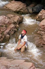
Once I did a week-long assignment covering a wilderness teen camp–you know, the type of program where troubled, out-of-control teens are whisked away in the night to find themselves deep in the wild, learning discipline through hard work and routine for weeks or months on end.     This one was isolated in a remote area of high Arizona desert, and everything I needed was packed on my back for the daily marches to each night’s new camping spot.    Within an hour of hiking, I slipped while fording a river, dunking a camera, a lens and smashing another on a rock.   I shot everything for the next five days with a backup Nikon FM2, a 24mm and a 35-70mm lens while the wet gear rusted inside a plastic bag.

And the photos were great.  Limiting myself to a couple of lenses and  a single camera body helped me focus on getting the moment,  gave me less distracting choices and ended up helping me get a very strong photo story.   I also learned to start a fire with a bow and stick, but that’s another story.


What the heck is a QR code?

Fitzgerald Photo vCard QR Code


We’ve all seen these little square-shaped boxes filled with tiny squares arranged in seemingly random and complicated ways. They pop up everywhere, from TV ads to the sides of buses to the backs of business cards (including mine).

Why?

QR (short for Quick Response) code is similar to a bar code. It’s a format well-suited for the smartphone user. Digital info can be captured and displayed as a unique pattern within the QR code (the more info, the more detailed the matrix pattern). Using a QR reader on your Droid or iPhone, you can point your camera lens at a QR code to show text, a url, vcard or other data contained within.

Why?

QR codes may turn out to be a fad, but I think they have merit.  The QR code on the back of my business cards, for example (above), contains my address information—my vCard—within it.  Instead of typing in all that info onto your little smartphone, you can point your phone at the code and -voila!- my name, address, phone and email will pop up ready to be added to your address book. It looks kind of cool, but it’s practical and thus earns a place on my card.

If you’re interested in checking it out, go to any one of many QR code generators just a Google search away online. I currently use i-nigma and QRReader on my iPhone.  Note:  If you have a pre-third-generation iPhone like I do, you may have trouble with the more complicated patterns (like mine, above) due to the limited ability of the camera sensor.

If you do use a QR code, consider creating special content—like coupons, a deal, or some funny or clever video that reveals itself only to QR cool kids. Remember. A QR code can be used for good or evil.   Check out this cool example just to start your day out right (below).

See what QR codes are capable of

Liability insurance is a photographer’s responsibility

My business insurance guy must be a wreck.  He’s legitimately concerned that most people walk around with too little protection against risk, in the form of property and liability insurance.

He’s right.

I’m always on location, handling high-voltage lights, carrying tons of heavy gear, working in the elements.   But, thanks to him, I know I’m covered in case something unforeseen happens.

I advise people to hire not just the photographer that fits into their budget, but the best photographer for them.  That is, someone who they personally gel with and whose style both speaks to them and fits the work they need done.

If it’s a business doing the hiring, I also advise them to look a little deeper than the photographer’s portfolio.   Just like you’d hire a licensed and bonded plumber or tradesman, your photographer—particularly in advertising and commercial photography—should have a minimum level of liability insurance to protect themselves and their clients in the event an accident should happen, in-studio or on location.

A true professional should offer this kind of protection for their clients as a matter of course.  Clients should always ask.

Here’s an informative article from Entrepreneur magazine explaining why home-based businesses should have insurance.   For studio-based LLCs like Fitzgerald Photo, it’s even more important.

Lights on Location Workshop rescheduled for Fall

Our  Lights on Location Workshop scheduled for August 16 has been postponed until Tuesday, October 18th from 5-8 pm.

Those already committed to the workshop don’t need to do anything further.  There are still five of the ten slots available for the Fall workshop.

It’s become clear that many photographers who otherwise would like to attend can’t easily come to an August workshop due to their busy personal and work schedules this time of year.   As a result, we’re choosing a date that hopefully will work better for everyone.

Stay tuned for more details as the date gets closer.  We’ve got a great workshop planned full of practical tips for photographers at the intermediate and advanced level who want to push themselves creatively with light on location.

Calling all photographers….

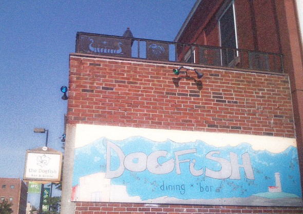
The Dogfish Cafe and Grille, 128 Free St., Portland, ME

Photography is often a solitary affair. Even if you have an assistant and stylist on a shoot, the responsibility lies with you, the photographer. And back at the studio, no one else is going to process the photos.

One of the things I miss most from my days as a staff shooter on a newspaper is the camaraderie and fellowship of other photographers. Generally, the people on a newspaper staff are very close—bonds forged from long hours working towards a noble goal—but newspaper photographers from competing newspapers shared friendships as well. Even though we were competitive with each other, we would always (with rare exceptions) help each other out with extra batteries, gear or advice.

In the commercial and advertising world, it’s a more lonely place. We may have teams around us, but we don’t regularly rub shoulders with other photographers.  I think as a result that something’s lost. One of the ways I grow is to see the work of other photographers…and sharing information about business practices benefits us all.

That’s why I’m so excited about the breakfast clubs being organized by ASMP New England (American Society of Media Photographers) throughout the Northeast.  Here in Maine, I’m the organizer of these so-called “breakfast clubs” and we’ve just scheduled our third one at the Dogfish Cafe and Grille on August 23rd.

Each of the locations hosting these clubs decides for themselves the best format, and that’s why our breakfast club has morphed into a cocktail club. Besides being easier to get to for me, I guess it’s not surprising that food and a few drinks appeals to a group of photographers.

By the way, this event isn’t limited to ASMP official members. It’s for any student or professional photographer who does commercial, editorial and advertising work like ASMP members do. Hopefully you’ll love what ASMP offers and will eventually apply for membership, but if you don’t you should still come out, have a drink and talk shop.   It’s also open to designers and other AIGA-types who work with people like us on a regular basis.

So come on out and meet some folks that toil in the photo trenches like you do.  You might just learn something.

Lights on Location workshop is around the corner

[photoshelter-img width=’600′ height=’593′ i_id=’I0000_pV8E5ci5xI’ buy=’0′]

This fall, we’ll be holding our next and final workshop of our 2011 workshop series here at Studio B.  In previous ‘shops we’ve gone over techniques and gear related to the use of small flashes on location. This time, we’re going for the bigger guns: studio strobes in the field.

This is done with non-studio shooter in mind….I’m talking about wedding, portrait and commercial photographers who find  themselves most often shooting in a variety of environments and where portability and power are required.

For years as a photojournalist, ambient light and a small off-camera corded flash sufficed for much of what I did.  It wasn’t until I began using more powerful studio strobes that I was able to really take advantage of faster recycle times and higher output, enabling me to shoot synchro-sunlight images any time of day.

At this workshop we’ll go over equipment and principles of shooting outside.  Then we’ll head outside the studio to make some fun photos happen.    Although we’ll be using larger strobes, the principles are the same with small flashes, and so we’ll use those as well.  Participants are encouraged to bring their portable gear and cameras with them so they can use the techniques we’re discussing.

Space is limited to ten.   Please RSVP to me here:  brian@fitzgeraldphoto.com if you have questions.  To snag your spot now, click to pay below.   Hope to see you there!


Lights on location: Amp up your location images with studio and portable strobes

Time: Tuesday, October 18, 5-8:30 pm
Location:  Starts at Maine Studio B, 28 Maple Street, Third Floor, Portland, ME (207) 699.9321
Cost: $99

Sometimes natural light isn’t enough.  Often it just needs to be “helped” by the addition of some well-placed strobes.  Join veteran photojournalist and commercial photographer Brian Fitzgerald for this comprehensive, hands-on workshop on the use of studio and portable flashes on location.   Whether you’re a studio photographer or you work out of the back of your Honda Civic,  you should know how to build a shot with all available tools–ambient and artificial.

In this workshop,  topics include:

Location gear – what you need to have
Small flashes (i.e., camera strobes) vs. studio strobes
Balancing ambient light and artificial light
Reflectors and modifiers
Tips for when things go wrong: surviving the location shoot
Plus: The 10-minute portrait challenge
Q-and-A session

Space is limited to 10. Reserve a spot now by contacting Brian Fitzgerald by email at brian@fitzgeraldphoto.com. Cost is $99 for this intensive instructional workshop.

Don’t get bit by (OS X) Lion


If you have a Mac shop,  you’re probably as excited as I am about many of the features in the newest Mac OS  X update, named Lion.   AirDrop, iOS features like pinch-zoom and apps organization (Launchpad) are just a few of the things I’m ready to add to my Mac experience.

But don’t let that lion out it’s cage just yet.

The reason is that along with those cool features, Lion removes support for Rosetta.  That’s the translator that enables older PowerPC programs to run on Apple’s  Intel-powered machines.

I happen to have several PowerPC programs that are critical for my business.  Once I install Lion, those programs will no longer work–including one very useful program, Quickbooks.  There are also a number of issues reported with Adobe products, especially CS4 and earlier photo suite products. For example, in pre-CS5 Photoshop, droplets no longer work on Lion.

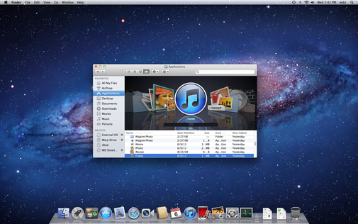
So before you install, do a simple check to see how it may impact you.  Go to  Utilities–>System Profiler and click on Applications (Under Software).  When the list of all your programs appears, click on the tab “Kind”, which sorts by type.  Scroll down the list and you’ll see “PowerPC” for any older programs that require Rosetta.

Some of these older programs may not be in use, in which case you can uninstall them wtih AppCleaner and install Lion.  But if you’re like me, you’ll wait a little longer until Lion is tamed with some updates and your PowerPC application developers come out with Lion-compatible versions.

The importance of raising questions

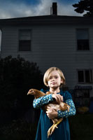
Trisha, Mike and Josephine Rideout of Huntington Ave. in Portland, ME.  Josephine, 5,  with her pet chicken, Maryanne.Photo by Brian Fitzgerald.Rideout FamilyPhoto by Brian Fitzgerald.Rideout Family (Brian Fitzgerald/© Brian Fitzgerald)
Who is this girl and why is she holding a pet chicken? (©2011 Brian Fitzgerald)

I have a photography mentor whose advice I often replay in my head. One of the sayings I most remember when I’m shooting my editorial portraits or more conceptual work is, “Leave them with questions rather than answers.”

This seems antithetical to my upbringing in newspaper photojournalism, where the success of a news photo hinges on the ability of the viewer to clearly digest what’s happening in the image with as little help from the caption as necessary.

But it only seems that way. The bread-and-butter of the community photojournalist isn’t spot news or hostage standoffs or even sports. Rather, it’s a big helping of portrait profiles with a side of found  features (so-called “wild art”) and the occasional self-assignment photo essay or story. Every now and then, an illustration.

It’s in these non-news situations where my mentor’s advice rings true. A successful photo is one that isn’t totally literal. A great photo doesn’t tie up every loose end and dot every “i”. Whether because of an interesting expression, body language or other reasons, a photo that leaves something unresolved in the viewer’s mind is the one you’ll bet they’ll look at for a while before moving on to Dear Abby. They might even come back later to study the photo to try to figure it out themselves.

To boil it all down, I think that when you have an image that forces the viewer to fill in the blanks a bit—you may just have an image that can touch people.  One master at this was the great portraitist Yousuf Karsh. He photographed many of the most iconic images of famous people in the 20th century, from Fidel Castro to Albert Einstein to Andy Warhol.   You just have to view the iconic portrait of Sir Winston Churchill to see what Karsh was able to do (the backstory on this particular photo is fascinating and a worthwhile read). Looking at his images, the viewer is compelled to try and guess what the subjects are thinking at that moment.  It’s as if you can see their souls and a little of their dirty laundry, too.

It’s an approach I always try to keep in mind when shooting images for certain clients, or for myself.  Special thanks to Josephine, above, and her chicken, Maryanne.


Moment + Light

Warren Smarlowit, 47, holds onto photos and other mementos that remind him of his family, including a nephew's athletic letter from the Yakama Nation Tribal School.

For me, photography boils down to two key elements: moment and light. You may have one in greater proportion to the other, but for most types of photography—certainly any imagery with people—you need both.

I used this criteria as a newspaper photo editor when judging daily work and the many portfolios that came across my desk.

You kinda know a “real” moment when you see one. It’s a look, an expression, or an interaction. Usually from the viewer’s perspective, it looks like you’re viewing a private scene, voyeur-style, and the subject appears totally unaware of the camera.

As a photojournalist, real moments are mostly found situations. In feature situations, the goal is to shoot photos (usually with a long lens) before the subject really becomes aware of your presence. You get something ‘real’ of the subject doing something interesting and later you deal with getting their permission and name to actually use the photos. In news situations, such as fires, accidents or events, the subjects are usually so focused on the happenings that getting moments is pretty easy, giving you time to work on composition and light too.

At the newspaper, moment trumped light any day of the week and twice on sundays. Robert Capa’s grainy, ghostly images of the landing at D-Day fails from a purely technical standpoint but no one would argue that the moment it captures place this work among history’s finest.

As a commercial and advertising photographer, my subjects are (mostly) aware of what I do. They are paying me to be there, or my clients are paying them to be there. It’s me, them and bunch of obtrusive lighting equipment, so the goal is to get the subjects to relax and give me something real despite the unreal surroundings. When successful I get a true serendipitous moment—a peice of chaos that I thankfully can not, and don’t want to, control—in the midst of a controlled setting.

The only difference between editorial and commercial photography in this regard is that non-editorial shooters have the luxury of not having to wait for the perfect light. Regardless, being attuned to capturing the authentic moment will help turn otherwise ordinary photos into memorable images.

That’s still theway I approach the debate between moment and light. Make sure you have a strong moment, and then work on the light.