Category Blog

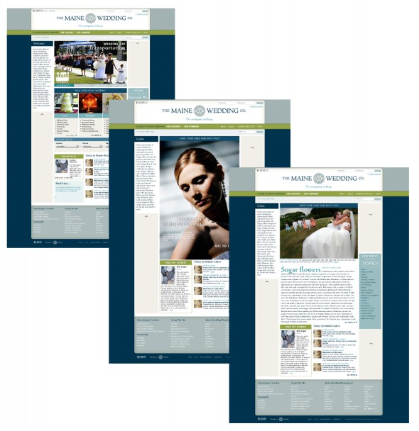
Introducing the Maine Wedding Company

No matter where we’ve lived, my wife Beth seems to wind up right in the thick of things.  She’s a very talented wedding photographer and owner of Blush Imagery–and she seems to know everyone in this town. She’s one of those Connector Types–a person who makes fast friends with people of all kinds and who is always introducing people to others they should know.

So, it wasn’t much of a surprise when, a couple of years ago, Beth brought up the idea of creating a wedding company that would serve and celebrate the many fine folks in Maine’s wedding industry.

Starting from that little seed, her idea has grown (with much tending and care).  I’m so proud to be able to broadcast her initial announcement of the Maine Wedding Company.  You can read more about what she’s up to on her blog, Applying Blush.   (Ahem….She’s looking for testers!)

As easy as 3-2-1: protect your most valuable files now

Hard Drive Failure

A few months ago, my assistant was dutifully burning DVDs from a backup external drive.  The hard drive, just a few months old, was humming along just fine until it simply disappeared from the desktop.  I’ve never had a hard drive fail so completely and without warning.   I took the disc in to Steve Bedell, a friend and systems guru with Network Knowledge.  He cracked the case and spent a day trying to recover the files, to no avail.  It was toast.

Even though all of those files existed elsewhere in my system (meaning nothing was permanently lost), it underlined the need for a more robust backup solution.   As Steve says, it’s not if your hard drive will fail…but when.   He also touts the oft-repeated rule of thumb when it comes to file backups:  have a 3-2-1 strategy.   What’s that?  It simply means that your important files should have three copies, on at least two different types of media (external drive, internal drive, write-once media like CD or DVDs, or cloud-based storage).  The “1” means that at least one copy should be stored offline (not plugged into your computer), preferably off-site in a safe location.

So, here’s my own Simple Simon method, which satisfies the 3-2-1 rule:   All of my image files live on a primary external hard drive plugged in full-time to my computer.  I also have these files in a “working”, or temporary, folder on my internal hard drive.  Everything is backed up to a second external hard drive that is unplugged and kept elsewhere.   Lastly, I burn DVDs of all these files once they are organized into the buckets I keep them in.   So:  three different permanent homes for my files, on two different types of media (external hard drive and DVD), with one copy (an external drive) stored off-site.   In the future I’ll probably explore cloud-based solutions, but right now they’re too slow for my needs.  I also use Time Machine for versioned backups, but I again don’t use this for image files for a variety of reasons.

What’s your solution?  Even if you don’t have a lot of money, a simple system like mine will give you peace of mind the next time you get a blank screen where your computer used to be.

It’s not about the cows. It’s about the people.

When people remark to me that I’m working long hours in my photography business, I usually respond, ‘hey-it beats working for a living’.   The truth is, it’s a lot of work to run a business—but the rewards are also great.   One of my joys is meeting new people and working with some really fantastic clients.

One of my favorites has been MooMilk, short for Maine’s Own Organic Milk Company.  This company is as tough and gritty as they come–formed as a response to being dropped from their conventional milk distributor last year.   The half-dozen organic milk producers comprising MooMilk are small family farms located in central, northern and Downeast Maine.   In addition to producing great-tasting, healthy milk they are running their farms and now, marketing their own product.  It’s not easy, but they are doing it.

In approaching my work with MooMilk, I realized that the idea I wanted to get across was simple:  MooMilk doesn’t come from cows.  It comes from people.  You can see a sampling of photos from my shoots above.   And there’s a great op-ed piece in the Bangor Daily News that speaks to the families that are MooMilk.

Shop Talk: What space are you in?

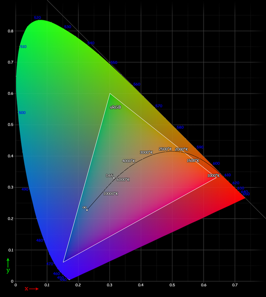
CIE Chart with sRGB Gamut by spigget.png
CIE Chart with sRGB Gamut (from Wikimedia Commons)

When you get a new digital camera, one of the bewildering number of options available to you in set up is to change the color space:  sRGB, Adobe 1998, or even ProPhoto RGB (only certain cameras).  Each of these has a wider color gamut than the last.  That’s a fancy way to say that they can see many more colors–and thus produce an image with more of the hue subtlety that nature offers.

Then there’s the color space, known as the working color space, that you use when processing an image in Photoshop.  This usually is the color space that the image came in, but you can assign a new working color space just for the purposes of your particular monitor, etc.   More on that in a future post.

Finally, there’s the output color space–the space that you convert your image to just before turning that image out for a client, a printer or for publication on a site.

No matter what color space your image is assigned in-camera or in your photo editing program, make sure to consider converting your image to sRGB if it is intended for web display, for printing at a photo lab or if it is being sent to a client who has a PC (when in doubt, assume the viewer’s computer is a PC!).

Why?  sRGB displays a more limited set of colors, but it’s a color space made for PC screens–and most computers out there are PCs, not 27-inch calibrated Mac screens like mine.

To convert an image to a new color space in Photoshop, go to Edit–>Convert to Profile and choose the sRGB option from the drop-down menu.  If you use Lightroom or other programs, many of them have an “convert to sRGB” option when exporting images.

Paying attention to the color space your photos are captured in and imaged in is important, but it’s equally important to convert to sRGB unless you know that your images are going to an offset printer (CMYK color space) or to someone who has a nice, big Mac computer just like you.  Your images will display better and your clients will be happier, too.

Portland’s own Mad Man

Portland-area fans of the AMC cult-favorite drama Mad Men take heart.  Due to the Mad Men Casting Call contest (a partnership between AMC and Banana Republic), you can get a shot at a guest appearance on the show.  All it takes is some creativity, a camera and a devotion to 1960s-era coolness bordering on the fanatical.

The rules are simple:  visit a Banana Republic to get a ‘Mad About Style Guide’, register, and then submit a photo showing a scene and characters that could fit right into the set of the TV show.   The photo with the highest number of votes when the contest ends on September 6 gets a walk-on appearance and a small shot at being a star.

Dan Routh is creative director of Burgess Advertising & Marketing, one of Maine’s largest ad firms.  He’s also a huge fan of the show, which depicts the life and times of Manhattan ad men in the 1960s.  Having cut his teeth as a New York City advertising art director, Routh knows the subject well.  He also happens to have a trove of period items–from desks to lamps to clunky black telephones–ready to serve as props.   Add to this the desire to take advantage of an opportunity to do a little social media marketing, and this contest was a no-brainer for Routh.

The only thing he had to buy was an $8 pack of Lucky Strikes cigarettes.

Check out Routh’s Mad Men photo and add your vote.

Below, see some of the shoot outtakes, including some wide scenes that include his entire office and the lights we used on the impromptu shoot.    Yes, that’s real cigarette smoke.

From Portland to Portland: 4:33 minutes of fame

Last month I was honored to be among the first participants in a whirlwind cross-country video “road trip” of creatives stretching from Portland Maine to the other Portland, some 2,500 miles away, in Oregon.

The Copyright Alliance is a non-profit organization that believes that copyright protection promotes creativity in any creative endeavor–writers to photographers, filmmakers to poets.  To raise awareness and–let’s be honest here–to get one heck of an ultimate road trip out of it to boot, executive director Patrick Ross is interviewing and videotaping creative types from coast to coast, then posting them on the Copyright Alliance site and on the Copyright Alliance YouTube channel.

Last month, Ross visited me in my Old Port studio where we talked about copyright issues, the value of personal projects and the need for continuing business education.   We had a good, albeit short visit as Ross had two other subjects to interview that day out of state.  I hope he enjoyed his brief visit to Portland, Maine–truly a place where creatives are an important part of the local culture and economy.

You can read the article and see additional videos from Maine and other states as they are posted on the Creators Across America section of the Creative Alliance website.   The work they do should be important to anyone who values the contributions of creative individuals.

The colors are coming

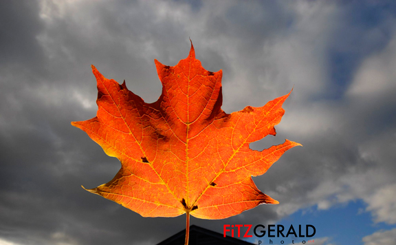
Maine Fall Leaves

Here in Maine, autumn is a pretty special time of year.   The leaves are turning brilliant colors, leaf-peepers on buses are chasing the peak colors as they move from Fort Kent down to Kittery and, somewhere, a photographer is taking killer photos.

A couple of things that I know to be true:  One, the fall is New England’s perfect season–it’s actually quite long, extending right up until late November–and it’s somewhat tourist-free after Labor Day.  This is when Mainers really seem to enjoy their state.  Two, the crisp blue of autumn skies and the aforementioned leaves make it the perfect time for photos that feature the environment…say, environmental portraits or architectural images.  People here are crazy for their fall foliage.  If you don’t believe me, check out the Yankee Foliage site, which tracks the the progression of peak leaf-changing as it marches southward.  They could well be tracking nuclear material in the former Soviet Union for all the detail and seriousness they apply to leaves.  Their obsession is to your benefit.

The problem is, although fall lasts forever here in Maine, those brilliantly-colored fall leaves don’t.  In fact, anyone hoping for beautiful shots displaying some of New England’s finest scenery should be planning on the shoot dates right about now.  I’ve had clients wait until the end of September or October to start setting things in motion only to miss the peak of leaf color due to an employee schedule change, sickness, bad weather or other logistical issues only to find that their visual opportunities have literally fallen away.

So whether you’re taking the images yourself or hiring a pro, start thinking and planning on your best autumn visuals now.

Shop Talk: Looking Sharp

In Photoshop there are several different ways to sharpen your images.  The two which I use routinely are quite different from each other, and are applied at opposite ends of my workflow.

Again, I’d love to hear from other photographers who use methods other than those I’m describing.

First, it’s important to understand that there are two (at least) different reasons for sharpening your images in the first place.  There’s the sharpening you do to an untouched or out-of-camera file that restores the  native sharpness of those fantastic, thousands-of-dollars lenses that you attach to your camera.  The second reason is to sharpen your images specifically for the intended medium of display (newsprint, photo print, computer screen or Wheaties box).

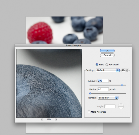
It’s surprising that with such great lenses, images from digital cameras look a bit soft at magnification.  That’s due in part to the low-pass filter built into the camera.  So, a good way to address this is by using the Smart Sharpen option in Photoshop (Filter–>Sharpen–>Smart Sharpen).   When you first open the Smart Sharpen dialog box, you’ll have to select “Lens Blur” from the small drop-down menu.  I use the basic rather than advanced, and typically set the sliders to a maximum amount of 275 and with a radius of 0.2.  Click the preview box and see the difference.   It’s an awesome tool and is best applied to images right out of the camera, before any other work is done.  See screenshot below:

What about Unsharpen Mask?  This is the favorite tool of photojournalists used to outputting images to be printed on tissue paper—aka, newsprint.  Newsprint is a poor printing medium as ink spreads and blots when it hits the fibers, rendering the sharpest images as indistinct blobs.  Hence, you must know what the final destination of your images will be.  If Newsprint, you’ll want to use higher levels of sharpness.  For prints, it’s less.  For screen/web, it’s still less.  An image that looks great for newsprint will look terrible on the screen, with halos around bright areas.   Once you apply Unsharpen Mask, your image is ‘damaged’ forever.  It should be the final step before output, after all other imaging is done.  It should never be done to a “master” version of a file that will be archived and used in potentially different ways later on.   Check out this handy table for approximate starting points for various output destinations (with due thanks to Rob Galbraith):

Finally, to recap:  Use Smart Sharpen to make your images pop the way your lenses intended for them to.  Save a master version of your final files and output variations of that file with different amounts of Unsharpen Mask depending on what that image will be used for:  newsprint, print, web, etc.  Rinse and repeat.

Maine Photographer chosen for Photoshelter showcase

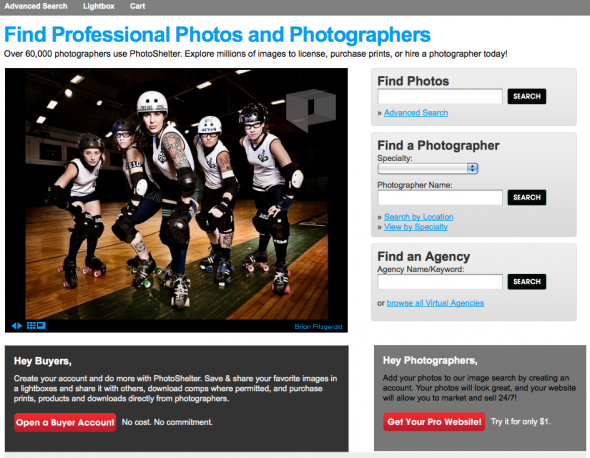
Kind of blowing my own horn here, but, well, this is pretty cool.  I’m a member of Photoshelter, which provides website and e-commerce tools and markets the work of photographers worldwide.  More than 60,000 photographers use the service, which is filled with all kinds of cool tools to help photographers help their clients.  Each month they choose 20 member photos to feature on their home page.   I’m a little surprised and humbled, but this month they chose to showcase one of my images of the Port Authorities Roller Derby team.   Really, it’s those ladies who are responsible for my selection–clearly.  So, roller dolls, thanks a million!  And thanks, Photoshelter, for the honor. Click to check out the August Photoshelter member showcase photos.

Interested photographers can click this Photoshelter link to learn more and join at a discount.

Shop Talk: Black and White image conversions

This is the first in a regular series I’m calling ‘Shop Talk’.  Basically, it’s a response to some of the questions I get, both from other photographers, friends…and our intern, Stepheney.     Most of the tips will be Photoshop oriented, but they will also relate to workflow, archiving of image files, and other software that I use in my daily business as a Maine commercial photographer.

Let me repeat:  I’m not an expert.  But I do make a living at this, and have a particular perspective that may be of use.

So, let’s dive right in.

I had a shoot last week that specified delivery of Black and White images instead of color.  It seems everyone has a different method for black and white conversions.  It matters how you do it since each method tends to have a different effect on the final image.  So, below, are two common methods–straight Photoshop grayscale conversion and desaturation–and the one I use, via Lab Color conversion.  Check out the photos of a lighthouse with lots of shadow area to see the results.

Method Number One: Shoot your photo in black and white.  Yes, your DSLR will allow you to shoot a black and white photo.  If you’re a purist, with a bagful of #15 and #25 filters, you might want to shoot in black and white so that you can use various filters for great effects in-camera.  Otherwise, it makes sense to shoot in color so you have more options down the road.  Why let your camera do the auto conversion from color to black and white when you have a big, powerful computer–with a big, powerful Adobe Photoshop program to do a custom conversion?  OK….maybe you don’t have either of those two things, and so in that case, flip that switch and go black and white.  Otherwise, don’t.

Method Number Two: Automatic GrayScale conversion


In Photoshop CS4, you can go to the Image–>Adjustments–>Black and White area of your toolbar and convert any color image to grayscale.  The process is automatic, and looks pretty good right out of the chute.  Why wouldn’t you do this?  Better investigate further…..

Method Number Two: Desaturate


To Desaturate, open your image and then go to Image–>Adjustments–>Desaturate.   Wow.  It looks pretty good, too, but if you look closely you’ll notice that it looks a bit muddier than the straight grayscale conversion above.  The whites aren’t so crisp and white, and the grays are a bit muddier.  Ok in a pinch, but still not great….

Method Number Three: Lab Color conversion

This is the one that I use.  I first learned about it from a workshop put on by digital photo pioneer Rob Galbraith, and I hear references from time to time about others using it as well.   For my money, it results in detail in shadow areas and looks like it maintains more shades of gray (for you Ansel Adams enthusiasts, this one will get you zones one through five).  Note:  Make sure that if you use this or the Grayscale method that you convert to a color space.  Why?  Because your image will look pretty messed up if you try to print it without it being considered a “color” image.  You’re just applying a color profile (like sRGB) to the black and white file, which has had all the color info stripped away.  The photo will still look black and white.

That’s it.  Hope it helps some of you.  I’d love to hear other methods you use to get from color to black and white.   Next week:  Sharpening (the other way).

(BF:  Somehow the actual ‘how to’ part of this tutorial got missed, so here goes.  To convert to black and white via Lab Color:

  • Go to Edit–>Convert to Profile
  • Choose Lab Color and click OK
  • Go to the Channels Palette and click/drag either the A or B channel to the little trash can icon at the bottom of the palette (trashing one will trash the other automatically)
  • Now go to Image->Grayscale to convert to Grayscale
  • If printing, go back to Edit–>Convert to Profile and select an RGB profile (I use sRGB)

That’s it!)