Posts by Brian

Shop Talk: Looking Sharp

In Photoshop there are several different ways to sharpen your images.  The two which I use routinely are quite different from each other, and are applied at opposite ends of my workflow.

Again, I’d love to hear from other photographers who use methods other than those I’m describing.

First, it’s important to understand that there are two (at least) different reasons for sharpening your images in the first place.  There’s the sharpening you do to an untouched or out-of-camera file that restores the  native sharpness of those fantastic, thousands-of-dollars lenses that you attach to your camera.  The second reason is to sharpen your images specifically for the intended medium of display (newsprint, photo print, computer screen or Wheaties box).

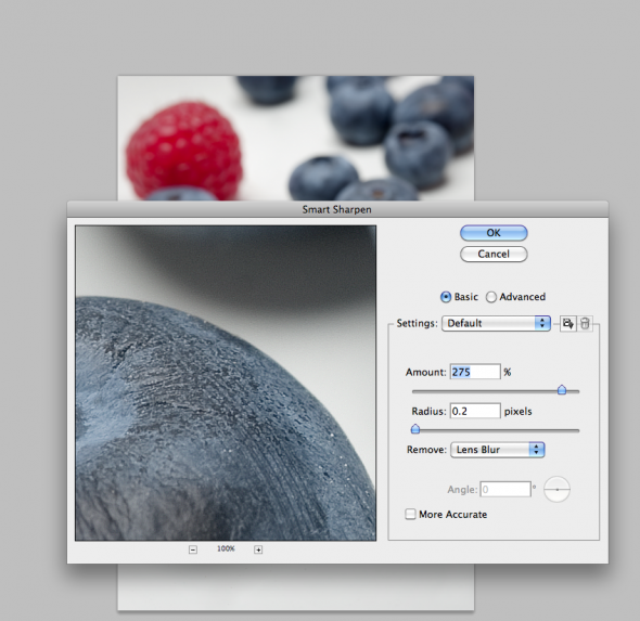
It’s surprising that with such great lenses, images from digital cameras look a bit soft at magnification.  That’s due in part to the low-pass filter built into the camera.  So, a good way to address this is by using the Smart Sharpen option in Photoshop (Filter–>Sharpen–>Smart Sharpen).   When you first open the Smart Sharpen dialog box, you’ll have to select “Lens Blur” from the small drop-down menu.  I use the basic rather than advanced, and typically set the sliders to a maximum amount of 275 and with a radius of 0.2.  Click the preview box and see the difference.   It’s an awesome tool and is best applied to images right out of the camera, before any other work is done.  See screenshot below:

What about Unsharpen Mask?  This is the favorite tool of photojournalists used to outputting images to be printed on tissue paper—aka, newsprint.  Newsprint is a poor printing medium as ink spreads and blots when it hits the fibers, rendering the sharpest images as indistinct blobs.  Hence, you must know what the final destination of your images will be.  If Newsprint, you’ll want to use higher levels of sharpness.  For prints, it’s less.  For screen/web, it’s still less.  An image that looks great for newsprint will look terrible on the screen, with halos around bright areas.   Once you apply Unsharpen Mask, your image is ‘damaged’ forever.  It should be the final step before output, after all other imaging is done.  It should never be done to a “master” version of a file that will be archived and used in potentially different ways later on.   Check out this handy table for approximate starting points for various output destinations (with due thanks to Rob Galbraith):

Finally, to recap:  Use Smart Sharpen to make your images pop the way your lenses intended for them to.  Save a master version of your final files and output variations of that file with different amounts of Unsharpen Mask depending on what that image will be used for:  newsprint, print, web, etc.  Rinse and repeat.

Maine Photographer chosen for Photoshelter showcase

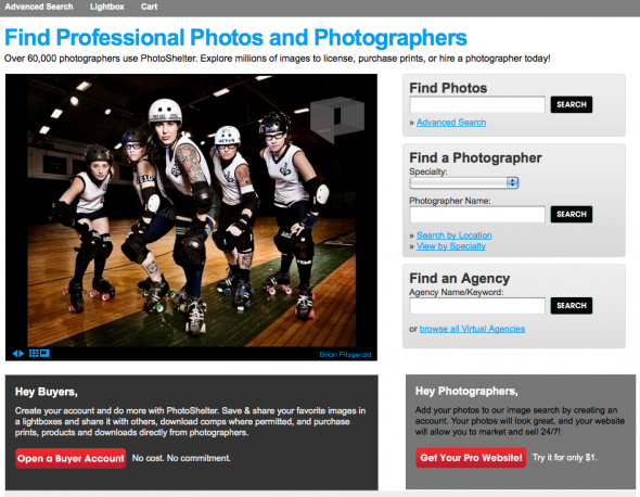
Kind of blowing my own horn here, but, well, this is pretty cool.  I’m a member of Photoshelter, which provides website and e-commerce tools and markets the work of photographers worldwide.  More than 60,000 photographers use the service, which is filled with all kinds of cool tools to help photographers help their clients.  Each month they choose 20 member photos to feature on their home page.   I’m a little surprised and humbled, but this month they chose to showcase one of my images of the Port Authorities Roller Derby team.   Really, it’s those ladies who are responsible for my selection–clearly.  So, roller dolls, thanks a million!  And thanks, Photoshelter, for the honor. Click to check out the August Photoshelter member showcase photos.

Interested photographers can click this Photoshelter link to learn more and join at a discount.

Shop Talk: Black and White image conversions

This is the first in a regular series I’m calling ‘Shop Talk’.  Basically, it’s a response to some of the questions I get, both from other photographers, friends…and our intern, Stepheney.     Most of the tips will be Photoshop oriented, but they will also relate to workflow, archiving of image files, and other software that I use in my daily business as a Maine commercial photographer.

Let me repeat:  I’m not an expert.  But I do make a living at this, and have a particular perspective that may be of use.

So, let’s dive right in.

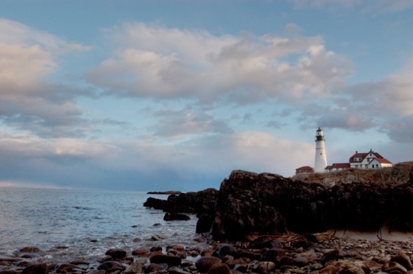
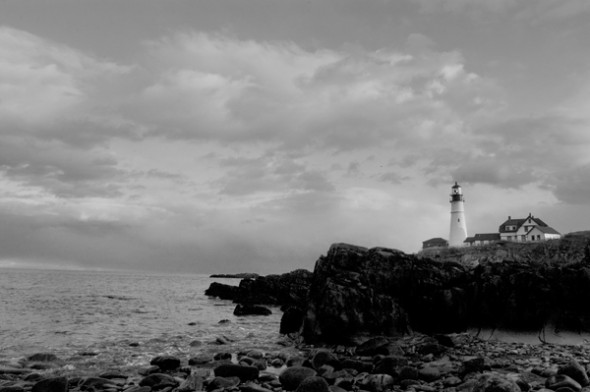
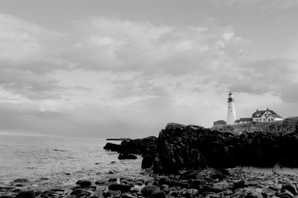
I had a shoot last week that specified delivery of Black and White images instead of color.  It seems everyone has a different method for black and white conversions.  It matters how you do it since each method tends to have a different effect on the final image.  So, below, are two common methods–straight Photoshop grayscale conversion and desaturation–and the one I use, via Lab Color conversion.  Check out the photos of a lighthouse with lots of shadow area to see the results.

Method Number One: Shoot your photo in black and white.  Yes, your DSLR will allow you to shoot a black and white photo.  If you’re a purist, with a bagful of #15 and #25 filters, you might want to shoot in black and white so that you can use various filters for great effects in-camera.  Otherwise, it makes sense to shoot in color so you have more options down the road.  Why let your camera do the auto conversion from color to black and white when you have a big, powerful computer–with a big, powerful Adobe Photoshop program to do a custom conversion?  OK….maybe you don’t have either of those two things, and so in that case, flip that switch and go black and white.  Otherwise, don’t.

Method Number Two: Automatic GrayScale conversion


In Photoshop CS4, you can go to the Image–>Adjustments–>Black and White area of your toolbar and convert any color image to grayscale.  The process is automatic, and looks pretty good right out of the chute.  Why wouldn’t you do this?  Better investigate further…..

Method Number Two: Desaturate


To Desaturate, open your image and then go to Image–>Adjustments–>Desaturate.   Wow.  It looks pretty good, too, but if you look closely you’ll notice that it looks a bit muddier than the straight grayscale conversion above.  The whites aren’t so crisp and white, and the grays are a bit muddier.  Ok in a pinch, but still not great….

Method Number Three: Lab Color conversion

This is the one that I use.  I first learned about it from a workshop put on by digital photo pioneer Rob Galbraith, and I hear references from time to time about others using it as well.   For my money, it results in detail in shadow areas and looks like it maintains more shades of gray (for you Ansel Adams enthusiasts, this one will get you zones one through five).  Note:  Make sure that if you use this or the Grayscale method that you convert to a color space.  Why?  Because your image will look pretty messed up if you try to print it without it being considered a “color” image.  You’re just applying a color profile (like sRGB) to the black and white file, which has had all the color info stripped away.  The photo will still look black and white.

That’s it.  Hope it helps some of you.  I’d love to hear other methods you use to get from color to black and white.   Next week:  Sharpening (the other way).

(BF:  Somehow the actual ‘how to’ part of this tutorial got missed, so here goes.  To convert to black and white via Lab Color:

  • Go to Edit–>Convert to Profile
  • Choose Lab Color and click OK
  • Go to the Channels Palette and click/drag either the A or B channel to the little trash can icon at the bottom of the palette (trashing one will trash the other automatically)
  • Now go to Image->Grayscale to convert to Grayscale
  • If printing, go back to Edit–>Convert to Profile and select an RGB profile (I use sRGB)

That’s it!)

Maine photographers give back with Flashes of Hope

I’ve gotta be one of the luckiest photographers in Maine.  How do I know?  Last week I was one of four photographers taking part in the Flashes of Hope shoot at Camp Sunshine in Casco, Maine.   More than a worthy cause, it’s a great way to give back to some amazing people.

Kevin Brusie, a local commercial shooter, has organized the local response to what is a national effort–to provide ill children and their families with professional portraits taken at hospitals and camps across the United States.  This is the third year Flashes has been in Maine, and my second year shooting.   Other photographers this year were Fred Field and Jeff Stevenson.

It’s one of the most humbling and touching experiences I’ve ever had.  Selfishly, though I’m giving my time and sharing my digital files for free, I feel like I’m getting far more than I’m giving.

I see the faces of the children–from very young to 18 years old–and as a group they impress me with their poise and grace.  As you might expect, these kids are far older than their years would suggest.

I’m including a handful of my favorite photos from my portion of the day, which involved a total of 40 families.

Copyright Alliance comes to Maine

Last month I got an interesting request from Patrick Ross, executive director of the Copyright Alliance.  This is a non-profit organization that promotes the intellectual property rights of artists (not just photographers, but artists of all stripes).   I recently wrote a post about the importance of copyright registration for photographers, and really am excited about the good work the CA is doing.

Now, I get the very cool opportunity to share my perspective as a Maine commercial photographer.   I’m honored that Ross will be conducting a video interview here at the spacious Fitzgerald Photo studio this week.   I guess that means I need to get a hair cut….

If you get the chance, check out the interactive map on the Copyright Alliance website, and see what other creatives are doing and saying.

Maine State Sales Tax 101 for photographers

After many years’ experience as working, professional photographer, I’m well-versed in the technical side of my craft.  The largest part of my business isn’t photography, though–it’s business.  You know, everything from marketing to maintaining my site to keeping records and doing taxes.  That’s often where photography businesses either make it or break it.

Whether you run a retail business (selling prints and products) or a service one, where deliverables are usually in electronic form, you need to know about state sales tax laws and how they apply to you.  I’ve been confused about this in the past, as have many other photographers I know.  My accountant didn’t know the answer, and so I called the state.  A very nice lady named Mary helped answer my questions and directed me to the instructional form on the Maine.Gov website that explained what I needed to know.  Click to download the form that applies to Photographers and Photofinishers.

Chances are if you’re like me, your sales tax strategy could use a few tweaks.

This is what real work looks like…

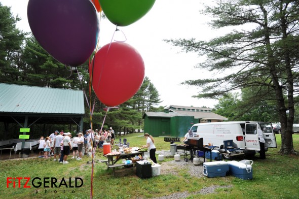
This weekend I had the pleasure of meeting and photographing Susan Taylor of  Simply Susies Catering, a Downeast vendor who has worked every wedding, BBQ, picnic and countless other types of events for 22 years up and down the coast.  I spent just three hours with Susie and her crew, busy prepping for a family BBQ at Freeport’s Winslow Park (see a couple of the photos above from the shoot just to get a sense of the place).

Next time I even think about complaining about the long hours or physical aspects of what I do for a living, I’ll remind myself to look at the photos I took yesterday.  In a past life, I held several food service jobs.  None comes close to the amount of work Susie had to do.  In humidity so thick it feels like you’re swimming in air. In the middle of a park, out of a van.  In the rain.  On a Sunday.

Of course, the food smelled and looked great.  Once the rain really started going, I beat a retreat even after Susie kindly offered me an apron and invited me to stay and help.  Uh…I would, Susie, but I don’t think I could keep up with you.  Susie just smiled, covered her head from the rain and got back to work.  Just another day at the office.   That’s a true professional…and some truly hard work.

Architectural photography checklist makes things go smoothly

Architectural photography is both an art and a science. Much depends on details and it’s easy for clients to forget to ask key questions during the process of searching for the right photographer for their job.

The American Society of Media Photographers (ASMP) has a lot of resources dedicated to helping you choose the right photographer no matter what your editorial or commercial need. In particular for architects, builders and real estate professionals, they have a great Architectural Photography Checklist to use when talking to a photographer or interviewing one for a possible job. Just click and download to view this handy .pdf document.

Using this guide, and having a detailed discussion with your photographer will help focus the process and can result in a better, more positive outcome for all parties concerned.

Maine blueberries mean summer

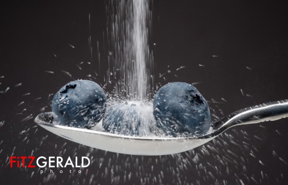
Summer is when Mainers get out and get active. The warm season isn’t all that long here, and people around these parts waste no opportunity to get outside–even if that means parking it around a patio table on their front driveway. Recently I photographed organic Maine blueberries for an article on summer activities for families–picking strawberries and blueberries at local farms being a good example.

Just looking at them makes me hungry.

Microstock: why it’s good (and bad)

Many professional photographers complain about the growth of microstock in the past few years–inexpensive stock images (costing as little as one to five dollars) from companies like istockphoto, shutterstock and BigStockPhoto. These images on average cost pennies to dozens of dollars to use and have become standard for businesses and web designers who don’t want to commission original work for hundreds of dollars.

I don’t blame them.

Microstock has its place. Why spend a ton of money on something that you may want to change frequently, or that is part of a simple Powerpoint? Some of my business customers go through a process that starts with them doing their own photography, purchasing microstock and finally hiring a pro—that’s me— when they get busy or large enough that it makes sense to do so. I tell my clients that they should do what they can to save their money, and bring me in only when they have a big, tricky or big-splash campaign that needs to be done right. I’m part of the mix, and my client is being prudent. I like that.

Microstock is useful but it has its drawbacks too. That image of a bunch of business types interacting might be nice looking and may perfectly illustrate an ad for your conference room space rentals. But you have no control of who else uses that image. It might also perfectly illustrate the meeting space of your competitor, who decides they want to use it as well. Or it may illustrate the types of clientele an upscale escort service wants to attract and show up in some places you don’t want to associate with your brand.

My suggestion? When you decide to use a piece of stock for your primary web or marketing materials, do a search to see who else is using it. An exciting service is called www.tineye.com and if you upload an image it’ll scour the web to find where else that image is published.

The image above, sold on istockphoto for less than $10, is being used for 236 different sites around the world (see screenshots below). Interesting to note that a dozen or more companies use this same image on their “about us” pages. Wouldn’t it be better to actually show your people?

Another alternative is to hire a professional to do your work. It may cost a bit more, but the image will be totally unique—the highest value in a world of cheap copies—just like your brand. It’s yours. It’ll feature your work or your team.

Whichever way you go, it’s worth your time to go in with eyes wide open.