Posts by Brian

Announcing: Pro Photogs, Beer, Reviews, ASMP


Maine ASMP Breakfast Club


Join Maine ASMP members as we mix it up during our bimonthly gathering.

This time around, we’re foregoing breakfast in favor of beer.  Peter Dennen,
of Pedro + Jackie Photo Consultants, will be on hand to give ten-minute speed-style portfolio reviews for six selected attendees (Thanks, Peter!).    Professional photographers, students and others are welcome to attend.   This is event is for ASMP and non-ASMP members.  Find out more here.

About the ASMP

The American Society of Media Photographers is the premier trade association for the world’s most respected photographers. ASMP is the leader in promoting photographers’ rights, providing education in better business practices, producing business publications for photographers, and helping to connect purchasers with professional photographers. ASMP, founded in 1944, has nearly 7,000 members and 39 chapters.

About Pedro + Jackie

P+J is the dynamic duo photo consulting team of Peter Dennen and Jackie Ney.  Their mission is to help build the careers of the photographers they engage with through sound advice, strategic initiatives and infusing our creative minds into the business of those they serve.  To learn more, check out http://www.pedroandjackie.com/


When

Wednesday, May 21, 2014
5:00pm-7:00pm

Where

Brian Boru Public House
57 Center Street
Portland, ME

Questions? 

Contact Brian Fitzgerald, breakfast coordinator


Storytelling for John T. Gorman Foundation

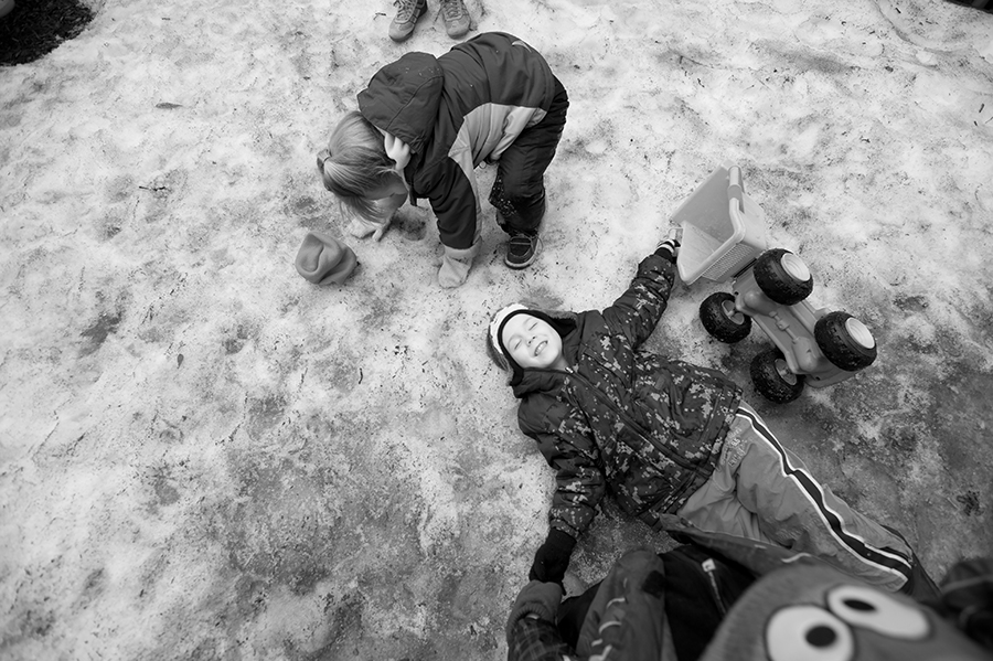
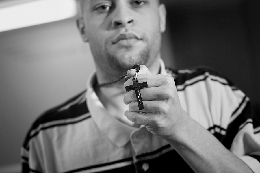
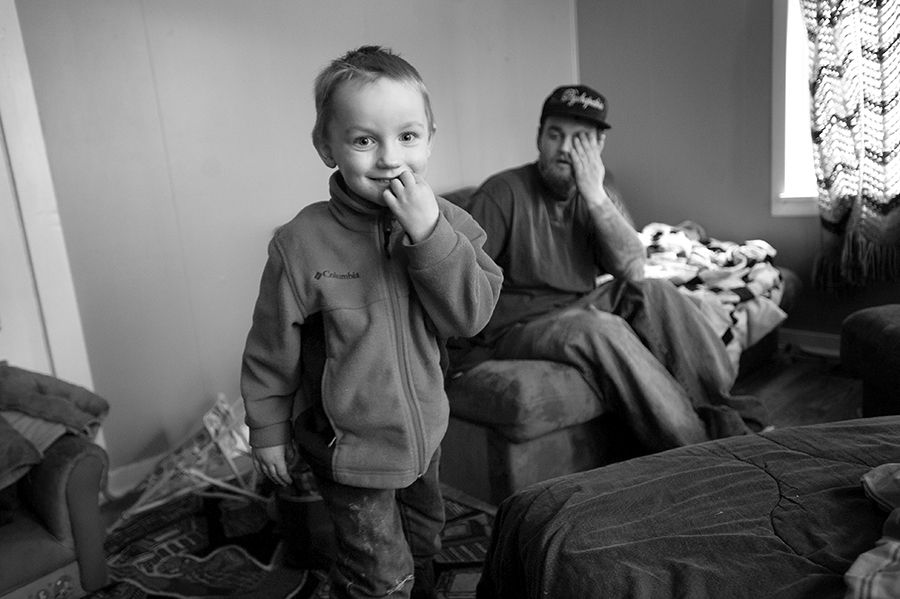
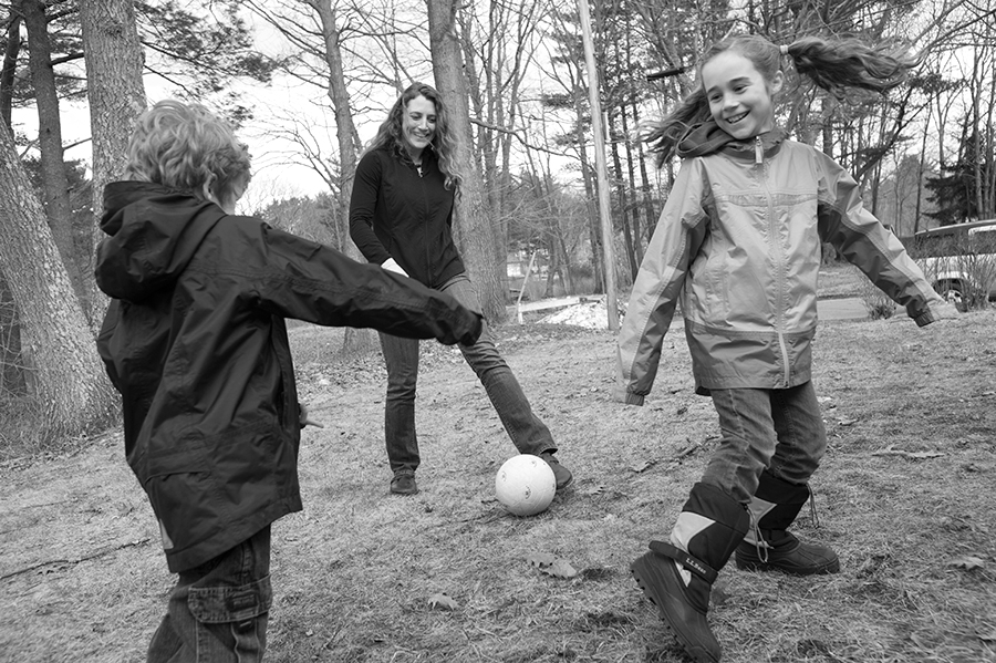
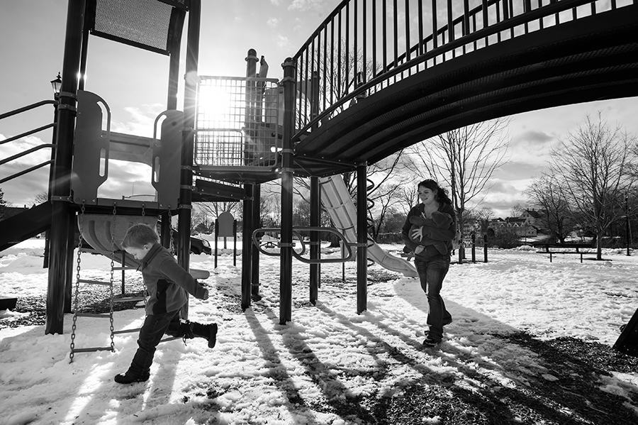
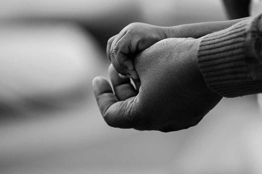
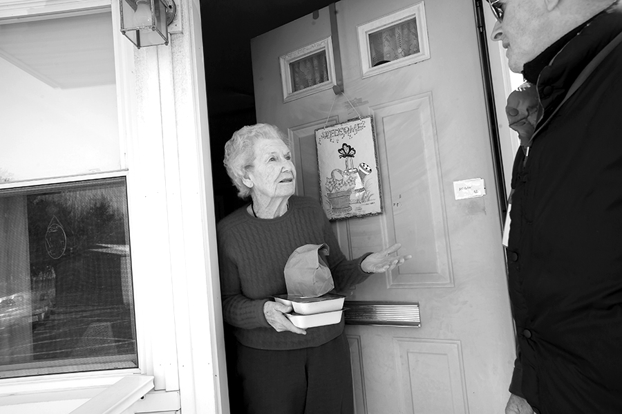
One of my favorite projects this past year was working with the John T. Gorman Foundation here in Portland.  This unassuming group directs their resources to many significant non-profits statewide, from early childhood education to homeless teens and more.  Especially at a time when the state has cut its funding back of such groups, private foundations like JTG have become even more important. 

My assignment was to document the people and faces of some of their supported programs, and to show the human impact of what they do.    Over the course of a month and a half, I created a series of images that tell the story of what JTG does by showing the lives of those impacted by their efforts. I was given wide discretion over what I photographed, and focused on populations served by the foundation, among them single mothers, early childhood education and teens.  Here’s a sampling of my favorites.

Enjoy!

JTG_01_BW

JTG_02_BW

JTG_03_BW

JTG_04_BW

JTG_06_BW

JTG_07_BW

JTG_08_BW

JTG_09_BW

Just Published: Pop Photo + Roller Derby Dolls

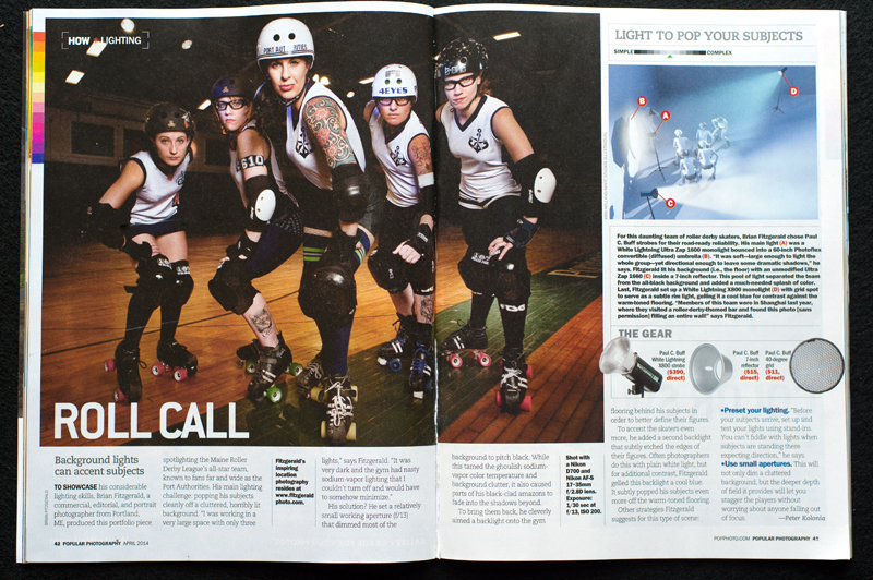
This is pretty fun—this month’s issue of Popular Photography Magazine features a two-page spread of my image of a Portland, Maine roller derby team in their regular “How * Lighting” feature. It’s a simple lighting setup that is extremely effective in creating a sense of drama. In a word, perfect for a subject like the roller derby dolls.

PopPhoto_RollerDerby_WEB

Limit yourself—and become a better photographer

I suspected things might end badly when Garin’s pickup ran over a Gila Monster.   Then again, I always figured that my week-long trip photographing a ‘tough-love’ camp for teens was going to contain some ups and downs.   We were reporting on one of those organizations that parents bundle their troubled teens off to, figuring that six weeks spent sleeping and hiking in the middle of a southwest desert can reach them in ways they haven’t been able to.  They aren’t usually wrong.

I pitched the story and a writer,  Garin, was assigned.   We would be backpacking and living with the kids for almost a week, at least 50 miles from the nearest town in the middle of Arizona’s Tonto National Forest.    We had to pack in water, and weight was an issue.  Due to the lack of ability to recharge my digital cameras, I shot with a reduced kit:   two Nikon film bodies, three lenses and a flash.   A couple of hours into our hike towards the first night’s camp, I forded a river, slipped on a rock and went down hard.  I emerged from the waters with my primary camera body soaked, the electronics fried.  My 80-200 mm lens dripped water, the front element smashed on the same slippery rock.

There I was, miles from anything, down to one film body (a Nikon FM2) and two lenses—a 24 mm f2 and a 35-70 f2.8.     I had approximately 5.5 days of our six-day trek left.    And I was sweating.

That trip was when I learned a fundamental truth:  that limitations can be a great thing.    Freed of the need to switch camera bodies, and forced to use a wide-angle and a medium telephoto lens, I adapted.  I spent time with each lens and worked them.  I got in close when before I might have stayed at a distance.  I didn’t worry about the shots I couldn’t get and focused on the types of shots I could.    In the end, I left at the end of the week with a set of images I was very happy with, and the sense that I had learned something important.

Why is this pertinent?   Because today it’s all about choice.    As a photographer, I’m always tempted to buy the newest gear or learn the latest technique, but I know that sometimes imposing limitations on myself makes me a stronger shooter.   Instead of taking all of my lenses to an assignment, I might force myself to shoot with just my 50mm lens.   I might forego the larger studio lights I typically use and instead shoot with speedlights or just a large window and a silver reflector.   It’s very, very easy to get distracted from the actual story that you’re trying to tell.   Too many gear choices, and too many possible locations tend to muddy the waters, sapping your energy and leaving you with weak images.   Better to commit to a couple of visual situations, and to a limited selection of gear, and then spend your time actually thinking while you photograph.


[photoshelter-gallery g_id=”G0000zDe80j3C3xc” g_name=”Anasazi-Teen-Camp” f_show_caption=”t” f_show_slidenum=”t” img_title=”casc” pho_credit=”iptc” f_link=”t” f_enable_embed_btn=”t” f_send_to_friend_btn=”t” f_fullscreen=”t” f_topbar=”t” f_bbar=”t” f_htmllinks=”t” f_mtrx=”t” fsvis=”f” width=”800″ height=”600″ bgcolor=”#AAAAAA” btype=”old” bcolor=”#CCCCCC” crop=”f” twoup=”t” trans=”xfade” tbs=”5000″ f_ap=”t” bgtrans=”f” linkdest=”c” f_constrain=”f” f_bbarbig=”” f_show_watermark=”f” f_smooth=”f” f_up=”f” target=”_self” wmds=”llQ6QNgpeC.p1Ucz7U.Y67rsXMpK3GqAqM9VGWvEGejM7KK78fXDZGLxaEev6fLBWle7OA–” ]


The most useful iOS apps for photographers (which have nothing to do with photography)


I’ve been an avid iOS and Mac user for years now—shocking, I know, for a photographer. But when I’m not doing photography (and as a self-employed pro photographer it’s shocking how much of my activities are NOT photo-related), I’m consumed with all the various activities of being a small business owner: accounting, billing, marketing, client management, etc.   I’ve found that these less-than-sexy parts of the business are what ensure I’ll be around to service my clients for years to come.

So I’ve come to love, love the unsexy parts.

Which is why I’m obsessed with looking for better ways to do things. I have an iPad 2, which I’ve owned since it first came out.   I’ve gone through a million apps over the years, but have settled into just a few must-have apps that I use not just daily, but constantly throughout each day.   I basically run my business using these apps.  So, here is my list of my five favorite, and most-used  apps for the iPad and iPhone.  Note:  These are the apps I use right now.  As always, your mileage may vary.


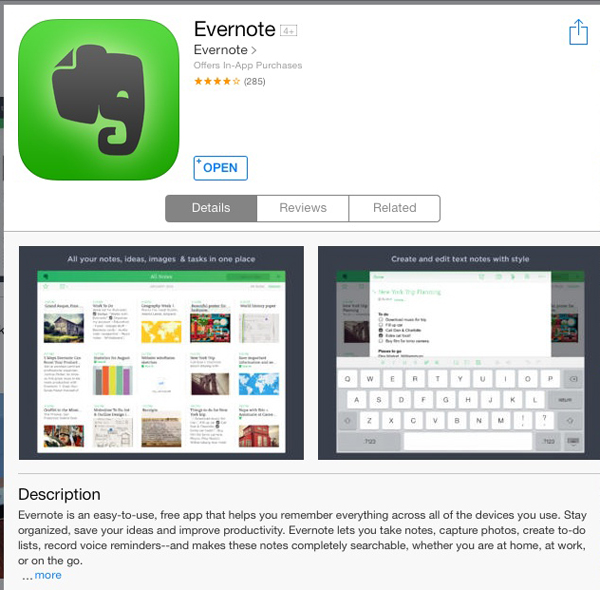
Evernote (A.K.A. the king of my app universe)

Evernote


Price: Free (Premium and Business subscription services available)

One-sentence description:  Your brain, digitized.

How it works:  Evernote is arranged as a series of notes organized into notebooks.  Each note is a blank page to which you can add text, images, links and attachments (like .pdfs).  Each note can be tagged as well so you can more easily search across your account.

What I use it for:  To keep track of notes, workflows, procedures, content, research, lighting recipes, business plan, etc.  I scan receipts and other important documents, sending them to Evernote.  I also use their web clipper to save web pages for later reference.

Best non-obvious use: To keep track of all my electronic model releases.

Pros:  Simple, easy to use and free.

Cons:  For some, the fact that it’s so simple and open makes it hard to see the value when compared to apps with specific functionality.

Final Words:  I love, love Evernote.  I don’t care about  Evernote Food, or Penultimate or Skitch (their other apps).  But I’ll use Evernote all day, every day and twice on Sundays.  After a couple of years’ use, I upgraded to Premium, which allows me to collaborate by sharing specific notebooks and notes with team members.  You’ll find as I did that the more you use it, the more you’ll find value in it.


1Password

1Password


Price: $49.99

One-sentence description:  Secure digital wallet for all your logins, credit cards and software registration info.

How it works:  Using the in-app web browser, quickly login to any website with stored credentials.  Open the login “vault” to view any stored information.

What I use it for:   Before I had 1Password, almost all of my passwords were the same—a very simple, plain-English password that I chose simply because I could remember it.  Guess what?  That’s a great way to get all of your stuff hacked.

Best non-obvious use:  I upload screenshots of my various FTP server login information so that I can quickly reference that wherever I happen to be.

Pros:  Works very well and is updated often.

Cons: The price—it’s expensive, and you’ll have to pay for a separate app for you Mac or Windows machine.   Also on iOS devices, there’s no way to add new passwords with just one click like you can in the desktop version—you’ll have to manually add a new entry yourself.

Final Words:  I’ve been using 1Password for about five years now, and it seems like every month or two there’s a new update.  For an app that you’re trusting your most sensitive information to, you want to know they are working hard to protect it.


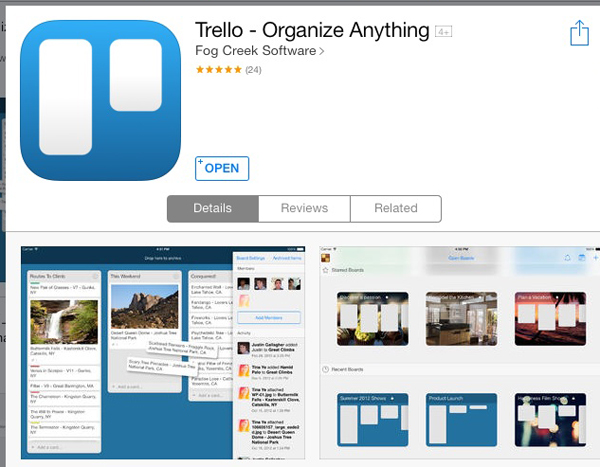
Trello

Trello

Price: Free (Subscription “Gold” service is $5/month; Business Class is $50/month)

One-sentence description:  A visual, post-it note-style project management tool.

How it works:  Consists of “Boards”, which are basically projects, made up of vertical “lists” consisting of “cards”.  Each card can contain checklists and file attachments.  Move cards by dragging and dropping them into lists, assign them a color-coded label and a due date.

What I use it for:  I’ve always been a big fan of OmniFocus, and still use it, but I’ve been using Trello for several months.  It’s become my go-to app for organizing my weekly and daily tasks, and for managing projects with and without collaboration from others on my team.  It’s the first thing I check in the morning and the last thing I check at night.

Best non-obvious use: I use Zapier to connect my Google Calendar to Trello, sending calendar entries into my Trello inbox as cards.

Pros:  It’s visual, which better matches the way I think.  It’s extremely easy and intuitive to use.  It’s free.

Cons:  Until recently, I couldn’t think of any.  Currently, my app crashes every time I delete a card on my iOS devices (it works fine via the web app).  It’s a known bug, but it hasn’t been fixed yet—more than a week after first experiencing it.

Final Words: There is a paid subscription model for Trello.  This enables you to customize the look of your boards, and are fun features, but not necessary.  More practical is the ability to have attachments larger than 10 MB each (up to 250 MB each).  If that’s useful for you, then Trello Gold is worth considering at $5/month or $45/year).   For large organizations, Business Class may be very attractive.


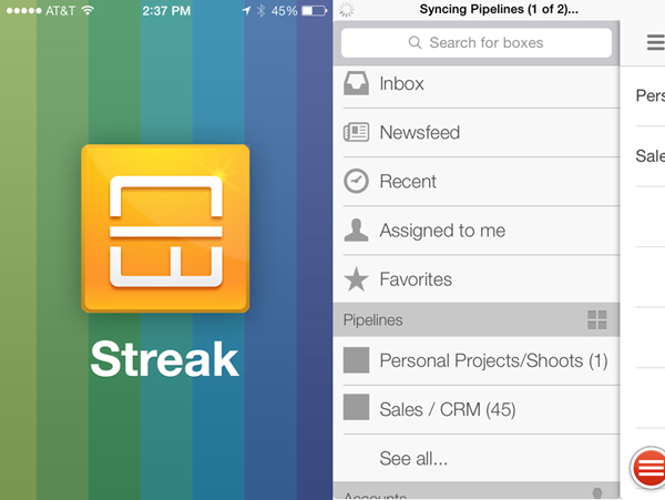
StreakCRM

Streak

Price: Free

One-sentence description:  A CRM (client relation management system)  fully integrated into your gmail inbox.

What I use it for: To track prospects, client and special projects, email and marketing workflow.  I also use the handy “snippets” feature, which allows me to create and store canned emails that I need to send over and over again.

Best non-obvious use:  I use it to track when I need to send follow-up emails to existing clients, and to track when (and by whom) my sent emails are opened.

Pros:  Useful, practical, easy to use.

Cons: It’s still technically in beta, which means you can expect some inconsistent behavior.   Still, the team has been releasing tons of new features, and is right on top of reported bugs.   The iOS app is optimized for the iPhone, though it will work on the iPad.

Final Words: Streak is an amazing tool.  It solves a lot of problems for me, and makes my life simpler by keeping me in my main work environment, Google Apps and Gmail.   I’m expecting them to monetize Streak at some point in the future, but it’s money that I’ll be glad to spend.  They’ve proven their value to me and it’s an app I want to support.


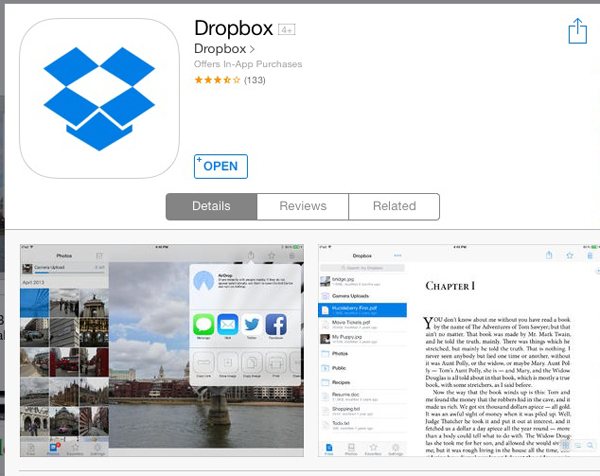
Dropbox

Dropbox

Price: Free (Pro subscription available for $99/year)

One-sentence description:   Store all of your files in one location and share them easily.

What I use it for:  To share files with team members, deliver large image files to clients and to back up my most sensitive files (software backups, business documents, etc.).

Best non-obvious use:  I sync my Documents folder on my Mac to Dropbox.  Essentially, my Documents folder is my Dropbox folder, which means those files are always available to me, anywhere.

Pros: Works well with many of my iOS apps.  I’ve set it so that every time I connect to a wifi network, my phone sends my most recent photos taken with the device to my Dropbox account so I can delete them from my phone.  I also can easily stream video files and view image and pdf files easily within the app.

Cons:  You only have 2GB worth of space on the free app, but at least you can gain extra space by doing things like sharing the app with a friend.  Not built for collaboration among teams.

Final Words:  Dropbox was a true pioneer in online storage, but there are many other options available now—many of whom give more storage for ‘free’ users.  I’d recommend doing your homework before deciding what’s right for you.

Stories from the past: John and Zelda Robertson

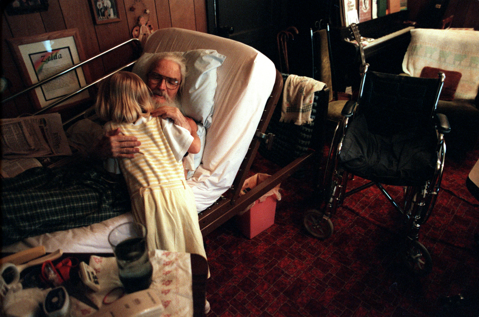
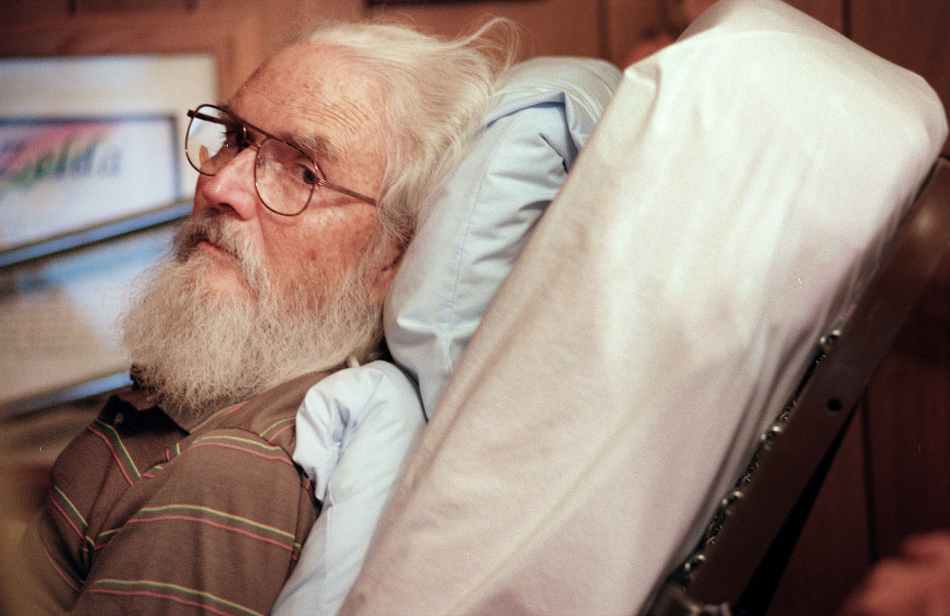
Over my career as a photojournalist I’ve met some amazing people and been fortunate enough to photograph incredible events. When I reflect on the stories I’ve done, however, one really stands out: the story of John Robertson. I’m revisiting his story because I think John and his wife, Zelda, have a story that’s worth telling even today, more than a decade later.

At that time I was photo editor at the Provo (Utah) Daily Herald newspaper, a scrappy 30,000 circulation daily newspaper situated in what truly must be one of the most beautiful places in the world. In between the Pet of the Week and the required weekly commercial construction feature photo (titled, of course, ‘What’s up!”), the four of us staff photographers were constantly on the lookout for meatier fare: long-term photo documentary projects. While our daily diet of spot news and features and sports kept us busy and shooting, the photo projects we started (and did largely on our own time) stoked our souls and fed our passion. I’ve worked for larger newspapers in my career, but a 30,000-circ. paper has about the right combination of resources and autonomy to allow motivated photographers to do great project work.

Often these projects would grow out of daily stories that we connected to and felt there were more visual potential in. That’s how I met John Robertson. Our health reporter, Ann Potempa, was doing a story on hospice care in Provo. The story centered on an in-patient hospice facility, with patients having six months or less to live. I met a hospice nurse named Kit who visited patients not just at the center but at their homes. As I learned more, I knew that I wanted to explore the idea of terminally-ill patients who decide to live life on their own terms, often in their own homes. Kit introduced me to the work of Dr. Ira Byock, a leading figure in hospice and palliative care. Ultimately, she introduced me to John Robertson, 72, and his wife Zelda.

On the surface of things, John’s story is about hospice care and the comfort it can provide during the final months, days and hours. For me, John’s story is about living—and then dying—well.

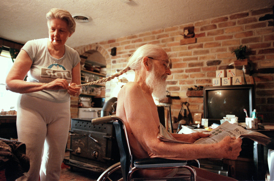
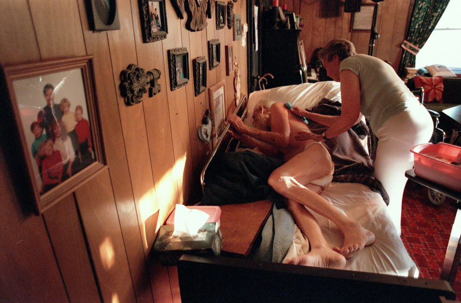
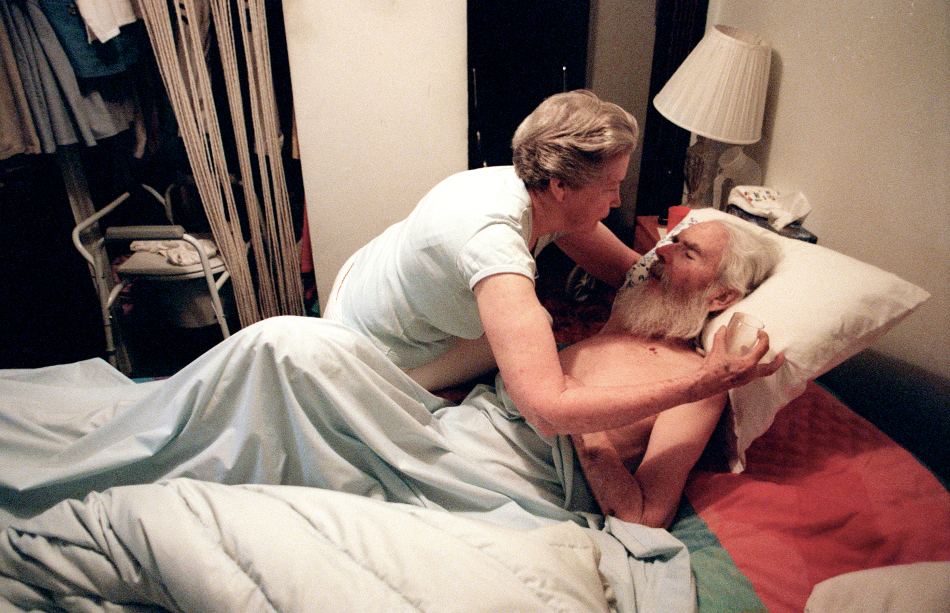
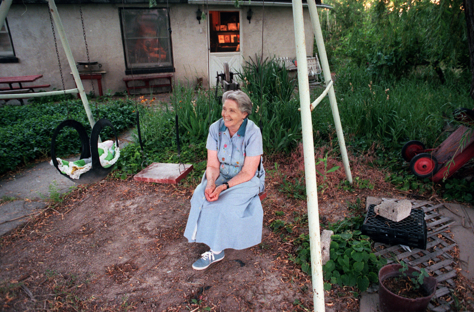
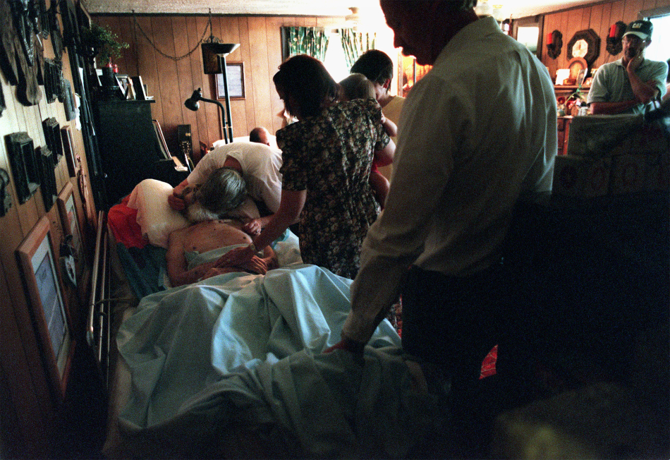
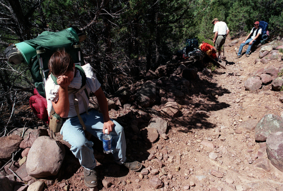
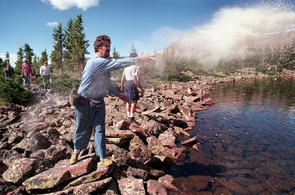
I met with John and Zelda and the first thing I noticed about this former school teacher was the long braid of hair running down his back. The elderly couple both ran marathons until John was diagnosed with cancer. After a long battle, he was placed on hospice, and true to his independent spirit had no intention of dying anywhere but at his home. I explained to them that I wanted to document their hospice journey. Amazingly, they agreed, but with one caveat—John wanted to hide nothing, and wanted me to be there for everything—the towel baths, the emotional visits with their many children and grandchildren, and ultimately, his final breaths as he lay on a hospital bed in his living room surrounded by family. The graciousness of the entire family to me, and their grace throughout what was obviously a painful journey was awe-inspiring. A month after John passed, his adult children invited me to hike to his favorite fishing lake deep in the Uinta primitive wilderness area in Northern Utah. We hiked in, camped, and the next morning committed his ashes to the winds and water. Much like they had been able to do during the period of hospice care, each of his children were able to spend a moment alone with John and say their goodbyes. Humbled by it all, I photographed as little as I needed to.

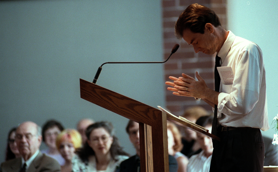
In all, the series ran in six weekly parts. The newspaper got some criticism for showing images such sensitive images of John, but mostly the reaction was positive. Frankly, hospice is an easy sell—the idea that one can die well, even in comfort, and on their own terms—is an attractive one. The Robertson family was thankful for the coverage, though I always knew they’d given far more to me than I to them. I think from the pictures below, it’s possible to see John and Zelda as the people they really were—not victims, but strong and courageous people.

Note: all photos courtesy of the Provo Daily Herald.


7-Robertson_Grandchild


1-John_Robertson


3-Robertson_Braid


2-Robertson_Bath


6-Zelda


8-Zelda-Healing


8-Robertson_withFamily


9-Robertson_Memorial


10-Robertson_Hike


11-Robertson_Ashes

Client Showcase: ecomaine

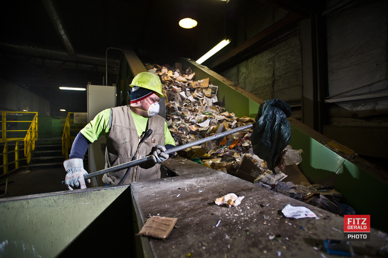
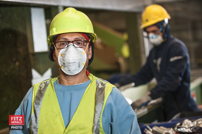
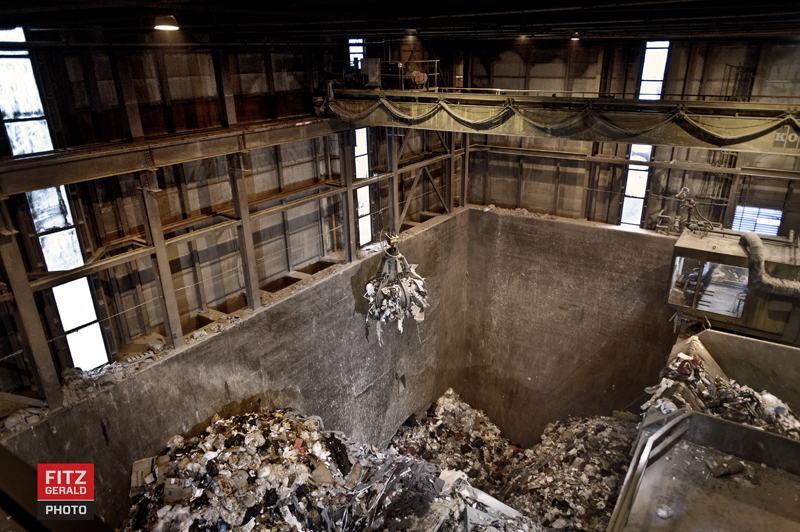
It’s nice to do creative work.  It’s even nicer to create work for a company that I like and believe in.   That’s why I was excited last fall when ecomaine approached me to create a library of images.  Ecomaine is a non-profit waste waste management facility run by 21 different municipalities in Maine that makes energy from trash—yours and mine.   They also recycled a staggering 35,000 tons of material at their recycling center in 2010-11.

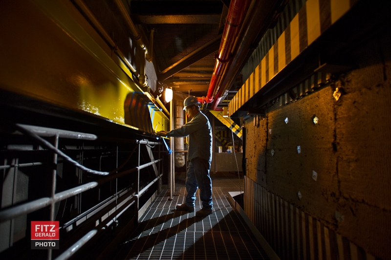
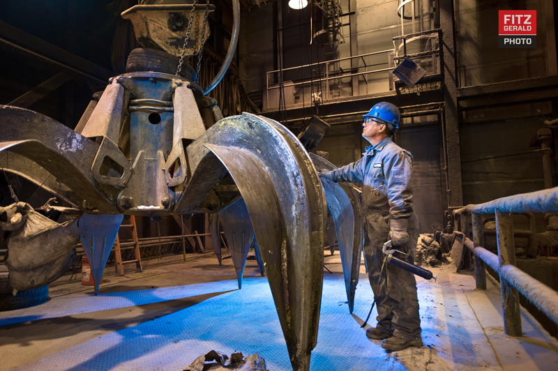
I love to photograph industrial operations—the bigger and the more technically challenging the better.    Ecomaine has three physical locations: a landfill, a recycling center and their waste-to-energy facility.   Gleaming on the outside, the waste-to-energy plant (perhaps not surprising given that they take in trash and incinerate it)  is full of dust, extreme temperatures and dark corners requiring extra location lighting magic.

It’s the whole ball of wax, as they say.  That is, if the wax is full of sodium-vapor lighting, large moving globs of machinery and lots of dust.

I love a challenge.

We carefully planned out a full day that would take us to all three facilities, starting with a landfill and then ending with the power plant.    With the outside temperature heading south from 33 degrees and an inside environment that approached the temperature of a Russian bath house,  our challenge was to move quickly and not let lenses fog or our energy to waste.  The lighting was fairly simple, since we had to be on-the-move all day.   From a scouting visit we knew which areas were high-priority for ecomaine.  Of key importance for me was to recruit workers as we progressed, incorporating them into images to provide scale and a human element.

All in all, the day went very well.   My assistant and I got a great workout climbing from the bottom to the top of the waste facility (broken elevator!).   Here’s a few of the images I really enjoyed creating from the shoot, (mostly) minus the dust.  Enjoy!


Fitzgerald_EcoMaine_01
Fitzgerald_EcoMaine_02
Fitzgerald_EcoMaine_03
Fitzgerald_EcoMaine_04
Fitzgerald_EcoMaine_05
Fitzgerald_EcoMaine_06
Fitzgerald_EcoMaine_07
Fitzgerald_EcoMaine_08


Friday Favorites: Extreme Puppy edition


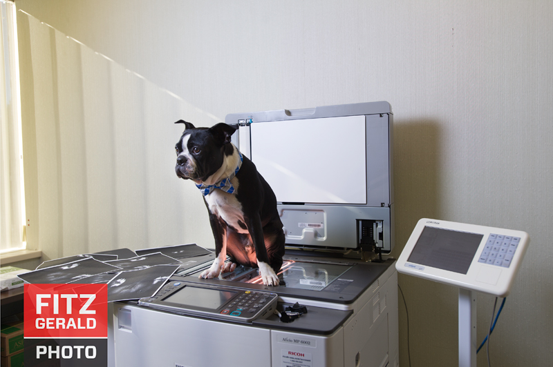
This Friday I’d like to share just a few outtake images from recent projects that were conceptual in nature.   I’ve always enjoyed doing this kind of concept work—it’s extremely creative and if successful, gives the viewer something extra that causes them to linger a bit.     What you end up with is more created than found.    Here are a couple of images that I really liked but that ended up as outtakes.  Enjoy….and happy Friday!


The concept was to photograph pets in an incongruous setting--in this case, a professional office environment--which could easily illustrate the perils of Take Your Pet to Work Day.
The concept was to photograph pets in an incongruous setting–in this case, a professional office environment–which could easily illustrate the perils of Take Your Pet to Work Day.


Everyday Heroes


[photoshelter-gallery g_id=”G0000xBUwjF4Y64U” g_name=”Firefighters-Calendar” f_show_caption=”t” f_show_slidenum=”t” img_title=”casc” pho_credit=”iptc” f_link=”t” f_enable_embed_btn=”t” f_send_to_friend_btn=”t” f_fullscreen=”t” f_show_watermark=”t” f_htmllinks=”t” f_mtrx=”t” fsvis=”f” width=”800″ height=”500″ bgcolor=”#AAAAAA” btype=”old” bcolor=”#CCCCCC” crop=”f” twoup=”t” trans=”xfade” tbs=”8000″ f_ap=”t” bgtrans=”f” linkdest=”c” f_constrain=”f” f_topbar=”f” f_bbar=”f” f_bbarbig=”” f_smooth=”f” f_up=”f” target=”_self” ]


I’m very excited to finally be able to share one of the coolest projects I am grateful to have worked on this year. It’s a project that combined both my interests and my skills and best of all….it benefits a great and worthy cause.

The Cause
The Fight for Air Climb is a fundraising effort that benefits the American Lung Association.    Firefighters and others from around the country participate in these ‘climbs’, in which entrants are timed on their ascent of a skyscraper or other high structure.   The Firefighter Challenge pits teams of firefighters against one another, each vying for the best time, the most money raised (and bragging rights).   Unlike other competitors, firefighters are required to wear their full gear—turnouts, helmets, gloves, boots and oxygen tanks.   In the process, these teams raise big money for ALA research and advocacy.


The Project
In 2013, a 12-member team from Auburn, Maine climbed 41 floors (82 flights) during the Boston Fight For Air Climb (each wearing more than 50 pounds of additional weight)  and crushed the other 40 firefighter teams from around New England.   On the heels of their success, this year the team set the goal of raising $10,000 for the charity.  They decided to do a charity calendar, and earlier this year approached me and asked for my help (Hint: I said yes).


The Concept
I first met with Team Captain Dan Masselli to discuss several concepts for the project.   I think he was a bit nervous, thinking that I might propose doing a “beefcake” style shoot with half-naked and oiled firefighters.   I’d done some research and found plenty of examples of such calendars done by other departments, that varied from high-production fashion shoots to glorified ‘selfies’ printed on what looked like a mimeograph machine.   What I didn’t see was much in the way of a unified conceptual approach that told a story of the team and showed the kind of personality that I knew would resonate better with the community.
Dan and the team loved my initial ideas, which led to the “Everyday Heroes” concept.    While firefighters are often portrayed as heroes, 90 (maybe even 95) per cent of the time they aren’t actually doing impossibly heroic things like pulling people from mangled cars, manning hoses at  high-rise apartment blazes or giving oxygen to a kitten.   Most of the time, their heroics are of a decidedly mundane nature: changing a baby’s diaper, putting out a smoking BBQ grill or mowing a senior’s lawn.  We’d show that stuff….just in full turn-out gear, of course.


The Challenge
As a photographer there were some obvious–and not so obvious–challenges to overcome. One was how to create 12 different conceptual images on location—each requiring lighting and planning, props and ‘models’—and to make it all happen within their tight deadlines.  The other was how to make the scenarios both realistic and over-the-top at the same time, all the while contending with logistical challenges like the weather.
We eventually photographed everything over the course of three jam-packed days in October.   Each shoot was planned down to the detail,  but with plenty of flexibility in the case of last-minute changes to plan.   It was a good thing we did.
The final image we made—of the entire team, standing in front of their firetrucks—is dramatic and one of my favorites from the whole shoot.  It also almost didn’t happen.   We originally planned to photograph the team just after sunset in front of the city’s ”burn building’—a concrete structure behind the Central Fire Station that the firefighters fill with smoke and use for training. When the time came, the burn building wasn’t available. So we ended up at at a different station entirely.   One of the trucks we needed was missing, and when the firefighters went to retrieve it, they were diverted to take an emergency call.    With daylight burning, we were out a second truck and half our firefighters.  Nervously we waited, prepping our gear and going over various other scenarios for how to salvage the shoot.  Three minutes after the sun disappeared, the truck rolled back in, we positioned it, set up our smoke and lights, arranged the group and shot 69 images, including the tests. The one that we used was taken at 6:18 pm.


The Result
As fun (and sometimes nerve-wracking) as the shooting days were, I am very happy with the final results.  I’m most gratified that they capture the personality of the Auburn team, and that they show them as what they are—a bunch of hard-working, good-natured guys who do a lot besides save lives and property.    The calendars are printed and are available for sale—primarily at locations around Auburn, but I’m told that if you email Dan Masselli he can help you to trade $15 for your very own copy, delivered to your home.     It’s a great cause, and certainly worth the price of three coffees.


The Video
Charlie Widdis, assistant extraordinairre, put together a short behind-the-scenes video of the project as well—it’s especially impressive knowing that he did that in between helping me set up and shoot my stills.  I hope you like it!

The Oldest State

[photoshelter-gallery g_id=”G0000sOyyfR00b.M” g_name=”The-Oldest-State” f_show_caption=”t” f_show_slidenum=”t” img_title=”casc” pho_credit=”iptc” f_link=”t” f_enable_embed_btn=”t” f_send_to_friend_btn=”t” f_fullscreen=”t” f_topbar=”t” f_bbar=”t” f_htmllinks=”t” f_mtrx=”t” fsvis=”f” width=”800″ height=”600″ bgcolor=”#AAAAAA” btype=”old” bcolor=”#CCCCCC” crop=”f” twoup=”t” trans=”xfade” tbs=”5000″ f_ap=”t” bgtrans=”f” linkdest=”c” f_constrain=”f” f_bbarbig=”” f_show_watermark=”f” f_smooth=”f” f_up=”f” target=”_self” wmds=”llQ6QNgpeC.p1Ucz7U.Y6o5tC5TrxMp6VJO9hJcL_B8JGMlCTtNb811K94c0LCp5bpqcCg–” ]

As an editorial and commercial photographer, you just never know when an amazing assignment will come your way. It’s a good habit to train yourself to look for opportunities for project work that will stretch you creatively.

2013 has been a great one for interesting visual projects. I was fortunate enough to be involved with the Southern Maine Agency on Aging for a project early in the year, and as a result of that ended up meeting and photographing several senior athletes.

Now, when I think ‘senior athletes’ I usually imagine high school kids runnning around a track–the kind of assignment I routinely had as a newspaper staffer. These seniors are over the age of 50, and are extremely talented athletes. I ended up doing a series of portraits of these Maine athletes who compete at a national level at the National Senior Games in their respective sports.

Maine famously has a population with the highest median age in the entire country. My concept was to photograph senior athletes in the environment they train in, showing their connection to Maine. I ended up photographing each on white seamless as a way of separating them from that environment, illustrating that they are serious, talented athletes independent of their Maine address. I call the project “the Oldest State”, and hope that it shows what’s possible no matter your age.

Thanks to the SMAA and to all of the athletes. I hope I never again have to set up white seamless outside on the Maine coast…but meeting these folks was an amazing experience.

–30–