As a photographer who doesn’t make a lot of prints—most of my ‘deliverables’ consist of digital files—I have to pay close attention to color that may render differently on my screen than on my clients’. Specifically, the Working Space color on my computer and the color space I embed in the digital file before sending it out a client or the photo lab.
Sound mystifying? Here’s a short break-down.
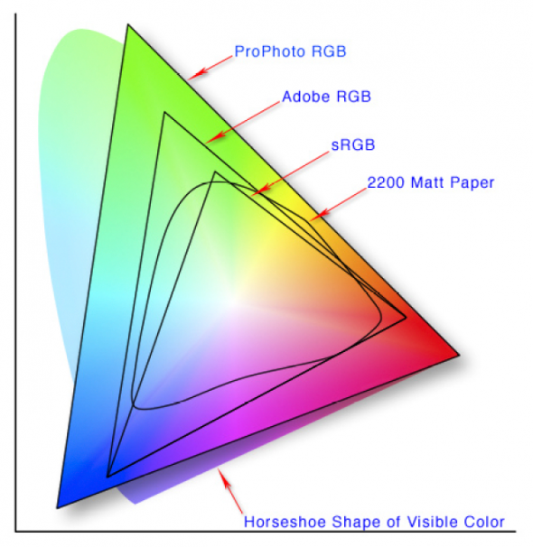
Color Space is simply the gamut, or range, of possible colors. Some spaces, such as ProPhoto RGB, encompass millions of colors, which makes the images look great on a computer screen. Output that file to a device that can’t read the ProPhoto RGB color space, and the results for your image will be less than stellar.
The basic thing I keep in mind is this. Work in the largest-gamut color space you can…say, ProPhoto or Adobe RGB. When outputting photos for a client or for a specific use (i.e., for the web), convert the photo’s color space to one with a more limited gamut if that makes it render better for that particular use.
As Rob Galbraith noted in a long-ago digital workflow seminar, “Assign on input. Convert on output.”
First step is setting the color space in your camera. My recommendation? ProPhoto RGB, if it is available. If not, AdobeRGB, both of which have a much bigger gamut than sRGB (see the color map above).
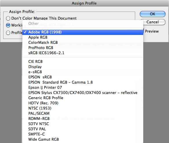
After you import your image into Photoshop in this format, you can choose to assign a new color space. This doesn’t actually change the digital zeros and ones that comprise your image, but it does make the photo appear different on the screen–sometimes very different. I only assign a new color space if my image is way too magenta, etc. I might assign ColorMatch RGB, which takes out redness pretty effectively. The key here is you’re visually making the photo look good on the screen. To Assign a color profile, go to Edit–>Assign Profile in Photoshop. There, you can choose from a variety of color spaces. If you have the “Preview” box checked, you’ll see the effect each profile will have on the image. If you find one you like, great. If you don’t, then don’t worry about assigning a different profile.

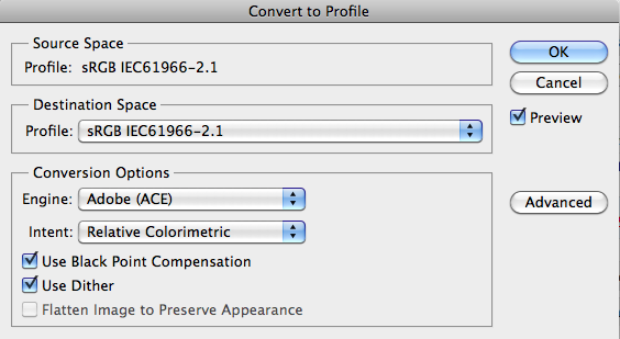
Once you’ve imaged the photo and it’s ready for it’s final destination—be it client or your own website—consider the end use. Then you Convert by going to Edit–>Convert to Profile in Photoshop, and choosing a space there. This time, the little zeros and ones inside the image file are changed by your selection, so always save the original before this “conversion” step. Note the “Source Space”—the current color space of your image file—and the “Destination Space”. In this example, both are sRGB.

My default is to convert it to sRGB. This is more limited in terms of gamut. However, sRGB is the best choice for PC (and non-Apple) screens. If you sent an image in the ProPhoto space that looks great on your gleaming Mac, your client’s PC might render it in unpredictable ways. Convert it to sRGB, you can know that it’ll look pretty close to what you see on most average screens. For this reason, if I’m publishing for the web I’ll convert to sRGB too. If you’re printing yourself, you may choose to keep in a higher gamut space. If you’re printing with a lab, you should check with them. Most ask for sRGB or allow you to embed an .icc profile (more on that another time; basically it’s a color profile designed for a specific printer). Color offset printers will require conversion to CMYK at this point, and then more imaging will likely be required to tweak the images before printing.
So, whether you ever decide to play with Photoshop’s “Assign Profile” function, you should always be aware of the color space your images are using. If they aren’t optimized for their eventual destination, make sure to convert those files to the proper color space.
