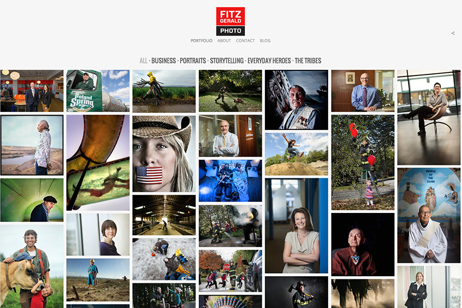
Today I’m relaunching www.fitzgeraldphoto.com with a new look and a complete re-edit of my work. For a lot of reasons I love the results.
Easy to navigate? Check. Responsive goodness? Check. Easy to customize (read: I can change the font to Zapf Wingbats at the click of a button)? Check.
Most photographers have a love-hate relationship with their websites. Love ’em one day, can’t stand to look at ’em the next. Even when I created great images I’d have liked to show to the world, I hesitated posting it on my old site. For me it was kind of like putting a new rear spoiler and sweet ground effects on a broken-down AMC Gremlin: A lot of effort but the end results pretty much look the same. Redoing my site involved not only a new design, but a full re-edit of my work—and that is a huge and hairy task I couldn’t wrap my head around.
Luckily, I got help with that piece from Peter Dennen of Pedro+Jackie Photo Consultants. Peter is a great editor, and he helped whip my work into shape. I’ve also relaunched my blog, too (ooh….ahhh). Now it looks more like a tricked-out 1974 AMC Javelin, which is kind of a bad-assed looking set of wheels (truly, thanks, Peter).
The process took longer than I initially planned but the upshot is it made me reevaluate my work and gain a new sense of perspective. So please take it for a ride and stay tuned for new work to pop up here on the blog and on fitzgeraldphoto.com. Thanks!
